
Recomendados
Más contenido relacionado
La actualidad más candente
La actualidad más candente (20)
Destacado
Destacado (13)
Similar a Presentation mini art school
Similar a Presentation mini art school (20)
Último
Último (20)
Presentation mini art school
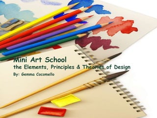
- 1. Mini Art School the Elements, Principles & Theories of Design By: Gemma Cocomello
- 2. In This Lesson 7 elements of design 6 principles of good design 4 laws of Gestalt theory
- 3. How it can help Vocabulary to talk about what we see in our visual culture Creates more effective visual messages Design professionals don’t need to know how to draw (many can’t)
- 4. Element #1- Space Positive & negative space Positive space is what’s filled Negative space is not your enemy Space is a requirement
- 6. Element#2- Line Primary tool First graphic marks humans make May be straight, angular, curvy, thick or thin Illustrations drawn within lines are called “line art” Associated with movement and eye flow
- 7. Element#3- Shape/Form Layout are mostly rectangle Inorganic and organic Inorganic are precisely geometric (perfect cirlces, squares, triangles, etc) Organic are more natural Shapes can trigger instant recognition
- 9. Element#4- Size/Scale Important for composing layouts Can shout with importance or whisper Large headlines vs. small advertisement
- 10. Element#5- Color Most powerful communication tool Draws attention Evokes emotion
- 12. Element#6- Texture Illusions (2D, 3D, depth, dimensions) Paper itself Visual impression Patterns
- 14. Element#7- Value Tones of light,dark and in between Grayscale Use light or dark tones to highlight one thing or de-emphasize another Black, white and gray are useful for giving the sense of 3D in 2D and give color when you can’t use color
- 17. 1. Have you ever been guilty of mixing colors/textures/patterns that did not go well together? 2. Share your artistic/design pet peeves. 3. Name or show some examples of when combining black and white with color work.
- 18. Principle#1- Focal Point/Empahis Center of visual interest (CVI) Rule #1- Have one Rule#2- One per screen, page, story, or ad Can be anything, as long as it’s the most eye catching piece of the visual information
- 19. Golden Proportion Ratio 1:1.618 Also called the divine proportion or the golden ratio Compositional grid suggesting asymmetrical placement When we divide a line into two parts so that the longer part divided by the smaller part is equal to the whole length divided by the longer part. Artists and designers like this due to its production of visual appeal
- 20. Rule of Thirds Simpler than the golden proportion 3X3 gird that suggests layout placement Divides the layout into evenly spaced 3X3 grids, the focal point goes on one of the four gridline intersections
- 22. Principle#2- Contrast Great deal of flexibility Limitless ways to achieve it Great way to avoid visual boredom
- 23. Principle#3- Balance Visually balanced Radial balance Symmetrical balance Asymmetrical balance
- 25. Principle#4- Movement Good design controls the eye’s flow Want the eye to move across the layout Lines create movements and different linear movements communicate different symbolic messages Horizontal: left to right or right to left Vertical: Stability or upward movements Diagonal: Exciting dynamic movement
- 27. Principle#5-Rhythm/Pattern In graphic design rhythmic movement has to do with repeating items strategically Grouping several photos establishes a rhythm Repeating fonts generates a rhythm Visual sense of togetherness Helps lead the eye from one thing to another
- 29. Principle#6-Unity All parts of the design that work together Consistency Oneness Visually unified if different parts have links or relationships to one another
- 32. Gestalt Theory 20th century German psychologists studied how the human brain perceives objects Discovered that the brain automatically simplifies, arranges and orders objects the eyes see Specific patterns of perception emerged from the research. Became the Gestalt Laws
- 33. Law#1-Proximity Objects close together belong to the same group Objects in the same direction are art of the same group (Common Fate) To avoid a busy cluttered layout
- 34. Law#2- Similarity Group things with similar properties (color, shapes,etc) In layout we can use similarity to create order and organization through unity
- 35. Law#3- Continuity Our minds will continue a pattern beyond its ending points Adds sense of direction and movement
- 36. Law#4- Closure Mentally filling in the gaps to complete a perceived shape Idea of designing with only a part but having the viewer perceive the whole.
- 37. Questions Find a web age, advertisement, etc that you feel passes the lessons elements and principles. Or find one that does not. Find and example that would pass the Gestalt theory
- 38. School’s Out!!!