Tommy
•Descargar como PPTX, PDF•
0 recomendaciones•388 vistas

Student investigation of the question: "Who spends more time gaming-Boys or Girls?"

Recomendados
Más contenido relacionado
Similar a Tommy
Similar a Tommy (19)
Más de Gary Johnston
Más de Gary Johnston (20)
Último
Último (20)
Tommy
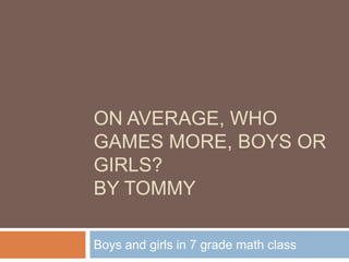
- 1. On average, who games more, boys or girls?By Tommy Boys and girls in 7 grade math class
- 2. Question On avg. who games more, boys or girls I think that the boys will game more because usually anyone with commonsense would know that boys like games more than girls but, but I just want to see.
- 3. Data Boys Mean: 555 Median: 550 Mode: N/A U. Quartile: 910 L. Quartile: 127.5 Range: 1040 I think the median in this case is a bit more accurate because there are two outlier. Girls Mean: 74 Median: 60 Mode: 60 U. Quartile: 125 L. Quartile: 17.5 Range: 190 Again, the median is still more accurate in my opinion because there are outliers.
- 4. Column Chart This is a good way to show your data. If it is accurate, it will be very useful in showing and comparing
- 5. Pie Chart In my opinion, the pie chart is more useful because you can see it as a whole and compare it more easily.
- 6. Line Chart This is only good for showing changing variable but for this kind of data, it is not very useful.
- 7. Which is better I choose the median because there were outliers and median do not include them I think that the pie chart is better in representing this kind of data because you can see how they relate to each others, and it is easier to compare (my opinion)
- 8. Reflection It is clear who gamed more on avg. boys Through this project, I found out that misleading chart can be very inaccurate and stupid. Data can look different on different type of chart and you can interpret them differently, either right or wrong. Also, different type of chart can be used for different type of data presenting