
Recomendados
Más contenido relacionado
La actualidad más candente
La actualidad más candente (20)
Destacado
Destacado (15)
Similar a Pop Art
Similar a Pop Art (20)
Pop Art
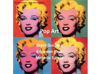
- 1. Marilyn Diptych – Andy Warhol (1962) Pop Art Grace Guideau Erica den Boer Melanie Turner
- 2. Art in the UK Began in England in the 1950’s by the Independent Group Just What Makes Today's Homes So Different, So Appealing? – Richard Hamilton (1956) Depicted the ideal American lifestyle
- 3. US v UK America Pop Art British Pop Art Eight Elvis’ – Andy Warhol (1963) Portrait of Nick Wilder – David Hockney (1966)
- 4. Roots Reaction to TV and mass media/mass production and consumerism Everyone was exposed to mass media Rooted from dada-ism Erased the lines from high and low art Went against the strict rules of previous art movements (abstract expressionism)
- 5. Characteristics Subjects Techniques/Styles Celebrities No brush jobs Comics Silk Screening Commercial Items Repetition of images News Changing color/texture Advertisements Ben-day dots Everyday Objects Combining images/items
- 6. KEY ARTISTS Jasper Johns Robert Rauschenberg Roy Lichtenstein Andy Warhol
- 7. Jasper Johns “I like what I see to be real, or to be my idea of what is real.” “Three Flags” by Jasper Johns
- 8. Background He was mostly an Abstract Expressionist but had Pop Art qualities within his work He painted things that the mind already knows (targets, numbers, and flags) Duchamp was a huge influence on his work Target (1958)
- 10. Numbers in Color (1958-59)
- 11. Map (1961)
- 12. Robert Rauschenberg “I don’t mess around with my subconscious.”
- 13. Background Used untraditional materials Trademark was combines Didn’t like seriousness, rejected Abstract Was enthusiastic about popular culture
- 15. Bed (1955)
- 17. Background Liked to use images from comic strips and commercials/advertisements Goes for a mechanical look in his art Uses thick black lines, primary colors, and Ben Day dots Reoccurring theme of men vs. women Look Mickey! (1961)
- 18. Theta By Morris Louis, 1961 Okay, Hot Shot (1964)
- 20. Roto Broil (1961) Washing Machine (1961)
- 21. Step on Can with Leg (1961)
- 22. Girl with Ball (1961)
- 23. The Kiss, 1961 Masterpiece, 1962 Eddie Diptych, 1962
- 24. The Drowning Girl (1963)
- 26. Andy Warhol “Everything is beautiful. Pop is everything.”
- 27. Death and Disasters Series (1962-63)
- 29. Gold Marilyn Monroe (1962)
- 30. Soup Cans (1962)
- 32. Gun (1981-82)
- 33. Many critics took the “dumb” look of Pop Art paintings at face value Still bound by seriousness of earlier art Pop Art Abstract Expressionism Look Mickey – Roy Lichtenstein (961) Excavation – Willem de Kooning (1950)
- 34. “I like what I see to be real, or to be my idea of what is real.” – Jasper Johns Many people thought Pop Art was a joke, it wasn’t “real” art That’s what the point of Pop Art was, to mock what is and what should be considered art Johns and Rauschenberg wanted people to see ordinary things/real images in new ways Monogram – Robert Rauschenberg (1955-59) Numbers in Color – Jasper Johns (1958-59)
- 35. Jasper Johns Johns was compared to Rembrandt in Time magazine Both are painters and printmakers Three Flags – Jasper Johns (1958) The Abduction of Europa – Rembrandt (1632)
- 37. Brillo (1964) “Why not create something new?” Public was confused by his work Unoriginal, didn’t know why he did it Never gave straight-forward answers in interviews, very mysterious
- 38. Aftermath Showed the public their obsession with the outside world and consumer culture Changed the playing field of what was “high” art Pop Art is well-liked and still relevant today
- 39. Fun Facts Johns and Warhol has said his Rauschenberg were greatest masterpiece is lovers himself Warhol produced the Valerie Solanas knew band The Velvet Warhol before shooting Underground him, as she was in his Andy Warhol’s real movie, Bike Boy name was Warhola Johns broke the record Warhol’s studio was for selling price of a called “The Factory” living artist
Notas del editor
- Europe was in a rough spot physically, emotionally, mentally, after the war and were envious of the American lifestyleFord, president, tootsie pop(worldwide sensation), cleaning lady, vacuum, holiday ham, radio, television,
- American:All about commercialism, icon/popular items, and popular cultureBritish:About the ideal American lifestyles that they saw in magazines
- Commercial Items: Soup cans, Brillo pads, soda pop, etc.- Silk screening is an industrial technique that Andy Warhol especially liked – he would take an image of something and create a stencil out of it and lay it on a canvas. Then he would brush layers of color over the stencil until the desired affect was achieved.
- A lot of pop artists actually had background in commercial art or advertising.Warhol was originally a commercial illustrator and got his bachelor’s degree in fine arts and graphic designLichtenstein got a degree in art from Ohio State but was drafted to the army during WWII. His experience with war showed through in some of his comic inspired art, such as “TakkaTakka”Rauschenberg originally wanted to be a minister or pharmacist. He was drafted into the US Marines and during that time he discovered his ability to draw everyday objects and his love for it, which he pursued after leaving the MarinesJohns studied art at 2 different universities, but got drafted into the army. When he came back from service, he met Rauschenberg and his art career really began
- His images of the American flag is what made him famous
- He actually created a performance piece called “Walkaround Time” that he based off of Duchamp’s painting “The Large Glass”
- ****HE DOESN’T GIVE ANSWERS IN HIS PAINTINGS********************************Theory One: He was named after Revolutionary hero Sergeant William Jasper, Theory Two: He dreamed about the flags and then painted themTheory Three: It’s like an optical illusion because your perception of the painting changes based on your vantage pointTheory Four: It’s purely aesthetic, there is no deeper meaning, it’s just a visual object
- This was his way of bringing what the mind already know into abstract art which sets framework for Pop Art later.Complementary color scheme
- Johns mocks the Abstract Expressionist movement by creating the United States in a sloppy, abstract way. He also puts the names on the states.
- Painter, sculptor, choreographer, print maker, composer, performerHis work enraged critics“his imagery and methods profoundly influenced pop, conceptual, and other late modern artists”He saw the beauty in everyday objects similar to DuchampLacked explanations for his own art pieces, let people put their own interpretations on his work
- - Clearly used untraditional materials in this piece- An example of a combine (an art piece that combined many materials and techniques)- One of his most famous piecesConsists of a stuffed angora goat, a tire, a police barrier, the heel of a shoe, a tennis ball, newspaper clippings, and some of Rauschenberg’s older paintings**the tennis ball is painted brown and placed behind the goat, suggesting that he is defecating on everything that lays below it and that none of it matters
- Rauschenberg had run out of materials to paint on, so he decided that his quilt would make as a good canvasConsists of a real quilt, sheet, and pillow, with layers of oil paint on topThe top half looks rather messy and distraught, while the lower half looks tidy except for a few paint drops that seem like they were dripped there on accidentSince he doesn’t give answers and wants every person to interpret on their own, their can be many different views.To me, it looks like it’s supposed to symbolize violence and how something violent usually happens when a person is in a vulnerable state – like sleeping in bed. And how people may try to cover up certain violent acts so others don’t find out, but there’s always some sort of trace or proof of it if you look close enough (which is symbolized by the quilt covering the mess of the bed, but you can still see the drips on the bottom)
- This quote goes completely against the point of prior art
- - Most of Lichtenstein’s paintings are edited images from comic strips.- He also paints popular “must have” items currently being advertised. - He enjoyed painting images taken from their original source– takes them out of context so the viewer surveys something not as noticeable normally- Lichtenstein made it obvious that he was making unoriginal paintings to challenge the idea of originality that was so prevalent at the time.- He wants his art to look mechanically made and does that by using thick black lines, primary colors, Ben Day dots, and a lot of stencils **(ben day is a technique he uses to show color through the use of dots, like you would see in comic books)- In several of his paintings we see a theme of the conflicting ideas of men’s roles vs. women’s roles**Background is Look Mickey! painted by Lichtenstein in 1961. He found this image in a bubble gum wrapper. He drew it then painted his drawing (he liked removing the images several times from their original sources). This was his first pop art painting and once he created it he was stuck on pop art.
- Painted in 1963Image is combined from four different comics.The words “I’m Pouring” takes a stab at what was considered “high art.” It refers to Abstract Expressionist Morris Louis’ painting style of pouring paint. Basically Lichtenstein is making fun of how people consider the nonobjective “poured” paintings more valuable.
- He depicts the man (on left) with pointed angular lines and the woman with soft curvy lines, seeming somewhat in shock.Lichtenstein is pointing out the stereotypes of men and women as men being calm and woman as more emotional.
- Both painted in 1961 and are advertisements for new commercial items at the timeIn the 60s anything could be new and improved or desirable as marketers presented the objects in dramatic light.Lichtenstein painted these objects as a symbol of the ideal life that the marketers were promoting to consumers. Both objects are alone in the picture as if straight from an advertisement catalogue.He doesn’t criticize the items or their advertisers but merely shows them as they are. This goes back to his quote about not having underlying meanings in his art. **Lichtenstein really liked commercial art. Although those who appreciated fine art disapproved of commercial art, Lichtenstein really noticed how the piece’s intent was directly expressed.
- Painted in 1961This is an advertisement to houseworkersThis woman is not dressed for housework- wearing a nice skirt and high heelsThe barely recognizable pressure opens the lidThe flowers on the can show industrialized freshness and cleanliness as it shows that you don’t have to actually touch the can to throw away the garbageThis paintings main subject is not the woman but the canMany of Lichtenstein’s paintings deal with the way woman are used as “extensions” to household appliances
- Copy of original honeymoon ad painted in 1961Compared to the original advertisement, the painting is much larger, it’s bigger than life size-both paintings have a cliché young beautiful woman with nice hair, big red lips, and a slim body-her frozen body position looks as if she is playing with the beach ball yet it doesn’t look like any fun-main subject of the painting is the woman and her stiff gesture-in the 60s, the color of comics would reflect the economy in a way. Ex. If economy was bad, a lot of things would be the same color. -Lichtenstein makes both her hair and the swimsuit blue to “save money” mocking economic principles the time-idea that women should only do certain things that “women ought to do” **Lichtenstein uses the “cliché woman” a lot. In his paintings the perfect women are considered good but vulnerable
- These perfect woman are all good but are all vulnerable ex. crying or waiting In the 60s before women had many rights, they were at the disposal of the men in a way and Lichtenstein is showing that through these images-He choses his comics very particularly- he wants EXTREMELY dramatic daily life (pop art makes you examine things in everyday life)
- 1963She’s drowning herself in emotion.All we can see of her is her face, hand, and her naked shoulder. She lies there as if in a bed symbolizing her final resting place.(she thinks she is going to die because of the pain Brad caused her.)The wave about her head is graceful and not dangerous showing the woman’s melodrama and willingness to give in too soonLichtenstein likes to zoom in on one picture so the viewers have no idea where the emotion comes from and so they can’t relate to the crisis.- This once again shows the vulnerable woman
- -Vietnam was going on at the same time as the Pop Art movement. Lichtenstein really like painting war and combat pictures and liked showing the battlegrounds close up so nobody would know who was winning.-painted in 1962-the war is fought by “soldiers” but the weapon seems to be firing itself (original comic had a hand on it)-Lichtenstein simplifies the comic by using fewer and more definite colors and shapes and makes the explosion graphic and mechanical to fit his style-He liked how commercial artists made words/symbols for sensations ex. Takkatakka is noise for machine gun which sounds jagged and loud- Can kind of see his ben-day dot technique at the front of his gun
- Pop Art is anything and everything around you, and Andy found beauty in that
- This series shows repeated images of death and disaster from newspapers and television to show how obsessed and attracted we are to the media and the repetition of a topic that news channels will constantly talk about
- Warhol made it in 1982He had a lifelong love of money, and profit was a strong motivation for himMoney was the epicenter of consumer culture, and he was highlighting it’s importanceThe painting represents all goods and items that can be purchased with money
- Rembrandt is one of the world’s greatest artists
- Didn’t know why he was doing what he was doing because his work had really no value since it was all brand name stuff you get at the storeVery mysterious about his work and what his point behind it was
- There is the Pop Art effect on webcams and MacBook's that lots of people usePop Art has inspired clothing, furniture, and bagsPop Art even affected David Bowie’s singing career as he was obsessed with Warhol and aspired to become a singer when Warhol produced the band The Velvet Underground. Bowie even wrote a song dedicated to Warhol
- Rauschenberg and Johns were working together for most of their 6 year relationshipThe picture of the banana is the album cover Andy designed for “The Velvet Underground and Nico” album“Warhol’s Greatest masterpiece” – he called his everyday look his “Andy suit” because it was a persona of himself he put up at all timesJohn’s “Three Flags” sold for $1 million, breaking the record for highest selling price of an artwork by a living artist