
Recomendados
Más contenido relacionado
La actualidad más candente
La actualidad más candente (20)
Destacado
Similar a Development diary media
Similar a Development diary media (20)
Más de gracesykes
Más de gracesykes (19)
Último
Último (20)
Development diary media
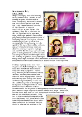
- 1. Development diary Front cover I began creating my front cover by firstly staring with the image. I decided to use a close up image for my front cover as when looking at my research I discovered that most dance magazines used close ups. Firstly I began by editing my photo for the front cover by using the paintbrush tool to make the skin look smoother, I done this by coloring in her skin and then changing the opacity to make it look more realistic. I then used the paint brush tool again to change the colour of her lips as I wanted them to stand out more, I done this by creating a new layer then colouring in her lips and turning down the opacity of this layer. I then used the tool levels and curves to make my image look more attractive so it would appeal to my target audience.I felt that this image represented the genre of my magazine well as my model looks dressed up like she’s out and having fun. I can also relate my image Laura Mulvey’s Male gaze theory as my target audience is aimed at more men than women therefore I thought this would attract male attention as it would be seen as visual pleasure. Next I put my image on the front of my magazine and started adding in the cover lines. I first started with the main cover line (Dance duffy style) which I created using the outer glow tool so I could achieve and effect which would make the cover line stand out on the page. I then added in the rest of my cover lines by using boxes and the outer glow and drop shadow tool.I also used the shape tool to create squares for my cover lines to go in and then I filled them with colour’s, I tried to stick to a colour scheme of red and yellow as I thought these colour’s represented my genre well as I thought they contrasted well with the main image. I mainly kept my fonts on the front cover the same throughout as Iwanted them to look effective and professional, whereas if they well all different I thought this would make the magazine look more scruffy. I used cover lines that I thought would attract my reader’s attention by using well known artists that related to my genre and would excite the
- 2. reader. I also added in my barcode and the price to my magazine which I ended pricing at £2.99 after looking at my research. By using the tool free transform I was able to manipulate my image to how I wanted it and also cropping it to a different size. I decided not to change the colour of my background but keep it the same as when I took my photo as I think it still fits in well with the genre and because it is light it makes the coverlines and the main image stand out more. The next things I done was to add in my title of my magazine, I decided to call it “Alive” as this link to the genre of m magazine well, I got the font of a website in which I then manipulated it using Photoshop to make it stand out more by using the drop shadow and outer glow tool. Contents page Firstly for my contents page I started with the title and the pictures, using the tool levels and curves I edited my photos to how I wanted them then I inserted them into the contents page, using the tool free transform I then was able to resize them to how I wanted them. Next I added in the box’s using the shape tool, I thought it looked better having the text inside boxes because it highlights what the text is saying and the yellow makes the boxes stand out which will attract my audience’s attention. I also chose to put the text in boxes because I think it looks more neat and professional and will be easier for my target audience to read. I chose to put the pictures on the right side because people read from left to right so therefore it will be easier for my audience. I used to drop shadow tool for the boxes with the numbers in because I wanted to highlight the page numbers in front of the pictures to it would catch my audience’s attention. I think the text inside of the contents page Is a good size because it is readable from a distance and the white makes it stand out, I also think I have laid it out well in contrast with the pictures.
- 3. Next I added in my other pictures but I decided to swap some of them around because I thought they would fit in better this way and attract my audience this way. I also then wrote my editors letter in which I then signed off with my name using the pencil tool to make it look more realistic. Overall I think my contents page works well sue to the colour scheme and I also think that all the pictures are relevant to my genre and represent my dance magazine well. Double Page Spread For my double page spread I first started off with splitting the page in half by using the line tool. Next I added in the box for the title using the shape tools and then filled it with black as I was going to have my title in yellow so the black would make it stand out and it would also match my contents page. Next I added in my sub- headingwhich I placed conventionally underneath the title. Next I added in the title which I chose to do yellow because it stood out from the black, I chose for the title to have a red outline because I thought this made it stand out even more and this sticks to my colour scheme. I also then added in the date and page number at the bottom of the page which I also conventionally placed there after looking at other magazines. I also added in a fact box for extra information to attract my audience. Next I started working on my main image for the double page spread. The first thing I done was use the clone tool to colour in some of her skin to make it look more smooth and I also used the clone tool to colour over some things which I didn’t want in the photo, lastly I used curves and level to edit the photo to how I wanted it.
- 4. This was my overall finished double page spread; I completed this by adding in a drop cap and the rest of the images. I also used some fact boxes to add extra detail to my magazine which I thought would be more attractive for my audience. Overall I am happy with the finished look because I think this the colours go well together which make my magazine appeal more my genre.