TỔNG ÔN TẬP THI VÀO LỚP 10 MÔN TIẾNG ANH NĂM HỌC 2023 - 2024 CÓ ĐÁP ÁN (NGỮ Â...
Vibe
1. VIBE
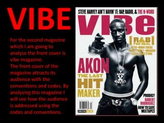
For the second magazine
which I am going to
analyse the front cover is
vibe magazine.
The front cover of the
magazine attracts its
audience with the
conventions and codes. By
analysing this magazine I
will see how the audience
is addressed using the
codes and conventions.
2. Vibe magazine overview:
• Publisher: Vibe Media
Audience:
• Editor: Jermaine Hall
• Circulation: 300,000
• Frequency: Monthly
• Country: U.S.
The front cover of this VIBE magazine suggests that it has an audience
of dedicated hip hop and R&B fans, who enjoy reading about the
wider subject. From the cover, I will assume the audience will feature
a mix of both genders. However, they may be predominately male.
They will be interested in a wide range of subjects including fashion.
Also, most of the readers will be regular to the magazine.
I will analyse the target audience for vibe magazine using this link
below:
http://issuu.com/claudedupre/docs/vibe_brand_media_kit_mk2010
This link of VIBE's media kit shows the Demographic statistics and
detailed information about VIBE's target audience.
3. Information on the target audience:
• The average age for VIBE is 28
• They are predominantly male with 62%
• They are well educated with the majority in employment with
73.9%
• They are predominantly African-American with 71.3%
• The readers of this magazine are into the latest technology
• They also enjoy reading about
music, films, celebrities, technology and fashion
• They will be dedicated music fans
Audience profile:
• Age: 28
• Gender: Male
• Ethnicity: African-American
• Employment: Well-paid job
• Geographic's: New York
4. Who are the core audience?
• The core audience for this magazine targets 18-34 year old. From
looking at the front cover, I can most defiantly see that this is true as
it is presented sophistically.
What are the attitudes, values and lifestyle of the audience?
• The audience will have an active social life by going to
cinemas, concerts and main events. Their well-paid job will pay for all
the activities done by the audience. They will also be heavy internet
users who consume music, film, TV and celebrity related content.
They will be very technology savvy with a desire to have the latest
technology. This target audience for VIBE magazine will influence the
ideas of the mainstream society.
Why is this audience attractive to advertisers?
• The target audience for VIBE are predominantly in employment with
a high income who influence the mainstream society. The audience
have many interests. Therefore, they will be interested in the
advertisements within the magazine, provided they are related to
their interests.
5. Codes, conventions and
mode of address
• I will now look at how the codes and conventions are
addressed, on the front cover of VIBE have been used to
attract the magazine’s target audience.
6. Masthead
• The masthead of this magazine is
bold which uses the colour pink.
This contrasts with the plain
background of white, which makes
the masthead of the magazine
stand out to its target audience.
The calligraphy makes the
magazine stand out. The usage of
bright colours will attract the
fashionable young audience. The • Therefore, it also shows that
masthead has been slightly the audience must be
covered by the image of the dedicated to the magazine
and buy it constantly. It also
magazine. This holds connotations reinforces the idea that
of identity and loyalty for its magazine is loyalty to its
audience. It shows, the audience audience. It shows that the
will be able to tell the identity magazine makes the
without seeing the full masthead. audience feel apart of it.
7. Image
The dominant image of this magazine shows a well-
known artist. This will instantly attract its target
audience, as it will appeal to its predominantly
African-American audience. The image overlaps the
masthead. This suggests loyal customers will
purchase this magazine as it is a well-known name.
The image is a Long mid shot which will help to
promote to the audience that the magazine is of an
R&B genre of music, and therefore will be interested
to read it if they are interested that particular genre.
The image itself is black and white, which also
reinforces the idea that the genre of music is R&B as
most of the videos are known to be set in black and
white. Therefore, appealing to its audience. This also
helps the rest of the headlines to contrast and stand
out, attracting the audience with its eye-catching
colours. The artist is seen to be top-less which could
appeal to both males and females, potentially
attracting new audiences. The artist is also shown
with what looks to be expensive jewellery which
helps to promote to its high-waged audience and if
their interested in fashion.
8. Banner
• The banner or boost helps to sell the magazine.
It is bold and fits in with the colour scheme. The
headlines flow around the image, which also acts
as boost. The headlines are a convenience to the
audience as people read form left to right. The
banner is black which again contrasts with the
other colours used to help promote the
magazine. The fans will notice the banner due to
it being placed at the top of the masthead and
recognize the bands shown.
9. Strap-lines
• The main headline says ‘AKON’ this
relates to the dominant image of the
front cover. By supporting the
image, this headline will pull the
audience into seeing what is in the
contents of the magazine. The strap-
line underneath ‘AKON’ explains to
the audience what the main title of
his article is. The headlines and
strap-line are used with contrasting
colours to stand out to the
audience; it also helps to determine
the difference between them.
10. • The strap-line saying ‘R&B
for real’ then listing artists of
this genre, will potentially
targets the main target
audience for this magazine.
This suggests that the
magazine is aimed at serious
music fans of this particular
genre, and therefore
attracting the audience. The
listing of the well-known
artists underneath the main
strap-line acts as anchorage
to tell the audience what the
magazine will be aimed
at, just with a glance at the
front cover.
11. • This strap-line acts as a ‘plus’ column
in the lower right hand corner. These
show a variety of different artists
which are of a similar genre to the rest
of the magazine. Again, appealing to
its target audience. It helps to create
the magazine more diverse then the
mainstream, which could therefore
gather new people to buying the
magazine. The colours used are similar
to the rest used throughout the front
cover which follows the same house
style for the magazine. The colours are
of contrast to each other which makes
them stand out due to them being
placed at the bottom of the page.
However, this aspect is quite
unconventional to its audience as it is
situated at the bottom right, which
makes it more difficult for the
audience to read as we read from left
to right, top to bottom.
12. Other
• The pricing is given in dollars which suggests
it’s an American based magazine and
therefore, it will be aimed at people living in
the U.S. This magazine will most likely not be
exported and just published in the U.S.
13. Representation of social
class:
• From the front cover, I will consider the issues from
analysing the headlines and conventions of this magazine
front cover. Some words used such as ‘hit' and 'real' can
show that this magazine is represented for dedicated music
fans. The artists stated on the front cover of the magazine
suggest that the magazine is predominantly about the R&B
genre of music, which will therefore attract more
mainstream music fans. The idea that the majority of the
artists mentioned are more American based which gives a
strong American identity to the magazine. The colours used
pink, yellow, and black give the house style of the
magazine. Although, the magazine uses many different
styles which will be unconventional towards its audience.