SlideShare una empresa de Scribd logo
1 de 8
Evaluation
I have asked a student about my broadsheet to gain some feedback and this is what
she thought:
The Broadsheet itself looks professional and the overall look of it is similar to
a normal broadsheet in a supermarket.
The colourful box at the top is nice but to improve it you need to get rid of the
black outline around the box as it breaks up each section whilst it is better for
the two boxes to flow together.
The cut out celebrities brings attention to the audience and shows that you
have broaden your skills whilst making the broadsheet.
Columns fit nicely in the grids provided and it was clever how you fit in the
barcode and image to the right size.
By using the line to separate the subheading to the article looks professional.
The apostrophe doesn’t look right in the overall heading as it looks upside
down and doesn’t suit the font provided.
There is a lot of white space around the masthead; you can improve this by
making the title bigger so that it takes up more of that space.
This feedback given is really helpful as it picks out details that I would have missed
when looking at it myself. What stood out to me from this feedback is the ‘line’ used
in my broadsheet to separate the article from the subheading, this stood out to me
because I researched what real techniques that broadsheets have used to make their
front cover more professional and concise. I found a front cover from The Times that
had used multiple line methods just to section each part out
which I thought looked really neat and also by using that
method really helped me to achieve the look of a broadsheet
front cover. I changed the colour of the line from black to
grey because I didn’t want the line colour to merge with
thetext colour so I made it lighter which makes it less obvious
but also very neat. I changed the colour by going on Indesign
and pressing Window>Colour>Colour, this opened a panel so
that I could change the colour type from black to grey which
really helped me to pick the right shade overall.
I didn’t know about creating grids until I used Indesign, this has helped me to produce
the Broadsheet and Tabloid in a professional way by keeping each column or title in
the right place so that it suited the theme of the newspaper but also to their audiences.
I used 7x5 for my broadsheet this is because I could really see the correct box sizes
with lots of columns. By having only 3x3 it would have been harder to find where the
boxes should go, as there was more white space between each box. To make the
different grids I went on Layout>create grids this opened up a box, which meant I
could type in and preview the amount of grids that I wanted. These were simple
techniques that really helped to produce the right
shapes for the broadsheet and tabloid.
By improving the size of fonts and covering as much
white space as possible I found that the Masthead on
my broadsheet was very weak, because I used a logo
that would go on top of the masthead meant that I
restricted the amount of space I could use. This made the
title have less impact and instead put most of the focus on
the main title, which is still important, but what I always
Mine
The Times
notice first is the type of newspaper it is. To improve this I used tools on Indesign
called ‘Tracking’ this separates the letters so that it covers the top of the broadsheet
and tabloid. I made the broadsheet newspaper title go right across so that it was the
same width as the two boxes below which I thought worked really well. For my
tabloid I made sure it spread out as much as possible so that it take up most of the
room like ‘The Sun’ would which is a very effective way of making your title larger
and professional. For my broadsheet I should have used the ‘vertical scale’ tool on
Indesign because I learnt that making the letters larger and stretched helped to cover
most of the white space. I should have put the logo in the centre of the title so that I
could make the font larger and stretch each letter so that it look up most of the title
space. For my Fanzine I used a different method to stretch my words, instead I used
‘ctrl and T’ and then used each corner to make the font larger than its original size. At
first I made the font a large size around 130pt and then put it into the right shape so
that it stayed the same length as the border below.
Finally for my Tabloid I used a method called
‘bledding’ which helps to make the top and bottom
word closer together, this tool is in Indesign and it
helped me to put the smaller font to the larger font,
this was very similar to ‘The Sun’ and ‘The Daily
Mirror’ as their top name is closer to the larger name which is what I was looking for.
To raise awareness of my work I put each work on my blog that will help a public
audience to read and it gives them the chance to also give me feedback from my
work. When putting it on my blog it helps my tutor to mark my tabloid, fanzine and
broadsheet so that I get feedback that will help me to improve my work further.
I think this is the first main project where I have struggled to keep my
work in the time given, the planning elements took a lot of time as I
involved fonts for the masthead, subheading, body text, picking a
name for the work, different moods boards etc. I tried to detail them
out as much as possible so that it helped me personally to actually
figure out what I wanted the broadsheet, tabloid and fanzine to look
like. Once I finished the planning which would normally take me
around a day and a half, I found that I only really had a day to create
my broadsheet later on. I ended up doing11 pages for my broadsheet
newspaper planning, when going through this process I found it very
simple I didn’t look at other websites for my fonts because I realised
the bold strong font that I needed would be in the fonts given on the
computer. I used fonts like ‘Arial Black’ and ‘Bernard MT
condensed’ that are fonts that are used constantly every day; I found those fonts
weren’t any different to the fonts that they sell on the street. I did my flat plans
through shapes and on Indesign because I wanted show a rough copy of what it would
look like and then a clear white copy from Indesign that would show the simple
sections through boxes. These were simple to do and didn’t take much time at all.
After this I ended up creating my broadsheet on Indesign, I first put my grids on
which helps me to pick out the sections I needed and then once I did that I started to
make my article columns. I did this first because I wanted to see where to fit the
image and what size it would be so that I could measure it in Photoshop, I already had
the image from my planning so I copied that in and did image>image size, this came
up with a box where I put the width and height of the picture box in Indesign. Once
they were exact then I saved it and went back on to Indesign, after this I pressed
‘Place’ which helped me to put the image where it needed to go. At first the image
was stretched and I didn’t notice until one of my teachers said I needed to widen the
image (as a stretched image wouldn’t normally be in a successful broadsheet), this
improved my image and work massively as it made Obama look bigger and also more
realistic when he was in the right proportion. Once I got the hang of the tools I ended
up adding little bits that I didn’t introduce in my planning for example barcodes,
sentences under the image, bright boxes and finally the line between the subheading
and my name. These factors were only put on because of finding research and looking
at other broadsheets, this took up a lot of time because I was trying to find the right
broadsheet that would be similar to mine. This helped to give me a sense of what a
broadsheet should look like. I did this for my tabloid and fanzine, I found that looking
at Google images and books really helped me to see what they all look like and what
details have been used to create a professional looking piece of print based
magazine/newspaper.
For my Fanzine I took a lot of pictures from a large fanzine
book as it gave me a lot of inspiration and ideas to create a
quirky hand drawn piece of work. When looking back at
my images it gave me an idea to rip out my article
and stick it on to my fanzine article page instead of
just putting a box with an article in it, I wanted to be creative and by ripping the
article out has helped me to get a quirky rough effect that I wanted. For the first time I
printed and scanned a piece of work in which I haven’t done in that in other projects,
for this last project I wanted to put all my skills into these pieces of work and then
trying new things like adding texture and
roughness which is what Hip Hop is
all about. Once I finished adding all the
elements of my broadsheet it ended
taking over most of the tabloid time so that
once that was done I was already late going
into my tabloid planning. This meant I had to rush to do my planning so that I could
have more time on my tabloid which from I’ve learnt will take a lot of time. If I was
late for one newspaper I was going to be late for the rest of them which means I
couldn’t make any more broadsheet, tabloids and fanzines which is a shame as it
would have showed more ways of creating tabloids etc. in a different layout which is
why I produced a lot of flat plans so that I could create more.
From other projects I have found that when I am in a group I am very good at
organising a team and to put them into different roles, from projects like the recipe
cards I helped to create the theme and also organised which days to create the recipe
card, this meant that we had plenty of time to produce the recipe cards. On my own
doing this project I have learnt that I definitely needed to be more organised and to
work out what work I was doing on what day. I would have improved the matter if I
did the work at home but I didn’t have the software to do it so instead I should have
come into college to catch up on extra planning and production so that it doesn’t look
rushed. I’m good at being a leader and I try to be calm and organise lists of what the
group needs to be doing every day, with this project I did lots of lists of what
I needed to do but I either lost those lists or didn’t look at them which means
I wasn’t organised and didn’t stick the time given.
Reviewing my work had a lot of good and bad elements to it, the
negatives about reviewing my work was that I kept forgetting to produce
jpegs for all the final pieces of work. After being told that I should have on my
broadsheet I still forgot to do it for my fanzine which shows that I wasn’t
concentrating or organised. To try and improve this I started to create around 2 jpegs
for my broadsheet, even though this isn’t enough and would already have a lot of the
elements, I found that looking at the two examples was very interesting as I didn’t
have the date and cost, barcode and the sentence under the image. My tutor told me
that a lot of broadsheet uses sentences under images so that the readers can
understand where the image was taken. This helped me to research what a broadsheet
layout normally looked like; I found that the date and price would normally be under
the main masthead and that the barcode would be near the bottom right which is
where I placed it. These elements helped to make my page look like a real broadsheet
front cover, whilst the first JPEG looked plain and didn’t have the right information
that a reader should have. For my Tabloid I tried to improve my production by taking
5 jpeg images which is more than 2 for my broadsheet, I looked back every time I
thought I finished and then found more elements that I needed to add or improve on
which was the advert at the top, (needed a title and a subheading) the image of the
victim (needed bullet points) and also the subheading at the bottom needed the
‘tracking’ and ‘vertical scale’ tool so that it would take more of the white space. What
I learnt from doing jpegs this time is that making those important improvements have
helped to develop the look of the overall front cover. I have incorporated elements
that I saw from the broadsheet into my tabloid for example I added the lines (above
and below my name, which was done on the broadsheet also), I put the sentences
under the images so that it told the reader who the people were and also put the date
and price understand the main masthead and advertisement.
I feel that the positive side of this is that I learnt from my mistake and knew that I
always had to take jpegs constantly and also by looking back at the jpegs it clearly
shows what’s been improved which will encourage me to use them more often as it
helps to develop my work. By being rushed through my time management I have
learnt that by shushing a lot of the sections have decreased the quality of my work. By
not taking time I forgot to do jpegs, I didn’t research elements enough and I didn’t
constantly look back to see what improvements I needed to make. To relax and take
time with my work is very important and I should have done that with my broadsheet.
For my fanzine I did my jpegs a little differently, I forgot to make jpegs again so I hid
each layer on Photoshop so that I could jpeg each section from the beginning. This
showed my development as it went on and how the front cover grew with the way it
looked, for this I did 4 jpegs, which is enough to show the development of my work. I
prefer doing the jpegs this way as it shows my ideas and what elements were added so
that to whole look of the front cover and article was to a good standard. I
got massively inspired by one image (on the left), which ended up being the
main edit for the front page. I wanted to create a lot of shapes because to me
it look very techno and futuristic and that’s what my magazine was about
the future of Hip Hop and the old school Hip Hop. Doing this effect made
the magazine looked more youthful and fun, by having different shading
between each shape you can see the body underneath and the actually
outlined how big each triangle was and where the main point was coming
from. I did these shapes on Photoshop by this method:
Copy image and page into a new document on Photoshop
Find a point where you want to create the shapes
Then go on the Polygonal Lasso Tool on the left of Photoshop
Create the shape you want and then press layer via copy.
After this to change the shade you press the ‘Apple key and L’, you can
change the colour of the shading but I kept it black and white.
Then you double click the layer and press stroke and then make it whatever
colour.
I have never used this method in any other project from last year to this year so by
trying something new was exciting and I learnt there is much more to learn through
Photoshop. I did another example (the fox image) as it’s easy to do and shows how
creative it can be towards an image.
The tools that I used the most and the new tools that I haven’t already spoke about
are:
Photoshop – old tools
Rubber, Cropping, Magic Wand and The Polygonal Lasso Tool, these were
used the most through the Broadsheet, Tabloid and Fanzine. I firstly cropped
every image and wanted and then used the rubber tool to get rid of most of the
excess background, once that was done I used the magic tool for the little
areas to clean away and then finally the polygonal lasso tool so that I could get
around the edges of the face or object. This method made
the people on my broadsheet stand out (other articles), it
helped to create Cressida and her outfits and finally made
the little objects in the background of the fanzine. This
method got rid of the background and helped to keep the main object.
On Indesign I used the rectangle tool, which created each box
that I needed for the broadsheet and tabloid, these boxes helped to put
the text in and the titles. By changing the colours of the boxes I went on
window > colour, this created the advert/article bit below the masthead
on the broadsheet, it brought colour to the page and more excitement
instead of the normal black and greys. I enjoyed using this tool as it
taught me to put images in by getting the right shape and size. I used
Indesign at work experience once at a Graphic Design place and
they taught me how to create columns and use it to my advantage
so I found that it was a head start for me that I already learnt
about this software.
I’m really please with my work as I feel it looks up to the
professional standard because of the technical tools I used,
adding more font and creating grids really helped to layout my
work so that it was simple and easy to insert things after placing
the boxes.
I overall feel that if I had more time to produce my broadsheet, fanzine and tabloid
then I would be able to produce more examples, this would help me to practice the
different elements and to see if I could experiment and also research more techniques
that I could use. I found a new technique whilst making my fanzine and that was
putting an old Hip Hop artists face on top of a young persons body, whilst planning
for this I thought that would be perfect for the front cover as I still encourages old
school Hip Hop fans to read my modern magazine. They wouldn’t have if I just spoke
about new artists, in the Hip Hop culture they seem to be desperate to go back to what
Hip Hop music used to be like so by having my article about old
fashion to the new it will bring a lot of audience in. The audience
for my fanzine would be from ages of 15 up to 35 years. I believe that new teenagers
that have been brought up in tough areas and have Hip Hop music and people around
them will be really interested in this magazine as it talks about there culture and also
the front cover is modern and would be affordable for the customers. I made the age
go up to 35 years, as the Hip Hop wording in the article would only be read to Hip
Hop people I feel that people at this age would still be talking like this and also dress
the way they do. Hip Hop culture and personality will always be with the people that
have been brought up with it. I feel a large audience age is acceptable has it’s a
modern/old looking magazine that anyone would like, it would have a variety of
articles from artists to fashion to culture. It has everything an audience would like. I
put Tupac Shakur on the young persons body because that represents the old music
and everyone in the Hip Hop industry recognise Tupac straight away. To do this
technique I did:
I used the crop tool on the original Tupac image and then I used the polygonal
tool on Photoshop to get rid of any background or white edges around the
face.
Then once I just had the neck and face I put the image onto the other mans
face. I used the opacity tool on that layer so that I could align the eyes and
mouth together. This helped me to find the right size for the Tupac face.
After fitting the face I used the rubber tool to rub out the layer underneath
(young mans face) so that you could just see Tupac’s face on the body, this
worked really well as the neck fitted perfectly with the young mans neck.
When finishing that I used the polygonal tool again but with a feather, the
feather I used was 10px, I used this so that the original neck would blend with
Tupac’s neck, this worked out really well as the colour blended perfectly as it
was black and white altogether.
To make sure that the black and white shades were perfect on Tupac’s side
and the young mans side I pressed the ‘command button and L’ which came
up with the levels box, they gave me three buttons to slide across so that the
colours would become similar to each other. I feel the tops are shaded
correctly but Tupac’s original image was to dark so that has let it down quite a
bit.
Finally to tweak the hat and hair I used the polygonal lasso tool to create a
black layer so that it would cover the ear, which ended up creating the shape
of the hat. Comparing and looking at them both I can see that that has worked
well and that it looks like Tupac is really wearing a hat. I also made sure that
the hair was still there so that it looked natural on top of the
bandana, I cropped that quite a lot so that it was just a little
piece of accessory on his head.
I’m really pleased with how Tupac looks because I tried this
technique on the SASH project by putting two faces together
and also adding heads to bodies to see how that would look
and to be taught how to do it and then for it to be successful
was one of the best techniques I have learnt in this project.
With the SASH project it didn’t work at all as the lines were
obvious between each face and the lines on the pictures
weren’t hidden but I never used feather so that tool has really
helped with this project.
The audience for my broadsheet is very similar to ‘The Guardian’, this is because
the subjects that I have chosen to show on my broadsheet are a mixture of ABC1
and AB, and these are the people that mostly read the Guardian. 89% of the
audience are ABC1 which means that they would be interested in the glamour of
the Oscars and that they would watch sophisticated films such as 12 years a Slave,
Gravity and American Hustle, which are well made films that talk about richness
and the poor. Customers in the AB and ABC1 bracket would also like Jamie
Oliver as he has just opened several ‘Jamie Italian’ restaurants
around the UK which are known to be expensive and to the more
richer audience. The subjects there that I have chosen are already an
interest to my audience. I would say that my audience for the
Broadsheet would be 20 years to 54 years as they have the most
audience numbers for reading The Guardian. Obama is an interest to
young people interested in politics and also his personality so by
having a variety of subjects just showhow my broadsheet
understands my audience. I chose to use the ‘Made In Chelsea’ Logo
for the main masthead as it looks like a royal broadsheet, which
works well with the ABC1 demographic. Finally the masthead and
subheading are written in a formal tone, which is what a well-
educated audience would want to read, a tabloid would be informal
which wouldn’t amuse an ABC1 audience. I feel I have achieved
what I wanted from the broadsheet because I have picked subjects
that have happened recently and celebrities that my audience
would recognise and like.
My tabloid has always been very similar to The Sun this is
because of the colour used and that the title I’ve chosen (The
World) is set out in a very similar way. I felt I wanted to keep my
tabloid as similar to The Sun because of the amount of readers
they get it everyday which according to the Audit Bureau of
Circulation it’s 3.13 million people. I’d say my audience for my
tabloid would be ages of 25-34 this is because it’s the second
highest audience for The Sun and my stories about politics and
the royal girlfriend would be an interest to people around that
age. The social grade for my audience would be ABC1C2 Adults
because these are people that can afford computers and
televisions which means they will be constantly up to date on the
news issues and celebrities personal lives which is what I’ve
introduced into my tabloid. The written article is also written in
an informal way, which means anyone can understand it from
any background, which will also be useful for my audience. I
achieved what I wanted with my audience and layout because of the
further research I did on the internet for example I wasn’t going to
use bullet points because I didn’t think they were very neat but when
I found tabloids did them, it ended up working really well as the
colour theme fitted and it was very informal for my audience to
enjoy. You can see on this tabloid (from the sun) how effective bullet
points are, they are straight to the point and effective in getting a
message across.
I found picking my images was quite simple, I went on Google images to research
images of Obama and for my broadsheet I wanted him to look powerful and a
dictator, this is because other broadsheets painted politicians as
serious and any subject that was about war or laws had either a
depressing or a formal image of that politicians face. The
example on the left shows how formal a broadsheet is and that by
having a serious picture, means it’s a serious story and that’s
what I wanted to put across for my broadsheet. I thought that by
having a large image between two writing columns would show
that there are a lot of people talking about him but he is so
powerful that it doesn’t matter. I chose the image of him pointing
because it looks like he is telling people of but also looking down on
them, which makes him look like the bad person.
When looking through Google images there
were a lot of silly ones of his face and then
intimidating ones of him when presenting a
speech, I made sure that the images of my
broadsheet and the images of my tabloid were
completely different. When researching tabloid
images I saw that they were very relaxed and
that the titles always made fun of the person directly so by having
a silly image with that would make them look worse. This is what
I did for my tabloid I made sure that the title worked well with the
image, when you first look at the image you think of him playing
and messing around. By saying ‘Obama is all play’ repeats what
Obama is doing in the image and links him into the article, which
I feel, really helped to link everything together. This is an
example of a tabloid and how they made the women look worried
so that it linked with the title that used words like ‘utter’ and
‘dared’ which work perfectly together. When looking at real broadsheet and tabloids
compared to mine I feel I have picked the right images altogether for my audience to
look at.
Written By Hannah Sewell

Más contenido relacionado

La actualidad más candente

Print screens for the construction of my front cover, contents and double pag...
Print screens for the construction of my front cover, contents and double pag...Print screens for the construction of my front cover, contents and double pag...
Print screens for the construction of my front cover, contents and double pag...brontesullivan14
 
Magazine design evaluation
Magazine design evaluationMagazine design evaluation
Magazine design evaluationempentertainment
 
Magazine Inspiration
Magazine InspirationMagazine Inspiration
Magazine InspirationTaggar97
 
Magazine Inspiration
Magazine InspirationMagazine Inspiration
Magazine InspirationTaggar97
 
Magazine design evaluation
Magazine design evaluationMagazine design evaluation
Magazine design evaluationWanderingHalle
 
Magazine Inspiration
Magazine InspirationMagazine Inspiration
Magazine InspirationTaggar97
 
Magazine Inspiration
Magazine InspirationMagazine Inspiration
Magazine InspirationTaggar97
 
Production reflection fmp
 Production reflection fmp Production reflection fmp
Production reflection fmpjackedwardsz
 
Magazine Inspiration
Magazine InspirationMagazine Inspiration
Magazine InspirationTaggar97
 
Magazine Inspiration
Magazine InspirationMagazine Inspiration
Magazine InspirationTaggar97
 

La actualidad más candente (20)

Magazine Evaluation PowerPoint
Magazine Evaluation PowerPointMagazine Evaluation PowerPoint
Magazine Evaluation PowerPoint
 
7. Evaluation
7. Evaluation7. Evaluation
7. Evaluation
 
Print screens for the construction of my front cover, contents and double pag...
Print screens for the construction of my front cover, contents and double pag...Print screens for the construction of my front cover, contents and double pag...
Print screens for the construction of my front cover, contents and double pag...
 
Fmp evaluation
Fmp evaluationFmp evaluation
Fmp evaluation
 
Magazine design evaluation
Magazine design evaluationMagazine design evaluation
Magazine design evaluation
 
Evaluation (4)
Evaluation (4)Evaluation (4)
Evaluation (4)
 
Magazine Inspiration
Magazine InspirationMagazine Inspiration
Magazine Inspiration
 
Magazine Inspiration
Magazine InspirationMagazine Inspiration
Magazine Inspiration
 
Evaluation
Evaluation Evaluation
Evaluation
 
Evaluation
EvaluationEvaluation
Evaluation
 
Magazine design evaluation
Magazine design evaluationMagazine design evaluation
Magazine design evaluation
 
Magazine Inspiration
Magazine InspirationMagazine Inspiration
Magazine Inspiration
 
Magazine Inspiration
Magazine InspirationMagazine Inspiration
Magazine Inspiration
 
Unit 14 - LO3
Unit 14 - LO3Unit 14 - LO3
Unit 14 - LO3
 
Print screens of contents
Print screens of contentsPrint screens of contents
Print screens of contents
 
Production reflection fmp
 Production reflection fmp Production reflection fmp
Production reflection fmp
 
Magazine Inspiration
Magazine InspirationMagazine Inspiration
Magazine Inspiration
 
Evanuation
EvanuationEvanuation
Evanuation
 
Q7 powerpoint
Q7 powerpointQ7 powerpoint
Q7 powerpoint
 
Magazine Inspiration
Magazine InspirationMagazine Inspiration
Magazine Inspiration
 

Similar a Evaluation (20)

7. evaluation(1)
7. evaluation(1)7. evaluation(1)
7. evaluation(1)
 
Task 10
Task 10Task 10
Task 10
 
7. evaluation done
7. evaluation done7. evaluation done
7. evaluation done
 
Evaluation
EvaluationEvaluation
Evaluation
 
Magazine cover process
Magazine cover processMagazine cover process
Magazine cover process
 
Media Eval - Q7
Media Eval - Q7Media Eval - Q7
Media Eval - Q7
 
Task 8
Task 8Task 8
Task 8
 
Unit 35 - LO3
Unit 35 - LO3Unit 35 - LO3
Unit 35 - LO3
 
Fmp evaluation real
Fmp evaluation realFmp evaluation real
Fmp evaluation real
 
7. evaluation(3)
7. evaluation(3)7. evaluation(3)
7. evaluation(3)
 
Evaluationfinal
EvaluationfinalEvaluationfinal
Evaluationfinal
 
Evaluation
EvaluationEvaluation
Evaluation
 
Page layout and design evaluation!!
Page layout and design evaluation!!Page layout and design evaluation!!
Page layout and design evaluation!!
 
7 evaluation
7 evaluation7 evaluation
7 evaluation
 
Evaluation
EvaluationEvaluation
Evaluation
 
Question 7
Question 7Question 7
Question 7
 
Professional writing task 10 evaluation
Professional writing task 10 evaluationProfessional writing task 10 evaluation
Professional writing task 10 evaluation
 
Task 10
Task 10Task 10
Task 10
 
Eval 7
Eval 7Eval 7
Eval 7
 
Evaluation fact
Evaluation factEvaluation fact
Evaluation fact
 

Más de Hannah Sewell

Research broadsheet newspaper
Research broadsheet newspaperResearch broadsheet newspaper
Research broadsheet newspaperHannah Sewell
 
Research in factual products
Research in factual productsResearch in factual products
Research in factual productsHannah Sewell
 
Research in factual products
Research in factual productsResearch in factual products
Research in factual productsHannah Sewell
 
Research in factual products
Research in factual productsResearch in factual products
Research in factual productsHannah Sewell
 
Planning experiement
Planning experiementPlanning experiement
Planning experiementHannah Sewell
 
On going evaluations
On going evaluationsOn going evaluations
On going evaluationsHannah Sewell
 
Harris Shutter Practicing Pictures
Harris Shutter Practicing PicturesHarris Shutter Practicing Pictures
Harris Shutter Practicing PicturesHannah Sewell
 
Practicing pictures2
Practicing pictures2Practicing pictures2
Practicing pictures2Hannah Sewell
 
Practicing the main idea technique
Practicing the main idea techniquePracticing the main idea technique
Practicing the main idea techniqueHannah Sewell
 

Más de Hannah Sewell (20)

Peer feedback(1) 3
Peer feedback(1) 3Peer feedback(1) 3
Peer feedback(1) 3
 
Presentation1
Presentation1Presentation1
Presentation1
 
Tabloid research
Tabloid researchTabloid research
Tabloid research
 
Research broadsheet newspaper
Research broadsheet newspaperResearch broadsheet newspaper
Research broadsheet newspaper
 
Tasks 3 to 6
Tasks 3 to 6Tasks 3 to 6
Tasks 3 to 6
 
Tasks 3 to 6
Tasks 3 to 6Tasks 3 to 6
Tasks 3 to 6
 
Research in factual products
Research in factual productsResearch in factual products
Research in factual products
 
Research in factual products
Research in factual productsResearch in factual products
Research in factual products
 
Research in factual products
Research in factual productsResearch in factual products
Research in factual products
 
Planning experiement
Planning experiementPlanning experiement
Planning experiement
 
On going evaluations
On going evaluationsOn going evaluations
On going evaluations
 
Second practice raw
Second practice rawSecond practice raw
Second practice raw
 
First raw pictures
First raw picturesFirst raw pictures
First raw pictures
 
Harris Shutter Practicing Pictures
Harris Shutter Practicing PicturesHarris Shutter Practicing Pictures
Harris Shutter Practicing Pictures
 
Practicing pictures2
Practicing pictures2Practicing pictures2
Practicing pictures2
 
Case studies art
Case studies art Case studies art
Case studies art
 
Practicing pictures
Practicing picturesPracticing pictures
Practicing pictures
 
Practicing pictures
Practicing picturesPracticing pictures
Practicing pictures
 
Practicing the main idea technique
Practicing the main idea techniquePracticing the main idea technique
Practicing the main idea technique
 
Planning Proposal
Planning ProposalPlanning Proposal
Planning Proposal
 

Último

在线办理ohio毕业证俄亥俄大学毕业证成绩单留信学历认证
在线办理ohio毕业证俄亥俄大学毕业证成绩单留信学历认证在线办理ohio毕业证俄亥俄大学毕业证成绩单留信学历认证
在线办理ohio毕业证俄亥俄大学毕业证成绩单留信学历认证nhjeo1gg
 
Pharmaceutical Packaging for the elderly.pdf
Pharmaceutical Packaging for the elderly.pdfPharmaceutical Packaging for the elderly.pdf
Pharmaceutical Packaging for the elderly.pdfAayushChavan5
 
How to Empower the future of UX Design with Gen AI
How to Empower the future of UX Design with Gen AIHow to Empower the future of UX Design with Gen AI
How to Empower the future of UX Design with Gen AIyuj
 
韩国SKKU学位证,成均馆大学毕业证书1:1制作
韩国SKKU学位证,成均馆大学毕业证书1:1制作韩国SKKU学位证,成均馆大学毕业证书1:1制作
韩国SKKU学位证,成均馆大学毕业证书1:1制作7tz4rjpd
 
Call Us ✡️97111⇛47426⇛Call In girls Vasant Vihar༒(Delhi)
Call Us ✡️97111⇛47426⇛Call In girls Vasant Vihar༒(Delhi)Call Us ✡️97111⇛47426⇛Call In girls Vasant Vihar༒(Delhi)
Call Us ✡️97111⇛47426⇛Call In girls Vasant Vihar༒(Delhi)jennyeacort
 
FiveHypotheses_UIDMasterclass_18April2024.pdf
FiveHypotheses_UIDMasterclass_18April2024.pdfFiveHypotheses_UIDMasterclass_18April2024.pdf
FiveHypotheses_UIDMasterclass_18April2024.pdfShivakumar Viswanathan
 
(办理学位证)埃迪斯科文大学毕业证成绩单原版一比一
(办理学位证)埃迪斯科文大学毕业证成绩单原版一比一(办理学位证)埃迪斯科文大学毕业证成绩单原版一比一
(办理学位证)埃迪斯科文大学毕业证成绩单原版一比一Fi sss
 
专业一比一美国亚利桑那大学毕业证成绩单pdf电子版制作修改#真实工艺展示#真实防伪#diploma#degree
专业一比一美国亚利桑那大学毕业证成绩单pdf电子版制作修改#真实工艺展示#真实防伪#diploma#degree专业一比一美国亚利桑那大学毕业证成绩单pdf电子版制作修改#真实工艺展示#真实防伪#diploma#degree
专业一比一美国亚利桑那大学毕业证成绩单pdf电子版制作修改#真实工艺展示#真实防伪#diploma#degreeyuu sss
 
3D Printing And Designing Final Report.pdf
3D Printing And Designing Final Report.pdf3D Printing And Designing Final Report.pdf
3D Printing And Designing Final Report.pdfSwaraliBorhade
 
Call Girls Aslali 7397865700 Ridhima Hire Me Full Night
Call Girls Aslali 7397865700 Ridhima Hire Me Full NightCall Girls Aslali 7397865700 Ridhima Hire Me Full Night
Call Girls Aslali 7397865700 Ridhima Hire Me Full Nightssuser7cb4ff
 
毕业文凭制作#回国入职#diploma#degree澳洲弗林德斯大学毕业证成绩单pdf电子版制作修改#毕业文凭制作#回国入职#diploma#degree
毕业文凭制作#回国入职#diploma#degree澳洲弗林德斯大学毕业证成绩单pdf电子版制作修改#毕业文凭制作#回国入职#diploma#degree 毕业文凭制作#回国入职#diploma#degree澳洲弗林德斯大学毕业证成绩单pdf电子版制作修改#毕业文凭制作#回国入职#diploma#degree
毕业文凭制作#回国入职#diploma#degree澳洲弗林德斯大学毕业证成绩单pdf电子版制作修改#毕业文凭制作#回国入职#diploma#degree ttt fff
 
Unveiling the Future: Columbus, Ohio Condominiums Through the Lens of 3D Arch...
Unveiling the Future: Columbus, Ohio Condominiums Through the Lens of 3D Arch...Unveiling the Future: Columbus, Ohio Condominiums Through the Lens of 3D Arch...
Unveiling the Future: Columbus, Ohio Condominiums Through the Lens of 3D Arch...Yantram Animation Studio Corporation
 
办理(UC毕业证书)查尔斯顿大学毕业证成绩单原版一比一
办理(UC毕业证书)查尔斯顿大学毕业证成绩单原版一比一办理(UC毕业证书)查尔斯顿大学毕业证成绩单原版一比一
办理(UC毕业证书)查尔斯顿大学毕业证成绩单原版一比一z xss
 
1比1办理美国北卡罗莱纳州立大学毕业证成绩单pdf电子版制作修改
1比1办理美国北卡罗莱纳州立大学毕业证成绩单pdf电子版制作修改1比1办理美国北卡罗莱纳州立大学毕业证成绩单pdf电子版制作修改
1比1办理美国北卡罗莱纳州立大学毕业证成绩单pdf电子版制作修改yuu sss
 
办理学位证(TheAuckland证书)新西兰奥克兰大学毕业证成绩单原版一比一
办理学位证(TheAuckland证书)新西兰奥克兰大学毕业证成绩单原版一比一办理学位证(TheAuckland证书)新西兰奥克兰大学毕业证成绩单原版一比一
办理学位证(TheAuckland证书)新西兰奥克兰大学毕业证成绩单原版一比一Fi L
 
Untitled presedddddddddddddddddntation (1).pptx
Untitled presedddddddddddddddddntation (1).pptxUntitled presedddddddddddddddddntation (1).pptx
Untitled presedddddddddddddddddntation (1).pptxmapanig881
 
Design principles on typography in design
Design principles on typography in designDesign principles on typography in design
Design principles on typography in designnooreen17
 
group_15_empirya_p1projectIndustrial.pdf
group_15_empirya_p1projectIndustrial.pdfgroup_15_empirya_p1projectIndustrial.pdf
group_15_empirya_p1projectIndustrial.pdfneelspinoy
 
cda.pptx critical discourse analysis ppt
cda.pptx critical discourse analysis pptcda.pptx critical discourse analysis ppt
cda.pptx critical discourse analysis pptMaryamAfzal41
 
PORTAFOLIO 2024_ ANASTASIYA KUDINOVA
PORTAFOLIO   2024_  ANASTASIYA  KUDINOVAPORTAFOLIO   2024_  ANASTASIYA  KUDINOVA
PORTAFOLIO 2024_ ANASTASIYA KUDINOVAAnastasiya Kudinova
 

Último (20)

在线办理ohio毕业证俄亥俄大学毕业证成绩单留信学历认证
在线办理ohio毕业证俄亥俄大学毕业证成绩单留信学历认证在线办理ohio毕业证俄亥俄大学毕业证成绩单留信学历认证
在线办理ohio毕业证俄亥俄大学毕业证成绩单留信学历认证
 
Pharmaceutical Packaging for the elderly.pdf
Pharmaceutical Packaging for the elderly.pdfPharmaceutical Packaging for the elderly.pdf
Pharmaceutical Packaging for the elderly.pdf
 
How to Empower the future of UX Design with Gen AI
How to Empower the future of UX Design with Gen AIHow to Empower the future of UX Design with Gen AI
How to Empower the future of UX Design with Gen AI
 
韩国SKKU学位证,成均馆大学毕业证书1:1制作
韩国SKKU学位证,成均馆大学毕业证书1:1制作韩国SKKU学位证,成均馆大学毕业证书1:1制作
韩国SKKU学位证,成均馆大学毕业证书1:1制作
 
Call Us ✡️97111⇛47426⇛Call In girls Vasant Vihar༒(Delhi)
Call Us ✡️97111⇛47426⇛Call In girls Vasant Vihar༒(Delhi)Call Us ✡️97111⇛47426⇛Call In girls Vasant Vihar༒(Delhi)
Call Us ✡️97111⇛47426⇛Call In girls Vasant Vihar༒(Delhi)
 
FiveHypotheses_UIDMasterclass_18April2024.pdf
FiveHypotheses_UIDMasterclass_18April2024.pdfFiveHypotheses_UIDMasterclass_18April2024.pdf
FiveHypotheses_UIDMasterclass_18April2024.pdf
 
(办理学位证)埃迪斯科文大学毕业证成绩单原版一比一
(办理学位证)埃迪斯科文大学毕业证成绩单原版一比一(办理学位证)埃迪斯科文大学毕业证成绩单原版一比一
(办理学位证)埃迪斯科文大学毕业证成绩单原版一比一
 
专业一比一美国亚利桑那大学毕业证成绩单pdf电子版制作修改#真实工艺展示#真实防伪#diploma#degree
专业一比一美国亚利桑那大学毕业证成绩单pdf电子版制作修改#真实工艺展示#真实防伪#diploma#degree专业一比一美国亚利桑那大学毕业证成绩单pdf电子版制作修改#真实工艺展示#真实防伪#diploma#degree
专业一比一美国亚利桑那大学毕业证成绩单pdf电子版制作修改#真实工艺展示#真实防伪#diploma#degree
 
3D Printing And Designing Final Report.pdf
3D Printing And Designing Final Report.pdf3D Printing And Designing Final Report.pdf
3D Printing And Designing Final Report.pdf
 
Call Girls Aslali 7397865700 Ridhima Hire Me Full Night
Call Girls Aslali 7397865700 Ridhima Hire Me Full NightCall Girls Aslali 7397865700 Ridhima Hire Me Full Night
Call Girls Aslali 7397865700 Ridhima Hire Me Full Night
 
毕业文凭制作#回国入职#diploma#degree澳洲弗林德斯大学毕业证成绩单pdf电子版制作修改#毕业文凭制作#回国入职#diploma#degree
毕业文凭制作#回国入职#diploma#degree澳洲弗林德斯大学毕业证成绩单pdf电子版制作修改#毕业文凭制作#回国入职#diploma#degree 毕业文凭制作#回国入职#diploma#degree澳洲弗林德斯大学毕业证成绩单pdf电子版制作修改#毕业文凭制作#回国入职#diploma#degree
毕业文凭制作#回国入职#diploma#degree澳洲弗林德斯大学毕业证成绩单pdf电子版制作修改#毕业文凭制作#回国入职#diploma#degree
 
Unveiling the Future: Columbus, Ohio Condominiums Through the Lens of 3D Arch...
Unveiling the Future: Columbus, Ohio Condominiums Through the Lens of 3D Arch...Unveiling the Future: Columbus, Ohio Condominiums Through the Lens of 3D Arch...
Unveiling the Future: Columbus, Ohio Condominiums Through the Lens of 3D Arch...
 
办理(UC毕业证书)查尔斯顿大学毕业证成绩单原版一比一
办理(UC毕业证书)查尔斯顿大学毕业证成绩单原版一比一办理(UC毕业证书)查尔斯顿大学毕业证成绩单原版一比一
办理(UC毕业证书)查尔斯顿大学毕业证成绩单原版一比一
 
1比1办理美国北卡罗莱纳州立大学毕业证成绩单pdf电子版制作修改
1比1办理美国北卡罗莱纳州立大学毕业证成绩单pdf电子版制作修改1比1办理美国北卡罗莱纳州立大学毕业证成绩单pdf电子版制作修改
1比1办理美国北卡罗莱纳州立大学毕业证成绩单pdf电子版制作修改
 
办理学位证(TheAuckland证书)新西兰奥克兰大学毕业证成绩单原版一比一
办理学位证(TheAuckland证书)新西兰奥克兰大学毕业证成绩单原版一比一办理学位证(TheAuckland证书)新西兰奥克兰大学毕业证成绩单原版一比一
办理学位证(TheAuckland证书)新西兰奥克兰大学毕业证成绩单原版一比一
 
Untitled presedddddddddddddddddntation (1).pptx
Untitled presedddddddddddddddddntation (1).pptxUntitled presedddddddddddddddddntation (1).pptx
Untitled presedddddddddddddddddntation (1).pptx
 
Design principles on typography in design
Design principles on typography in designDesign principles on typography in design
Design principles on typography in design
 
group_15_empirya_p1projectIndustrial.pdf
group_15_empirya_p1projectIndustrial.pdfgroup_15_empirya_p1projectIndustrial.pdf
group_15_empirya_p1projectIndustrial.pdf
 
cda.pptx critical discourse analysis ppt
cda.pptx critical discourse analysis pptcda.pptx critical discourse analysis ppt
cda.pptx critical discourse analysis ppt
 
PORTAFOLIO 2024_ ANASTASIYA KUDINOVA
PORTAFOLIO   2024_  ANASTASIYA  KUDINOVAPORTAFOLIO   2024_  ANASTASIYA  KUDINOVA
PORTAFOLIO 2024_ ANASTASIYA KUDINOVA
 

Evaluation

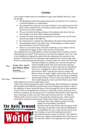
  • 1. Evaluation I have asked a student about my broadsheet to gain some feedback and this is what she thought: The Broadsheet itself looks professional and the overall look of it is similar to a normal broadsheet in a supermarket. The colourful box at the top is nice but to improve it you need to get rid of the black outline around the box as it breaks up each section whilst it is better for the two boxes to flow together. The cut out celebrities brings attention to the audience and shows that you have broaden your skills whilst making the broadsheet. Columns fit nicely in the grids provided and it was clever how you fit in the barcode and image to the right size. By using the line to separate the subheading to the article looks professional. The apostrophe doesn’t look right in the overall heading as it looks upside down and doesn’t suit the font provided. There is a lot of white space around the masthead; you can improve this by making the title bigger so that it takes up more of that space. This feedback given is really helpful as it picks out details that I would have missed when looking at it myself. What stood out to me from this feedback is the ‘line’ used in my broadsheet to separate the article from the subheading, this stood out to me because I researched what real techniques that broadsheets have used to make their front cover more professional and concise. I found a front cover from The Times that had used multiple line methods just to section each part out which I thought looked really neat and also by using that method really helped me to achieve the look of a broadsheet front cover. I changed the colour of the line from black to grey because I didn’t want the line colour to merge with thetext colour so I made it lighter which makes it less obvious but also very neat. I changed the colour by going on Indesign and pressing Window>Colour>Colour, this opened a panel so that I could change the colour type from black to grey which really helped me to pick the right shade overall. I didn’t know about creating grids until I used Indesign, this has helped me to produce the Broadsheet and Tabloid in a professional way by keeping each column or title in the right place so that it suited the theme of the newspaper but also to their audiences. I used 7x5 for my broadsheet this is because I could really see the correct box sizes with lots of columns. By having only 3x3 it would have been harder to find where the boxes should go, as there was more white space between each box. To make the different grids I went on Layout>create grids this opened up a box, which meant I could type in and preview the amount of grids that I wanted. These were simple techniques that really helped to produce the right shapes for the broadsheet and tabloid. By improving the size of fonts and covering as much white space as possible I found that the Masthead on my broadsheet was very weak, because I used a logo that would go on top of the masthead meant that I restricted the amount of space I could use. This made the title have less impact and instead put most of the focus on the main title, which is still important, but what I always Mine The Times
  • 2. notice first is the type of newspaper it is. To improve this I used tools on Indesign called ‘Tracking’ this separates the letters so that it covers the top of the broadsheet and tabloid. I made the broadsheet newspaper title go right across so that it was the same width as the two boxes below which I thought worked really well. For my tabloid I made sure it spread out as much as possible so that it take up most of the room like ‘The Sun’ would which is a very effective way of making your title larger and professional. For my broadsheet I should have used the ‘vertical scale’ tool on Indesign because I learnt that making the letters larger and stretched helped to cover most of the white space. I should have put the logo in the centre of the title so that I could make the font larger and stretch each letter so that it look up most of the title space. For my Fanzine I used a different method to stretch my words, instead I used ‘ctrl and T’ and then used each corner to make the font larger than its original size. At first I made the font a large size around 130pt and then put it into the right shape so that it stayed the same length as the border below. Finally for my Tabloid I used a method called ‘bledding’ which helps to make the top and bottom word closer together, this tool is in Indesign and it helped me to put the smaller font to the larger font, this was very similar to ‘The Sun’ and ‘The Daily Mirror’ as their top name is closer to the larger name which is what I was looking for. To raise awareness of my work I put each work on my blog that will help a public audience to read and it gives them the chance to also give me feedback from my work. When putting it on my blog it helps my tutor to mark my tabloid, fanzine and broadsheet so that I get feedback that will help me to improve my work further. I think this is the first main project where I have struggled to keep my work in the time given, the planning elements took a lot of time as I involved fonts for the masthead, subheading, body text, picking a name for the work, different moods boards etc. I tried to detail them out as much as possible so that it helped me personally to actually figure out what I wanted the broadsheet, tabloid and fanzine to look like. Once I finished the planning which would normally take me around a day and a half, I found that I only really had a day to create my broadsheet later on. I ended up doing11 pages for my broadsheet newspaper planning, when going through this process I found it very simple I didn’t look at other websites for my fonts because I realised the bold strong font that I needed would be in the fonts given on the computer. I used fonts like ‘Arial Black’ and ‘Bernard MT condensed’ that are fonts that are used constantly every day; I found those fonts weren’t any different to the fonts that they sell on the street. I did my flat plans through shapes and on Indesign because I wanted show a rough copy of what it would look like and then a clear white copy from Indesign that would show the simple sections through boxes. These were simple to do and didn’t take much time at all. After this I ended up creating my broadsheet on Indesign, I first put my grids on which helps me to pick out the sections I needed and then once I did that I started to make my article columns. I did this first because I wanted to see where to fit the image and what size it would be so that I could measure it in Photoshop, I already had the image from my planning so I copied that in and did image>image size, this came up with a box where I put the width and height of the picture box in Indesign. Once they were exact then I saved it and went back on to Indesign, after this I pressed
  • 3. ‘Place’ which helped me to put the image where it needed to go. At first the image was stretched and I didn’t notice until one of my teachers said I needed to widen the image (as a stretched image wouldn’t normally be in a successful broadsheet), this improved my image and work massively as it made Obama look bigger and also more realistic when he was in the right proportion. Once I got the hang of the tools I ended up adding little bits that I didn’t introduce in my planning for example barcodes, sentences under the image, bright boxes and finally the line between the subheading and my name. These factors were only put on because of finding research and looking at other broadsheets, this took up a lot of time because I was trying to find the right broadsheet that would be similar to mine. This helped to give me a sense of what a broadsheet should look like. I did this for my tabloid and fanzine, I found that looking at Google images and books really helped me to see what they all look like and what details have been used to create a professional looking piece of print based magazine/newspaper. For my Fanzine I took a lot of pictures from a large fanzine book as it gave me a lot of inspiration and ideas to create a quirky hand drawn piece of work. When looking back at my images it gave me an idea to rip out my article and stick it on to my fanzine article page instead of just putting a box with an article in it, I wanted to be creative and by ripping the article out has helped me to get a quirky rough effect that I wanted. For the first time I printed and scanned a piece of work in which I haven’t done in that in other projects, for this last project I wanted to put all my skills into these pieces of work and then trying new things like adding texture and roughness which is what Hip Hop is all about. Once I finished adding all the elements of my broadsheet it ended taking over most of the tabloid time so that once that was done I was already late going into my tabloid planning. This meant I had to rush to do my planning so that I could have more time on my tabloid which from I’ve learnt will take a lot of time. If I was late for one newspaper I was going to be late for the rest of them which means I couldn’t make any more broadsheet, tabloids and fanzines which is a shame as it would have showed more ways of creating tabloids etc. in a different layout which is why I produced a lot of flat plans so that I could create more. From other projects I have found that when I am in a group I am very good at organising a team and to put them into different roles, from projects like the recipe cards I helped to create the theme and also organised which days to create the recipe card, this meant that we had plenty of time to produce the recipe cards. On my own doing this project I have learnt that I definitely needed to be more organised and to work out what work I was doing on what day. I would have improved the matter if I did the work at home but I didn’t have the software to do it so instead I should have come into college to catch up on extra planning and production so that it doesn’t look rushed. I’m good at being a leader and I try to be calm and organise lists of what the group needs to be doing every day, with this project I did lots of lists of what I needed to do but I either lost those lists or didn’t look at them which means I wasn’t organised and didn’t stick the time given. Reviewing my work had a lot of good and bad elements to it, the negatives about reviewing my work was that I kept forgetting to produce
  • 4. jpegs for all the final pieces of work. After being told that I should have on my broadsheet I still forgot to do it for my fanzine which shows that I wasn’t concentrating or organised. To try and improve this I started to create around 2 jpegs for my broadsheet, even though this isn’t enough and would already have a lot of the elements, I found that looking at the two examples was very interesting as I didn’t have the date and cost, barcode and the sentence under the image. My tutor told me that a lot of broadsheet uses sentences under images so that the readers can understand where the image was taken. This helped me to research what a broadsheet layout normally looked like; I found that the date and price would normally be under the main masthead and that the barcode would be near the bottom right which is where I placed it. These elements helped to make my page look like a real broadsheet front cover, whilst the first JPEG looked plain and didn’t have the right information that a reader should have. For my Tabloid I tried to improve my production by taking 5 jpeg images which is more than 2 for my broadsheet, I looked back every time I thought I finished and then found more elements that I needed to add or improve on which was the advert at the top, (needed a title and a subheading) the image of the victim (needed bullet points) and also the subheading at the bottom needed the ‘tracking’ and ‘vertical scale’ tool so that it would take more of the white space. What I learnt from doing jpegs this time is that making those important improvements have helped to develop the look of the overall front cover. I have incorporated elements that I saw from the broadsheet into my tabloid for example I added the lines (above and below my name, which was done on the broadsheet also), I put the sentences under the images so that it told the reader who the people were and also put the date and price understand the main masthead and advertisement. I feel that the positive side of this is that I learnt from my mistake and knew that I always had to take jpegs constantly and also by looking back at the jpegs it clearly shows what’s been improved which will encourage me to use them more often as it helps to develop my work. By being rushed through my time management I have learnt that by shushing a lot of the sections have decreased the quality of my work. By not taking time I forgot to do jpegs, I didn’t research elements enough and I didn’t constantly look back to see what improvements I needed to make. To relax and take time with my work is very important and I should have done that with my broadsheet. For my fanzine I did my jpegs a little differently, I forgot to make jpegs again so I hid each layer on Photoshop so that I could jpeg each section from the beginning. This showed my development as it went on and how the front cover grew with the way it looked, for this I did 4 jpegs, which is enough to show the development of my work. I prefer doing the jpegs this way as it shows my ideas and what elements were added so that to whole look of the front cover and article was to a good standard. I got massively inspired by one image (on the left), which ended up being the main edit for the front page. I wanted to create a lot of shapes because to me it look very techno and futuristic and that’s what my magazine was about the future of Hip Hop and the old school Hip Hop. Doing this effect made the magazine looked more youthful and fun, by having different shading between each shape you can see the body underneath and the actually outlined how big each triangle was and where the main point was coming from. I did these shapes on Photoshop by this method: Copy image and page into a new document on Photoshop Find a point where you want to create the shapes Then go on the Polygonal Lasso Tool on the left of Photoshop
  • 5. Create the shape you want and then press layer via copy. After this to change the shade you press the ‘Apple key and L’, you can change the colour of the shading but I kept it black and white. Then you double click the layer and press stroke and then make it whatever colour. I have never used this method in any other project from last year to this year so by trying something new was exciting and I learnt there is much more to learn through Photoshop. I did another example (the fox image) as it’s easy to do and shows how creative it can be towards an image. The tools that I used the most and the new tools that I haven’t already spoke about are: Photoshop – old tools Rubber, Cropping, Magic Wand and The Polygonal Lasso Tool, these were used the most through the Broadsheet, Tabloid and Fanzine. I firstly cropped every image and wanted and then used the rubber tool to get rid of most of the excess background, once that was done I used the magic tool for the little areas to clean away and then finally the polygonal lasso tool so that I could get around the edges of the face or object. This method made the people on my broadsheet stand out (other articles), it helped to create Cressida and her outfits and finally made the little objects in the background of the fanzine. This method got rid of the background and helped to keep the main object. On Indesign I used the rectangle tool, which created each box that I needed for the broadsheet and tabloid, these boxes helped to put the text in and the titles. By changing the colours of the boxes I went on window > colour, this created the advert/article bit below the masthead on the broadsheet, it brought colour to the page and more excitement instead of the normal black and greys. I enjoyed using this tool as it taught me to put images in by getting the right shape and size. I used Indesign at work experience once at a Graphic Design place and they taught me how to create columns and use it to my advantage so I found that it was a head start for me that I already learnt about this software. I’m really please with my work as I feel it looks up to the professional standard because of the technical tools I used, adding more font and creating grids really helped to layout my work so that it was simple and easy to insert things after placing the boxes. I overall feel that if I had more time to produce my broadsheet, fanzine and tabloid then I would be able to produce more examples, this would help me to practice the different elements and to see if I could experiment and also research more techniques that I could use. I found a new technique whilst making my fanzine and that was putting an old Hip Hop artists face on top of a young persons body, whilst planning for this I thought that would be perfect for the front cover as I still encourages old school Hip Hop fans to read my modern magazine. They wouldn’t have if I just spoke about new artists, in the Hip Hop culture they seem to be desperate to go back to what Hip Hop music used to be like so by having my article about old fashion to the new it will bring a lot of audience in. The audience
  • 6. for my fanzine would be from ages of 15 up to 35 years. I believe that new teenagers that have been brought up in tough areas and have Hip Hop music and people around them will be really interested in this magazine as it talks about there culture and also the front cover is modern and would be affordable for the customers. I made the age go up to 35 years, as the Hip Hop wording in the article would only be read to Hip Hop people I feel that people at this age would still be talking like this and also dress the way they do. Hip Hop culture and personality will always be with the people that have been brought up with it. I feel a large audience age is acceptable has it’s a modern/old looking magazine that anyone would like, it would have a variety of articles from artists to fashion to culture. It has everything an audience would like. I put Tupac Shakur on the young persons body because that represents the old music and everyone in the Hip Hop industry recognise Tupac straight away. To do this technique I did: I used the crop tool on the original Tupac image and then I used the polygonal tool on Photoshop to get rid of any background or white edges around the face. Then once I just had the neck and face I put the image onto the other mans face. I used the opacity tool on that layer so that I could align the eyes and mouth together. This helped me to find the right size for the Tupac face. After fitting the face I used the rubber tool to rub out the layer underneath (young mans face) so that you could just see Tupac’s face on the body, this worked really well as the neck fitted perfectly with the young mans neck. When finishing that I used the polygonal tool again but with a feather, the feather I used was 10px, I used this so that the original neck would blend with Tupac’s neck, this worked out really well as the colour blended perfectly as it was black and white altogether. To make sure that the black and white shades were perfect on Tupac’s side and the young mans side I pressed the ‘command button and L’ which came up with the levels box, they gave me three buttons to slide across so that the colours would become similar to each other. I feel the tops are shaded correctly but Tupac’s original image was to dark so that has let it down quite a bit. Finally to tweak the hat and hair I used the polygonal lasso tool to create a black layer so that it would cover the ear, which ended up creating the shape of the hat. Comparing and looking at them both I can see that that has worked well and that it looks like Tupac is really wearing a hat. I also made sure that the hair was still there so that it looked natural on top of the bandana, I cropped that quite a lot so that it was just a little piece of accessory on his head. I’m really pleased with how Tupac looks because I tried this technique on the SASH project by putting two faces together and also adding heads to bodies to see how that would look and to be taught how to do it and then for it to be successful was one of the best techniques I have learnt in this project. With the SASH project it didn’t work at all as the lines were obvious between each face and the lines on the pictures weren’t hidden but I never used feather so that tool has really helped with this project.
  • 7. The audience for my broadsheet is very similar to ‘The Guardian’, this is because the subjects that I have chosen to show on my broadsheet are a mixture of ABC1 and AB, and these are the people that mostly read the Guardian. 89% of the audience are ABC1 which means that they would be interested in the glamour of the Oscars and that they would watch sophisticated films such as 12 years a Slave, Gravity and American Hustle, which are well made films that talk about richness and the poor. Customers in the AB and ABC1 bracket would also like Jamie Oliver as he has just opened several ‘Jamie Italian’ restaurants around the UK which are known to be expensive and to the more richer audience. The subjects there that I have chosen are already an interest to my audience. I would say that my audience for the Broadsheet would be 20 years to 54 years as they have the most audience numbers for reading The Guardian. Obama is an interest to young people interested in politics and also his personality so by having a variety of subjects just showhow my broadsheet understands my audience. I chose to use the ‘Made In Chelsea’ Logo for the main masthead as it looks like a royal broadsheet, which works well with the ABC1 demographic. Finally the masthead and subheading are written in a formal tone, which is what a well- educated audience would want to read, a tabloid would be informal which wouldn’t amuse an ABC1 audience. I feel I have achieved what I wanted from the broadsheet because I have picked subjects that have happened recently and celebrities that my audience would recognise and like. My tabloid has always been very similar to The Sun this is because of the colour used and that the title I’ve chosen (The World) is set out in a very similar way. I felt I wanted to keep my tabloid as similar to The Sun because of the amount of readers they get it everyday which according to the Audit Bureau of Circulation it’s 3.13 million people. I’d say my audience for my tabloid would be ages of 25-34 this is because it’s the second highest audience for The Sun and my stories about politics and the royal girlfriend would be an interest to people around that age. The social grade for my audience would be ABC1C2 Adults because these are people that can afford computers and televisions which means they will be constantly up to date on the news issues and celebrities personal lives which is what I’ve introduced into my tabloid. The written article is also written in an informal way, which means anyone can understand it from any background, which will also be useful for my audience. I achieved what I wanted with my audience and layout because of the further research I did on the internet for example I wasn’t going to use bullet points because I didn’t think they were very neat but when I found tabloids did them, it ended up working really well as the colour theme fitted and it was very informal for my audience to enjoy. You can see on this tabloid (from the sun) how effective bullet points are, they are straight to the point and effective in getting a message across.
  • 8. I found picking my images was quite simple, I went on Google images to research images of Obama and for my broadsheet I wanted him to look powerful and a dictator, this is because other broadsheets painted politicians as serious and any subject that was about war or laws had either a depressing or a formal image of that politicians face. The example on the left shows how formal a broadsheet is and that by having a serious picture, means it’s a serious story and that’s what I wanted to put across for my broadsheet. I thought that by having a large image between two writing columns would show that there are a lot of people talking about him but he is so powerful that it doesn’t matter. I chose the image of him pointing because it looks like he is telling people of but also looking down on them, which makes him look like the bad person. When looking through Google images there were a lot of silly ones of his face and then intimidating ones of him when presenting a speech, I made sure that the images of my broadsheet and the images of my tabloid were completely different. When researching tabloid images I saw that they were very relaxed and that the titles always made fun of the person directly so by having a silly image with that would make them look worse. This is what I did for my tabloid I made sure that the title worked well with the image, when you first look at the image you think of him playing and messing around. By saying ‘Obama is all play’ repeats what Obama is doing in the image and links him into the article, which I feel, really helped to link everything together. This is an example of a tabloid and how they made the women look worried so that it linked with the title that used words like ‘utter’ and ‘dared’ which work perfectly together. When looking at real broadsheet and tabloids compared to mine I feel I have picked the right images altogether for my audience to look at. Written By Hannah Sewell