
Recomendados
Más contenido relacionado
La actualidad más candente
La actualidad más candente (19)
Destacado
Destacado (19)
Similar a Final Pitch
Similar a Final Pitch (20)
Más de harrybrewinsmith
Último
Último (20)
Final Pitch
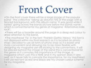
- 1. Front Cover •On the front cover there will be a large image of the popular band ‘ the collective’ taking up around 75% of the page with a fenced background, with the album name ‘It was good while it lasted’ going across the bands picture below the bands name which is conventional for my genre of magazine ‘Alternative indie rock’. •There will be a boarder around the page in a deep red colour to draw attention to the band. •The masthead ‘Fix’ in the font ‘Franklin Gothic Heavy’ this font is not displayed within my final research as it is located on photo shop i decided to use all fonts of photo shop as it is easier and more convenient and allowing me to be more flexible with designing my magazine yet still sticking to the conventions, it will be placed behind the image of the band this is conventional for this genre as it connotes the importance of the image, a magazine which uses this is NME and in my opinion does it very well, as it never fails to connote the importance, for my masthead I will use red font as red and black are my chosen colour scheme for my magazine.
- 2. •Around the image there will be black, white and red font in the style of ’incised 901 BD bold’ and ‘Agent’ which are both similar to the font of ‘Cella’ which a sample of this font is displayed within my Final research, with the names of other bands such as Florence and the machine and the killers, Linkin Park Biffy Clyro and others this will give possible buyers a quick inside to the content of the magazine, the text surrounding the image will be in blacks and reds as this is the general colour scheme for my magazine as it was the most popular choice from my questionnaire and focus group also proved to be conventional for this genre, however due to yellow being popular within my questionnaire i have chosen to use yellow for the bands name to connotes its importance. •Above the picture of the band, there will be a promotion which will sell the magazine to my target audience as it was proven to be an effective way to draw the attention of readers possibly free exclusive posters of the band members. •There will also be ‘World exclusive’ written across the bands picture at an angle to promote the bands story within my magazine as my double page spread will be an exclusive of the band.
- 3. Contents page •The contents page will be laid out the same as Kerrang. • Does with a large image of the band in the top left with the main features of the magazine running down the right of the focal picture of the band, which I learned was effective after looking at Hannah Spooners work. •I shall also have 4 other pictures on the page in the bottom left there will be a picture of the editor (myself) with a brief description of this issue. There will also be two pictures of posters within the magazine overlaying the main picture of the band to the bottom left of the image. In the bottom right hand of the page there will be an image of the front cover. • The font I am using is ’incised 901 BD bold’ using black and red text as this is the colour scheme of my magazine, only the main features of the contents will be stated. The text will be kept minimal to try and captivate my target audience youths.
- 4. Double page •The double page spread will be an exclusive of the band on the front featuring a fact file and Band/singer latest releases as these were the most popular choices from my questionnaire which I conducted. •A large image of the band will be on the left hand page taking up around 80% of the page with the fact file underneath it. •On the left hand page there will be an image of the lead singer of the band, and the Band/singer latest releases in column format in the font ’incised 901 BD bold’