SlideShare una empresa de Scribd logo
1 de 4
The audience for this magazine are
people who are interested in a r&b
style of music and the sub audience
are fans of the people featured in
the magazine.
The logo is big and
recognizable, it also
shows the importance of
the magazine. And the
name of the magazine.
The colours on this
magazine are used from a
colour scheme. The colour
scheme on this magazine is
orange white and black.
The image is a
medium close up of
famous singer this
gives the audience
the impression that
she is rich and
confident of her
image as a queen.
They have used a
contrasting image so
it stands out from the
background and
entices the audience
to read on.
The font is big and stands
out and makes it look like
it is important in areas. It is
also contrasted into the
background.
The title is large and bright
colours to make it stand
out and to make it
recognized.
The audience for this magazine are
people who are interested in “rap”
style of music and the sub audience
are fans of the people featured in
the magazine.
The logo is big and
recognizable, it also
shows the importance of
the magazine. And the
name of the magazine.
The colours on this
magazine are used from a
colour scheme. These
consist of red black blue
and white.
The image is a close
up of famous rapper
‘Lil Wayne’ this gives
the audience the
impression that he is
confident and raring
to go. They have used
a contrasting image
so it stands out from
the background and
entices the audience
to read on.
The font is big and stands
out and makes it look like
it is important in areas. It is
also contrasted into the
background.
The title shows arrogance
and confident ability
because it is in a huge size
font and above it says “a
decade of dominance”.
The logo is red and
white. These colours
are contrasting. The
red stands out to the
reader and shows
importance in the
magazine.
The image in this
magazine is a long
shot of a famous
singer, she is
guarded by 2
jaguars to
illustrate her
inhibitions.
Colour scheme in this
magazine is
black, white, red and blue.
These colours are good for
contrasting colours.
The headline has good
contrasting colours. And
the black shows darkness
and secureness.
The font is big and
has good contrasting
colours such as black
background with
white text.
• Audience
• genre conventions
• name of magazine
• images
• layout
• font
• colour

Más contenido relacionado

Más de jasonb139

Image editing done
Image editing   doneImage editing   done
Image editing donejasonb139
 
Colour palette
Colour paletteColour palette
Colour palettejasonb139
 
Double page spread layout
Double page spread layoutDouble page spread layout
Double page spread layoutjasonb139
 
Contents page layout
Contents page layoutContents page layout
Contents page layoutjasonb139
 
Front cover layout
Front cover layoutFront cover layout
Front cover layoutjasonb139
 
Hierachy of fonts needs adding to blog spot
Hierachy of fonts needs adding to blog spotHierachy of fonts needs adding to blog spot
Hierachy of fonts needs adding to blog spotjasonb139
 
Drafts for contents page needs uploading to blogspot
Drafts for contents page needs uploading to blogspotDrafts for contents page needs uploading to blogspot
Drafts for contents page needs uploading to blogspotjasonb139
 
Drafts for front cover needs uploading to blogspot
Drafts for front cover needs uploading to blogspotDrafts for front cover needs uploading to blogspot
Drafts for front cover needs uploading to blogspotjasonb139
 
Fonts for masthead
Fonts for mastheadFonts for masthead
Fonts for mastheadjasonb139
 
Colour palette
Colour paletteColour palette
Colour palettejasonb139
 
Hierachy of typefaces
Hierachy of typefacesHierachy of typefaces
Hierachy of typefacesjasonb139
 
Music magazine genre
Music magazine genreMusic magazine genre
Music magazine genrejasonb139
 
Magazine double page spreads
Magazine double page spreadsMagazine double page spreads
Magazine double page spreadsjasonb139
 
Magazine contents
Magazine contentsMagazine contents
Magazine contentsjasonb139
 
Slide layouts
Slide layoutsSlide layouts
Slide layoutsjasonb139
 

Más de jasonb139 (20)

Image editing done
Image editing   doneImage editing   done
Image editing done
 
Colour palette
Colour paletteColour palette
Colour palette
 
Double page spread layout
Double page spread layoutDouble page spread layout
Double page spread layout
 
Contents page layout
Contents page layoutContents page layout
Contents page layout
 
Front cover layout
Front cover layoutFront cover layout
Front cover layout
 
Layout
LayoutLayout
Layout
 
Hierachy of fonts needs adding to blog spot
Hierachy of fonts needs adding to blog spotHierachy of fonts needs adding to blog spot
Hierachy of fonts needs adding to blog spot
 
Font names
Font namesFont names
Font names
 
Drafts for contents page needs uploading to blogspot
Drafts for contents page needs uploading to blogspotDrafts for contents page needs uploading to blogspot
Drafts for contents page needs uploading to blogspot
 
Drafts for front cover needs uploading to blogspot
Drafts for front cover needs uploading to blogspotDrafts for front cover needs uploading to blogspot
Drafts for front cover needs uploading to blogspot
 
Fonts for masthead
Fonts for mastheadFonts for masthead
Fonts for masthead
 
Colour palette
Colour paletteColour palette
Colour palette
 
Hierachy of typefaces
Hierachy of typefacesHierachy of typefaces
Hierachy of typefaces
 
Layout
LayoutLayout
Layout
 
Music magazine genre
Music magazine genreMusic magazine genre
Music magazine genre
 
Magazine double page spreads
Magazine double page spreadsMagazine double page spreads
Magazine double page spreads
 
Magazine contents
Magazine contentsMagazine contents
Magazine contents
 
Magazine
MagazineMagazine
Magazine
 
Images
ImagesImages
Images
 
Slide layouts
Slide layoutsSlide layouts
Slide layouts
 

Magazine annotations x 3 front covers

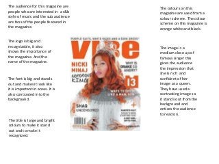
  • 1. The audience for this magazine are people who are interested in a r&b style of music and the sub audience are fans of the people featured in the magazine. The logo is big and recognizable, it also shows the importance of the magazine. And the name of the magazine. The colours on this magazine are used from a colour scheme. The colour scheme on this magazine is orange white and black. The image is a medium close up of famous singer this gives the audience the impression that she is rich and confident of her image as a queen. They have used a contrasting image so it stands out from the background and entices the audience to read on. The font is big and stands out and makes it look like it is important in areas. It is also contrasted into the background. The title is large and bright colours to make it stand out and to make it recognized.
  • 2. The audience for this magazine are people who are interested in “rap” style of music and the sub audience are fans of the people featured in the magazine. The logo is big and recognizable, it also shows the importance of the magazine. And the name of the magazine. The colours on this magazine are used from a colour scheme. These consist of red black blue and white. The image is a close up of famous rapper ‘Lil Wayne’ this gives the audience the impression that he is confident and raring to go. They have used a contrasting image so it stands out from the background and entices the audience to read on. The font is big and stands out and makes it look like it is important in areas. It is also contrasted into the background. The title shows arrogance and confident ability because it is in a huge size font and above it says “a decade of dominance”.
  • 3. The logo is red and white. These colours are contrasting. The red stands out to the reader and shows importance in the magazine. The image in this magazine is a long shot of a famous singer, she is guarded by 2 jaguars to illustrate her inhibitions. Colour scheme in this magazine is black, white, red and blue. These colours are good for contrasting colours. The headline has good contrasting colours. And the black shows darkness and secureness. The font is big and has good contrasting colours such as black background with white text.
  • 4. • Audience • genre conventions • name of magazine • images • layout • font • colour