Mobile-first, a quick introduction
•
10 likes•3,362 views

Mobile-first is a simple idea with big implications: digital products should be designed for mobile first. Not the other way around. These are the slides for my 12 minute presentation at IA day 2012. Just a quick introduction to the mobile-first concept. Props to Luke Wroblewski and Brad Frost. I got most of the stuff in this presentation from their presentations and blogs. Luke Wroblewski: http://www.lukew.com/presos/preso.asp?26 Brad Frost: http://bradfrostweb.com/blog/web/for-a-future-friendly-web/

Recommended
More Related Content
What's hot
What's hot (20)
Viewers also liked
Viewers also liked (20)
Similar to Mobile-first, a quick introduction
Similar to Mobile-first, a quick introduction (20)
Recently uploaded
Recently uploaded (20)
Mobile-first, a quick introduction
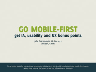
- 1. GO MOBILE-FIRST get IA, usability and UX bonus points Jelle Desramaults, IA day 2012 Netlash, Ghent These are the slides for my 12 minute presentation at IA day 2012. Just A quick introduction to the mobile-first concept. I added these notes at the bottom so you can follow along on slideshare.
- 2. HELLO Jelle Desramaults Freelance design studio gorilla My name is Jelle Desramaults. I run a freelance design studio called Gorilla. I design websites and web applications. I keep a keen eye on the mobile space. I work and live in Ghent, Belgium.
- 3. My website This is my studio’s website. http://gorilla-webdesign.be
- 4. ME a This is me. At Build 2011 (http://buildconf.com) by the way. Build rocks!
- 5. MARCEL This is my son. Marcel. Thought I’d score some bonus oohs from the ladies with this slide.
- 6. follow me @jdesramaults @jelled A-U-L-T-S I’m @jdesramaults on twitter. Difficult name, I know. Longest twitter handle ever. @jelled was already taken so I chose the next logical thing. Sorry ‘bout that :)
- 7. B-L-E-W-S-K-I Luke Wroblewski @lukew follow him! Another guy with a difficult name. He had more luck with his twitter handle. Follow him, read him, watch him.
- 8. Luke Wroblewski has been talking about mobile-first for a couple of years. He wrote a book about it in 2011. Published by A Book Apart. Read it!
- 9. Jelle @lukew @jdesramaults Desramaults A small, simple idea. Design for mobile first, expand that experience to the desktop ? So what is mobile-first? It’s a simple idea with big implications. The idea: digital products should be designed for mobile first. Not the other way around.
- 10. Google Luke Wrobleski isn’t the only one thinking and working mobile-first. Some big players are adapting this way of working.
- 11. Facebook
- 12. Adobe
- 13. better than desktop experience joe hewitt, former design lead facebook
- 14. Jelle @lukewtime Now is the @jdesramaults Desramaults NOW IS THE TIME yeah right, so was last year The ubiquitous mobile web has been boldly predicted for some years now but I think it’s safe to say that it has finally arrived. Even in little old Belgium.
- 15. Smartphones passed PC shipments in Q4 2010 this was boldly predicted for Q4 2012, but happend 2 years early (end 2010)
- 16. CONTEXT IS BLURRING desktop use vs. mobile use is blurring An important thing to realise is this: the difference in the way we use desktop versus mobile is blurring.
- 17. (this used to be) DESKTOP CONTEXT indoors fast connection comfortably seated good hardware
- 18. (this used to be) MOBILE CONTEXT on-the-go outside crappy connection
- 19. on-the-go still true but NEW CONTEXT This is the new “mobile” context. We still use our smartphone On-the-go but we are also using them alongside our tablets, desktop PCs laptops. A lot of sofas in the world look like the one in the bottom picture (iPhone, iPad, MacBook while watching TV).
- 20. ANYWHERE ANYTIME (iphone, see?)
- 21. SMARTPHONE USE 76% 62% 80% WAITING IN LINE WATCHING TV DOWNTIME 76% 39% IN STORES TAKING A POOP This is how and where we use our smartphone nowadays. On the move, waiting in line or out shopping but also while we’re watching TV or during downtime. 39% enjoys a quick game of angry birds while pooping (UH!).
- 22. THIS USED TO BE THE WEB till about 2007 Up until 2007-ish we built our digital products for this device. Befor 2007 smartphones weren’t so great and network connection was crappy (and very expensive).
- 23. THIS IS THE WEB 5 years later In 2007 Apple came out with the first iPhone. In the 5 following years things changed… a lot. Network connectivity (and pricing) improved and a plethora of capable mobile devices started to appear.
- 24. TOMORROW’S WEB? who knows? ? ?? ? ? ??? ? ? ? ? ? ? ? ? ?? ? ? ?? Nobody knows what tomorrow will bring but designing digital products for the desktop computer might become a continually backward way of doing things. It makes more sense to design for the smallest screens first.
- 25. RESPONSIVE WEB DESIGN COOL! not so great after all But… feels clumsy short-sighted The forward-thinking web designer has been designing responsive web sites for about a year now. Cool! A big step in the right direction. However we are finding that this way of working feels a bit clumsy and that the user experience doesn’t always scale down well.
- 26. MOBILE-FIRST JACKPOT! future friendly feels ”right” progressive This feels a lot better. Start from mobile and progressively enhance the user experience for larger screens. Feels better and feels like a safer—future friendly—bet in these rapidly changing times.
- 27. 4 BONUS POINTS for you lovely IAs, usability experts and UX designers
- 28. POINT 1 DESIGN FOR A SMALL SCREEN When you loose 80% of your screen you are forced to focus on the stuff that matters laser focus
- 29. 70+ links? Take Flickr for example. Over the course of the last years the desktop website has grown into a behemoth with a multitude of fly-out menu’s containing more that 70 links.
- 30. Compare that to Flick’s mobile website. I count 10 links. What changed? Smaller screen size forced Flickr to focus on the things that matter most to their users.
- 31. On a lot of websites the actual content—you know, that thing users visit the site for—is hard to find. Only 20% of the screen is filled with content.
- 32. 80% of the screen is filled with… well, bullshit. Bonus point #1: going mobile first will cut the crap.
- 33. POINT 2 DESIGN FOR THE BIG THUMB Going big for mobile = better usability for desktop Bonus point #2: using big touch targets for the mobile version of your digital product means a more usable desktop product. Bigger is better.
- 34. big thumb little links Thumbs are clumsy devices compared to our mouse pointers. You need to accommodate for these big meat sticks.
- 35. TOUCH TARGET SIZE 44px/pt 44px/pt A comfortable touch target size is something around 44px by 44px. This is taken from Apple’s iOS human interface design guidelines by the way.
- 36. POINT 3 DESIGN FOR ONE EYE Partial attention So keep it simple, keep it usable Bonus point #3: mobile users give you partial attention. Design a simple and focused user experience. Again, what’s good for mobile works well on desktop too.
- 37. focused design! check the guides
- 38. All the big players (Apple, Microsoft, Google) have designer guidelines for a good mobile experience. These guidelines are solid universal UX design principles. Good for mobile and good for desktop.
- 39. GOOD DESIGN ADVICE Elevate the content that people care about Give people a logical path to follow Make usage easy and obvious … A few guidelines taken from Apple’s iOS Human Interface guidelines. Good design guidelines, period.
- 40. POINT 4 DESIGN FOR CRAPPY CONNECTIONS Not everyone’s on WIFI or 3G Fast for mobile = lightning fast for desktop Fast UX = better UX Bonus point #4: going mobile-first forces you to keep things lightweight and fast. A fast mobile product is a very fast desktop product. A faster UX is a better UX.
- 41. I stole it all from these guys. Maximum respect! PROPS http://lukew.com/presos http://bradfrostweb.com/blog/ web/for-a-future-friendly-web That’s it! A big shout out to Luke Wroblewski and Brad Frost. These guys are amazing! Read their stuff, watch their presentations. I basically copy/pasted most of their stuff and slapped it up with some Gorilla visual style. Thanks guys!
- 42. THANKS! @jdesramaults jelle@gorilla-webdesign.be http://gorilla-webdesign.be Thanks for watching. I hope you liked it. I’d love to hear from you! Shout out on twitter or e-mail me with your questions and remarks.