SlideShare una empresa de Scribd logo
1 de 33
Jon Arne Sæterås Product Director, Mobiletech Twitter: @jonarnes Email: jas@mobiletech.mobi
Baby steps… Mobile web Mobile internet usage will be bigger than most people think MobileFirst! ,[object Object]
Some differences
Context
View port
Pixels
Some Quick-Wins
Media Queries
JavaScript
Cache,[object Object]
Page view growth: 2009-2010: 109% 2010-2011: 150% Unique users
23,7% of pupulation Device OS Source: Mobiletech.no/Forbrukerog media
23,7% of pupulation Browser Connection Source: Mobiletech.no/Forbrukerog media
Bedtime Desktop preferred Breakfast / commuting
iPad ready?? http://www.apple.com/ipad/ready-for-ipad/
Common pitfalls  Don’t forget that Data traffic is expensive  The the network is slow The device has lower processing power That the interaction model is unknown That the screen is smaller
Context  Hardware OS Physical capabilities tech perspective Browser WRT App Social networks Local user profile CRM Superlocal Home/abroad Telco network WiFi Bandwidth
Logic is moving More front-end! Get started! Feature detection, not device detection
View port The visual part of the web site http://www.flickr.com/photos/dm-set/3579287485/
On a desktop viewport  = size of <html/>  = size of the browser window
Visual Viewport Layout Viewport
Layout viewport default width iPhone Safari: 980px Opera: 850px AndriodWebKit: 800px IE: 974 px Symbian WebKit: Tries to keep the layout viewport equal to the visual viewport. BadaWebkit: layout viewport as wide as the widest element Blackberry: layout viewport equals the visual viewport at 100% zoom
Best user experience when  visual view port width = layout view port width = device-width
1px != 1px iPhone 4 has 640 physical pixels, but layout viewport is 320 “High DPI” screens “CSS pixels” Zoom level Not the same as physical pixels on the device Decides how many physical pixels a CSS pixel covers Read More: http://www.quirksmode.org/mobile/viewports.html http://www.flickr.com/photos/korosirego/
? Good to know that: ,[object Object]
Different “kinds” of pixels
Users ZoomBaby steps: How to make use of this? http://www.flickr.com/photos/andrewrennie/
Overriding the default <meta name="viewport" content="width=240,  height=320,  user-scalable=yes, initial-scale=2.5,  maximum-scale=5.0, minimum-scale=1.0" /> Width/Height of viewport Zoomable? Initial zoom <meta name="viewport”  content="target-densitydpi=device-dpi" /> device-dpi:    Use the device's native dpi as target dpi. low-dpi:       120dpi medium-dpi:    160dpi, which is also the default as of today high-dpi:      240dpi <number>:      We take any number between 70 and 400 as a valid target dpi. 4 has 640 physical pixels, but layout viewport is 320
iPhone4 High DPI trick 640px wide <imgsrc=“image.png” width=“320” alt=“highdpi” /> Pysical image size = visual viewport width * pixel ratio
Media Queries <stylemedia="handheld”  type=“” /> Small screens For big screens
Media queries Target size of viewport with a different CSS <link rel="stylesheet" type="text/css”  media="only screen and (max-width: 480px), only screen and (max-device-width: 480px)” href=“small-device.css" /> Landscape or portrait? <link rel=”stylesheet”  media=”all and (orientation:portrait)”  href=”portrait-style.css” /> <link rel=”stylesheet”  media=”all and (orientation:landscape)” href=”landscape-style.css” /> <link media=”all and (-webkit-min-device-pixel-ratio:2)”  href=”highDPI.css” type=”text/css” rel=”stylesheet” /> High DPI screens
Detect iPad if(navigator.platform== "iPad”){ //put iPadcss into the dom } @media only screen  and (min-device-width: 768px)  and (max-device-width: 1024px) { 	/* “iPad” style*/ }
Javascript

Más contenido relacionado

La actualidad más candente

Ajax Push ICEfaces Ted Goddard
Ajax Push ICEfaces Ted GoddardAjax Push ICEfaces Ted Goddard
Ajax Push ICEfaces Ted Goddard
rajivmordani
 
Responsive web design & mobile web development - a technical and business app...
Responsive web design & mobile web development - a technical and business app...Responsive web design & mobile web development - a technical and business app...
Responsive web design & mobile web development - a technical and business app...
Atos_Worldline
 
The Mobile Platform World
The Mobile Platform WorldThe Mobile Platform World
The Mobile Platform World
Matt Evans
 
Web App vs Web Site
Web App vs Web SiteWeb App vs Web Site
Web App vs Web Site
Matt Evans
 
Mobile First Responsive Web Design — BD Conf Oct 2013
Mobile First Responsive Web Design — BD Conf Oct 2013Mobile First Responsive Web Design — BD Conf Oct 2013
Mobile First Responsive Web Design — BD Conf Oct 2013
Jason Grigsby
 

La actualidad más candente (17)

Ajax Push ICEfaces Ted Goddard
Ajax Push ICEfaces Ted GoddardAjax Push ICEfaces Ted Goddard
Ajax Push ICEfaces Ted Goddard
 
Skill Session - Web Multi Device
Skill Session - Web Multi DeviceSkill Session - Web Multi Device
Skill Session - Web Multi Device
 
Responsive web design & mobile web development - a technical and business app...
Responsive web design & mobile web development - a technical and business app...Responsive web design & mobile web development - a technical and business app...
Responsive web design & mobile web development - a technical and business app...
 
Perf ug fastandbeautiful
Perf ug fastandbeautifulPerf ug fastandbeautiful
Perf ug fastandbeautiful
 
The Mobile Platform World
The Mobile Platform WorldThe Mobile Platform World
The Mobile Platform World
 
50 Mobile Hacks for Career Counselors
50 Mobile Hacks for Career Counselors50 Mobile Hacks for Career Counselors
50 Mobile Hacks for Career Counselors
 
Web App vs Web Site
Web App vs Web SiteWeb App vs Web Site
Web App vs Web Site
 
Mobile Web Mega Trend 2010
Mobile Web Mega Trend 2010Mobile Web Mega Trend 2010
Mobile Web Mega Trend 2010
 
Devoxx be fast and beautiful images
Devoxx be fast and beautiful imagesDevoxx be fast and beautiful images
Devoxx be fast and beautiful images
 
Beautiful and Fast Images
Beautiful and Fast Images Beautiful and Fast Images
Beautiful and Fast Images
 
Waterford fast images
Waterford fast imagesWaterford fast images
Waterford fast images
 
Responsive images are here. Now what?
Responsive images are here. Now what?Responsive images are here. Now what?
Responsive images are here. Now what?
 
Pre-Conference Course: Wearables Workshop: UX Essentials - Phillip Likens
Pre-Conference Course: Wearables Workshop: UX Essentials - Phillip LikensPre-Conference Course: Wearables Workshop: UX Essentials - Phillip Likens
Pre-Conference Course: Wearables Workshop: UX Essentials - Phillip Likens
 
Mobile First Responsive Web Design — BD Conf Oct 2013
Mobile First Responsive Web Design — BD Conf Oct 2013Mobile First Responsive Web Design — BD Conf Oct 2013
Mobile First Responsive Web Design — BD Conf Oct 2013
 
Fundamentals of Designing for Multiple Devices - GA, New York, 07 Oct 2013
Fundamentals of Designing for Multiple Devices - GA, New York, 07 Oct 2013Fundamentals of Designing for Multiple Devices - GA, New York, 07 Oct 2013
Fundamentals of Designing for Multiple Devices - GA, New York, 07 Oct 2013
 
Designing For Multiple Devices - GA New York, 6 March 2013
Designing For Multiple Devices - GA New York, 6 March 2013Designing For Multiple Devices - GA New York, 6 March 2013
Designing For Multiple Devices - GA New York, 6 March 2013
 
Mobile migration talk by appSTUDIO at WordCamp Jerusalem 2010
Mobile migration talk by appSTUDIO at WordCamp Jerusalem 2010Mobile migration talk by appSTUDIO at WordCamp Jerusalem 2010
Mobile migration talk by appSTUDIO at WordCamp Jerusalem 2010
 

Destacado

Bienvenida simulación de negocios 17 1
Bienvenida simulación de negocios 17 1Bienvenida simulación de negocios 17 1
Bienvenida simulación de negocios 17 1
Aramir14
 
Bienvenida simulación de negocios 17 1
Bienvenida simulación de negocios 17 1Bienvenida simulación de negocios 17 1
Bienvenida simulación de negocios 17 1
Aramir14
 

Destacado (17)

Enhancing GA with form factor data
Enhancing GA with form factor dataEnhancing GA with form factor data
Enhancing GA with form factor data
 
Search on Mobile - Mobile Copenhagen 2012
Search on Mobile - Mobile Copenhagen 2012Search on Mobile - Mobile Copenhagen 2012
Search on Mobile - Mobile Copenhagen 2012
 
Makingweb: Great front end performance starts on the server.
Makingweb: Great front end performance starts on the server.Makingweb: Great front end performance starts on the server.
Makingweb: Great front end performance starts on the server.
 
RWD myth busting @ Topconf
RWD myth busting @ TopconfRWD myth busting @ Topconf
RWD myth busting @ Topconf
 
Velocity EU: Give Responsive Design a Mobile Performance Boost
Velocity EU: Give Responsive Design a Mobile Performance BoostVelocity EU: Give Responsive Design a Mobile Performance Boost
Velocity EU: Give Responsive Design a Mobile Performance Boost
 
Mobile is slow - Over the Air 2013
Mobile is slow - Over the Air 2013Mobile is slow - Over the Air 2013
Mobile is slow - Over the Air 2013
 
Web 2.0 Apps
Web 2.0 AppsWeb 2.0 Apps
Web 2.0 Apps
 
Web 2.0
Web 2.0Web 2.0
Web 2.0
 
ModevTablet: Embrace Device Diversity
ModevTablet: Embrace Device DiversityModevTablet: Embrace Device Diversity
ModevTablet: Embrace Device Diversity
 
Front-End Performance Starts On the Server
Front-End Performance Starts On the ServerFront-End Performance Starts On the Server
Front-End Performance Starts On the Server
 
Bienvenida simulación de negocios 17 1
Bienvenida simulación de negocios 17 1Bienvenida simulación de negocios 17 1
Bienvenida simulación de negocios 17 1
 
Lasinversiones
LasinversionesLasinversiones
Lasinversiones
 
Digitale Medier 2011
Digitale Medier 2011Digitale Medier 2011
Digitale Medier 2011
 
Presentacion 16 3
Presentacion 16 3Presentacion 16 3
Presentacion 16 3
 
Bienvenida simulación de negocios 17 1
Bienvenida simulación de negocios 17 1Bienvenida simulación de negocios 17 1
Bienvenida simulación de negocios 17 1
 
Publicidad
PublicidadPublicidad
Publicidad
 
Presentacion 16 3 calidad
Presentacion 16 3 calidadPresentacion 16 3 calidad
Presentacion 16 3 calidad
 

Similar a Mobile for web developers

Mobile App Development
Mobile App DevelopmentMobile App Development
Mobile App Development
Chris Morrell
 
Developing for Mobile Web
Developing for Mobile WebDeveloping for Mobile Web
Developing for Mobile Web
Barbara Bermes
 
Responsive UX - One size fits all @BigDesign conference #BigD12
Responsive UX - One size fits all   @BigDesign conference #BigD12Responsive UX - One size fits all   @BigDesign conference #BigD12
Responsive UX - One size fits all @BigDesign conference #BigD12
touchtitans
 
Jason.O Keefe.Genuitec.Presentation.Final
Jason.O Keefe.Genuitec.Presentation.FinalJason.O Keefe.Genuitec.Presentation.Final
Jason.O Keefe.Genuitec.Presentation.Final
Ajax Experience 2009
 
Handys und Tablets - Webentwicklung jenseits des Desktops - WebTech Mainz 12....
Handys und Tablets - Webentwicklung jenseits des Desktops - WebTech Mainz 12....Handys und Tablets - Webentwicklung jenseits des Desktops - WebTech Mainz 12....
Handys und Tablets - Webentwicklung jenseits des Desktops - WebTech Mainz 12....
Patrick Lauke
 
Making The Most Of Mobile
Making The Most Of MobileMaking The Most Of Mobile
Making The Most Of Mobile
Suzzicks
 

Similar a Mobile for web developers (20)

Mobile App Development
Mobile App DevelopmentMobile App Development
Mobile App Development
 
Fake it 'til you make it
Fake it 'til you make itFake it 'til you make it
Fake it 'til you make it
 
Creating a Slick Web App Using jQTouch
Creating a Slick Web App Using jQTouchCreating a Slick Web App Using jQTouch
Creating a Slick Web App Using jQTouch
 
Developing for Mobile Web
Developing for Mobile WebDeveloping for Mobile Web
Developing for Mobile Web
 
SmartPhone Design and Delivery
SmartPhone Design and DeliverySmartPhone Design and Delivery
SmartPhone Design and Delivery
 
Responsive websites. Toolbox
Responsive websites. ToolboxResponsive websites. Toolbox
Responsive websites. Toolbox
 
Best Practices in Mobile Development: Building Your First jQuery Mobile App
Best Practices in Mobile Development: Building Your First jQuery Mobile AppBest Practices in Mobile Development: Building Your First jQuery Mobile App
Best Practices in Mobile Development: Building Your First jQuery Mobile App
 
Responsive UX - One size fits all @BigDesign conference #BigD12
Responsive UX - One size fits all   @BigDesign conference #BigD12Responsive UX - One size fits all   @BigDesign conference #BigD12
Responsive UX - One size fits all @BigDesign conference #BigD12
 
Mobile Web Overview https://www.edocr.com/v/k52p5vj4/
Mobile Web Overview https://www.edocr.com/v/k52p5vj4/Mobile Web Overview https://www.edocr.com/v/k52p5vj4/
Mobile Web Overview https://www.edocr.com/v/k52p5vj4/
 
Multi screen HTML5
Multi screen HTML5Multi screen HTML5
Multi screen HTML5
 
Vodafone Widget Camp
Vodafone Widget CampVodafone Widget Camp
Vodafone Widget Camp
 
Jason.O Keefe.Genuitec.Presentation.Final
Jason.O Keefe.Genuitec.Presentation.FinalJason.O Keefe.Genuitec.Presentation.Final
Jason.O Keefe.Genuitec.Presentation.Final
 
Handys und Tablets - Webentwicklung jenseits des Desktops - WebTech Mainz 12....
Handys und Tablets - Webentwicklung jenseits des Desktops - WebTech Mainz 12....Handys und Tablets - Webentwicklung jenseits des Desktops - WebTech Mainz 12....
Handys und Tablets - Webentwicklung jenseits des Desktops - WebTech Mainz 12....
 
Making The Most Of Mobile
Making The Most Of MobileMaking The Most Of Mobile
Making The Most Of Mobile
 
Mobilise your ASP.NET website
Mobilise your ASP.NET websiteMobilise your ASP.NET website
Mobilise your ASP.NET website
 
Mobile web application development
Mobile web application developmentMobile web application development
Mobile web application development
 
QuickSoft Mobile Tips & Tricks 11-03-10
QuickSoft Mobile Tips & Tricks 11-03-10QuickSoft Mobile Tips & Tricks 11-03-10
QuickSoft Mobile Tips & Tricks 11-03-10
 
Making your site mobile-friendly - DevCSI Reading 21.07.2010
Making your site mobile-friendly - DevCSI Reading 21.07.2010Making your site mobile-friendly - DevCSI Reading 21.07.2010
Making your site mobile-friendly - DevCSI Reading 21.07.2010
 
Jquery mobile
Jquery mobileJquery mobile
Jquery mobile
 
Intro to PhoneGap and PhoneGap Build
Intro to PhoneGap and PhoneGap BuildIntro to PhoneGap and PhoneGap Build
Intro to PhoneGap and PhoneGap Build
 

Último

Artificial Intelligence: Facts and Myths
Artificial Intelligence: Facts and MythsArtificial Intelligence: Facts and Myths
Artificial Intelligence: Facts and Myths
Joaquim Jorge
 

Último (20)

Finology Group – Insurtech Innovation Award 2024
Finology Group – Insurtech Innovation Award 2024Finology Group – Insurtech Innovation Award 2024
Finology Group – Insurtech Innovation Award 2024
 
HTML Injection Attacks: Impact and Mitigation Strategies
HTML Injection Attacks: Impact and Mitigation StrategiesHTML Injection Attacks: Impact and Mitigation Strategies
HTML Injection Attacks: Impact and Mitigation Strategies
 
Exploring the Future Potential of AI-Enabled Smartphone Processors
Exploring the Future Potential of AI-Enabled Smartphone ProcessorsExploring the Future Potential of AI-Enabled Smartphone Processors
Exploring the Future Potential of AI-Enabled Smartphone Processors
 
Tata AIG General Insurance Company - Insurer Innovation Award 2024
Tata AIG General Insurance Company - Insurer Innovation Award 2024Tata AIG General Insurance Company - Insurer Innovation Award 2024
Tata AIG General Insurance Company - Insurer Innovation Award 2024
 
Artificial Intelligence: Facts and Myths
Artificial Intelligence: Facts and MythsArtificial Intelligence: Facts and Myths
Artificial Intelligence: Facts and Myths
 
AWS Community Day CPH - Three problems of Terraform
AWS Community Day CPH - Three problems of TerraformAWS Community Day CPH - Three problems of Terraform
AWS Community Day CPH - Three problems of Terraform
 
04-2024-HHUG-Sales-and-Marketing-Alignment.pptx
04-2024-HHUG-Sales-and-Marketing-Alignment.pptx04-2024-HHUG-Sales-and-Marketing-Alignment.pptx
04-2024-HHUG-Sales-and-Marketing-Alignment.pptx
 
Bajaj Allianz Life Insurance Company - Insurer Innovation Award 2024
Bajaj Allianz Life Insurance Company - Insurer Innovation Award 2024Bajaj Allianz Life Insurance Company - Insurer Innovation Award 2024
Bajaj Allianz Life Insurance Company - Insurer Innovation Award 2024
 
From Event to Action: Accelerate Your Decision Making with Real-Time Automation
From Event to Action: Accelerate Your Decision Making with Real-Time AutomationFrom Event to Action: Accelerate Your Decision Making with Real-Time Automation
From Event to Action: Accelerate Your Decision Making with Real-Time Automation
 
Automating Google Workspace (GWS) & more with Apps Script
Automating Google Workspace (GWS) & more with Apps ScriptAutomating Google Workspace (GWS) & more with Apps Script
Automating Google Workspace (GWS) & more with Apps Script
 
TrustArc Webinar - Unlock the Power of AI-Driven Data Discovery
TrustArc Webinar - Unlock the Power of AI-Driven Data DiscoveryTrustArc Webinar - Unlock the Power of AI-Driven Data Discovery
TrustArc Webinar - Unlock the Power of AI-Driven Data Discovery
 
Axa Assurance Maroc - Insurer Innovation Award 2024
Axa Assurance Maroc - Insurer Innovation Award 2024Axa Assurance Maroc - Insurer Innovation Award 2024
Axa Assurance Maroc - Insurer Innovation Award 2024
 
[2024]Digital Global Overview Report 2024 Meltwater.pdf
[2024]Digital Global Overview Report 2024 Meltwater.pdf[2024]Digital Global Overview Report 2024 Meltwater.pdf
[2024]Digital Global Overview Report 2024 Meltwater.pdf
 
Apidays New York 2024 - The value of a flexible API Management solution for O...
Apidays New York 2024 - The value of a flexible API Management solution for O...Apidays New York 2024 - The value of a flexible API Management solution for O...
Apidays New York 2024 - The value of a flexible API Management solution for O...
 
The 7 Things I Know About Cyber Security After 25 Years | April 2024
The 7 Things I Know About Cyber Security After 25 Years | April 2024The 7 Things I Know About Cyber Security After 25 Years | April 2024
The 7 Things I Know About Cyber Security After 25 Years | April 2024
 
Strategies for Unlocking Knowledge Management in Microsoft 365 in the Copilot...
Strategies for Unlocking Knowledge Management in Microsoft 365 in the Copilot...Strategies for Unlocking Knowledge Management in Microsoft 365 in the Copilot...
Strategies for Unlocking Knowledge Management in Microsoft 365 in the Copilot...
 
A Domino Admins Adventures (Engage 2024)
A Domino Admins Adventures (Engage 2024)A Domino Admins Adventures (Engage 2024)
A Domino Admins Adventures (Engage 2024)
 
What Are The Drone Anti-jamming Systems Technology?
What Are The Drone Anti-jamming Systems Technology?What Are The Drone Anti-jamming Systems Technology?
What Are The Drone Anti-jamming Systems Technology?
 
presentation ICT roal in 21st century education
presentation ICT roal in 21st century educationpresentation ICT roal in 21st century education
presentation ICT roal in 21st century education
 
Apidays Singapore 2024 - Building Digital Trust in a Digital Economy by Veron...
Apidays Singapore 2024 - Building Digital Trust in a Digital Economy by Veron...Apidays Singapore 2024 - Building Digital Trust in a Digital Economy by Veron...
Apidays Singapore 2024 - Building Digital Trust in a Digital Economy by Veron...
 

Mobile for web developers

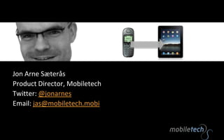
  • 1. Jon Arne Sæterås Product Director, Mobiletech Twitter: @jonarnes Email: jas@mobiletech.mobi
  • 2.
  • 10.
  • 11. Page view growth: 2009-2010: 109% 2010-2011: 150% Unique users
  • 12. 23,7% of pupulation Device OS Source: Mobiletech.no/Forbrukerog media
  • 13. 23,7% of pupulation Browser Connection Source: Mobiletech.no/Forbrukerog media
  • 14. Bedtime Desktop preferred Breakfast / commuting
  • 16. Common pitfalls Don’t forget that Data traffic is expensive The the network is slow The device has lower processing power That the interaction model is unknown That the screen is smaller
  • 17. Context Hardware OS Physical capabilities tech perspective Browser WRT App Social networks Local user profile CRM Superlocal Home/abroad Telco network WiFi Bandwidth
  • 18. Logic is moving More front-end! Get started! Feature detection, not device detection
  • 19. View port The visual part of the web site http://www.flickr.com/photos/dm-set/3579287485/
  • 20. On a desktop viewport = size of <html/> = size of the browser window
  • 22. Layout viewport default width iPhone Safari: 980px Opera: 850px AndriodWebKit: 800px IE: 974 px Symbian WebKit: Tries to keep the layout viewport equal to the visual viewport. BadaWebkit: layout viewport as wide as the widest element Blackberry: layout viewport equals the visual viewport at 100% zoom
  • 23. Best user experience when visual view port width = layout view port width = device-width
  • 24. 1px != 1px iPhone 4 has 640 physical pixels, but layout viewport is 320 “High DPI” screens “CSS pixels” Zoom level Not the same as physical pixels on the device Decides how many physical pixels a CSS pixel covers Read More: http://www.quirksmode.org/mobile/viewports.html http://www.flickr.com/photos/korosirego/
  • 25.
  • 27. Users ZoomBaby steps: How to make use of this? http://www.flickr.com/photos/andrewrennie/
  • 28. Overriding the default <meta name="viewport" content="width=240, height=320, user-scalable=yes, initial-scale=2.5, maximum-scale=5.0, minimum-scale=1.0" /> Width/Height of viewport Zoomable? Initial zoom <meta name="viewport” content="target-densitydpi=device-dpi" /> device-dpi: Use the device's native dpi as target dpi. low-dpi: 120dpi medium-dpi: 160dpi, which is also the default as of today high-dpi: 240dpi <number>: We take any number between 70 and 400 as a valid target dpi. 4 has 640 physical pixels, but layout viewport is 320
  • 29. iPhone4 High DPI trick 640px wide <imgsrc=“image.png” width=“320” alt=“highdpi” /> Pysical image size = visual viewport width * pixel ratio
  • 30. Media Queries <stylemedia="handheld” type=“” /> Small screens For big screens
  • 31. Media queries Target size of viewport with a different CSS <link rel="stylesheet" type="text/css” media="only screen and (max-width: 480px), only screen and (max-device-width: 480px)” href=“small-device.css" /> Landscape or portrait? <link rel=”stylesheet” media=”all and (orientation:portrait)” href=”portrait-style.css” /> <link rel=”stylesheet” media=”all and (orientation:landscape)” href=”landscape-style.css” /> <link media=”all and (-webkit-min-device-pixel-ratio:2)” href=”highDPI.css” type=”text/css” rel=”stylesheet” /> High DPI screens
  • 32. Detect iPad if(navigator.platform== "iPad”){ //put iPadcss into the dom } @media only screen and (min-device-width: 768px) and (max-device-width: 1024px) { /* “iPad” style*/ }
  • 34.
  • 35. PhoneGap – native wrapper (http://www.phonegap.com/)
  • 36. jQuery Mobile – (http://jquerymobile.com/)
  • 37. Zepto.js - jQuery like (http://zeptojs.com/)
  • 38. Jo - Mobile App Framework (http://joapp.com/)
  • 40. Wink Toolkit - Transitions/Animations (http://www.winktoolkit.org/)
  • 41. ChocolateChip Mobile - (http://chocolatechipmobile.wordpress.com/)
  • 43. baseJS - only Apple (http://paularmstrongdesigns.com/projects/basejs/)
  • 44. XUI - compact (http://xuijs.com/)
  • 46. jQTouch - jQuery plugin (http://www.jqtouch.com/)
  • 47. UiUIKit - Universal iPhone UI Kit (http://code.google.com/p/iphone-universal/)
  • 49. PastryKit – Apple’s proprietary framework (http://davidbcalhoun.com/2009/pastrykit-digging-into-an-apple-pie)
  • 51. Modernizer – Feature detection (http://www.modernizr.com) Tips: Don’t use combined css and js frameworks. Don’t use jQuery Don’t use iPhone-only libs
  • 52.
  • 56.
  • 57. Inline images Reduces number of http request (latency) <imgsrc="data:image/gif;base64,R0lGODlhEAAOALMAAOazToeHh0tLS/7LZv/0jvb29t/f3//Ub/ /ge8WSLf/rhf/3kdbW1mxsbP//mf///yH5BAAAAAAALAAAAAAQAA4AAARe8L1Ekyky67QZ1hLnjM5UUde0ECwLJoExKcpp V0aCcGCmTIHEIUEqjgaORCMxIC6e0CcguWw6aFjsVMkkIr7g77ZKPJjPZqIyd7sJAgVGoEGv2xsBxqNgYPj/gAwXEQA7" width="16" height="14" alt=”inline”/>
  • 58. Storage window.localStorage.setItem('key', 'value'); window.sessionStorage.setItem('key', 'value'); window.sessionStorage.removeItem('key'); window.localStorage.removeItem('key'); window.sessionStorage.getItem('key'); window.localStorage.getItem('key'); window.sessionStorage.clear(); window.localStorage.clear(); Cookieson steroids
  • 59. HTTP response header 200 OK Connection: close Date: Tue, 04 Jan 2011 20:05:52 GMT Server: Apache Content-Type: text/html; charset=UTF-8 Client-Date: Tue, 04 Jan 2011 20:05:52 GMT Client-Peer: 89.221.244.18:80 Client-Response-Num: 1 Vary: Accept,User-Agent Cache-Control: no-transform, max-age=3600 Expires: <some time in the future> Last-Modified: <some time in the past> Allow caching. Don’t forget images, css and js http-headers
  • 60. Mobile SEO 140 bill web searches pr month x 5%on mobile = 6-8 billion mobile searches Make search engines aware of your site. Submit a mobile site map Handle mobile crawlers Enable deep linking Meta tags <meta name=“Handheldfriendly” content=“true”/> <meta name=“MobileOptimized” content=“240”/> <link rel=“alternate” media=“handheld” href=“”/>
  • 61. Redirect mobile user agents Not bullet proof! Client side or server side Deep linking <script language=javascript> if((navigator.userAgent.match(/iPhone/i)) || (navigator.userAgent.match(/iPod/i))){ if(confirm('Hey, is it an apple in your hand? Mobile site?')) location.replace("URL HERE"); } </script>
  • 62. Is the mobile web becoming desktop-web-like?…or is the web becoming more mobile aware? Jon Arne Sæterås Product Director, Mobiletech Twitter: @jonarnes Email: jas@mobiletech.mobi

Notas del editor

  1. Betyrmer front end!
  2. @media only screen and (-webkit-min-device-pixel-ratio: 2) { // CSS goes here }if (navigator.connection.type==navigator.connection.WIFI) {}