
Recomendados
Más contenido relacionado
La actualidad más candente
La actualidad más candente (19)
Destacado
Destacado (20)
Similar a Digipak analysis – pond
Similar a Digipak analysis – pond (20)
Más de josh38642
Digipak analysis – pond
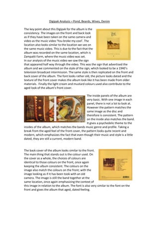
- 1. Digipak Analysis – Pond, Beards, Wives, Denim The key point about this Digipak for the album is the consistency. The images on the front and back look as if they have been taken on the same camera and video as the music video ‘You broke my cool’. The location also looks similar to the location we see on the same music video. This is due to the fact that the album was recorded on the same location, which is Zampatti Farm, where the music video was set. In our analysis of the music video we saw the sign that appeared half way through the video. This was the sign that advertised the album and we commented on the style of the sign, which looked to be a 1940’s television broadcast intermission. The same style is then replicated on the front and back cover of the album. The font looks rather old, the picture looks dated and the texture of the front cover makes the album look like it has been made from older materials. Finally the light cream and mustard colours used also contribute to the aged look of the album’s front cover. The inside panels of the album are very basic. With one image in each panel, there is not a lot to look at. However the pattern matches the same image as the disc and therefore is consistent. The pattern on the inside also matches the band. It gives a psychedelic theme to the insides of the album, which matches the bands music genre and profile. Taking a break from the aged feel of the front cover, the pattern looks quite recent and modern, which emphasizes the fact that even though their music and style is a little dated, they are still a current, modern band. The back cover of the album looks similar to the front. The main thing that stands out is the colour used. On the cover as a whole, the choices of colours are identical to those colours on the front, once again keeping the album consistent. The colours on the image also match the colours on the front; with the image looking as if it has been took with an old camera. The image is still the band together at the same location, once again emphasizing the context of this image in relation to the album. The font is also very similar to the font on the front and gives the album that aged, dated feeling.