
Recomendados
Recomendados
Más contenido relacionado
La actualidad más candente
La actualidad más candente (14)
Destacado
Destacado (8)
Similar a State of the Union
Similar a State of the Union (20)
State of the Union
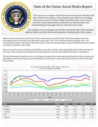
- 1. State of the Union: Social Media Report This report is an analysis of the Internet conversations relating to the State of the Union address. We analyzed many millions of messages from sources such as Twitter, Blogs, Social Networks, news sources and other online publications to provide true measurement and understanding of messages that are relevant to this study. Our analysis covers messages and articles around the time of the televised address, before and after the event to provide a detailed look at this chatter. Below we have a Trend chart that shows all the conversations around the State of the Union address and what percentage of that conversation was dedicated to each topic. The Y axis is labeled with percentages. This is our normalized Post Reach: This value is the total number of post results matching our query divided by the total number of results for the State of the Union. Here we see that economy, spending and healthcare were the top three topics being talked about before the State of the Union. This could mean that people were expecting these to be the most talked about topics in the address. The days following the speech we see a very large percentage of the conversation being focused on the economy and spending. It's also interesting to note that healthcare conversations continued to fall in relation to other State of the Union chatter.
- 2. Sentiment Analysis for Jobs Analytics is a powerful tool which uses automated textual analysis (frequently called Natural Language Processing, or NLP) to determine subject-‐speciRic sentiment information, topics of conversation and interesting words in thousands of pieces of content on request in under a minute. The system backing Analytics is the most powerful analysis system in the industry. We can Rilter results based on the queries we build. This means that we can actually see what people are saying speciRically about a certain topic. In this instance we are looking at the sentiment around President Obama in relation to jobs and unemployment. Topic Word Cloud The Rirst box we see is a “Topic Word Cloud”. This box contains hot topics of conversation within the articles around jobs. By default, the words are sized based on how important the system believed them to be in these conversations (larger being more signiRicant) and colored based on sentiment / tone averages used with that topic. If a topic is green, it is generally referred to positively in this context. If it is red, it is frequently negative.
- 3. Overall Sentiment Below, we see two pie charts. These charts show the overall sentimental tone for job-‐related conversations in relation to the President. The left side, labeled Sentiment by Subject References, shows the percentage of speciRic references to jobs which were positive, negative or mixed (mixed being those which were both positive and negative). The right side, labeled Sentiment by Subject Posts, are the percentage of articles or posts which contained sentiment about jobs that were positive, negative or mixed. Sentiment Trend The next tool we see is our sentiment trend which shows the sentimental tone over time. We can see some big spreads early in September, late in November, and again in late December.
- 4. Word & Category Analysis Finally, the “Word and Category Analysis” shows the most commonly used adjectives. This will tell us what percentage of the posts contained these adjectives and the sentiment behind them. We also see in the last column a list of categories that adjectives fall into. This is helpful to see the context of the sentimental tone and how much of this content falls inside these categories. Sentiment Analysis for Spending Here we analyze sentiment around government spending. We can see in the word cloud below that Democrats are viewed more negatively than Republicans when it comes to spending. Also, we see that Bush is mentioned as well. In this case people are defending President Obama by reminding others that President Bush had large budget deRicits and over spent signiRicantly. Below analytics, we can see posts that illustrate this point. The sentiment trend has not changed much over time but we do see some signiRicant spreads throughout the last few months.
- 6. Post / Article Viewer Here we have some examples of the posts that we have aggregated into our database. We index posts as they appear online. The posts below can explain some of the sentiment above. Inside the tool itself we are able to click the blue arrows to the left of the post and see all of the content.
- 7. Online InRluence Map Top Sources is a powerful tool which is rather unique. The data generated by this process can be viewed either as a list or in an interactive visualization map. In this instance we Rind the most inRluential websites talking about President Obama over the last year and a half. This can be beneRicial if you wanted to get an inRluential third party blog to write a favorable story about an issue. The ecosystem below contains the top 100 online sources using Social Radar's Top Sources Algorithm. Top sources are determined both by the amount of inRluence of the source and other factors such as the amount of relevant posts. Each circle represents a source, and each line represents a link. You can bind the size and color of the circles to different attributes to help you in determining inRluence and activity.