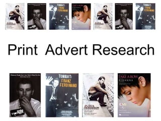
2. There isn't really a house style font, the title and the information is written in numerous different fonts. This can create an effect that's both interesting and engaging towards an audience. Colour Scheme: Browns, black, grey and beige. Remains simplistic and links in with colours associated with the Indie genre. Follows the principle of the rule of thirds Image of the album cover its promoting actual artist of the album. Masthead Release Date The costume would definitely be associated with that of the Indie genre additionally it supports the evidence we gathered for the types of clothing in which represents that’s of the Indie genre Writing is in the bottom left hand corner, therefore making use of the dead corner
3. Similarly, as with the last print advert there isn’t a specific house style font. A number of different fonts are adopted, this makes the advert more engaging and interesting to its audience. It is also representative of the Indie genre due to the fact it looks more natural and spontaneous than over analysed. Similar fonts used throughout however, not exactly the same. Masthead/Album Name Follows the principle of the rule of thirds Promoting album cover Image of the album cover its promoting Release Date Images of the band and mid shot of the main performer. Colour Scheme: Includes orange, brown, black, white, grey and neutral colours.
4. Album name the band's name is in the bottom left dead corner. Colour Scheme: Black and White Release date Follows the principle of the rule of thirds Image of the album cover its promoting the band's name/logo is in the bottom left dead corner. Similar fonts, apart from the font used for the Arctic Monkeys logo.
5. Colour Scheme: Grey, neutral colours and black. Masthead/Single Name Consistent house style Artists name Image of the album cover its promoting Doesn’t follow the principle of thirds Making use of the dead corner: Record Label
6. Summary Of Print Advert Research As a group we have researched into a number of different print adverts in order to recognise the typical generic conventions used. This allows us to either follow conventions or go against them when we come to creating the ancillaries. We have chosen three print adverts which fit our genre, and one which differs, this allows us to have a clear idea of what's conventional both within the Indie genre, as well as others. All four of the print adverts we have assessed use the album/single cover as the background/image. Due to this, we shall follow the conventions and use the same image as we do for our digi-pack.