
Recomendados
Más contenido relacionado
Destacado
Destacado (16)
Similar a Fund of design unit 6 module 3 type as visual organizer
Similar a Fund of design unit 6 module 3 type as visual organizer (20)
Más de kateridrex
Más de kateridrex (20)
Fund of design unit 6 module 3 type as visual organizer
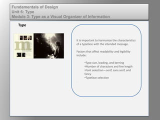
- 1. It is important to harmonize the characteristics of a typeface with the intended message. Factors that affect readability and legibility include: •Type size, leading, and kerning •Number of characters and line length •Font selection—serif, sans serif, and fancy •Typeface selection . Type Fundamentals of Design Unit 6: Type Module 3: Type as a Visual Organizer of Information
- 2. The upper halves of characters are scanned by the eye, making for easy recognition and reading. Words set in lowercase type are more easily recognizable than words set in uppercase type. Type should be seamless and not call attention to itself. Legibilty Fundamentals of Design Unit 6: Type Module 3: Type as a Visual Organizer of Information
- 3. Too tight of spacing causes the reader to work harder. Too loose of spacing creates rivers, disrupting eye movement across a page. Normal is “just right.” Spacing Fundamentals of Design Unit 6: Type Module 3: Type as a Visual Organizer of Information
- 4. Not all typefaces are created equal Fundamentals of Design Unit 6: Type Module 3: Type as a Visual Organizer of Information
- 5. Most text settings are improved with a 1-2 point increase in leading. Too much linespace can cause type to become disjointed and ununified. Leading Fundamentals of Design Unit 6: Type Module 3: Type as a Visual Organizer of Information
- 6. • Should be comfortable to read • Larger type = longer line length • Should not exceed 35 - 70 characters per line Line Length Fundamentals of Design Unit 6: Type Module 3: Type as a Visual Organizer of Information
- 7. Widows • A short line at the end of a paragraph. • General rule of thumb: If it is less than 7 characters it is a widow. Orphans • A short line that appears at the top of a column or the first line of a paragraph that appears at the end of a column or page. Widows & Orphans Fundamentals of Design Unit 6: Type Module 3: Type as a Visual Organizer of Information