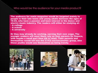
1. The audience for remix magazine would be targeted mainly to
people in their late teens and young adults between the ages of
18-24, who have a passion and keen interest in the dance and
electro music industry. The readers will either be studying at:
• A collage
• A school
• A university
Or they may already be working, earning their own wage. The
younger readers will most likely rely on their parents for finance,
with maybe a small part time job in retail. Their parents and
themselves would fall into the C1/C2 socioeconomic group, also
these youths would see themselves as being trendy.
2. They will most likely be mainstreamers, who will not want to challenge
any type of media content with a small percentage of aspirers who
will look towards the celebrities in the magazine as role models.
Their personalities will be loud, bright and outgoing.
3. To attract my target audience to Remix magazine I took into account l
many different features. One of the main features of Remix magazine
in order to capture my audiences attention would be to have one
main image of a famous celebrity on the front cover with a strong
main headline. This means that when the reader reviews the choices
of magazine available to them, Remix will immediately stand out to
them encouraging them to purchase my product.
Trendy title Bright
design colour use
Interesting Main
cover lines picture
Bold
Free CD headline
4. One of the main features that I considered to appeal to my audience were the images that
I took. I made sure that each picture was:
A big icon like Georgie Baker
Fashionable and quite trendy
The models were young people that can relate well to the target audience
Simple using the white background
Good, professional photography
The snow in the background to make an image look a bit unique
Lots of Mid shots and close ups
Editing skills were used to enhance the features on each of my images to make them look
the best standard of photography they possibly could be.
Chatty language and exclusive strong interviews will help entice a young audience and the
language used is down to earth and real.
I included lots of pictures as my audience, I think would prefer a higher ratio of images to
text as big chunks of writing will bore the reader.
A free CD on my front cover which also attract the audiences attention and also a
competition to win free concert tickets will make the readers feel as if they are getting
great value for money and a lot of product.