6. How does your media product represent particular social groups? I think my magazine represents children as; Eccentric Wild Having fun This is a stereotype of children
7. How did you attract your audience? A bright, bold and big masthead Splodges behind the masthead – makes it fun Bright blue background Model of the age group Funky fonts
8. What have you learnt about technologies from the process of constructing this product? More techniques on Photoshop Stroke function – to create a border. Used on double page spread Feather radius on magic wand tool, for cutting out pictures
Notas del editor
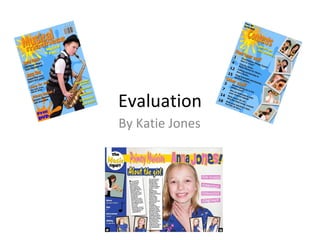
I chose to create a child’s jazz music magazine. However, this was a challenge as there aren’t many children’s music magazines around. To do so, I researched into children’s magazines, looking at the layouts, fonts and colour schemes. I then looked at jazz magazines, looking in particular at what kind of photos are on the front covers. I then combined ideas from both these genres. This is developing the typical idea of a child’s magazine by introducing the idea of jazz. I felt that jazz worked well to incorporate in my child’s music magazine as the stereotype of both jazz musicians and children, are that they are both crazy, mad and wacky. I used the typical conventions of a jazz magazine by the model in the pictures posing with their instrument. Secondly, I used the conventions of a child’s magazine by using bright colours, bold fonts, and interesting layouts throughout.
I think that my media product represents children as eccentric, wild and having fun. This is partly stereotypical of children, but that is how everyone sees them, as well as themselves.
I attracted my audience by using the bright, bold and big masthead with the splodges behind. I also used a bright blue background with a slight darker splodge on it, which broke up the background and gave added interest for the audience. Furthermore, I attracted my audience by using a model of their age group, for example the saxophonist on the front cover, all the brass players on the contents page and the feature on the double page spread. By using funky fonts I also addressed my target audience
I have learnt a few more techniques on photo shop whilst constructing my product, such as, the stroke function (where I can create a border around things. I used this on the title on the double page spread, and also the pictures at the bottom) and I also learnt how to change the feather radius when cutting out the pictures