SlideShare una empresa de Scribd logo
1 de 4
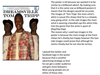
The poster is A4 because we wanted it to be
        similar to a billboard advert. By making sure
        that it is the same size as billboard posters it
        means that the designs would be accurate.
        The images of ‘Tom Tripp’ the main artist’s
        attire is casual this shows that he is a relaxed,
        easy going artist. In the side images the main
        artist is wearing a baseball cap this attire links
        into the genre that the artist is apart of
        (Rap/Hip-Hop).
        The reason why I used two images in the
        poster is because the main image at the front
        shows he’s cheeky but happy however the two
        side images could prove that although he
        seems cheeky but he can also be serious


I placed the twitter and
facebook logo in the poster
because that is another
advertising strategy so that
he can get a wider audience
and gain more followers.
Most young people are on
either of those sites
In both posters where it says ‘out now’ that is
                                                  where I am placing the album cover
                                                  I was not entirely sure whether to make the back
                                                  grounds plain white or having the sky as the
                                                  background so I asked my teacher Ms Prince for
                                                  feedback and she suggested that I kept the clouds.
                                                  Personally I think by having the clouds as the
                                                  background it could symbolise ‘Dreamsville’ that
                                                  he’s in a fantasy still or it would represent that he
                                                  see’s a bright future for himself in his career.
                                                  The reason why I used bright colours is because
                                                  lyrically the artist ‘Tom Tripp’ does not rhyme about
                                                  what stereotypical Rap artist speak about, he’s
                                                  more fun and optimistic so the use of bright colours
                                                  illustrate that he’s different and has a unique
                                                  mentality .


Poster1                                                                                                           Poster2
 The different coloured music notes represents his                                                    The different colours links in to what the
 passion for music, by it being scattered it suggest that                                             album name is (True colours) so I used two
 music is his life and the use of different coloured notes                                            bright looking colours and one dark colour
 show that not all music are the same for example                                                     so that the poster did not look to over the
 music not all rap music are the same, meaning that not                                               top
 all of them speak about the same stuff some of them                                                  Having used three colours for the t-shirt
 are negative and some are positive                                                                   display that the artist has three sides to him;
 Thirdly the reason why I decided to make the music                                                   •Red-passion
 notes in different colours is because firstly they link in                                           •Blue- dreams/desire
 with album name and secondly I tried the notes out in                                                •Black- ambition and dedication
 just one set of colour and to me it looked too plain and
 wasn’t very appealing or advertising.
In this image I merged the
notes and the different
     coloured teachers with a
     white background
     personally it looks nice
     but it’s too much going
     on that I think the
     audience will lose focus
     of the artist who is the
     main attraction
Overall I will leave the decision up to my group to see which one they like the
most. The reason why we are creating a poster is because this is another
advertising technique to promote our artist.
I made the font a little bit big because I wanted people to see it with out actually
being next it for example drivers who are driving through the area also the poster
is colourful so that it stands out from other posters and eye capturing to an
unknown audience which will lead to Tom our artist gaining more publicity.

Más contenido relacionado

La actualidad más candente

question 2
question 2question 2
question 2monsss3
 
My ancillary genre theory
My ancillary genre theoryMy ancillary genre theory
My ancillary genre theorysallymcmanus
 
Analysis of CD covers
Analysis of CD coversAnalysis of CD covers
Analysis of CD coversWells06
 
Analysis of front covers
Analysis of front covers Analysis of front covers
Analysis of front covers melrose08
 
FRONT COVER RAW IMAGES
FRONT COVER RAW IMAGESFRONT COVER RAW IMAGES
FRONT COVER RAW IMAGESsarahpoore17
 
Artist picture analysis
Artist picture analysisArtist picture analysis
Artist picture analysisNicoleTonge
 
Interview and conclusion
Interview and conclusionInterview and conclusion
Interview and conclusionrachael swan
 
Analysis of cd covers
Analysis of cd coversAnalysis of cd covers
Analysis of cd coversWells06
 
Contents page 3
Contents page 3Contents page 3
Contents page 3hanson7653
 
Analysis of cd covers(New)
Analysis of cd covers(New)Analysis of cd covers(New)
Analysis of cd covers(New)Wells06
 
Florence and the machine cosmic love
Florence and the machine  cosmic loveFlorence and the machine  cosmic love
Florence and the machine cosmic lovetolubarnes
 
Micro analysis of sing street
Micro analysis of sing streetMicro analysis of sing street
Micro analysis of sing street136722
 

La actualidad más candente (20)

question 2
question 2question 2
question 2
 
Interview
InterviewInterview
Interview
 
My ancillary genre theory
My ancillary genre theoryMy ancillary genre theory
My ancillary genre theory
 
Analysis of CD covers
Analysis of CD coversAnalysis of CD covers
Analysis of CD covers
 
Evaluation
EvaluationEvaluation
Evaluation
 
Evaluation
EvaluationEvaluation
Evaluation
 
Evaluation
EvaluationEvaluation
Evaluation
 
Evaluation
EvaluationEvaluation
Evaluation
 
Analysis of front covers
Analysis of front covers Analysis of front covers
Analysis of front covers
 
FRONT COVER RAW IMAGES
FRONT COVER RAW IMAGESFRONT COVER RAW IMAGES
FRONT COVER RAW IMAGES
 
Artist picture analysis
Artist picture analysisArtist picture analysis
Artist picture analysis
 
Interview and conclusion
Interview and conclusionInterview and conclusion
Interview and conclusion
 
Analysis of cd covers
Analysis of cd coversAnalysis of cd covers
Analysis of cd covers
 
Contents page 3
Contents page 3Contents page 3
Contents page 3
 
Alison Artist
Alison ArtistAlison Artist
Alison Artist
 
Scanned images
Scanned imagesScanned images
Scanned images
 
Mood board
Mood boardMood board
Mood board
 
Analysis of cd covers(New)
Analysis of cd covers(New)Analysis of cd covers(New)
Analysis of cd covers(New)
 
Florence and the machine cosmic love
Florence and the machine  cosmic loveFlorence and the machine  cosmic love
Florence and the machine cosmic love
 
Micro analysis of sing street
Micro analysis of sing streetMicro analysis of sing street
Micro analysis of sing street
 

Destacado

Construccion de superficies opticas 3
Construccion de superficies opticas 3Construccion de superficies opticas 3
Construccion de superficies opticas 3campus party
 
Analysis of customer satisfaction with waiting lines in two sever
Analysis of customer satisfaction with waiting lines in two severAnalysis of customer satisfaction with waiting lines in two sever
Analysis of customer satisfaction with waiting lines in two severGodfred Abledu
 
Presentazione Marco Zamperini
Presentazione Marco ZamperiniPresentazione Marco Zamperini
Presentazione Marco ZamperiniPaolo Ferrara
 

Destacado (8)

Trabajo de sena principal[1]
Trabajo de sena principal[1]Trabajo de sena principal[1]
Trabajo de sena principal[1]
 
Construccion de superficies opticas 3
Construccion de superficies opticas 3Construccion de superficies opticas 3
Construccion de superficies opticas 3
 
Analysis of customer satisfaction with waiting lines in two sever
Analysis of customer satisfaction with waiting lines in two severAnalysis of customer satisfaction with waiting lines in two sever
Analysis of customer satisfaction with waiting lines in two sever
 
Presentazione Marco Zamperini
Presentazione Marco ZamperiniPresentazione Marco Zamperini
Presentazione Marco Zamperini
 
Introducción ubuntu
Introducción ubuntuIntroducción ubuntu
Introducción ubuntu
 
Energía solar
Energía solarEnergía solar
Energía solar
 
Facebook
FacebookFacebook
Facebook
 
Nuevos D.C mayo 2011
Nuevos D.C mayo 2011Nuevos D.C mayo 2011
Nuevos D.C mayo 2011
 

Similar a Poster

Evaluation post 2 Media Studies
Evaluation post 2 Media StudiesEvaluation post 2 Media Studies
Evaluation post 2 Media Studiessanamiee1
 
Evaluation post 2
Evaluation post 2 Evaluation post 2
Evaluation post 2 EmilyCherry
 
Analysis of digipack a2 media
Analysis of digipack a2 mediaAnalysis of digipack a2 media
Analysis of digipack a2 mediahollylaverick
 
In what ways does your media product use, develop and challenge real media te...
In what ways does your media product use, develop and challenge real media te...In what ways does your media product use, develop and challenge real media te...
In what ways does your media product use, develop and challenge real media te...hollylaverick
 
Question 2
Question 2 Question 2
Question 2 ArianaK1
 
Liiar analysis of ancillary texts
Liiar analysis of ancillary textsLiiar analysis of ancillary texts
Liiar analysis of ancillary textsRebecca Witty
 
Evaluation question 2
Evaluation question 2Evaluation question 2
Evaluation question 2Katie Rickett
 
Evaluation question
Evaluation questionEvaluation question
Evaluation questionCronoRonz
 
Digipak analysis
Digipak analysisDigipak analysis
Digipak analysishanaa_m
 
Textual analysis
Textual analysisTextual analysis
Textual analysismilliebevan
 
Analysis of dijipacks a2 media studies
Analysis of dijipacks a2 media studies Analysis of dijipacks a2 media studies
Analysis of dijipacks a2 media studies hollylaverick
 
Digipak analysis
Digipak analysisDigipak analysis
Digipak analysisPedsldn
 
Media eval q2 a2
Media eval q2 a2Media eval q2 a2
Media eval q2 a2957755
 
Evaluation question 1
Evaluation question 1Evaluation question 1
Evaluation question 1tylerplatt20
 

Similar a Poster (20)

Eval 2
Eval 2Eval 2
Eval 2
 
Evaluation post 2 Media Studies
Evaluation post 2 Media StudiesEvaluation post 2 Media Studies
Evaluation post 2 Media Studies
 
Evaluation post 2
Evaluation post 2 Evaluation post 2
Evaluation post 2
 
Analysis of digipack a2 media
Analysis of digipack a2 mediaAnalysis of digipack a2 media
Analysis of digipack a2 media
 
In what ways does your media product use, develop and challenge real media te...
In what ways does your media product use, develop and challenge real media te...In what ways does your media product use, develop and challenge real media te...
In what ways does your media product use, develop and challenge real media te...
 
Question 2
Question 2 Question 2
Question 2
 
Liiar analysis of ancillary texts
Liiar analysis of ancillary textsLiiar analysis of ancillary texts
Liiar analysis of ancillary texts
 
Evaluation question 2
Evaluation question 2Evaluation question 2
Evaluation question 2
 
Album artwork
Album artworkAlbum artwork
Album artwork
 
Evaluation question
Evaluation questionEvaluation question
Evaluation question
 
Digipak analysis
Digipak analysisDigipak analysis
Digipak analysis
 
Question 2 Draft
Question 2 DraftQuestion 2 Draft
Question 2 Draft
 
Rihrih
RihrihRihrih
Rihrih
 
Textual analysis
Textual analysisTextual analysis
Textual analysis
 
Analysis of dijipacks a2 media studies
Analysis of dijipacks a2 media studies Analysis of dijipacks a2 media studies
Analysis of dijipacks a2 media studies
 
Digipak analysis
Digipak analysisDigipak analysis
Digipak analysis
 
Rihrih
RihrihRihrih
Rihrih
 
Media eval q2 a2
Media eval q2 a2Media eval q2 a2
Media eval q2 a2
 
Evaluation question 1
Evaluation question 1Evaluation question 1
Evaluation question 1
 
Evaluation
EvaluationEvaluation
Evaluation
 

Más de kay95carter

Music video evaluation 1 new
Music video evaluation 1 newMusic video evaluation 1 new
Music video evaluation 1 newkay95carter
 
Music video evaluation 4
Music video evaluation 4Music video evaluation 4
Music video evaluation 4kay95carter
 
Music video evaluation 2
Music video evaluation 2Music video evaluation 2
Music video evaluation 2kay95carter
 
Music video evaluation 1
Music video evaluation 1Music video evaluation 1
Music video evaluation 1kay95carter
 
Music video story booard
Music video story booardMusic video story booard
Music video story booardkay95carter
 
Magazine evaluation 7
Magazine evaluation 7Magazine evaluation 7
Magazine evaluation 7kay95carter
 
Magazine evaluation 6
Magazine evaluation 6Magazine evaluation 6
Magazine evaluation 6kay95carter
 
Magazine evaluation 5
Magazine evaluation 5Magazine evaluation 5
Magazine evaluation 5kay95carter
 
Magazine evaluation 3
Magazine evaluation 3Magazine evaluation 3
Magazine evaluation 3kay95carter
 
Magazine evaluation 1
Magazine evaluation 1Magazine evaluation 1
Magazine evaluation 1kay95carter
 
Working progress poster
Working progress posterWorking progress poster
Working progress posterkay95carter
 
Working progress inlay
Working progress inlayWorking progress inlay
Working progress inlaykay95carter
 
Draft album cover designs 2
Draft album cover designs 2Draft album cover designs 2
Draft album cover designs 2kay95carter
 
Draft album cover designs
Draft album cover designsDraft album cover designs
Draft album cover designskay95carter
 
Lady gaga telephone postmodernism
Lady gaga telephone postmodernismLady gaga telephone postmodernism
Lady gaga telephone postmodernismkay95carter
 
Double page spread
Double page spreadDouble page spread
Double page spreadkay95carter
 

Más de kay95carter (20)

Music video evaluation 1 new
Music video evaluation 1 newMusic video evaluation 1 new
Music video evaluation 1 new
 
Music video evaluation 4
Music video evaluation 4Music video evaluation 4
Music video evaluation 4
 
Music video evaluation 2
Music video evaluation 2Music video evaluation 2
Music video evaluation 2
 
Music video evaluation 1
Music video evaluation 1Music video evaluation 1
Music video evaluation 1
 
Music video story booard
Music video story booardMusic video story booard
Music video story booard
 
Magazine evaluation 7
Magazine evaluation 7Magazine evaluation 7
Magazine evaluation 7
 
Magazine evaluation 6
Magazine evaluation 6Magazine evaluation 6
Magazine evaluation 6
 
Magazine evaluation 5
Magazine evaluation 5Magazine evaluation 5
Magazine evaluation 5
 
Magazine evaluation 3
Magazine evaluation 3Magazine evaluation 3
Magazine evaluation 3
 
Magazine evaluation 1
Magazine evaluation 1Magazine evaluation 1
Magazine evaluation 1
 
Working progress poster
Working progress posterWorking progress poster
Working progress poster
 
Working progress inlay
Working progress inlayWorking progress inlay
Working progress inlay
 
Draft album cover designs 2
Draft album cover designs 2Draft album cover designs 2
Draft album cover designs 2
 
Draft album cover designs
Draft album cover designsDraft album cover designs
Draft album cover designs
 
Lady gaga telephone postmodernism
Lady gaga telephone postmodernismLady gaga telephone postmodernism
Lady gaga telephone postmodernism
 
Double page spread
Double page spreadDouble page spread
Double page spread
 
Contents
ContentsContents
Contents
 
Evaluation 7
Evaluation 7Evaluation 7
Evaluation 7
 
6
66
6
 
4
44
4
 

Poster

  • 1. The poster is A4 because we wanted it to be similar to a billboard advert. By making sure that it is the same size as billboard posters it means that the designs would be accurate. The images of ‘Tom Tripp’ the main artist’s attire is casual this shows that he is a relaxed, easy going artist. In the side images the main artist is wearing a baseball cap this attire links into the genre that the artist is apart of (Rap/Hip-Hop). The reason why I used two images in the poster is because the main image at the front shows he’s cheeky but happy however the two side images could prove that although he seems cheeky but he can also be serious I placed the twitter and facebook logo in the poster because that is another advertising strategy so that he can get a wider audience and gain more followers. Most young people are on either of those sites
  • 2. In both posters where it says ‘out now’ that is where I am placing the album cover I was not entirely sure whether to make the back grounds plain white or having the sky as the background so I asked my teacher Ms Prince for feedback and she suggested that I kept the clouds. Personally I think by having the clouds as the background it could symbolise ‘Dreamsville’ that he’s in a fantasy still or it would represent that he see’s a bright future for himself in his career. The reason why I used bright colours is because lyrically the artist ‘Tom Tripp’ does not rhyme about what stereotypical Rap artist speak about, he’s more fun and optimistic so the use of bright colours illustrate that he’s different and has a unique mentality . Poster1 Poster2 The different coloured music notes represents his The different colours links in to what the passion for music, by it being scattered it suggest that album name is (True colours) so I used two music is his life and the use of different coloured notes bright looking colours and one dark colour show that not all music are the same for example so that the poster did not look to over the music not all rap music are the same, meaning that not top all of them speak about the same stuff some of them Having used three colours for the t-shirt are negative and some are positive display that the artist has three sides to him; Thirdly the reason why I decided to make the music •Red-passion notes in different colours is because firstly they link in •Blue- dreams/desire with album name and secondly I tried the notes out in •Black- ambition and dedication just one set of colour and to me it looked too plain and wasn’t very appealing or advertising.
  • 3. In this image I merged the notes and the different coloured teachers with a white background personally it looks nice but it’s too much going on that I think the audience will lose focus of the artist who is the main attraction
  • 4. Overall I will leave the decision up to my group to see which one they like the most. The reason why we are creating a poster is because this is another advertising technique to promote our artist. I made the font a little bit big because I wanted people to see it with out actually being next it for example drivers who are driving through the area also the poster is colourful so that it stands out from other posters and eye capturing to an unknown audience which will lead to Tom our artist gaining more publicity.