
Recomendados
Más contenido relacionado
La actualidad más candente
La actualidad más candente (20)
Destacado
Similar a Here are the key points about the document:- The document is about American painter Georgia O'Keeffe (1887-1986) and includes biographical information as well as details about her artistic style and some of her most famous paintings. - It discusses O'Keeffe's use of abstraction, scale, point of view, color, shape, contrast and emphasis in her flower paintings which were often magnified and isolated organic shapes. - Examples of some of her most iconic paintings are included like "Jack in the Pulpit IV", "Light Coming on the Plains II", "Blue and Green Music", and "Large Dark Red Leaves on White".Based on this, a concise SE
Similar a Here are the key points about the document:- The document is about American painter Georgia O'Keeffe (1887-1986) and includes biographical information as well as details about her artistic style and some of her most famous paintings. - It discusses O'Keeffe's use of abstraction, scale, point of view, color, shape, contrast and emphasis in her flower paintings which were often magnified and isolated organic shapes. - Examples of some of her most iconic paintings are included like "Jack in the Pulpit IV", "Light Coming on the Plains II", "Blue and Green Music", and "Large Dark Red Leaves on White".Based on this, a concise SE (20)
Último
Último (20)
Here are the key points about the document:- The document is about American painter Georgia O'Keeffe (1887-1986) and includes biographical information as well as details about her artistic style and some of her most famous paintings. - It discusses O'Keeffe's use of abstraction, scale, point of view, color, shape, contrast and emphasis in her flower paintings which were often magnified and isolated organic shapes. - Examples of some of her most iconic paintings are included like "Jack in the Pulpit IV", "Light Coming on the Plains II", "Blue and Green Music", and "Large Dark Red Leaves on White".Based on this, a concise SE
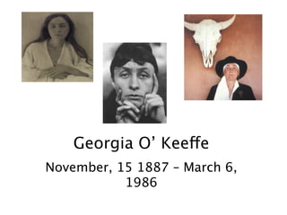
- 1. Georgia O’ Keeffe November, 15 1887 – March 6, 1986
- 2. What are we doing today…
- 3. What are we doing today… • Learn about Georgia O’Keeffe.
- 4. What are we doing today… • Learn about Georgia O’Keeffe. • Create a watercolor painting of a flower that is magnified, large,& colorful. It should seem like it is falling off the page. – Think about the art elements and principles as we explore the works of Georgia O’Keeffe.
- 5. 1986 -1887
- 6. 1986 -1887 99
- 7. Frank Lloyd Wright (June 8, 1867 April 9, 1959) Henri Matisse (December 31, 1869 November 3, 1954) Pablo Ruiz Picasso (October 25, 1881 April 8, 1973) Georgia O’ Keeffe November, 15 1887 – March 6, 1986 Grant Wood (Feb13, 1891 Feb12, 1942) Alexander alder (July 22, 1898 Nov 11,1976) Frankenthaler, Helen Dec 12, 1928 Alexandra Nechita (Aug 27, 1985 -
- 8. Vocabulary
- 9. Vocabulary • Abstract - In art, a departure from natural appearances in order to create new arrangements of lines, colors, shapes, forms and textures.
- 10. Vocabulary • Abstract - In art, a departure from natural appearances in order to create new arrangements of lines, colors, shapes, forms and textures. • Scale - The relationship (smaller or larger) of an object to its representation in a drawing or painting.
- 11. Vocabulary • Abstract - In art, a departure from natural appearances in order to create new arrangements of lines, colors, shapes, forms and textures. • Scale - The relationship (smaller or larger) of an object to its representation in a drawing or painting. • Point-of-view - The location or angle from which a subject is viewed. “Bugs – eye”
- 12. Vocabulary • Abstract - In art, a departure from natural appearances in order to create new arrangements of lines, colors, shapes, forms and textures. • Scale - The relationship (smaller or larger) of an object to its representation in a drawing or painting. • Point-of-view - The location or angle from which a subject is viewed. “Bugs – eye”
- 13. Art Elements What you see!
- 14. Art Elements What you see! Color - The sensation resulting from reflection or absorption of light by a surface. Color has three properties: hue, value, & intensity. Warm colors seem to advance toward the viewer, while cool colors seem to recede.
- 15. Art Elements What you see! Color - The sensation resulting from reflection or absorption of light by a surface. Color has three properties: hue, value, & intensity. Warm colors seem to advance toward the viewer, while cool colors seem to recede. Color established the shapes in O’Keeffe ’s paintings, and she often used contrasts of warm and cool colors to create emphasis. Her use of color and magnification was overwhelming.
- 16. Art Elements What you see! Color - The sensation resulting from reflection or absorption of light by a surface. Color has three properties: hue, value, & intensity. Warm colors seem to advance toward the viewer, while cool colors seem to recede. Color established the shapes in O’Keeffe ’s paintings, and she often used contrasts of warm and cool colors to create emphasis. Her use of color and magnification was overwhelming. Shape - Shape is an area contained within an implied line and defined or identified because of color or value changes. Shapes have two dimensions, height and width, and can be geometric (triangular,circular, rectangular) or organic (free-form or as found in nature, such as leaves, flowers, mountains, or clouds). Shapes can also be positive (a representational shape) or negative (the background upon which the shape rests).
- 17. Art Elements What you see! Color - The sensation resulting from reflection or absorption of light by a surface. Color has three properties: hue, value, & intensity. Warm colors seem to advance toward the viewer, while cool colors seem to recede. Color established the shapes in O’Keeffe ’s paintings, and she often used contrasts of warm and cool colors to create emphasis. Her use of color and magnification was overwhelming. Shape - Shape is an area contained within an implied line and defined or identified because of color or value changes. Shapes have two dimensions, height and width, and can be geometric (triangular,circular, rectangular) or organic (free-form or as found in nature, such as leaves, flowers, mountains, or clouds). Shapes can also be positive (a representational shape) or negative (the background upon which the shape rests). O’Keeffe often magnified the scale of the shapes in her paintings. At other times, she isolated shapes on the canvas to create focal points.
- 18. Art Principles What you do with the elements!
- 19. Art Principles What you do with the elements!
- 20. Art Principles What you do with the elements! • Contrast - Refers to differences in values,colors, textures, shapes and other elements in an artwork.
- 21. Art Principles What you do with the elements! • Contrast - Refers to differences in values,colors, textures, shapes and other elements in an artwork.
- 22. Art Principles What you do with the elements! • Contrast - Refers to differences in values,colors, textures, shapes and other elements in an artwork. • Emphasis - create focus in the work. Artists can emphasize color, texture, value.
- 23. Art Principles What you do with the elements! • Contrast - Refers to differences in values,colors, textures, shapes and other elements in an artwork. • Emphasis - create focus in the work. Artists can emphasize color, texture, value. O’Keeffe’s paintings were created by the placement and isolation of her subjects, in addition to the use of strong values and contrasts.
- 24. Jack in the Pulpit IV 1930, oil on canvas, 40” x 30”, National Gallery of Art, Washington, D. C.
- 25. Elements: Color: •Warm or cool? •How does the color define the shape? Shape: •Where are parts of the petal missing? Cropped? •Geometric or organic? Jack in the Pulpit IV 1930, oil on canvas, 40” x 30”, National Gallery of Art, Washington, D. C.
- 26. Elements: Color: •Warm or cool? •How does the color define the shape? Shape: •Where are parts of the petal missing? Cropped? •Geometric or organic? Principles: Contrast: •Where is the area of greatest contrast? •Where do you see shape contrast? Emphasis: •Size? •Color? Jack in the Pulpit IV 1930, oil on canvas, 40” x 30”, National Gallery of Art, Washington, D. C.
- 27. Elements: Color: •Warm or cool? •How does the color define the shape? Shape: •Where are parts of the petal missing? Cropped? •Geometric or organic? Principles: Contrast: •Where is the area of greatest contrast? •Where do you see shape contrast? Emphasis: •Size? •Color? Technical: Why do you think it was so big? How was it made? Expressive: •How Does it make you feel? •Does it make you want to see a Jack-in-the-pulpit plant? Jack in the Pulpit IV 1930, oil on canvas, 40” x 30”, National Gallery of Art, Washington, D. C.
- 28. Elements: Color: •Warm or cool? •How does the color define the shape? Shape: •Where are parts of the petal missing? Cropped? •Geometric or organic? Principles: Contrast: •Where is the area of greatest contrast? •Where do you see shape contrast? Emphasis: •Size? •Color? Technical: Why do you think it was so big? How was it made? Expressive: •How Does it make you feel? •Does it make you want to see a Jack-in-the-pulpit plant? Jack in the Pulpit IV 1930, oil on canvas, 40” x 30”, National Gallery of Art, Washington, D. C.
- 29. Jack-in-the-pulpit Arisaema triphyllum (Arisaema atrorubens, Arisaema stewardsonii)
- 30. Jack-in-the-pulpit Arisaema triphyllum (Arisaema atrorubens, Arisaema stewardsonii)
- 31. Light Coming on the Plains II 1917, watercolor, 12” x 9”, Amon Carter Museum, Ft. Worth, Texas
- 32. Blue and Green Music 1919, oil on canvas, 23” x 19”, The Art Institute of Chicago
- 33. Large Dark Red Leaves on White 1925, oil on canvas, 32” x 21”, The Phillips Collection, Washington, D. C.
- 34. Where is the area of greatest contrast? Red Poppy 1927, oil on canvas, 7-1/8” x 9”, Private collection
- 35. Purple Petunia 1927, oil on canvas, 36” x 30”, Private collection
- 37. What point of view is used here? Corn Dark I 1924, oil on composition board, 31-3/4” x 11-7/8”, The Metropolitan Museum of Art, New York
- 38. City Night 1926, oil on canvas, 48” x 30” location unknown
- 40. The Lawrence Tree 1929, oil on canvas, 31-1/16” x 39-3/16”, Wadsworth Atheneum, Hartford, Connecticut
- 41. Ranchos Church I 1929, oil on canvas, 18-1/2” x 24”, Norton Gallery and School of Art, West Palm Beach, Florida
- 42. Cow’s Skull with Calico Roses 1931, oil on canvas, 35-3/4” x 24”, The Art Institute of Chicago
- 43. Ram’s Head, White Hollyhock—Hills 1935, oil on canvas, 30” x 32-1/4”, Brooklyn Museum of Art, Brooklyn, New York
- 45. What effect does the warm background color have? White Shell with Red 1938, pastel on paper, 21” x 27”, Art Institute of Chicago
- 46. Cliffs Beyond Abiquiu, Dry Waterfall 1943, oil on canvas, 30” x 16”, Cleveland Museum of Art, Cleveland, Ohio
- 47. Hands – On Project • Use a pencil to lightly sketch your flower. • Use watercolor paint to color your flower. – Vibrant color – Emphasis – Contrast – Magnified – Falling off the page - cropped Fill up the entire space !
- 48. What you Need • Watercolor paper • Watercolor paint • Water containers • Silk or live flowers • Paper towels • Pencil • Masking Tape • Brushes Next Step Think About what you want to draw. How would a bug see it? •Would you look at the center? •Hang from a leaf? Big, Big, Big
- 49. Let’s get started Water Color Time Are we done yet? Remember you can always add but you can’t take away!
- 50. Let’s get started •Tape the edges of the paper down. •Lightly sketch your object. Water Color Time Are we done yet? Remember you can always add but you can’t take away!
- 51. Let’s get started •Tape the edges of the paper down. •Lightly sketch your object. Water Color Time •You will be using watercolor paint. Are we done yet? Remember you can always add but you can’t take away!
- 52. Let’s get started •Tape the edges of the paper down. •Lightly sketch your object. Water Color Time •You will be using watercolor paint. •Use your brush to add water. •Add paint to brush. •Dab/rinse your brush on paper towel between colors. (Think: WATER • PAINT • WIPE) •You can tint - add water to a color. •Start light – you can layer watercolor paint. •Remember: be kind to your brush Are we done yet? Remember you can always add but you can’t take away!
- 53. Let’s get started •Tape the edges of the paper down. •Lightly sketch your object. Water Color Time •You will be using watercolor paint. •Use your brush to add water. •Add paint to brush. •Dab/rinse your brush on paper towel between colors. (Think: WATER • PAINT • WIPE) •You can tint - add water to a color. •Start light – you can layer watercolor paint. •Remember: be kind to your brush Are we done yet? •When your whole paper is filled. •Your name is on your paper. Remember you can always add but you can’t take away!
- 54. Let’s get started •Tape the edges of the paper down. •Lightly sketch your object. Water Color Time •You will be using watercolor paint. •Use your brush to add water. •Add paint to brush. •Dab/rinse your brush on paper towel between colors. (Think: WATER • PAINT • WIPE) •You can tint - add water to a color. •Start light – you can layer watercolor paint. •Remember: be kind to your brush Are we done yet? •When your whole paper is filled. •Your name is on your paper. Remember you can always add but you can’t take away!
Notas del editor
- \n
- \n
- \n
- \n
- \n
- \n
- \n
- \n
- \n
- \n
- \n
- Color—The sensation resulting from reflection or\nabsorption of light by a surface. Color has three properties:\nhue, which is the name of the color; value,\nwhich is the lightness or darkness of the color; and\ni n t e n s i t y, which refers to the purity of the hue. In a\npainting, warm colors seem to advance toward the\nv i e w e r, while cool colors seem to recede. Color established\nthe shapes in O’Keeff e ’s paintings, and she\noften used contrasts of warm and cool colors to create\nemphasis. Her use of color and magnification was\no v e r w h e l m i n g .\nShape—Shape is an area contained within an implied\nline and defined or identified because of color or\nvalue changes. Shapes have two dimensions, height\nand width, and can be geometric (triangular, circular,\nrectangular) or organic (free-form or as found in\nnature, such as leaves, flowers, mountains, or clouds).\nShapes can also be positive (a representational shape)\nor negative (the background upon which the shape\nrests). O’Keeffe often magnified the scale of the\nshapes in her paintings. At other times, she isolated\nshapes on the canvas to create focal points.\n
- Color—The sensation resulting from reflection or\nabsorption of light by a surface. Color has three properties:\nhue, which is the name of the color; value,\nwhich is the lightness or darkness of the color; and\ni n t e n s i t y, which refers to the purity of the hue. In a\npainting, warm colors seem to advance toward the\nv i e w e r, while cool colors seem to recede. Color established\nthe shapes in O’Keeff e ’s paintings, and she\noften used contrasts of warm and cool colors to create\nemphasis. Her use of color and magnification was\no v e r w h e l m i n g .\nShape—Shape is an area contained within an implied\nline and defined or identified because of color or\nvalue changes. Shapes have two dimensions, height\nand width, and can be geometric (triangular, circular,\nrectangular) or organic (free-form or as found in\nnature, such as leaves, flowers, mountains, or clouds).\nShapes can also be positive (a representational shape)\nor negative (the background upon which the shape\nrests). O’Keeffe often magnified the scale of the\nshapes in her paintings. At other times, she isolated\nshapes on the canvas to create focal points.\n
- Color—The sensation resulting from reflection or\nabsorption of light by a surface. Color has three properties:\nhue, which is the name of the color; value,\nwhich is the lightness or darkness of the color; and\ni n t e n s i t y, which refers to the purity of the hue. In a\npainting, warm colors seem to advance toward the\nv i e w e r, while cool colors seem to recede. Color established\nthe shapes in O’Keeff e ’s paintings, and she\noften used contrasts of warm and cool colors to create\nemphasis. Her use of color and magnification was\no v e r w h e l m i n g .\nShape—Shape is an area contained within an implied\nline and defined or identified because of color or\nvalue changes. Shapes have two dimensions, height\nand width, and can be geometric (triangular, circular,\nrectangular) or organic (free-form or as found in\nnature, such as leaves, flowers, mountains, or clouds).\nShapes can also be positive (a representational shape)\nor negative (the background upon which the shape\nrests). O’Keeffe often magnified the scale of the\nshapes in her paintings. At other times, she isolated\nshapes on the canvas to create focal points.\n
- Color—The sensation resulting from reflection or\nabsorption of light by a surface. Color has three properties:\nhue, which is the name of the color; value,\nwhich is the lightness or darkness of the color; and\ni n t e n s i t y, which refers to the purity of the hue. In a\npainting, warm colors seem to advance toward the\nv i e w e r, while cool colors seem to recede. Color established\nthe shapes in O’Keeff e ’s paintings, and she\noften used contrasts of warm and cool colors to create\nemphasis. Her use of color and magnification was\no v e r w h e l m i n g .\nShape—Shape is an area contained within an implied\nline and defined or identified because of color or\nvalue changes. Shapes have two dimensions, height\nand width, and can be geometric (triangular, circular,\nrectangular) or organic (free-form or as found in\nnature, such as leaves, flowers, mountains, or clouds).\nShapes can also be positive (a representational shape)\nor negative (the background upon which the shape\nrests). O’Keeffe often magnified the scale of the\nshapes in her paintings. At other times, she isolated\nshapes on the canvas to create focal points.\n
- Contrast—Contrast refers to differences in values,\ncolors, textures, shapes and other elements in an artwork\nthat create visual excitement. Shape contrast\noccurs when organic shapes are placed in a geometric\nenvironment. Value contrast is most evident when\nblack is next to white or when light values are placed\nnext to dark values. O’Keeffe used value contrasts to\nhelp define the shapes in her paintings and used color\ncontrasts to create emphasis.\nEmphasis—Emphasis is used by artists to create\ndominance and focus in their work. Placement in the\ncenter, isolation, strong values, or shape contrasts can\nall be used by the artist to draw attention to the most\nimportant aspects of a painting. Emphasis in\nO’Keeffe’s paintings was created by the placement\nand isolation of her subjects, in addition to the use of\nstrong values and contrasts.\n
- Contrast—Contrast refers to differences in values,\ncolors, textures, shapes and other elements in an artwork\nthat create visual excitement. Shape contrast\noccurs when organic shapes are placed in a geometric\nenvironment. Value contrast is most evident when\nblack is next to white or when light values are placed\nnext to dark values. O’Keeffe used value contrasts to\nhelp define the shapes in her paintings and used color\ncontrasts to create emphasis.\nEmphasis—Emphasis is used by artists to create\ndominance and focus in their work. Placement in the\ncenter, isolation, strong values, or shape contrasts can\nall be used by the artist to draw attention to the most\nimportant aspects of a painting. Emphasis in\nO’Keeffe’s paintings was created by the placement\nand isolation of her subjects, in addition to the use of\nstrong values and contrasts.\n
- Contrast—Contrast refers to differences in values,\ncolors, textures, shapes and other elements in an artwork\nthat create visual excitement. Shape contrast\noccurs when organic shapes are placed in a geometric\nenvironment. Value contrast is most evident when\nblack is next to white or when light values are placed\nnext to dark values. O’Keeffe used value contrasts to\nhelp define the shapes in her paintings and used color\ncontrasts to create emphasis.\nEmphasis—Emphasis is used by artists to create\ndominance and focus in their work. Placement in the\ncenter, isolation, strong values, or shape contrasts can\nall be used by the artist to draw attention to the most\nimportant aspects of a painting. Emphasis in\nO’Keeffe’s paintings was created by the placement\nand isolation of her subjects, in addition to the use of\nstrong values and contrasts.\n
- Contrast—Contrast refers to differences in values,\ncolors, textures, shapes and other elements in an artwork\nthat create visual excitement. Shape contrast\noccurs when organic shapes are placed in a geometric\nenvironment. Value contrast is most evident when\nblack is next to white or when light values are placed\nnext to dark values. O’Keeffe used value contrasts to\nhelp define the shapes in her paintings and used color\ncontrasts to create emphasis.\nEmphasis—Emphasis is used by artists to create\ndominance and focus in their work. Placement in the\ncenter, isolation, strong values, or shape contrasts can\nall be used by the artist to draw attention to the most\nimportant aspects of a painting. Emphasis in\nO’Keeffe’s paintings was created by the placement\nand isolation of her subjects, in addition to the use of\nstrong values and contrasts.\n
- Contrast—Contrast refers to differences in values,\ncolors, textures, shapes and other elements in an artwork\nthat create visual excitement. Shape contrast\noccurs when organic shapes are placed in a geometric\nenvironment. Value contrast is most evident when\nblack is next to white or when light values are placed\nnext to dark values. O’Keeffe used value contrasts to\nhelp define the shapes in her paintings and used color\ncontrasts to create emphasis.\nEmphasis—Emphasis is used by artists to create\ndominance and focus in their work. Placement in the\ncenter, isolation, strong values, or shape contrasts can\nall be used by the artist to draw attention to the most\nimportant aspects of a painting. Emphasis in\nO’Keeffe’s paintings was created by the placement\nand isolation of her subjects, in addition to the use of\nstrong values and contrasts.\n
- Very early in her career, Georgia O’Keeffe came to her own conclusions about the artist\nshe wanted to be. As she said herself, “I decided I was a very stupid fool not to at least\npaint as I wanted to and say what I wanted to when I painted as that seemed to be the only\nthing I could do that didn’t concern anybody but myself—that was nobody’s business but\nmy own.…I found that I could say things with color and shapes that I couldn’t say in any\nother way—things that I had no words for.” This simple abstract painting reflects that\nphilosophy.\nIn this painting, color and shape show O’Keeffe’s vision of the lights from town on the\nflat Texas landscape in the dark of night. When O’Keeffe became the supervisor of art\neducation for the public schools in Amarillo, Texas in 1912, it was still a frontier town. It\nhad no paved roads or fences. One of the evening pastimes O’Keeffe enjoyed was walking\nout of town across the flat prairie and then turning around and being guided back to\ntown by the lights.\nOnly shades of blue create the scene, with shapes created entirely from color. Aflat area\nof darkest blue color is seen at the bottom of the painting, creating a horizon line and a\nbase for a larger ovoid shape above it. A bright area of white rests at the horizon line and\ngradually melts into increasingly darker values of blue as you move higher into the shape\n(the night sky). The contrast between the two white areas (circular shape and the white\narea along the horizon) and the dark blue below the horizon line gives emphasis to\nboth areas.\nGeorgia O’Keeffe Slide List\n6 Page Revised 12/05\nHow did O’Keeffe\nachieve emphasis\nin this painting?\n
- Very early in her career, Georgia O’Keeffe came to her own conclusions about the artist\nshe wanted to be. As she said herself, “I decided I was a very stupid fool not to at least\npaint as I wanted to and say what I wanted to when I painted as that seemed to be the only\nthing I could do that didn’t concern anybody but myself—that was nobody’s business but\nmy own.…I found that I could say things with color and shapes that I couldn’t say in any\nother way—things that I had no words for.” This simple abstract painting reflects that\nphilosophy.\nIn this painting, color and shape show O’Keeffe’s vision of the lights from town on the\nflat Texas landscape in the dark of night. When O’Keeffe became the supervisor of art\neducation for the public schools in Amarillo, Texas in 1912, it was still a frontier town. It\nhad no paved roads or fences. One of the evening pastimes O’Keeffe enjoyed was walking\nout of town across the flat prairie and then turning around and being guided back to\ntown by the lights.\nOnly shades of blue create the scene, with shapes created entirely from color. Aflat area\nof darkest blue color is seen at the bottom of the painting, creating a horizon line and a\nbase for a larger ovoid shape above it. A bright area of white rests at the horizon line and\ngradually melts into increasingly darker values of blue as you move higher into the shape\n(the night sky). The contrast between the two white areas (circular shape and the white\narea along the horizon) and the dark blue below the horizon line gives emphasis to\nboth areas.\nGeorgia O’Keeffe Slide List\n6 Page Revised 12/05\nHow did O’Keeffe\nachieve emphasis\nin this painting?\n
- Very early in her career, Georgia O’Keeffe came to her own conclusions about the artist\nshe wanted to be. As she said herself, “I decided I was a very stupid fool not to at least\npaint as I wanted to and say what I wanted to when I painted as that seemed to be the only\nthing I could do that didn’t concern anybody but myself—that was nobody’s business but\nmy own.…I found that I could say things with color and shapes that I couldn’t say in any\nother way—things that I had no words for.” This simple abstract painting reflects that\nphilosophy.\nIn this painting, color and shape show O’Keeffe’s vision of the lights from town on the\nflat Texas landscape in the dark of night. When O’Keeffe became the supervisor of art\neducation for the public schools in Amarillo, Texas in 1912, it was still a frontier town. It\nhad no paved roads or fences. One of the evening pastimes O’Keeffe enjoyed was walking\nout of town across the flat prairie and then turning around and being guided back to\ntown by the lights.\nOnly shades of blue create the scene, with shapes created entirely from color. Aflat area\nof darkest blue color is seen at the bottom of the painting, creating a horizon line and a\nbase for a larger ovoid shape above it. A bright area of white rests at the horizon line and\ngradually melts into increasingly darker values of blue as you move higher into the shape\n(the night sky). The contrast between the two white areas (circular shape and the white\narea along the horizon) and the dark blue below the horizon line gives emphasis to\nboth areas.\nGeorgia O’Keeffe Slide List\n6 Page Revised 12/05\nHow did O’Keeffe\nachieve emphasis\nin this painting?\n
- Very early in her career, Georgia O’Keeffe came to her own conclusions about the artist\nshe wanted to be. As she said herself, “I decided I was a very stupid fool not to at least\npaint as I wanted to and say what I wanted to when I painted as that seemed to be the only\nthing I could do that didn’t concern anybody but myself—that was nobody’s business but\nmy own.…I found that I could say things with color and shapes that I couldn’t say in any\nother way—things that I had no words for.” This simple abstract painting reflects that\nphilosophy.\nIn this painting, color and shape show O’Keeffe’s vision of the lights from town on the\nflat Texas landscape in the dark of night. When O’Keeffe became the supervisor of art\neducation for the public schools in Amarillo, Texas in 1912, it was still a frontier town. It\nhad no paved roads or fences. One of the evening pastimes O’Keeffe enjoyed was walking\nout of town across the flat prairie and then turning around and being guided back to\ntown by the lights.\nOnly shades of blue create the scene, with shapes created entirely from color. Aflat area\nof darkest blue color is seen at the bottom of the painting, creating a horizon line and a\nbase for a larger ovoid shape above it. A bright area of white rests at the horizon line and\ngradually melts into increasingly darker values of blue as you move higher into the shape\n(the night sky). The contrast between the two white areas (circular shape and the white\narea along the horizon) and the dark blue below the horizon line gives emphasis to\nboth areas.\nGeorgia O’Keeffe Slide List\n6 Page Revised 12/05\nHow did O’Keeffe\nachieve emphasis\nin this painting?\n
- \n
- \n
- By early 1919, O’Keeffe knew that she wanted to take a year off to just paint. Alfred\nStieglitz, who had become her friend and was an ardent admirer of her talents, gave her\nthat opportunity by offering her a large space in his brother’s New York brownstown\nwhere she could live and work. In this space, and encouraged by Stieglitz, she continued\nto develop the abstractions and flower paintings that she had begun during her teaching\ndays, and also painted a series of works that were inspired by music. Her feelings were\nconveyed in these canvases through clear organization and clear-cut shapes and colors.\nThis totally non-representational painting is from the series that was music-inspired. A\nlarge triangular shape dominates the canvas. Wavy lines of cool colors, both inside and\noutside this shape, create organic shapes that contrast with the triangle’s sharp outlines.\nBroad strokes of dark blue form the sides of the triangle to give it further emphasis.\nSmaller triangle shapes fill the balance of the canvas. The contrasts of undulating next to\nstraight lines, organic shapes next to geometric shapes, and dark shades next to light tints\nillustrate how O’Keeffe translated music into her own unique vision.\n
- Large Dark Red Leaves on White\n1925, oil on canvas, 32” x 21”, The Phillips Collection, Washington, D. C.\n
- For O’Keeffe, the object alone could never substitute for the work of art. Color was her\nformal language. When asked to choose whether the flower or the color was her focus,\nO’Keeffe refused to say. Instead she spoke of the primacy of aesthetics. “What is my\nexperience of the flower if not color?” she declared.\nIn addition to the vibrant red color of this flower, the point-of-view dominates the canvas.\nIt is as if the viewer is a bee about to land in the center of the bloom. Color contrasts of\ndark against light give definition to all areas of the flower’s shape, from the black center\nof the bloom to the shape of the bright red petals which are contrasted against the cool\nbackground with its hint of blue. O’Keeffe achieves further emphasis with the scale of the\nflower, which fills the entire space and is cropped at the edge of the canvas. O’Keeffe said,\n“…I’ve painted it big enough so that others would see what I see.”\nFun Fact: In 1995, the United States Postal Service honored O’Keeffe by issuing a commemorative\nfirst-class postage stamp with this image.\n
- In this painting, O’Keeffe painted a point-of-view that is ecen closer to the center of the\nflower. Because the flower is so large and the edges of its shape are cropped at the side\nof the canvas, the painting has become almost an abstract image of shadows and curved\nlines. The only thing that helps to maintain the flower’s definition are the dark, barely visible\nshapes of the stamens and pistil in the convergence of dark lines at the center of the\nflower. This area of greatest contrast also creates emphasis and establishes the focal point\nof the painting.\nColor contrasts help to define the flower, with dark lines of shadows helping to give the\npetunia’s ruffled petals their form. The warm purple of the flower provides additional\nemphasis through color dominance, since the warm tones of reddish-purple seem to\nadvance towards the viewer.\n
- \n
- O’Keeffe created this painting in the summer of 1924 at Lake George, in upstate New\nYork, where the Stieglitz family maintained a summer home. O’Keeffe enjoyed the outdoor\nlife there, helping to maintain the grounds and tending a garden where she grew corn.\nFor this painting, she found inspiration in the light-colored veins of the dark green leaves\nreaching out in all directions. From this interesting point of view, the viewer is placed\nabove the plant and looks down to see the leaves of a young corn stalk radiate out from\nits center.\nCool green and blue colors define the shapes of the leaves and create their rippling forms.\nDarker shades create shadows that further define the center of the corn stalk and emphasize\nthe curl of each individual leaf. The white veins down the center of two leaves are\nemphasized by the contrast with the darker green color. The image of the corn leaves is\nscaled to fit the entire canvas, with the contrast between the cool greens of the plant and\nthe warm burgundy color of the barely visible background further emphasizing the image.\n
- O ’ K e e ff e ’s body of work truly defies classification, but this painting illustrates why she\nhas, on occasion, been associated with a group of 20th century artists known as the\nPrecisionists. These artists straddled the boundary between representational art and abstraction\nby reducing their images to simple geometric forms, as O’Keeffe did in this painting.\nIn this city scene, the viewer stands at the base of tall buildings and, looking up, sees them\nas simple elongated black forms. They are devoid of any details and jut up at an angle into\nthe sky, their dark shapes contrasting against the cool blue sky to further define their\nforms. The blue background is the only color in this otherwise black and white\ncomposition.\nBetween the black shapes on either side of the painting is another elongated shape, this\none emphasized by the contrast of its whiteness next to the darker shapes. Further contrast\nis provided by the round shape of the glowing light between the buildings at the bottom\nof the canvas. O’Keeffe isolated this shape in the area of sky between the tall shapes\nand gave it emphasis not only through placement but also by contrasting its shape and\ncolor against the dark background.\n
- \n
- O’Keeffe painted this image during the first summer she spent in New Mexico. The ponderosa\npine tree depicted in this painting grew on a ranch near the Taos home of writer\nD. H. Lawrence, whom O’Keeffe frequently visited. As O’Keeffe herself described it, “I\nspent several weeks up at the Lawrence ranch…there was a long weathered carpenter’s\nbench under the tall tree in front of the little old house that Lawrence lived in there. I often\nlay on that bench looking up into the tree—past the trunk and up into the branches. It was\nparticularly fine at night with the stars above the tree.” Looking at this painting, we can\nalmost imagine ourselves laying on that bench and looking up through the branches of this\ngrand tree.\nO’Keeffe used three simple colors, black, brown and blue, to create the shape of the tree\ntrunk and dark limbs against the night sky. The areas of black represent the heavy areas\nof pine needles at night; in reality, they would only appear as areas of dark shadow. The\nbrown tree trunk is emphasized by its dominance on the canvas, extending its branches\nfrom the lower right corner to the upper left across the width of the canvas. Its warm color\nalso makes it appear as if it is advancing towards us. To create the stars in the sky,\nO’Keeffe used dabs of white that contrast against the darker background.\nFun Fact: When the Wadsworth Atheneum acquired this painting in 1981, O’Keeffe commented\nthat, “the painting was done so it could be hung with any end up.” The painting is\npresently hung at the Atheneum in keeping with the artist’s strong early preference, which\nshe stated on numerous occasions, instructing that the tree should “stand on its head.”\nHowever, it is curious that all the art books show this painting with the orientation as\npresented here.\n
- Ranchos Church I\n1929, oil on canvas, 18-1/2” x 24”, Norton Gallery and School of Art,\nWest Palm Beach, Florida\n\nBeginning in 1929, O’Keeffe began yearly trips to New Mexico during the summer\nmonths. This painting is of the eighteenth century Saint Francis of Assisi Mission (also\ncalled Ranchos Church) located in Taos, New Mexico. O’Keeffe felt that the adobe church\nwas one of the most beautiful buildings left by the early Spanish settlers of the area. She\ndecided she had to paint it, and produced a series of eight works depicting the large structure.\nThis painting is one of the first in the series, but it shows only a part of the structure’s\nback side. In landscapes as well as in her flower paintings, she said “I often painted fragments\nof things because it seemed to make my statement as well as or better than the\nwhole could.”\nThis painting emphasizes the church’s bulging, sculptural masses. Its shapes are created\nby the contrast of light and dark colors. Darker shades create shadows to further define\nthe structure’s form. Its size within the canvas fills almost the entire space to give it\nemphasis through placement. In addition, O’Keeffe carefully used color to separate the\nareas of the building, sky and ground to further emphasize the structure’s harmony with\nthe surrounding nature and contrasted the warm color of the building and ground with the\ncool blue of the sky.\n
- Cow’s Skull with Calico Roses\n1931, oil on canvas, 35-3/4” x 24”, The Art Institute of Chicago\nIn addition to the desolate southwest landscape, the recurring subject of animal bones\n(specifically skulls) can be seen in O’Keeffe’s paintings after her first introduction to New\nMexico. These skulls, either alone, with flowers or in a landscape setting, were subjects\nthat she returned to time and again. She saw in the jagged edges, worn surfaces and pale\ncolors the essence of the desert, and she had several skulls shipped east so she could continue\nto paint New Mexico themes while she was back in New York City. The interesting\nshapes and textures of bones and their natural play of positive form and negative space\nnever ceased to inspire her.\nIn this painting, O’Keeffe creates an interesting, almost bizarre effect by using a skull with\na flower in a monochromatic (composed of primarily one color) composition. The whiteness\nof the painting is interrupted by a black area through the center of the painting behind\nthe skull, which draws the viewer’s attention to the skull’s geometric shape and the\nflower’s organic shape, this giving both emphasis.Without the contrast of the black area,\nthe details of both the skull and flower would be lost to the subtleties of the pale palette.\nThrough the use of white and shadow, O’Keeffe has given equal weight to the contrasting\ndry bones and the living flower. Yellow is the only color used (inside the skull’s cavity),\nhelping to provide additional emphasis through its placement in the center of the canvas\nand isolated in a vast area of white.\n
- Ram’s Head, White Hollyhock—Hills\n1935, oil on canvas, 30” x 32-1/4”, Brooklyn Museum of Art, Brooklyn, New York\nOften in O’Keeffe’s works the expression of one theme contained the seeds of another.\nThe skull and flower theme in “Cow’s Skull with Calico Roses” was taken one step further\nin this painting that combines skeletal, floral and and the addition of landscape\nimages in the same composition. Although all elements are realistically depicted,\nO’Keeffe has created an eerie effect by having the skull and flower shapes float in the sky\nabove the rolling hills. This placement is unexpected and, along with the unusual size of\nthe skull, creates emphasis within the composition. In addition, the warm colors used in\nthe skull make it seem to advance, while the cooler color of the sky in the background\nseems to recede, making the skull more dominant in the composition. The contrast of the\nliving flower with the dead animal’s skull provides an interesting juxtaposition that led\nmany critics to call O’Keeffe’s work surrealistic.\n
- \n
- White Shell with Red\n1938, pastel on paper, 21” x 27”, Art Institute of Chicago\nTo render small objects in unrealistically large scale was O’Keeffe’s way of making us\nlook at natural objects in new ways. In this painting, O’Keeffe returned to the concept of\nscale to give this shell a special power and strength. The shell’s white shape, created by\ncolor, line and shadow, fills almost the entire canvas, and its dominant size gives it\nemphasis. The contrast of its light color against the red background also helps add to its\npower; the warm color of the background seems to advance towards us, pushing the shell\nwith it.\n
- Cliffs Beyond Abiquiu, Dry Waterfall\n1943, oil on canvas, 30” x 16”, Cleveland Museum of Art, Cleveland, Ohio\nSpending time in New Mexico revived O’Keeffe. After being only a seasonal visitor for\nmany years, she finally bought her first piece of property there in 1940. Five years later\nshe bought an ancient abandoned house near the village of Abiquiu (pronounced\n“AB-i-kew”) and began an extensive restoration project that took three years. After\nStieglitz’s death in 1946, she permanently made her home on her New Mexico property.\nThe hills and rock formations of New Mexico held a special fascination for O’Keeffe. The\ncliffs in this painting are rendered using various values of yellow, brown and red color to\ncreate their shapes and give them a three-dimensional appearance. Darker values create\nshading and shadows, giving the landscape its depth. Only the occasional desert shrubs,\nrendered in dabs of cool green color, interrupt the barren landscape and contrast with the\nyellow and brown hills. At the center of the painting is an area where the red color of the\nrocks is isolated among the yellow of the surrounding cliffs. The warm red color advances\nand its placement at the center gives emphasis to this area of the painting.\n
- Hands –On Okeefe\nSimplified Watercolor Painting\nGoal\nUse watercolor pencils to paint a flower, shell or skull using vibrant color to create emphasis and contrast. Can utilize “bugs –eye” point of view.\nCriteria\n• Use vibrant colors\n• Create contrast by using light and dark colors or light tints and dark shades of only one color.\nFill the entire paper\nMaterials\n• Watercolor paper\nMasking Tape\n• Watercolor brushes and paints \n• Silk or live flowers, shells, cow skull\n• Water containers \n• Paper towels\n• Pencils \n• White crayon\nPreparation\nHave the students select an object that they will paint. Ask the students to think about how the object would look if they were to shrink to the size of a bug and crawl around on the object. Which part of the object would they find most interesting as the subject of a close-up picture? If they’ve chosen a flower to paint, would it look interesting to paint only the center of the flower? Or a view of the flower from one of the leaves? If they selected a shell, what point of view could they select; looking up at the shell from the point of view of the sand. Next, briefly demonstrate the proper use of the watercolor pencils and brushes. Make sure the brushes are well rinsed both between colors and when they are finished. Replace dirty water so that colors stay pure. Dab brushes on the paper towels to absorb excess water; do not mash the brushes into the paper towel.\nProcedure\n1. Begin by taping the edges of the watercolor paper to the desk to hold it in place while you work. (It will also help to keep the paper from warping as you paint.)\n2. With your pencil, lightly sketch your object onto the paper from the point of view you have selected. Translate\nthe object into simple shapes. Draw the object large enough that part of it is cropped at the edges of the paper.\n3. Use the white crayon to draw over the lines of your pencil sketch to outline the shape of your object and prepare it for painting. Since the short class time does not allow for the paint drying before applying additional colors, the crayon will help to contain the wet areas of paint and keep them from bleeding into each other.\n4. Fill in your crayon outline with watercolor paint. You may use light and dark colors, or you may wish to limit yourself to shades and tints of one color, as long as it is a vibrant color. Use water to lighten a color (a tint); use a touch of black to make the color darker (a shade). To avoid colors running into each other, paint one area and\nthen move to another area not bordered by what you’ve just painted. When the first area is mostly dry, you can then add paint to an adjacent area. Your painting is finished when all of the paper within the masking tape has been painted.\n5. As the painting dries, remove the masking tape and sign your painting along the bottom edge of the unpainted area.\n
- \n
- \n
- \n
- \n
- \n
- \n
- \n
- \n
- \n
- \n
- \n
- \n
- \n
- \n