
Recomendados
Más contenido relacionado
La actualidad más candente
La actualidad más candente (20)
Destacado
Similar a Evaluation question 5
Similar a Evaluation question 5 (20)
Más de korrine4150
Último
Último (20)
Evaluation question 5
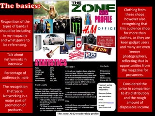
- 1. Clothing from these shops however also Recgonition of the recognising that types of bands I this audience shop should be including for more than in my magazine clothes, as they are and what genre to keen gadget users be referencing. and many are even keener Talk about photographers, instruments in reflecting that in interview opportunities from the magazine for Percentage of prosumers. audience is male Considered the The recognition price in comparison that Social to it’s distribution Networking is a and the rough major part of amount of promotion of disposable income. products.
- 6. The Masthead changed from the original as the audience feedback came in. I showed it to a few people To try and gage what they though of initial planning showing initial layouts and the above masthead. The main feedback was that they liked the layout with the “THE” on top of the “ZONE” but they felt the colour didn’t represent the genre, or was particularly attractive/effective. I then went back to the drawing board to recreate with a new colour scheme and font style to work best with the colour scheme.
- 7. I wanted to incorporate a real colloquial feel as when, during audience feedback, I asked why people brought a magazine, they said to relax. It was also crucial to feature a lot of interviews as this was something people wanted, discovered in my audience research.
- 9. 80% 70% 60% 50% 40% 30% 20% 10% 0% Male Female
- 10. The Stereotypical Male Persona
- 12. More military feel may Picture not to appeal to a provocative more but still slightly masculine suggestive audience Red creates Word Hot is a some sexual stereotypically connotations female word Quite a Three singled masculine out articles are font but still on female not gender artists specific Black and Use of term white creates Front Woman colour gender suggests her neutrality power
- 13. The common The red acts as a position of the bold standout masthead compared to the adheres to more brand loyalty as monotone, colo it is ur scheme that automatically relies on two recognisable. main colours. The positioning of the masthead in the top This front cover was a major influence on the right corner is a convention of music choice of photo as the image will appeal to magazines as It doesn’t detract from the men as it oozes sex appeal yet at the same main artist which can be a selling point, but time doesn’t deter females as the image is the first thing you look at due to it’s doesn’t show the artist purely as a sex object positioning and the brand name can also be by showing masses of skin, I tried to emulate a major selling point. this affect with my own front cover.
- 14. Miss May was chosen to represent the emo kids. Her choice of position and image was imitating one of the key target audiences. Her images weren’t too provocative but still played on the slightly suggestive that is a convention of the “sexed up” magazine images of todays society.
- 15. alice’s wonderland was a more provocative choice however we made sure their positions and clothes weren’t in any way demeaning. We still recognised the need for the focus on the music so chose to shoot in a location that made the whole look more casual, a house. People noted that they liked exclusives and the whole article had an “exclusive” feel to it.
- 16. A double page spread is a big selling point for a magazine and having a front page for the double page spread acts as a sort of introduction for the article that sets the tone, and reassures the audience that this band is going to be a major part of this issue. A new trend is seeing magazines offer more for your money and spreading an interview across a number of pages especially if it is the major article in the magazine. My decision to do this was inspired by the Glasvegas DPS I analysed in research.
- 17. The stereotypical layout offers people the opportunity to use the image page as a poster. Especially in the case of the girls I tried to choose the more provocative picture for the “poster” page as I felt it would appeal to the male audience. The contents is quirky whilst the layout is simplistic but affective. The colour choice was to focus on their sexuality and personalities. Bold pinks to represent the stereotypical female sex. And the blue refers to the male dream of the perfect ‘girl next door’.
- 18. Some of the artists featured I tried to maintain some form of are the ones pointed out as similar style e.g. the strict black and People also stated that being popular in my white and font styles, therefore people they wanted the UK audience research e.g. Panic responded to the common theme that Top 40. Due to our at the Disco and The Foo made the magazine instantly fortnightly release that Fighters. recognisable. wouldn't be appropriate so I responded with a top download chart – converging the print with the digital. The use of pull quotes and call outs of the articles inside the magazine automatically informs new reaserd of the tone and can give instant insights into what to Referencing the audience feedback a major aspect expect, therefore people wanted was live music, therefore on the people know where to contents page I pinpointed and highlighted (with go and what they want images) an exclusive backstage insight.