
Recomendados
Recomendados
Más contenido relacionado
Destacado
Similar a Brand Identity Keynote
Último
Último (20)
Brand Identity Keynote
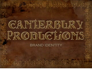
- 1. BRAND IDENTITY 1
- 2. WHAT’S IN A NAME ? Canterbury itself evokes a narrative thought, as Chaucer’s tales are known worldwide. This helps to set us apart via our name, we start with a strong story. 2
- 3. My business partner and I made a list of literary, artistic, personal, and a combination of titles we liked and we agreed Canterbury Productions would encompass all that we envisioned for our company. 3
- 4. Canterbury Productions is protectable, as it us not currently registered with the Department of Commerce. 4
- 5. Canterbury Productions is descriptive and generic as everyone knows Chaucer’s Tales but not us. 5
- 6. Shape Style The Subtext within the Old English to text represent Comedy evoke a classic look and Tragedy Color Design Earth tones that Like the Cover of a Leonardo would’ve used classic book 6
- 7. The laws of shape and color are abided by as the typography reads right to left to match our eyes, while the colors differ from our competitions. 7
- 8. This logo also relates to two of top 100 brand colors as seen on ColorLovers.com Business Blog. The font stands apart as the smaller lettering symbolizes the sub companies within Canterbury. 8
- 9. A Producer is not the show, they make the show happen- the logo of the Producer should do the same. 9
- 10. Is a titan in the Broadway community has a simple logo featuring the classic Disney Logo with Theatrical Productions LTD. in all capitols with a The lines seem to show a subliminal line above and below. “line in the sand” between the Walt Disney Company and its Theatrical Production Wing. 10
- 11. Sir Andrew Lloyd Webber’s Really Useful Group utilizes a Swiss Army Knife as an icon centered above the company title. I really like how ALW took a mantra and a logo both non- relating to Theatre. 11
- 12. VISION To produce artistic and financially sound theatre by telling great stories. 12
- 13. MANTRA To bring real life to the stage through passionate theatrical productions. 13
- 14. HOW ? Push the boundaries of the art form by holding up a mirror to society. 14
- 15. Commission Works 15
- 16. Hire a team to create/scout new projects 16
- 17. Develop new talent 17
- 18. we work to tell relevant stories that create an emotional connection with our audience 18
- 19. our name, logo, culture, mantra, and tagline tie together to unify the brand and keep us strong 19
- 20. WHERE ART IMITATES LIFE 20