![DIZZEE RASCAL Contents Analysis ,[object Object],[object Object],[object Object],[object Object],[object Object],[object Object],[object Object],[object Object],[object Object],[object Object],[object Object],[object Object],IMAGE The image used is the shape and size of a CD cover which links to the fact that it is in a music magazine. The colours red and black and white are used again in the photo which follows the house style. The image is above text and both together have been put in a frame which makes it look like a poster, this again reinforces the fact it is a music magazine. MASTHEAD The masthead is at the top of the page on the contents; this reinforces the brand identity. ISSUE DATE LAYOUT The magazine follows the rule of thirds on the contents. The image is in the middle with a short article; this is because it is the most interesting part of the page.](data:image/gif;base64,R0lGODlhAQABAIAAAAAAAP///yH5BAEAAAAALAAAAAABAAEAAAIBRAA7)
Recomendados
Más contenido relacionado
Más de laurajtaylor94
Más de laurajtaylor94 (19)
Último
Último (20)
Analysing nme_dizzee_cover-prep_for_blog_ppt
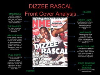
- 1. DIZZEE RASCAL Front Cover Analysis MASTHEAD Identifies magazine. Audience recognise it. Red, bold font; stands out. Top of magazine; brand identification. BACKGROUND Shows themes that may be used inside; relates to main article. Relates to teenagers who are rebellious because it is graffiti; it also hints at the genre of music the artist produces. PULL QUOTE Taster of what is going to be inside the magazine; makes audience want to buy it and read it. Sounds like it is going to be happy article because of the word ‘JOY’. MAIN COVER LINE Target audience will know who the main article is about. Fans of this artist will want to buy it. Image is behind the writing; artists name is more important. THE FLASHER This offers something extra to the target audience. MAIN IMAGE Takes up most of the cover. Stands out; appealing to audience. Dizzee Rascal looks like he is having a joke and having fun. PRICE TAG/ISSUE DATE AND BARCODE Buyer knows how much the magazine costs. COVER LINES Small titles which refer to the information inside. Bands which would normally be found in NME. HEADER FOOTER
- 3. DIZZEE RASCAL Double Page Spread Analysis IMAGE The image takes up the whole of the left side of the double page spread; this shows that it is just as important as the text. The audience will automatically look straight at it. The image follows the colour scheme from the front cover and the contents page (red, black and white). The background of the image is graffiti which implies that the target audience of the article is teenagers who are rebellious; this also links to the header ‘FROM TAGS TO RICHES’. Just like on the front cover Dizzee Rascal looks as though he doesn’t take himself too seriously which is appealing to the audience. TEXT/FONT The article headline is written in san-serif block lettering so that it stands out. ‘FROM TAGS TO RICHES’ is the name of the article and it is giving the reader hope that no matter what they're life is like now, it can change to get better. There is stand first; this introduces the article and gives the audience a small idea about what the article may include. Once again there is a drop capital at the beginning, the letter ‘Y takes up six lines’. BY-LINE Shows who has written the article. EDITORIAL The language used is quite informal and chatty which makes it easy for the audience to relate to what it is about. ‘hanging around’, ‘Where’s my fucking name then?’ (Quote) They will happily swear. LAYOUT The image takes up the whole of the left hand side of the double page spread; this could be used as a poster after the reader has finished with the article. The heading take up half of the right hand side of the page ‘TAGS’ and ‘RICHES’ being the most dominant words, showing the comparison and the change in lifestyle; anything is possible, it is aspirational. The article is in small font and fits around the images at the bottom of the page which hint at what being famous is like (drinking and listening to music).