
Recomendados
Más contenido relacionado
Destacado
Destacado (14)
Similar a Evaluation - Question 2
Similar a Evaluation - Question 2 (20)
Último
Último (20)
Evaluation - Question 2
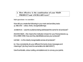
- 5. Eye contact Date engages reader Masthead Tabs colour coded for easy access for readers Price Easy to read and understand storyline Anchoring References other soaps Website and barcode
- 6. Eye contact Date engages reader Masthead Tabs colour coded for easy access for Price readers Anchoring References other soaps Website and twitter feed
- 7. •For the front cover of our magazine we decided to use TV easy’s layout and bright colours we wanted it to be cheap and easily accessible. •We wanted to make the front cover entertaining and informative but to use the colours to get attention and entertain. •Our magazine is aimed at 16-24 yr olds as the soaps used on the front cover are also aimed at 16-24 yr olds and appeal to them. •The coloured tabs show how you can easily navigate your way through the magazine, this shows the simplicity and how easy and quick it is to access what you want. •We challenged an important convention by the main cover star making eye contact which is engaging the audience/reader.
- 8. Clear photo’s identify Purple tape main characters E4 branding E4 logo
- 9. Anchored slogan to the characters – Shows storyline Followed by subheadings to show further information on Easy access colour the storyline coded pages Masthead – top 3rd of the page Stands out
- 10. Advertises other soaps Grip the reader Eye contact from Character to engage the reader with Facial expressions also show the emotions which ‘one liners’ intrigues the reader to want to know more
- 11. Billboard shows the characters facial expressions... We did each facial expression different to increase emotions and to create a personality for each character for the audience to relate to. Brand identity is created by using the purple tape and the E4 logo.
- 12. All of the characters that we used in our trailer were the same age. We also showed age by the costume and outfits that our characters were wearing e.g. student clothes. By using a feather boa Rhino has drawn on it adds humour and eyebrows and fake tan on increases the parody, to increase the parody of also by putting makeup his character appearance. on one side of He also has a tattoo of a ‘Mickey’s’ face it shows Rhino on his arm which that there is two sides also adds humour as his to his character. character name is ‘Rhino’.