
Recomendados
Más contenido relacionado
La actualidad más candente
La actualidad más candente (15)
Similar a Woman in Black poster dark color scheme
Similar a Woman in Black poster dark color scheme (20)
Más de leahwilshh
Más de leahwilshh (19)
Woman in Black poster dark color scheme
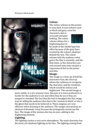
- 1. Woman in black poster Colour. The colour scheme in this poster is very dark. It uses colours such as black and grey, even the characters skin is very pale and grey looking. The colour scheme allows for a frightening face to be made in the smoke type line effect because of the grey lines created by the colours shadows behind the text. The colour scheme tells the audience what genre the film is instantly, and the blue hints, in the characters eye and around some text can give a supernatural feel to the poster and film. Image. The image is a close up of half the characters face, the close up allows the audience to recognize the character, and his emotions, which would be serious and frightened. The second image is more subtle, it is of a woman’s face. Because it is more profound it is harder for the audience to see and when they do see it they are jumped or shocked. The fact that the text is smudged into this image may be telling the audience that that is the ‘woman in black’ or she is the ghost that needs to be believed in. These enigmas are very effective when drawing in the audience. The images also portray an element of dramatic irony because the protagonist cannot see the face. The image of the woman also has no eyes, adding to the frightening element. Lighting. The lighting creates a very eerie atmosphere. The main character has the most, yet shadowy lighting on his face. The lighting coming from
- 2. the left of the poster fades to black when it reaches the women’sface which is effective because it allows for her to be there. The darkness behind this shadow suggests that with the women, comes danger and the unknown. Text. The text styles is all slightly stretched upward, and it all leads to the women’s shadow/smoke face. The white colour of the text stands out for the audience to see, following Chris frosts theory on readable text. The text style is also a bit scratched and old looking, adding to the eerie atmosphere. Language. There is minimal language used, there is a statement of the main character whom is Daniel Radcliff, who is very well known by this films target audience because of starring in all harry potter films. There is also a rhetorical question used, which addresses the audience directly, which then involves them in the film, and creates a sense of mystery because it is just below the shadowy ghost. The ghost is difficult to see and only parts of a face is there, because of what the question implies, the language and image compliment each other in terms of the rhetorical question. Influences; this poster has really influenced me to use a language and image link, I think it is really effective! I have also been influenced by this poster to use more shadows.