
Recomendados
Más contenido relacionado
Destacado
Destacado (8)
Último
Último (20)
Q2 : how does your media product represent a particular social group ?
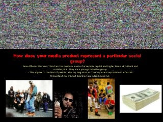
- 1. New Affluent Workers: This class has medium levels of economic capital and higher levels of cultural and social capital. They are a young and active group. - This applies to the kind of people I aim my magazine at. Their style and reputation is reflected throughout my product based on a rap/hip-hop genre.
- 2. FRONT COVERFEATURE ARTICLE PHOTO - Topless(this is a statement, reflecting the masculine and intimidating aspect of the genre, this is something that the readers would admire as it fits the genre that they are interested in. The artist is, essentially, a representative of the target audience, a young, superior, masculine, and strong appearance, all qualities which are desirable in the eyes of the readers.) TEXT & FONT – A bold and big font gives a relatively masculine feel which also matches the genre of music and possibly suggests that the magazine is aimed at COLOUR SCHEME – WHITE RED AND BLACK – all gender neutral / are each a representative of qualities and aspects of the rap/hip-hop genre: Red – danger, rebellion White- god like, superior implication Black – a metaphorical representation of having a ‘dark side’ - rebel qualities MODE OF ADDRESS – the way which the article is written. (use of slang and chatty– indicates informality and therefore suggests that the readers are also easy going, casual and )
- 3. CONTENTS COLOUR SCHEME AND TEXT– the colour scheme mimics the house style/ front cover . The colours make the text bold and stand out in a masculine way which matches the genre (in a sense that the readers also are self expressive, bold and dominant). PHOTOS – There are three photos in all. They are all close ups /mid-shots of the artists. This makes the whole page seem intimate in a way so as to draw the reader in. This is enhanced by the way each one is making eye contact with the camera. TYPOGRAPHY – A high impact font to draw the reader in. The font size corresponds to highest/lowest priority and allow the reader to get the valuable information first as a young person is reading it.
- 4. DOUBLE PAGE SPREAD COLOUR SCHEME – the colours red, black and white link to the house style and reflect aspects of the demographic of my readers. This includes the connotation from the colour red, which symbolises danger and blood theme, a quality that is highly respected MODE OF ADDRESS – the way which the article is written. (use of slang and chatty– indicates informality and therefore suggests that the readers are also easy going, casual and ) PHOTO – taking up a whole page, giving the impression that the artist are superiors and dominant. This fits both the genre and the qualities that appeal to my readers. TEXT – the typography used within this double page spread links to HOUSE STYLE and also matches the masculinity of the magazine conveyed through the use of a bold strong impact font.
- 5. TO CONCLUDE The social group that my product represents follows the genre’s reputation of the genre – appeal to those who are predominantly young, urban followers of hip-hop culture.