Usability of third party applications
•Descargar como DOC, PDF•
0 recomendaciones•553 vistas

BT's usability standards applied to business applications bought from third parties or developed internally

Recomendados
Más contenido relacionado
Similar a Usability of third party applications
Similar a Usability of third party applications (20)
Más de Mark Morrell
Más de Mark Morrell (20)
Último
Último (20)
Usability of third party applications
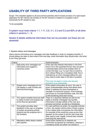
- 1. USABILITY OF THIRD PARTY APPLICATIONS Scope: This checklist applies to all procurement activities which include provision of a web based application for BT internal use (hosted on the BT intranet or hosted on a supplier’s site if exclusively for BT people to use). To be acceptable A system must meet criteria 1.1, 1.11, 2.6, 3.1, 3.3 and 5.2 and 80% of all other criteria in sections 1 – 5. Section 6 details additional information that can be provided, but these are not assessed. 1. System status and messages Users require informative error messages and clear feedback in order to navigate smoothly. It should always be clear to them what is the next step, what information they should enter, and what to do if they get stuck. Criteria Notes/examples 1.1 Data entry error messages are If the user has entered information in the form informative and suggest a that is not in the expected format, they are given corrective action understandable advice that enables them to correct the data. e.g. if a user tries to submit a form without filling out a mandatory field, this is indicated by an error message telling the user they need to enter data in the field in question. This may not apply in some rare security situations (e.g. passwords) 1.2 System error messages do not If the system encounters an error, the user is just display a code number and given understandable advice that allows them technical terminology either to address the issue themselves or escalate it to technical support. If the message just shows an incomprehensible code, the user is left wondering what went wrong. 1.3 The system enables technical staff There is a reporting interface as well as the to easily monitor and analyse any ability to directly investigate raw log files. errors that are generated Information includes details of the user and process concerned, as well as a timestamp. 1.4 The system provides clear If a user performs an action, for example submits feedback to the user on progress a form, the system informs them if there is going of system processing activity to be a delay while it processes the information. (beyond just the progress bar in An example of this would be a pop-up box that the browser) appears on the screen to let the user know that they need to wait. Ideally it should also indicate how long this wait will be. 1.5 Mandatory fields clearly marked Entry boxes marked by an asterisk are with asterisk commonly recognised as mandatory, whereas if mandatory boxes are either not marked or
- 2. marked with a custom icon the experience becomes less intuitive. 1.6 Auto-population of data already The user is spared the frustration and wasted entered or already known by the time of having to re-enter information that the system system already has stored (e.g. name) or that the user has already entered. 1.7 All information needed for the user The user should not be forced to jump to complete tasks is available on backwards and forwards between pages in order the current page to get all the information they need. E.g. in filling out a form for annual leave, they can also view information about how much leave they have left to take. 1.8 Data validation on fields ensures If the user enters inappropriate data (e.g. that appropriate entries are made numbers in a field that only allows letters), the by the user system prompts them to correct themselves. 1.9 A clear visual focus indicator As the user moves through a form, they can see shows the user where the cursor where they are in it e.g. the cursor flashes in a is text field or a button is highlighted. 1.10 Help is available to the user in a As in Word of Excel, the user can easily access central help area a central help area to browse through help topics, and without interrupting the flow of what they are doing. 1.11 Context-sensitive help is available Short snippets of help are available to the user to the user at each step of the on the current page, particularly at points where process people often get stuck or confused. An example of this would be question mark icons next to fields, which the user can roll their mouse over to get help. 2. Branding and appearance The application should be easily configurable to reflect the branding of the organisation. Criteria Notes/examples 2.1 There is a consistent look and feel The user is not confused by different appearance throughout in different parts of the application. This is much the same as navigating through a website: while subtle elements such as colour may be used to make it clear which section you are in, the overall layout and style remain the same. 2.2 Default font is legible The type of font used, as well as its size and colour, are easy on the eye rather than being difficult to read and causing the user strain. ‘Sans serif’ fonts such as Arial and Verdana are the easiest to read on a computer screen. 2.3 The content of the page appears Unless the screen resolution is locked down correctly (and with no errors) even centrally, users may well change it to suit their when the window is resized particular needs and preferences. They may also use the browser at just half its full size. The application can cope with this and still present users with a usable interface. 2.4 The content displays correctly The interface is still usable even if someone has even when a large font size is chosen to view browser content with a larger text selected via the browser settings size. 2.5 Text in default colours has enough E.g. text is navy on white, not light grey on dark contrast to be legible grey. 2.6 Application can easily be A good example of this is in Clarity, where you
- 3. configured to change the logos, can use configuration options to change the colours and images colours and images used in order to create exactly the interface you want. 2.7 Form fields allow sufficient space It’s frustrating for the user if there isn’t enough for entries space in an entry box to type in what they need to. 3. Terminology Default terminology should be user-friendly, consistent, and easily configurable to fit the context of the organisation. Criteria Notes/examples 3.1 Text can be easily changed and Every organisation has its own particular help and advice tips can be added terminology that is familiar and accepted. on the initial login screen, at Meaning will differ from company to company, page/form level, and at field level and even in different countries. It is essential that text can easily be changed to reflect local meaning. 3.2 User-friendly terminology While it is possible to change text, the basic language the system uses is intuitive and straightforward. It isn’t necessary to change all the text just to make it user friendly. 3.3 Terminology on all field labels, See notes for 3.1 above. An example of this not buttons, titles and navigation is being the case is the default label in Oracle for easily configurable daily expense allowances. The term used for this is “per diem”, which is not widely used in the UK but cannot be changed in the configuration. 3.4 Multilingual entries are easily The application is configurable for different configurable countries. 3.5 Consistency of terminology E.g. if “Submit” is used at the end of a form, this throughout is used consistently on all forms. 3.6 Related buttons and page The title of a page is the same as the button or headings should match link used to navigate to it.
- 4. 4. Navigation Users should be able to navigate intuitively and without getting lost. Criteria Notes/examples 4.1 Consistent and logical navigation E.g. if you cancel or go back the application flow takes you to where you were before 4.2 The system shows the user their E.g. in Oracle, the system shows users with a progress through task steps visual image that there are four steps in the current process and that you are currently on step two. 4.3 User can go backwards in the A back button is provided in the application to process without losing data allow users to go back a step and check or modify an entry. Without this, the tendency is to use the browser back button, and data may be lost. 4.4 TAB works in a logical order and The use of TAB in a form to move from one field reaches all functions or function to the next happens in a logical order. 4.5 ENTER activates the current Once a particular control is highlighted (e.g. a control button) the user can press ENTER to activate it. 4.7 Experienced users can skip Users can quickly get to the parts of the repetitive navigation links application they use most frequently. 4.6 Keyboard shortcuts are available These speed up usage of the system and mean users have the option of using shortcuts if this is their preferred method. 4.8 Selecting a button or link twice in a Users often double-click a button to activate it. It row (quickly) does not cause error is important that this doesn’t cause an error. 5. Accessibility The following general accessibility guidelines should be met as a baseline. You should add any requirements from your organisation’s own accessibility policy. Criteria Notes/examples 5.1 The application is still usable when The application remains usable when browser browser accessibility options are accessibility options are selected, such as the selected removal of page styling. E.g. at BT, when the style was removed from a Clarity screen. 5.2 The use of assistive technology The application is built in a way that supports (e.g. a screen reader) is supported assistive technologies - e.g. a screen reader, which attempts to identify and interpret what is being displayed on a page, and represent it to the user with text-to-speech, sound or Braille. 5.3 Colour should be an enhancement E.g. coloured text is not the only means of rather than the only way to convey denoting a mandatory field (which would not be certain information accessible to colour-blind users). 5.4 All images should have If a user rolls their mouse over an image, they informative ALT text are given descriptive text about it (also used by assistive technology). 6. Additional questions/miscellaneous (these are not part of the checklist pass / fail process) Criteria Notes/examples 6.1 Has usability testing been An indicator of how seriously the vendor takes
- 5. performed and, if so, what reports usability and the investment they have made in are available? making their application usable and accessible. 6.2 Does the vendor have a usability Another indicator of how seriously the vendor group and, if so, when was it takes usability. established? 6.1 What are the vendor’s While exact performance is difficult to predict commitments and targets with (given differences of architecture in each respect to performance? organisation), examples should be given of expected performance within a number of environments. 6.2 Are any applets required (e.g. java, This is about checking whether the application xml) that must be installed will run in the browser without additional separately? components having to be installed on the user’s computer. If additional components are required, this will add to the time and cost of maintenance. 6.3 What browsers and browser This is a check to see that the application will versions are supported? work fully in any browsers/versions used by employees. 6.4 Are any custom browser settings If custom browser settings are required to run required? the application, this may affect other applications already running through the browser. 6.5 Can the application be configured Any of the configurations applied to the in a supportable way, or will application should not need to be re-applied at changes have to be re-applied upgrade. after every upgrade? 6.6 Does the application pass W3C Another indicator of how serious the vendor is validation? about the accessibility of the application. This can be checked using the W3C Validator (see appendix C, ‘Useful resources’). 6.7 How is accessibility testing done? The vendor should provide detailed reports on What guidelines (e.g. Section 508, how their product meets accessibility standards. WCAG) does the application comply with?