Tornado re brand presentation (draft)(not for reproduction)
•Descargar como PPTX, PDF•
2 recomendaciones•1,035 vistas

Presentation to athletic department at Concordia University Texas - an evolution of brand assets.

Recomendados
Más contenido relacionado
Destacado
Destacado (18)
Similar a Tornado re brand presentation (draft)(not for reproduction)
Similar a Tornado re brand presentation (draft)(not for reproduction) (20)
Tornado re brand presentation (draft)(not for reproduction)
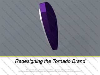
- 1. Redesigning the CTX Brand Redesigning the Tornado Brand Presented by The Communications Office, a division of External Relations The information and logos provided in this presentation are drafts and should not be reproduced.
- 2. Building a Brand- Why? A BRAND IS MORE THAN A LOGO • It’s a visual and recognizable representation of an organization. • It’s the promise behind the product you deliver. • It should be memorable. Presented by The Communications Office, a division of External Relations The information and logos provided in this presentation are drafts and should not be reproduced.
- 3. A brand is a visible representation of an organization and it should embody the ideal of the organization. The way we make our ideas tangible is through our “brand identity”. If our brand is the sum of all the impressions a person has about Concordia University Texas, our brand identity is comprised of the sum of all the things we create to carry our messages to the community – like our brochures, magazines, flyers and our web site. In this context, community refers to all audiences we communicate with – potential students, current students, parents, donors, churches and many others. If we want to cultivate a clear, consistent, memorable impression of Concordia University Texas, it is important that the ways we communicate and support the idea behind our brand are equally clear, consistent and memorable. -from the Concordia University Style Guide
- 4. Anatomy of a Brand PMS: 7406 (coated and uncoated) CMYK: C0 / M18 / Y100 / K0 HEX: ffcb05 PMS: 282 (coated and uncoated) CMYK: C100 / M60 / Y0 / K60 HEX: 00274c Presented by The Communications Office, a division of External Relations The information and logos provided in this presentation are drafts and should not be reproduced.
- 5. PMS: 7406 (coated and uncoated) CMYK: C0 / M18 / Y100 / K0 HEX: ffcb05 PMS: 282 (coated and uncoated) CMYK: C100 / M60 / Y0 / K60 HEX: 00274c Note: A secondary color palette is also used and were inspired by ‘buildings and landmarks we see every day on our campus’. (source: umich.edu/style-guide/design-principles/colors) Presented by The Communications Office, a division of External Relations The information and logos provided in this presentation are drafts and should not be reproduced.
- 6. Tornado includes a cross and three rings that signify the Trinity. The official athletic font is Serpentine, used in italics. For ‘Tornados’, note it is in all caps PMS: 268 (coated and uncoated) CMYK: C82 / M100 / Y0 / K12 RGB: 79 / 8 /31 HEX: 4F2683 Yellow lines separate content and mimic lines used with our mission statement. PMS: 122 (coated and uncoated) CMYK: C0/ M17/ Y80 / K0 RBG: 255 / 210 / 79 HEX: ffd24f Presented by The Communications Office, a division of External Relations The information and logos provided in this presentation are drafts and should not be reproduced.
- 7. Presented by The Communications Office, a division of External Relations The information and logos provided in this presentation are drafts and should not be reproduced.
- 8. Anatomy of a Brand Let’s look at how existing assets were used to create new logos: Presented by The Communications Office, a division of External Relations The information and logos provided in this presentation are drafts and should not be reproduced.
- 9. Anatomy of a Brand Let’s look at how existing assets were used to create new logos: Presented by The Communications Office, a division of External Relations The information and logos provided in this presentation are drafts and should not be reproduced.
- 10. Anatomy of a Brand Let’s look at how existing assets were used to create new logos: Presented by The Communications Office, a division of External Relations The information and logos provided in this presentation are drafts and should not be reproduced.
- 11. Note the shadow added to the wordmark to add depth. Here in CTX Purple at 25%. This works well with embroidered images as well. The color of the shadow in the wordmark mirrors the lines of motion in the shield logo – also in 25% of CTX Purple. Presented by The Communications Office, a division of External Relations The information and logos provided in this presentation are drafts and should not be reproduced.
- 12. Uses official Serpentine font. Its square shape was desirable for certain placement. It also further signifies our modified acronym: CTX. Here, it’s used on the baseball field. An outline was added to add depth and to stand out against another dark background color, green. Presented by The Communications Office, a division of External Relations The information and logos provided in this presentation are drafts and should not be reproduced.
- 13. Tornado with shield Multiple outlines Shadow on text Angled background We took the Serpentine letters from the interlocking CTX logo and applied them to the earlier assets shown including the angled background, Tornado with shield, shadow on text and multiple outlines.
- 14. Example of new logos in apparel Presented by The Communications Office, a division of External Relations The information and logos provided in this presentation are drafts and should not be reproduced.
- 15. Example of new logos in apparel Presented by The Communications Office, a division of External Relations The information and logos provided in this presentation are drafts and should not be reproduced.
- 16. Example of new logos in apparel Presented by The Communications Office, a division of External Relations The information and logos provided in this presentation are drafts and should not be reproduced.
- 17. Example of new logos in apparel Presented by The Communications Office, a division of External Relations The information and logos provided in this presentation are drafts and should not be reproduced.
- 18. Example of new logos in apparel Presented by The Communications Office, a division of External Relations The information and logos provided in this presentation are drafts and should not be reproduced.
- 19. Example of new logo on notecards (flat – double sided) Presented by The Communications Office, a division of External Relations The information and logos provided in this presentation are drafts and should not be reproduced.
- 20. Example of new logo on notecards (folded – inside blank) Presented by The Communications Office, a division of External Relations The information and logos provided in this presentation are drafts and should not be reproduced.
- 21. Example of new logo on letterhead
- 22. Example of 3D logo for video board
- 23. Example of 3D logo in motion for video board
- 24. Example of header redesign for website
- 25. On Branding… Ralph Lauren fashion designer ‚When you think of the blur of all the brands that are out there, the ones you believe in and the ones you remember ... they are the ones that stand for something.‛ A brand for a company is like a reputation for a person. You earn reputation by trying to do hard things well… If you do build a great experience, customers tell each other about that. Word of mouth is very powerful. Jeff Bezos founder of Amazon.com Presented by The Communications Office, a division of External Relations The information and logos provided in this presentation are drafts and should not be reproduced.
- 26. Proposed timeline for implementation February 19 Focus Group mtg 1 (presentation) March XX April XX Focus Group mtg 2 (feedback) Shared final revisions May -July Submit to Ad Council for review Finalize, create style guide, work on trademark August Official launch & training of new assets Presented by The Communications Office, a division of External Relations The information and logos provided in this presentation are drafts and should not be reproduced.
- 27. Q& A Presented by The Communications Office, a division of External Relations The information and logos provided in this presentation are drafts and should not be reproduced.
Notas del editor
- A brand is so much more than a ‘logo’. It’s the visual and recognizable representation of an organization. However, it’s also the brand behind the promise.As an institution, ask yourself what you want people to remember about your program – and be that.
- Let’s look at an example of a brand that
- Origin of our colors: is unclear.However, gold is often used to signify things including: success (think ‘gold standard’ or gold medal), optimism. It’s attention grabbing and also opposite purple on the color wheel. Purple often represents royalty or ‘class’. For athletics, indicating an elite status in competition. If we relate our colors to Christianity, yellow is the symbol of light and purity, youth, happiness, hospitality, love and benevolence. Purple signifies faith and trust.
- Official school colors are Pantone 286 (purple) and 122 (gold)A secondary color palette is created to work with and support the primary colors. CTX Gray is used throughout the university – not just for athletics. It provides a contemporary neutral background that is a nice alternative to black.‘Strike Gold’ as used by some CTX teams is a proprietary color designed for Nike. While impossible to duplicate, Pantone 102 is a very close alternative. Note its brightness without crossing the line to neon green.
- The shield behind the Tornado provides:A strong background. This image will show up more easily on apparel, uniforms, etc. Strong edges define the area. The inside lines indicate ‘motion’.The shield also mimics the main university shield logo.
- 1.We dropped ‘University’ form the existing wordmark. This allows for text to be more easily read (less letters/words taking up space). Angled lines on either side of ‘Texas’ here indicate motion. A banner is added under ‘Concordia Texas’ to allow for the addition of a designation such as mascot (Tornados), sport (basketball) or department (athletics department. 2. The angled background was created to add an element of motion. The top exaggerated angle adds a hard edge to signify strength and domination.The outline incorporates more of our colors and allows a subtle separation from a background color. Multiple colors from the official color palette can be incorporated. Or, the logo can exist in 1-color when necessary.3. The wordmark, banner and background come together to make a strong logo that incorporate all of the above elements. This may be helpful for jerseys, for example, where a strong image is desired and our name is needed.
- Here, we combine the Tornado mascot logo with the wordmark + banner.Notice that the official Serpentine font is maintained throughout.
- We took the Serpentine letters from the interlocking CTX logo and applied them to the earlier assets shown including the angled background.This would be a great logo to use for embroidery on polo shirts, etc. (See embroidery example)
- The Tornado icon would ‘twist’ and spiral as a 3-D image.
- The Tornado icon would ‘twist’ and spiral as a 3-D image.
- We want your feedback. Please share with others who have a direct impact/connection with this information, and record it to share with us at the second ‘Focus Group’ meeting in March.We want CTX Athletics to be a brand that people recognize, respect and promote. We can help with creating and supplying the assets, but we need you as ambassadors to promote this brand in the community. It takes a village…