80 ĐỀ THI THỬ TUYỂN SINH TIẾNG ANH VÀO 10 SỞ GD – ĐT THÀNH PHỐ HỒ CHÍ MINH NĂ...
Captain America A2 Media Studies Magazine Analysis
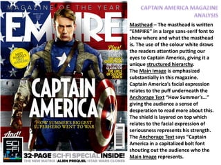
1. Masthead – The masthead is written
“EMPIRE” in a large sans-serif font to
show where and what the masthead
is. The use of the colour white draws
the readers attention putting our
eyes to Captain America, giving it a
unique structured hierarchy.
The Main Image is emphasized
substantially in this magazine.
Captain America’s facial expression
relates to the puff underneath the
Anchorage Text “How Summer’s…”
giving the audience a sense of
desperation to read more about this.
The shield is layered on top which
relates to the facial expression of
seriousness represents his strength.
The Anchorage Text says “Captain
America in a capitalized bolt font
shouting out the audience who the
Main Image represents.
2. On the right hand side we have “Plus!
The Real Exorcist…” which is a Puff
showing the least important compared
to Captain America’s Anchorage Text.
The Issue No and Price are shown in a
small non-bold font to prevent
customers driven away by the price.
The addition of Extras of the 32-Page
Sci-Fi Special Inside will make
consumers purchase and adds a form
of psychological pricing as if the
magazine is cheaper with the
accumulation of the Sci-Fi booklet. The
Theme of the magazine is
concentrated on the country America
– we see the flag represented as the
background, Captain America’s
clothing and his shield. Also, the text
consists of American colours apart
from the yellow. This tells us that the
country America takes its pride
seriously.