
Recomendados
Más contenido relacionado
La actualidad más candente
La actualidad más candente (19)
Destacado
Destacado (20)
Similar a Advertising coursework part 1 example
Similar a Advertising coursework part 1 example (20)
Más de mrsloan
Más de mrsloan (20)
Último
Último (20)
Advertising coursework part 1 example
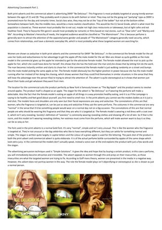
- 1. Advertising Coursework Part 1. Both print adverts and the commercial advert is advertising DKNY "Be Delicious". This fragrance is most probably targeted at young trendy woman between the ages of 21 and 28. They probably work in places to do with fashion or retail. They may not be the going out "partying" type as DKNY is promoted more for the day and romantic times. Social class wise, they may not be at the "top of the ladder" but not at the bottom either. Somewhere between both, like the middle class, would be a more realistic classification. This would be the C1 Social Grade, which is what most the population is classed as. These women most probably like to eat out, maybe not high class restaurants or takeaways, but at light cafes and eat healthier food. They’re favourite film genre’s would most probably be romantic or films based on real stories, such as “Dear John” and “Marley and Me”. According to Maslow’s hierarchy of needs, the targeted audience would be classified as “The Mainstream”. This is because perfume is generally worn to attract the attention of the opposite/same gender and people of “The Mainstream” category generally need security, which comes from relationships, and have a domestic everyday life, which is most probably what these targeted women are searching for. Women are shown as seductive in both print adverts and the commercial for DKNY “Be Delicious”. In the commercial the female model for the ad uses her looks and seductiveness to her advantage to get the apple off the male model for the ad. Men are shown as quite gullible as the male model in the commercial gives up the apple he intended to get for the attractive female model. The female model allowed the man to pick up the apple for her, which she could have done for herself. this shows that she has the hold over the man and she shows that by letting him do the work. The man becomes instantly smitten and starts to chase her. In the commercial the female model is just walking randomly on a street and bumps into the male model picking the same apple as her. The female model obviously has the higher position in power because she has the male model running after her instead of her doing the chasing, which shows women that they could find themselves in similar situations in the sense that they will have the advantage over the person they’re trying to attract the attention of. The advert is quite stereotypical as it shows that women just flaunt their looks and get whatever they want from men. The location for the commercial suits the product perfectly as New York is famously known as “The Big Apple” and the product seems to revolve around apples. The product itself is shaped as an apple. The slogan for the advert is “Be Delicious” as if wearing the perfume will make u delectable. Also the fact that the female model is eating an apple of all things in a way promotes healthy eating, and it is as if the campaign is saying to be healthy and feel good about yourself, you first need to smell nice. In the print adverts you cannot see the models bodies as it is just a mid shot. The models faces and shoulders are only seen but their facial expressions are sexy and seductive. The connotations of this are that women, who the fragrance is targeted at, can be just as sexy and seductive if they use the same perfume. The costumes in the commercial are very “normal” in the sense that it’d be something people would wear on a normal day not on a big occasion. The connotations of this are that normal people are who should be wearing this fragrance and that they are who it is targeted at. The female model is wearing a red dress with a coat over it, which isn’t very revealing. Society’s definition of “sexiness” is commonly wearing revealing clothes and showing off a lot of skin. So if that is the norm, and this model isn’t wearing revealing clothes, her sexiness must come from the perfume, which will make women want to buy it so they can be as sexy as her. The font used in the print adverts is a normal bold font. It’s very “normal”, simple and isn’t very unusual. This is like the women who the fragrance is targeted at. They’re not unusual or like big celebrities who like to have everything different, but they can settle for something normal and simple. The slogan is written quite largely in capital letters and the colour of a green apple is used for the lettering. The pack shot of the product in both the print advert and commercial advert is quite elaborate. It is of the actual perfume bottle surrounded by apples of the same shape which look extra juicy. In the commercial the models don’t actually speak, instead a voice over at the end explains the product with just a few words and the slogan. The advertising persuasion technique used is “Simple Solutions”. It gives the idea and hope that by buying a certain product, in this case a perfume, you will immediately become attractive and irresistible. The advert appeals to women through this and preys on their insecurities, as those insecurities are what the targeted women are trying to fix. According to Goff mans theory, women are presented in the media in a negative way. However, this advert does not portray women in this way. The role the female model plays isn't objectifying or stereotypical as she is shown as just a normal person.
- 2. Advertising Analysis Coursework Vera Wang Princess Perfume The TV advert starts off by showing jewellery and gold crown with gems. This gives connotations of wealth, luxury (things you'd expect when you're in royalty, especially a 'princess'). A typical princess would be portrayed as elegant, classy etc. A first thought would be a fairytale typical princess but this advert shows a more modern take on being a princess. It's not your typical type; she goes partying, likes to mess around in her room etc. This is would appeal to a more teenage audience as this is what teenagers would usually do. They like to have fun! The soundtrack is very upbeat music and teenager’s these days tend to prefer to listen to songs that are lively because it represents their youth. The colours throughout the advert are very pink, this gives connotations of girlyness and femininity. There are lots of bright colours some of which contrast with each other to make the colours stand out more. This is to attract the audience’s attention. At the beginning you get a glimpse of the product and as the slides quickly change u see more and more of the product and you get a full view, this is to intrigue the younger generation as you see young people are very energetic and need that element of thrill in their lives. The perfume bottle is shaped like a heart with a little crown at the top, this connotates love and also authority. This is because hearts are always associated with love and by having a crown you must have some status because a crown is linked with royalty. There are also a lot of close up’s on the beautiful models face, she always seems to be happy and smiling so this persuades the audience that in buying the perfume you can achieve happiness and enjoy life as well. This would a be a snob appeal as the product suggests to benefit the customer more than it will in reality. The camera doesn’t stay focused on one thing for too long and it changes scene quickly, this is very jumpy, lively like the audience. This advert also portrays young women as fun, loving people, who are innocent and sweet like ‘princesses’ but they also can have a more edgy and rebellious side- this is why she is seen with the drummers in the advert wearing black, and dressed like a rock star. This advert also uses the bandwagon appeal because you see other people there and most teenagers would love to feel that free and happy. Referring to Maslows hierarchy of needs the customers of this product would probably be mainstreamers or aspires. The reason they might be mainstreamers are they want security in being the same as other people and this product is trying to give them happiness (which is sometimes classified as a type of security). Also, the reason why they would be an aspirer would be, they need the status, they want to get the latest thing out here and what could be a higher status than royality? In the first picture of the advert campaign the picture is taken mid shot and the model is holding her gold necklace and the product is seen at the bottom corner of the picture. Whereas in the second campaign she is casually lying down in her messy bed and her legs are up in the background and she’s posing very sweetly. Her facial expression in the first one is sort of a smile however not completely she still has that look of determination and she she really connects with the audience as there is direct mode of address. This could mean there is an element of mystery as she has decided not to smile fully. Similarly in the second picture she’s looking at the camera with ehr sharp eyes and this time her mouth is a bit open, forming almost a smile. Yet again there is something which is keeping her from showing a full smile, this perhaps could be her status, showing she’s a strong character and doesn’t have to prove her emotions to everybody yet at the same time she has to look inviting. Her costume in both pictures are very fantasy looking (as if she just walked out of a fairytale). It’s very elegant and puffy, it looks expensive and this would be expected if she is be a princess. In both campaigns they also use massive crowns/tiara’s this really garbs the audience’s attention as it’s very captivating and glamorous. The target audience would probably briefly imagine themselves wearing something like that. There are two types of fonts used in both campaigns, the ‘Vera Wang’ part is in capitals and serifs however the princess part looks like handwriting (again referring to teenagers and this is perhaps how they would write at school or other places.) This would show that this product would fit two types of audiences, maybe a more mature audience with a bit of fun to them or maybe a younger generation. This is because the different aspects of the picture could relate to different people. The shot is also taken from eye level and directly infront of the model to suggest even though she has a higher status we are all equal and we could amount to that too. The target audience profile would mainly be aimed at young women or teenage girls this is because at this time in their life they are still capable of having fun and living a dream. They’re ethnicity could be varied as the model in the picture is mixed race. She would probably get some money off her parents or possibly work in a high street retail store to at least earn an income. They’re parents probably middle class so they do have some money. The shops they’d go to would probably be , TopShop, Miss Selfridge, River Island, Newlook, H&M etc. Using Demographics they would be classified as either KIPPERS for the younger audience or a YUPPIE for the more young female adults. According to Goffmans Theory of representations of Gender in Advertising women are presented in a negative way however in this advert it's not the case. In his theory men are often seen as the dominent and have more superiority and women are seen as the dumb bimbo's that have no power. This advert though shows that women/girls aren't the typical sex symbol or whatever, they have some authority and respect. She's not exposing herself to lack of clothes and proving woman dont have to be nude or anything to get attention.