
Recomendados
Más contenido relacionado
Último
Último (20)
Destacado
Destacado (20)
Conventions of a popular music magazine
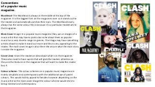
- 1. Conventions of a popular music magazine. Masthead- The Masthead is always in the middle at the top of the magazine. It is the biggest font on the magazine cover so it stands out to the reader and automatically catches their eyes. The Masthead nearly always has the same colour this is because it is a particular trademark to that magazine. Main Cover Image- In a popular music magazine they use an images of a music artist that may have a particular niche about them as popular music has a very diverse range on genres. The image may have something artistic about to make it stand out more and this is very appealing to the reader. The main cover image is also there the secure what the main story is inside the magazine. Cover Lines- Gives the reader an idea about what is in the magazine. These also need to have words that will grab the readers attention as they are the features in the magazine that will want to make the reader buy it. Colour scheme- The colour schemes on a popular music magazine are mainly simplistic and contemporary with the additional use of pastel colours. This would mainly appeal to females however depending on the music artist as the main cover image the colour scheme would stick to being minimal and contemporary.