
Recomendados
Más contenido relacionado
La actualidad más candente
La actualidad más candente (18)
Destacado
Destacado (10)
Similar a Presentation1
Similar a Presentation1 (20)
Último
Último (20)
Presentation1
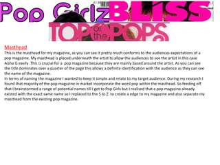
- 1. Masthead This is the masthead for my magazine, as you can see it pretty much conforms to the audiences expectations of a pop magazine. My masthead is placed underneath the artist to allow the audiences to see the artist in this case Aisha G easily .This is crucial for a pop magazine because they are mainly based around the artist. As you can see the title dominates over a quarter of the page this allows a definite identification with the audience as they can see the name of the magazine. In terms of naming the magazine I wanted to keep it simple and relate to my target audience. During my research I found that majority of the pop magazine in market incorporate the word pop within the masthead. So feeding off that I brainstormed a range of potential names till I got to Pop Girls but I realised that a pop magazine already existed with the exact same name so I replaced to the S to Z to create a edge to my magazine and also separate my masthead from the existing pop magazine.
- 2. Mise- en – scene I choose to look at the front cover of my magazine to highlight the similarities and differences for the mise- en -scene of my magazine cover and Top of the pops. Firstly we can see that both images include an angle of gaze this is done to allow the audience to connect with the artist and also it attracts audiences when on the shelf ready for sale. The lighting used within the images is very neutral which reinforces that the natural girl next door look of the artists. However an aspect that challenges the conventions of the magazine is the fact that Aisha is holding her hair on the front cover. The main reason I briefed Aisha to do the particular pose is that I wanted to represent the idea of bullying subtlety as young girls tend to pull each others hairs in a nasty way when bullying other close peers therefore by briefing Aisha to do this pose on the front cover I'm getting her to own it which reflects how she's over the past and her troubles.
- 3. Costume and Props I have chosen my front cover and double page spread to show the props and the way in which they challenge and follow the conventions of a pop magazine. In both the front cover and double page spread, first thing about the costumes that you notice is the simplicity .They were picked so that they looked like the outfits that young teen girls would generally wear rather than the high end fashion labels. The main research I did before deciding on an outfit with Aisha was looking at clothing websites like next and new look to see what was on sale currently that targeted my audience. This allowed me to make an accurate choice on what Aisha should wear .In terms of make up I decided to keep Aisha look mostly fresh faced but allowed for a tiny bit of foundation just to allow for a more even skin tone and better quality of pictures.
- 4. These include the clothing stores I looked at to base Aisha's look during the photo-shoot on . All clothing stores were mentioned by 12-15 year olds teenage girls as the ones they often visit when shopping for clothes. By having Aisha wear clothing that was similar to ones that the clothing stores had in stores allows the audiences to feel that they could look like Aisha on a daily basis.
- 5. Written content The written content of my magazine is essentially conforming to the standard pop magazine article. It uses a range of language techniques to create a piece of professional writing which would make it appropriate to print however I still use conversational language to make it seem like the a normal conversation I'm having with Aisha which is a feature many pop magazines have. To spark the readers interest I have used a pull quote however looking back I could have made it more bolder by using a darker colour so it could stand out more. The written content also follows the conventions by being split into columns this is a standard presentational technique that allows the audience to read the article easily . To follow this up the font size used is 11 this again follows the conventions of a pop magazine as size 11 is the standard font size within a magazine creating that ease of reading.
- 6. The title font and style of my magazine is quite similar to existing pop magazines as it conforms the conventions because of the bold and bright coloured letters that are used this furthered by the fact I have used a standard serif font. I think that it was important that I used a standard serif font to keep the magazine look more modern overall. However I think the fact that I used three colours in text was quite unconventional and not a regular feature in pop magazine although We love pop does occasionally do it. But during the creating stage I felt that it was appropriate to use three colours.
- 7. The title font and style of my magazine is quite similar to existing pop magazines as it conforms the conventions because of the bold and bright coloured letters that are used this furthered by the fact I have used a standard serif font. I think that it was important that I used a standard serif font to keep the magazine look more modern overall. However I think the fact that I used three colours in text was quite unconventional and not a regular feature in pop magazine although We love pop does occasionally do it. But during the creating stage I felt that it was appropriate to use three colours.