

Recomendados
Más contenido relacionado
La actualidad más candente
La actualidad más candente (17)
Destacado
Destacado (19)
Similar a Mobile seo
Similar a Mobile seo (20)
Último
Último (20)
Mobile seo
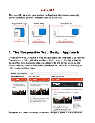
- 1. Mobile SEO There are three main approaches to develop a site targeting mobile devices (feature phones, smartphones and tablets): 1. The Responsive Web Design Approach Responsive Web Design is a Web design approach that uses CSS3 Media Queries and a fluid grid with relative units in order to display a flexible design that automatically adapts according to the device used by the visitor: mobile, smartphone, tablet, desktop, etc. without redirecting or referring to another page. The pros and cons of a responsive web design approach from a mobile
- 2. SEO perspective are: With a responsive Web design approach you won’t split link popularity among many URLs targeting the different devices and will avoid any content duplication issue, maximizing and reusing the same information by changing its format based on the device. Nonetheless, this approach would require a possible site redesign and won’t provide a highly targeted, differentiated user experience and content offering based on the used device. 2. The Dynamic Serving Approach With dynamic serving your Web server needs to respond with a different piece of HTML on the same URL depending on the user agent requesting the page: Mobile users and bots should see a mobile specific page version served on the same address than the desktop one, that should be only accessible to desktop users and search bots. The pros and cons of a dynamic serving approach from a mobile SEO
- 3. perspective are: This approach gives you the alternative of creating a specifically targeted page for each type of device if you need to (desktop, feature phone, smartphone or tablet), giving a highly targeted user experience without splitting link popularity since they’re all going to be shown through the same URL, based on the identified user agent. Nonetheless, the maintenance costs and implementation complexities can be high. 3. The Parallel Mobile Site Approach With a parallel mobile site you will create an additional mobile site URL structure targeting users accessing via mobile devices, that will be shown under the “m” subdomain. In this approach visitors and search bots that end-up in the wrong site version are 301-redirected to the correct one. For example, if a mobile user or googlebot mobile try to access the yourname.com/category page, they will be 301-redirected to the mobile version of that specific page: m.yourname.com/category. The same will happen the other way around, with desktop visitors and search bots 301- redirected to their correct desktop page version. The pros and cons of a parallel mobile site approach from a
- 4. mobile SEO perspective are: This approach is similar to the one of the dynamic serving in the sense that you can create independent and specifically targeted pieces of content, that can be totally differentiated to give the best user experience, nonetheless, in this case the pages will be shown through different URLs which can cause a link popularity split and a content duplication risk if it’s not correctly optimized (with redirections and the use of tags that will be covered later). Improve & Maximize – The Mobile SEO Recommendations As a result of the Mobile SEO audit you should create actionable Mobile SEO recommendations to improve the site mobile search visibility, traffic and conversions. Use these templates I’ve shared before to create actionable SEO audit reports by formatting the recommendations in a easy to understand document that drives accurate implementation and facilitates the follow- up. You can organize the report by including the findings from the mobile SEO audit along the following recommendations: Mobile Site Architecture Recommendations To make sure your mobile site is crawlable and indexable it’s fundamental you develop recommendations to take into considerations and fix all of the crawling errors and indexing issues found in the “How is your site crawled & indexed by mobile search engines?” research and
- 5. analysis, that also serve as an input to develop and optimize your new mobile site architecture, paying special attention to: The mobile site speed. Make sure your mobile pages load fast, taking into consideration Google’s Web performance best practices, particularly those for mobile optimization, that take into consideration mobile devices limited CPU capabilities and the high round-trip times of mobile networks. Among others, optimizing caching, defer parsing of Javascript, make landing pages redirects cacheable, minimizing round-trip times, payload size and browser rendering, etc. are some of the recommendations to have a fast site. All page elements and content are effectively displayed in mobile devices. Verify large images, javascript, videos, etc with mobile emulators such as Google’s Gomometer (or some of the others used in the previous analysis). Remember that some formats won’t be shown in most of mobile devices, such as Flash. Take also into consideration that mobile search results snippets showing titles, meta descriptions and URLs can be different and are usually shorter than for desktop. To make sure you make the most out of them with the mobile targeted keywords and you’re as concise as possible you can use the Firefox extension User Agent Switcher to easily visualize Google’s search results as a mobile device and verify how they’re displayed. It’s also fundamental to reorganize your mobile page elements in order to fit well in your most popular mobile devices screens – the ones you identified in the “What Mobile devices are used by your site visitors?” analysis–, taking into consideration these Jakob Nielsen’s mobile usability guidelines. Maintain a consistent user interface design through the Mobile & Desktop sites Although is true that you will need to reorganize your content and eliminate some elements to fit well in mobile screens is important to keep
- 6. the same design patterns and references between your Mobile and Desktop sites, that will help your users to identify and browser more easily through your mobile site. Additionally, in dependence of the type of mobile site architecture you’ve identified as the adequate for your mobile requirements and restrictions in the previous “Your Mobile Site Architecture” analysis you will need to take also into consideration some of the following recommendations: For Responsive Web Design Allow search engines to crawl pages’ assets (css, js, images). Make sure you’re not blocking these elements with your robots.txt. Use a CMS or Framework to facilitate the implementation, such as Bootstrap or Foundation and follow Google’s guidelines to use responsive Web design effectively. Since you will be using the same page for both desktop and mobile purposes it’s even more important that you check those elements that could have problems to be shown in mobile screens and the site speed. For Dynamic Serving Use the vary HTTP header “User Agent” when serving different content through the same address according to the user agent to help Googlebot discover your mobile-optimized content faster. Since you will be automatically serving your mobile and desktop content through the same URLs it’s fundamental that you verify if you’re effectively detecting the user- agents (and avoid cloaking) by on one hand, always showing the same information to your mobile visitors and search bots and, on the other, the same to your desktop visitors and search bots. Use Google Webmasters Tools Fetch as Googlebot mobile option and Screaming Frog’s crawling capabilities as Googlebot mobile, as it was shown in the “How is your site crawled & indexed by mobile search engines?” analysis. For Parallel Mobile Sites Enable a consistent Mobile URL structure under an “m” subdomain that correspond to the same desktop version structure. For example, the mobile version of yourname.com/category will be m.yourname.com/category.
- 7. Use 301-redirects in all of the site pages to refer mobile users and bots accessing a desktop page version to its mobile version and viceversa. For example, a mobile visitor or search bot accessing to yourname.com/category should be 301-redirected to m.yourname.com/category, and viceversa with desktop visitors and search bots (they will be redirected to the relevant desktop page when trying to access a mobile page version). Add a link rel=”alternate” tag in each of the desktop pages referring to their specific mobile versions and a link rel=”canonical” tag in all of the mobile pages referring to their desktop versions, as specified by Google, for example: Always include a link from the mobile versions to their specific desktop versions and viceversa, from each desktop page to its relevant mobile version. For example, you should include a link from the desktop site yourname.com/category to its mobile version m.yourname.com/category. Create a Mobile XML Sitemap for feature phone or smartphone and submit it to Google Webmaster Tools through the Optimization > Sitemaps functionality. Configure Google Analytics to show your full hostname, to make sure you can effectively track your mobile subdomain. Mobile Content Recommendations
- 8. It’s important to create or optimize your mobile site structure with pages that target through their different elements (title, meta descriptions, URLs, etc.) and main information (text, images, videos, etc.), by featuring: Relevant terms with the higher mobile search volume identified in the mobile keyword research you did in “Your Mobile Sector Audience” analysis that are also attractive from a business perspective. These can be a bit trickier to optimize if you’ve chosen a responsive Web design alternative and your mobile keywords are different from your desktop ones. If this is the case, then you should identify which of your desktop pages are the ones that could be also especially relevant and attractive for your mobile audience. Address and phone of each office or locality with geolocalized terms in your mobile optimized pages for local related businesses. Structured data according to Google’s specification to include your business name, products reviews, events, videos, in order to display rich snippets in the search results. To verify if you’re correctly implemented structured data on your site you can use the Structured Data Testing Tool or go to Google Webmaster’s Tool and select the Optimization > Structured Data report. Make sure to prioritize those keywords that you have already mobile visibility, traffic and conversions that you perviously identified in the “What keywords and pages are used by your mobile users to visit the site?” analysis. Mobile Popularity Recommendations If you’ve chosen the responsive Web design or dynamic serving
- 9. alternatives then you won’t need additional activity from a link popularity perspective since your mobile URLs are also your Desktop ones, which are likely already attracting links from ongoing link building campaigns (if not, make sure to start one now). Nonetheless, with the parallel mobile site approach you will need to pay more attention to create links that increase –especially at the beginning– the specific mobile site structure authority. To establish a strategy that will help you to increase your mobile site authority according to your present situation take into consideration what you’ve found previously in “Your Mobile Search Popularity” analysis, the volume, type, authority, sources and trends of your incoming links compared to your competitors. A couple of good ways to do it, particularly for mobile and local services and products, are: Earning citations and references from local media, events or organizations and your online community. Creating a Google+ for Business page, that will also help you to earn more visibility in local related search results.
- 10. alternatives then you won’t need additional activity from a link popularity perspective since your mobile URLs are also your Desktop ones, which are likely already attracting links from ongoing link building campaigns (if not, make sure to start one now). Nonetheless, with the parallel mobile site approach you will need to pay more attention to create links that increase –especially at the beginning– the specific mobile site structure authority. To establish a strategy that will help you to increase your mobile site authority according to your present situation take into consideration what you’ve found previously in “Your Mobile Search Popularity” analysis, the volume, type, authority, sources and trends of your incoming links compared to your competitors. A couple of good ways to do it, particularly for mobile and local services and products, are: Earning citations and references from local media, events or organizations and your online community. Creating a Google+ for Business page, that will also help you to earn more visibility in local related search results.