UI:UX Design and Empowerment Strategies for Underprivileged Transgender Indiv...
Prelim R&P of Similar Products
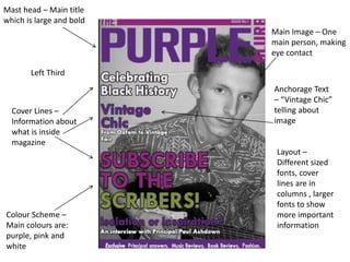
1. Mast head – Main title
which is large and bold
Left Third
Cover Lines –
Information about
what is inside
magazine
Main Image – One
main person, making
eye contact
Anchorage Text
– “Vintage Chic”
telling about
image
Colour Scheme –
Main colours are:
purple, pink and
white
Layout –
Different sized
fonts, cover
lines are in
columns , larger
fonts to show
more important
information
2. Mast head –
Contents heading,
which includes the
same colour theme
Bold sub headings –
most important bits
information in the
magazine
Images – 4 Different
sized images and
different shots
House style – Colour
scheme from title
page is kept the
same on contents
3. Mast head – Large
bold title which
grabs your attention
Left Third
Cover Lines –
Information about
magazine content
Colour Scheme –
Main colours are:
blue, green, white
and brown
Main Image – One
main person, but
they are not making
eye contact
Layout –
Heading and
sub-headings
bold whereas
the text is not.
Layout is like a
conventional
magazine with
the left third
mast head and
a main image.
4. Mast head –
Contents heading
large and bold, gets
the readers
attention
Editor Image –
contains the image
of the editor and
information about
them
Images – 2 Different
sized images and
different shots; one
of the editor and
one of the students
House style – Colour
scheme is different
to the front page
because green, blue
and brown.