SlideShare una empresa de Scribd logo
1 de 23
Descargar para leer sin conexión
Be future friendly
     Be device agnostic!


Responsive Design is a set of practices rather than a technology choice.

Netbiscuits’ technology simplifies Responsive Design practices with
specialisation on mobile. We call it Responsive Mobile Design.


                                   1
Content based on
            White Paper to come in
            September 2012.
            By Stephan Haux, Head of
            Product Development at
            Netbiscuits.


        2
What is Responsive Design?
 • In May 2010, Boston designer Ethan Marcotte coined it in
   his article on “A List Apart”:

 "Mobile browsing is expected to outpace desktop-based
 access within three to five years (…). In short, we're faced with
 a greater number of devices, input modes, and browsers than
 ever before (…) how can we - and our designs- adapt?"

 • The evolution of screen sizes 

 • Many web users are mobile only

 • 80+% of web users browse the internet on mobile


                                    3
Mobile Forecasts


2.1bn+ mobile devices with HTML5 browsers by
                    2016
                       4
Purpose of RMD
Responsive Mobile Design focuses on solving three core issues:

1. displaying the right sized images for a screen using CSS
   “media queries”; 

2. developing one single layout that can self-adapt on the
   client-side for any browser, in many cases by reusing the
   desktop version of a site in the mobile realm using CSS; 

3. hiding inappropriate content from devices that can’t display
   it using CSS and adaptive markup components.

A stepstone towards the mythical One Web!


                                 5
Reality Check
Reality tells us three things:

1. CSS and Javascript does not work uniformly on all OS/
   browsers (HTML Standards issue)

2. Adaptive markup assumes that devices have have uniform
   capabilities. Reality is massive hardware fragmentation in
   screen sizes, browser capabilities and processor speeds; 

3. Higher implementation cost with building and
   maintenance effort through traditional implementation using
   the CSS3 and media query approach


                                 6
The many faces of the
  little green robot


  Testing on 400+ Android devices that matter


                                      http://t.co/Oepit10b
                       7
4,000 android flavours


      Source: Open Signal Maps

                   8
4,000 android flavours


      Source: Open Signal Maps

                   9
4,000 android flavours


      Source: Open Signal Maps

                   10
4,000 android flavours


      Source: Open Signal Maps

                   11
4,000 android flavours


      Source: Open Signal Maps

                   12
Necessity of RMD
What stakeholders are expecting:
1. For advertisers, responsive mobile website is the answer
   to keep costs low in long term
2. For developers, responsive mobile website reduces
   work load by ensuring information integrity (update one
   website version and not multiple versions) and scalable
   functionality that works in cross devices
3. For brand ambassadors, responsive mobile website is
   the answer (to help) keep the look-and-feel consistent in
   digital communication.


                              13
Necessity of RMD
From a practical perspective:
• To provide seamless windows Size
  management: 
  • On devices, windows are not resizable. 
  • But there are many screen sizes and
    aspect ratios
• To manage display/orientation change
  • it happens all the time on mobile, never
    on desktop
• To optimise media queries on the fly
  over 3G


                             14
Necessity of RMD
To handle various input methods in a mouse-
less context
• Keyboards
• Track balls
• Single touch screens (stylus devices, kiosk
  systems)
• Multi-touch screens (smartphones + tablets)
• Camera + Microphone (tablets, smart TV)
• Haptic sensors
• other still unknown features!


                        15
Nextgen devices?


        16
Necessity of RMD
To address the specificities of Mobile Usage 

• Shorter attention span

• Mono tasking requires responsive services

• Couch & bed friendly ergonomics

• Single handed mode (Thumb)

• Short, focused, linear experience

• Interface/Content caching between online/offline environments 

=> Mobile UX/UI specialists wanted!


                                      17
Best Practices
• Hierarchy of Importance
• Content First
• Think Modules
• Fluid Framework / In-content adaptation
• Multi Touch / Gesture enabled
• Responsive Environment Settings
• Adaptive navigation
• Seamless Browsing Experience
=> That's what we are capitalising and putting into our
technology.


                                  18
Netbiscuits Approach
• Netbiscuits aims to focus on addressing responsive
  design issues especially across mobile and multi-
  touch devices.

• Netbiscuits is a SaaS platform which delivers all the
  components that is needed to build a responsive
  mobile experience:

     • Device adaptive Mark-Up (BiscuitML technology
       for device compatible code generation)

     • Device adaptive CSS and Javascript. We
       deliver just the right code payload

     • Media queries optimisation and caching


                                     19
Netbiscuits Tactile FW
• Netbiscuits has an integrated Tactile framework, an extension of the
  Netbiscuits platform, which is designed to bring out more from multi-
  touch enabled browsers on supported connected devices.

• Components:
     • Layout Manager
     • An extensible Javascript Framework
     • A CSS Processor
     • Device Information Service
     • Extra features:
        • Image Scaler
        • Location Awareness


                                     20
Benefits of RMD with

• Framework = Responsive Mobile
  Design Made easy

• Affordable and cost effective 

• Cloud = Scalability and sustainability

• True and unprecedented device
  agnosticism 

• Fits with the SOA architecture of your
  Digital Delivery platform

                             21
How to?
• Synch with your IT on ...
    • SOA Architecture (SAP & co layer)
    • Digital Delivery Platform = CMS layer + Rendering Engine
• Define your multi-device strategy ...
    • Get UX specialists on board
    • Scope and plan your project roadmap
• Execute with ...
    • best-in-class technology: Netbiscuits
    • top skills: Our solution partners


                              22
Thank You!
Lucas Challamel - ANZ Country Manager
T: 04 1014 1795 - E: l.challamel@netbiscuits.com


                 @netbiscuitsAPAC


                        23

Más contenido relacionado

Destacado

Designing Brand Breakthroughs In The Cognitive Era
Designing Brand Breakthroughs In The Cognitive EraDesigning Brand Breakthroughs In The Cognitive Era
Designing Brand Breakthroughs In The Cognitive Era
Joanna Peña-Bickley
 
From Desktop to Mobile: Application Functionality for Small Screens
From Desktop to Mobile: Application Functionality for Small ScreensFrom Desktop to Mobile: Application Functionality for Small Screens
From Desktop to Mobile: Application Functionality for Small Screens
Joseph Labrecque
 

Destacado (16)

Designing Brand Breakthroughs In The Cognitive Era
Designing Brand Breakthroughs In The Cognitive EraDesigning Brand Breakthroughs In The Cognitive Era
Designing Brand Breakthroughs In The Cognitive Era
 
Talk: Cognitive Storytelling In The 4th Dimension - How Would Orson Welles Ta...
Talk: Cognitive Storytelling In The 4th Dimension - How Would Orson Welles Ta...Talk: Cognitive Storytelling In The 4th Dimension - How Would Orson Welles Ta...
Talk: Cognitive Storytelling In The 4th Dimension - How Would Orson Welles Ta...
 
The next wave of innovation in social media
The next wave of innovation in social mediaThe next wave of innovation in social media
The next wave of innovation in social media
 
From Desktop to Mobile: Application Functionality for Small Screens
From Desktop to Mobile: Application Functionality for Small ScreensFrom Desktop to Mobile: Application Functionality for Small Screens
From Desktop to Mobile: Application Functionality for Small Screens
 
The Internet of Things: Designing for Magical Moments of Truth
The Internet of Things: Designing for Magical Moments of TruthThe Internet of Things: Designing for Magical Moments of Truth
The Internet of Things: Designing for Magical Moments of Truth
 
Multiple Design Strategies for Multiple Screens
Multiple Design Strategies for Multiple ScreensMultiple Design Strategies for Multiple Screens
Multiple Design Strategies for Multiple Screens
 
Emerging Media Trends
Emerging Media TrendsEmerging Media Trends
Emerging Media Trends
 
Multiscreen Experience Design (short presentation, English)
Multiscreen Experience Design (short presentation, English)Multiscreen Experience Design (short presentation, English)
Multiscreen Experience Design (short presentation, English)
 
Designing and developing products for multiple platforms
Designing and developing products for multiple platformsDesigning and developing products for multiple platforms
Designing and developing products for multiple platforms
 
Second Screen Strategy: Planning For (And Against) A Multi-Screen World
Second Screen Strategy: Planning For (And Against) A Multi-Screen WorldSecond Screen Strategy: Planning For (And Against) A Multi-Screen World
Second Screen Strategy: Planning For (And Against) A Multi-Screen World
 
Working through Screens Idea Cards | www.FlashbulbInteraction.com/WTS.html
Working through Screens Idea Cards  |  www.FlashbulbInteraction.com/WTS.htmlWorking through Screens Idea Cards  |  www.FlashbulbInteraction.com/WTS.html
Working through Screens Idea Cards | www.FlashbulbInteraction.com/WTS.html
 
Mobile megatrends 2012
Mobile megatrends 2012Mobile megatrends 2012
Mobile megatrends 2012
 
All The Screens: Cross Platform Design Strategies
All The Screens: Cross Platform Design StrategiesAll The Screens: Cross Platform Design Strategies
All The Screens: Cross Platform Design Strategies
 
Screenager++ : Indonesia digital consumer survey 2016 - Accenture
Screenager++ : Indonesia digital consumer survey 2016 - AccentureScreenager++ : Indonesia digital consumer survey 2016 - Accenture
Screenager++ : Indonesia digital consumer survey 2016 - Accenture
 
Automobiles
AutomobilesAutomobiles
Automobiles
 
The New Multiscreen World By Google
The New Multiscreen World By GoogleThe New Multiscreen World By Google
The New Multiscreen World By Google
 

Último

Why Teams call analytics are critical to your entire business
Why Teams call analytics are critical to your entire businessWhy Teams call analytics are critical to your entire business
Why Teams call analytics are critical to your entire business
panagenda
 
+971581248768>> SAFE AND ORIGINAL ABORTION PILLS FOR SALE IN DUBAI AND ABUDHA...
+971581248768>> SAFE AND ORIGINAL ABORTION PILLS FOR SALE IN DUBAI AND ABUDHA...+971581248768>> SAFE AND ORIGINAL ABORTION PILLS FOR SALE IN DUBAI AND ABUDHA...
+971581248768>> SAFE AND ORIGINAL ABORTION PILLS FOR SALE IN DUBAI AND ABUDHA...
?#DUbAI#??##{{(☎️+971_581248768%)**%*]'#abortion pills for sale in dubai@
 

Último (20)

Manulife - Insurer Transformation Award 2024
Manulife - Insurer Transformation Award 2024Manulife - Insurer Transformation Award 2024
Manulife - Insurer Transformation Award 2024
 
Connector Corner: Accelerate revenue generation using UiPath API-centric busi...
Connector Corner: Accelerate revenue generation using UiPath API-centric busi...Connector Corner: Accelerate revenue generation using UiPath API-centric busi...
Connector Corner: Accelerate revenue generation using UiPath API-centric busi...
 
MINDCTI Revenue Release Quarter One 2024
MINDCTI Revenue Release Quarter One 2024MINDCTI Revenue Release Quarter One 2024
MINDCTI Revenue Release Quarter One 2024
 
Spring Boot vs Quarkus the ultimate battle - DevoxxUK
Spring Boot vs Quarkus the ultimate battle - DevoxxUKSpring Boot vs Quarkus the ultimate battle - DevoxxUK
Spring Boot vs Quarkus the ultimate battle - DevoxxUK
 
Axa Assurance Maroc - Insurer Innovation Award 2024
Axa Assurance Maroc - Insurer Innovation Award 2024Axa Assurance Maroc - Insurer Innovation Award 2024
Axa Assurance Maroc - Insurer Innovation Award 2024
 
CNIC Information System with Pakdata Cf In Pakistan
CNIC Information System with Pakdata Cf In PakistanCNIC Information System with Pakdata Cf In Pakistan
CNIC Information System with Pakdata Cf In Pakistan
 
2024: Domino Containers - The Next Step. News from the Domino Container commu...
2024: Domino Containers - The Next Step. News from the Domino Container commu...2024: Domino Containers - The Next Step. News from the Domino Container commu...
2024: Domino Containers - The Next Step. News from the Domino Container commu...
 
EMPOWERMENT TECHNOLOGY GRADE 11 QUARTER 2 REVIEWER
EMPOWERMENT TECHNOLOGY GRADE 11 QUARTER 2 REVIEWEREMPOWERMENT TECHNOLOGY GRADE 11 QUARTER 2 REVIEWER
EMPOWERMENT TECHNOLOGY GRADE 11 QUARTER 2 REVIEWER
 
ProductAnonymous-April2024-WinProductDiscovery-MelissaKlemke
ProductAnonymous-April2024-WinProductDiscovery-MelissaKlemkeProductAnonymous-April2024-WinProductDiscovery-MelissaKlemke
ProductAnonymous-April2024-WinProductDiscovery-MelissaKlemke
 
Cyberprint. Dark Pink Apt Group [EN].pdf
Cyberprint. Dark Pink Apt Group [EN].pdfCyberprint. Dark Pink Apt Group [EN].pdf
Cyberprint. Dark Pink Apt Group [EN].pdf
 
AWS Community Day CPH - Three problems of Terraform
AWS Community Day CPH - Three problems of TerraformAWS Community Day CPH - Three problems of Terraform
AWS Community Day CPH - Three problems of Terraform
 
Why Teams call analytics are critical to your entire business
Why Teams call analytics are critical to your entire businessWhy Teams call analytics are critical to your entire business
Why Teams call analytics are critical to your entire business
 
FWD Group - Insurer Innovation Award 2024
FWD Group - Insurer Innovation Award 2024FWD Group - Insurer Innovation Award 2024
FWD Group - Insurer Innovation Award 2024
 
Boost Fertility New Invention Ups Success Rates.pdf
Boost Fertility New Invention Ups Success Rates.pdfBoost Fertility New Invention Ups Success Rates.pdf
Boost Fertility New Invention Ups Success Rates.pdf
 
Navigating the Deluge_ Dubai Floods and the Resilience of Dubai International...
Navigating the Deluge_ Dubai Floods and the Resilience of Dubai International...Navigating the Deluge_ Dubai Floods and the Resilience of Dubai International...
Navigating the Deluge_ Dubai Floods and the Resilience of Dubai International...
 
Strategize a Smooth Tenant-to-tenant Migration and Copilot Takeoff
Strategize a Smooth Tenant-to-tenant Migration and Copilot TakeoffStrategize a Smooth Tenant-to-tenant Migration and Copilot Takeoff
Strategize a Smooth Tenant-to-tenant Migration and Copilot Takeoff
 
Rising Above_ Dubai Floods and the Fortitude of Dubai International Airport.pdf
Rising Above_ Dubai Floods and the Fortitude of Dubai International Airport.pdfRising Above_ Dubai Floods and the Fortitude of Dubai International Airport.pdf
Rising Above_ Dubai Floods and the Fortitude of Dubai International Airport.pdf
 
[BuildWithAI] Introduction to Gemini.pdf
[BuildWithAI] Introduction to Gemini.pdf[BuildWithAI] Introduction to Gemini.pdf
[BuildWithAI] Introduction to Gemini.pdf
 
+971581248768>> SAFE AND ORIGINAL ABORTION PILLS FOR SALE IN DUBAI AND ABUDHA...
+971581248768>> SAFE AND ORIGINAL ABORTION PILLS FOR SALE IN DUBAI AND ABUDHA...+971581248768>> SAFE AND ORIGINAL ABORTION PILLS FOR SALE IN DUBAI AND ABUDHA...
+971581248768>> SAFE AND ORIGINAL ABORTION PILLS FOR SALE IN DUBAI AND ABUDHA...
 
ICT role in 21st century education and its challenges
ICT role in 21st century education and its challengesICT role in 21st century education and its challenges
ICT role in 21st century education and its challenges
 

Responsive Mobile Design with Netbiscuits

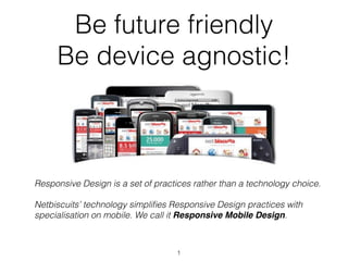
  • 1. Be future friendly Be device agnostic! Responsive Design is a set of practices rather than a technology choice. Netbiscuits’ technology simplifies Responsive Design practices with specialisation on mobile. We call it Responsive Mobile Design. 1
  • 2. Content based on White Paper to come in September 2012. By Stephan Haux, Head of Product Development at Netbiscuits. 2
  • 3. What is Responsive Design? • In May 2010, Boston designer Ethan Marcotte coined it in his article on “A List Apart”: "Mobile browsing is expected to outpace desktop-based access within three to five years (…). In short, we're faced with a greater number of devices, input modes, and browsers than ever before (…) how can we - and our designs- adapt?" • The evolution of screen sizes  • Many web users are mobile only • 80+% of web users browse the internet on mobile 3
  • 4. Mobile Forecasts 2.1bn+ mobile devices with HTML5 browsers by 2016 4
  • 5. Purpose of RMD Responsive Mobile Design focuses on solving three core issues: 1. displaying the right sized images for a screen using CSS “media queries”;  2. developing one single layout that can self-adapt on the client-side for any browser, in many cases by reusing the desktop version of a site in the mobile realm using CSS;  3. hiding inappropriate content from devices that can’t display it using CSS and adaptive markup components. A stepstone towards the mythical One Web! 5
  • 6. Reality Check Reality tells us three things: 1. CSS and Javascript does not work uniformly on all OS/ browsers (HTML Standards issue) 2. Adaptive markup assumes that devices have have uniform capabilities. Reality is massive hardware fragmentation in screen sizes, browser capabilities and processor speeds;  3. Higher implementation cost with building and maintenance effort through traditional implementation using the CSS3 and media query approach 6
  • 7. The many faces of the little green robot Testing on 400+ Android devices that matter http://t.co/Oepit10b 7
  • 8. 4,000 android flavours Source: Open Signal Maps 8
  • 9. 4,000 android flavours Source: Open Signal Maps 9
  • 10. 4,000 android flavours Source: Open Signal Maps 10
  • 11. 4,000 android flavours Source: Open Signal Maps 11
  • 12. 4,000 android flavours Source: Open Signal Maps 12
  • 13. Necessity of RMD What stakeholders are expecting: 1. For advertisers, responsive mobile website is the answer to keep costs low in long term 2. For developers, responsive mobile website reduces work load by ensuring information integrity (update one website version and not multiple versions) and scalable functionality that works in cross devices 3. For brand ambassadors, responsive mobile website is the answer (to help) keep the look-and-feel consistent in digital communication. 13
  • 14. Necessity of RMD From a practical perspective: • To provide seamless windows Size management:  • On devices, windows are not resizable.  • But there are many screen sizes and aspect ratios • To manage display/orientation change • it happens all the time on mobile, never on desktop • To optimise media queries on the fly over 3G 14
  • 15. Necessity of RMD To handle various input methods in a mouse- less context • Keyboards • Track balls • Single touch screens (stylus devices, kiosk systems) • Multi-touch screens (smartphones + tablets) • Camera + Microphone (tablets, smart TV) • Haptic sensors • other still unknown features! 15
  • 17. Necessity of RMD To address the specificities of Mobile Usage  • Shorter attention span • Mono tasking requires responsive services • Couch & bed friendly ergonomics • Single handed mode (Thumb) • Short, focused, linear experience • Interface/Content caching between online/offline environments  => Mobile UX/UI specialists wanted! 17
  • 18. Best Practices • Hierarchy of Importance • Content First • Think Modules • Fluid Framework / In-content adaptation • Multi Touch / Gesture enabled • Responsive Environment Settings • Adaptive navigation • Seamless Browsing Experience => That's what we are capitalising and putting into our technology. 18
  • 19. Netbiscuits Approach • Netbiscuits aims to focus on addressing responsive design issues especially across mobile and multi- touch devices. • Netbiscuits is a SaaS platform which delivers all the components that is needed to build a responsive mobile experience: • Device adaptive Mark-Up (BiscuitML technology for device compatible code generation) • Device adaptive CSS and Javascript. We deliver just the right code payload • Media queries optimisation and caching 19
  • 20. Netbiscuits Tactile FW • Netbiscuits has an integrated Tactile framework, an extension of the Netbiscuits platform, which is designed to bring out more from multi- touch enabled browsers on supported connected devices. • Components: • Layout Manager • An extensible Javascript Framework • A CSS Processor • Device Information Service • Extra features: • Image Scaler • Location Awareness 20
  • 21. Benefits of RMD with • Framework = Responsive Mobile Design Made easy • Affordable and cost effective  • Cloud = Scalability and sustainability • True and unprecedented device agnosticism  • Fits with the SOA architecture of your Digital Delivery platform 21
  • 22. How to? • Synch with your IT on ... • SOA Architecture (SAP & co layer) • Digital Delivery Platform = CMS layer + Rendering Engine • Define your multi-device strategy ... • Get UX specialists on board • Scope and plan your project roadmap • Execute with ... • best-in-class technology: Netbiscuits • top skills: Our solution partners 22
  • 23. Thank You! Lucas Challamel - ANZ Country Manager T: 04 1014 1795 - E: l.challamel@netbiscuits.com @netbiscuitsAPAC 23