Responsive & Adaptive Design @mLearnCon15 Nick Floro
•
28 recomendaciones•3,163 vistas

Responsive and adaptive designs are extremely popular in the world of mobile learning, but they are also very commonly misunderstood concepts. Today’s mobile learning professionals need to understand what responsive and adaptive designs really are in order to plan and implement them effectively with HTML5-based solutions.

Recomendados
Recomendados
Más contenido relacionado
La actualidad más candente
Destacado
Destacado (10)
Similar a Responsive & Adaptive Design @mLearnCon15 Nick Floro
Similar a Responsive & Adaptive Design @mLearnCon15 Nick Floro (20)
Más de Nick Floro
Más de Nick Floro (20)
Último
Último (20)
Responsive & Adaptive Design @mLearnCon15 Nick Floro
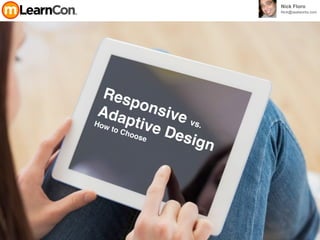
- 1. Responsive vs. Adaptive Design How to Choose Nick Floro Nick@sealworks.com
- 2. fixed width design. 900 to 1,100 pixels
- 3. SEMANTICS CSS3 3D, GRAPHICS & EFFECTS DEVICE ACCESS PERFORMANCE & INTEGRATION MULTIMEDIA OFFLINE & STORAGECONNECTIVITY
- 4. Internet Explorer 9 BETA Web Browser Based Delivery Chrome Safari Firefox Opera Edge
- 5. screen size, platform and orientation
- 9. Responsive web design is that it will fluidly change and respond to fit any screen or device size. CSS3, media queries, the @media rule, and fluid grids that use percentages to create a flexible foundation.
- 10. Adaptive Web Design uses a predefined set of layout sizes based on device screen size along with CSS and JavaScript, the AWD approach adapts to the detected device. The condensed definition of an adaptive design is that it will change to fit a predetermined set of screen and device sizes.
- 11. desktoptabletphone Think Mobile First Progressive Enhancement
- 12. Content Strategy
- 13. Performance Browser Support Content Current technology or solution in place? Time Device Orientation Things to Consider
- 14. Specifications
- 15. Selecting a Size Pixels & Aspect Ratio iPhone 4 960 x 640 iPhone 480 x 320 iPhone 5 1136 x 640
- 17. Android Xoom 1280 x 720 HTC Incredible 800 x 480 Selecting a Size Pixels & Aspect Ratio iPad 1024 x 768 iPhone 4 960 x 640iPhone 480 x 320 iPhone 5 1136-by-640 Galaxy 1280 x 720 Galaxy S4 1920 x1080
- 18. Android Xoom 1280 x 720Galaxy SIII 1280 x 720 Selecting a Size Pixels & Aspect Ratio Droid 960 x 540 Kindle Fire 7 1024 x 600 Galaxy Note 2 1280 x 720
- 19. Android Xoom 1280 x 720 Selecting a Size Pixels & Aspect Ratio iPad 4th gen + 2048 x 1536 iPad 1024 x 768
- 30. Discover Look & Play
- 31. User Interface | UI
- 32. Web Design in 2015
- 34. getskeleton.com
- 35. GetBootStrap.com
- 36. GetBootStrap.com
- 37. GetBootStrap.com
- 38. GetBootStrap.com
- 39. GetBootStrap.com
- 43. Define a Process
- 44. 3 Key Factors 1. Audience 2. Technology 3. User Stories
- 45. Mobile Factors
- 46. Form Factors
- 47. Bandwidth
- 48. Bandwidth
- 49. Input Mechanism
- 50. Context
- 52. Visual Thinking
- 55. Tools
- 59. initializr.com
- 60. Testing
- 61. Test on Mobile − iOS 7.x - 8.x − Android 4.x - 5.x − Windows 8 − Tablet vs Phablet vs Phone − Portrait vs Landscape Test on Windows 8, 7, Vista, XP - Internet Explorer 9, 10, Spartan - Firefox 28 + - Chrome 35 + Test on OS X − Safari 7, 8+ − Firefox 28 + − Chrome 335 + Testing Code
- 62. BrowserStack.com
- 67. Experiment experiment Adobe Edge Reflow creative.adobe.com/ products/reflow GetBootStrap.com Play / Test HTML Content Chrome Browser View / Developer/Developer Tools CanIUse.com Quick Browser Compatibility initializr.com Setup of Template / HTML / JS
- 68. ResourcesTo help you grow. I never look back, it only distracts from the now ~ The Incredibles
- 69. CodeSchool.com
- 70. CodeSchool.com
- 72. html5rocks.com
- 74. lynda.com
- 75. CaniUse.com
- 76. CaniUse.com
- 77. Sencha.com
- 78. POP - Prototyping on Paper | iOS App for Rapid Prototypes
- 81. Thank You Nick Floro nick@sealworks.com twitter.com/NickFloro Download the Presentation at: http://www.slideshare.net/nickfloro