
Recomendados
Más contenido relacionado
La actualidad más candente
La actualidad más candente (20)
Similar a Production of my Magazine
Similar a Production of my Magazine (20)
Último
Último (20)
Production of my Magazine
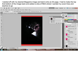
- 1. I started off with my desired Magazine image and laid it onto an A4 page. I had to make the top And bottom of the image back and added a strip of RED where I wanted my cover lines and skylines to go
- 2. I added some contrast using curves and I added some brightness using the brightness tool.
- 3. After looking at my audience feedback and I chose the most voted for font (tosca zero) and made a mast head. I wished to follow the colour pattern (red) so I coloured the font red. I decided to stretch the font across the top of the page as it followed conventions when making a mag.
- 4. Here you can see I have added LOCKDOWN (which was in the most voted for 'defused' font type) to the page. I made the font white to bring it from the dark background. I also made it very large (178 pt) so it was obvious that it was an important feature. I added a backdrop as well.
- 5. Next I added some pictures from the photo shot I had taken earlier and added them to the page. I added a flash word also which would encourage the audience to purchase the mag.
- 6. Here I have just added some information describing the anchorage text. I added a question which Again would gain the audiences attention. I followed the red colour scheme. I also used the myraid Pro font which is similar to Arial but it isn't too fancy and easy to read.
- 7. Here you can see I have added the second part of my mast head. (horror) which was 98 pt and in Tosca Zero font. I made it white to bring it away from the M. I also added a paragraph going into Further detail about LOCKDOWN.
- 8. Here you can see I have added a slogan and some other stories to the page which gives the mag Some bulk. I added the slogan so that the mad would have a separate identity.
- 9. Here I simply added a stock image of a BAR CODE and the date which is a necessity for a mag.
- 10. Perhaps the most difficult part of the mag. I needed to make more impact of the zombie so I decided to copy the background image, select only the face using the lasso tool and lay it over the background. This was a skill I developed in year 12 when I did the same with my music mag.
- 11. Here you can see I have added the cover lines and a skyline. I added information such like Upcoming films, and interviews and information about what will be featured with in the mag.