Error messaging for fun and profit
•Descargar como PPSX, PDF•
0 recomendaciones•568 vistas

Presentation given at NEOUPA's World Usability Day festivities about writing effective error messaging.

Recomendados
Más contenido relacionado
Similar a Error messaging for fun and profit
Similar a Error messaging for fun and profit (20)
Último
Último (20)
Error messaging for fun and profit
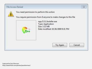
- 1. Captured by Paul Sherman http://www.flickr.com/photos/paulsherman/
- 2. Error Messaging for Fun and Profit (Possibly just profit)
- 4. Captured by Paul Sherman http://www.flickr.com/photos/paulsherman/
- 5. What’s a good error message? Avoiding the awkward conversation
- 6. Captured by Paul Sherman http://www.flickr.com/photos/paulsherman/
- 8. They make users feel ashamed.
- 9. They make users angry.
- 10. They turn your users into someone else’s users.
- 12. Be Kind
- 13. Be Clear
- 14. Be Prescriptive
- 15. Some examples to think about Please enter a ten-digit telephone number. Please enter a valid email address (like billg@microsoft.com). We’re sorry, we didn’t recognize that credit card number. Please check it and try again.
- 16. The Best Error Message of All
- 17. Why do we get it wrong? Things that get in the way Technology People Limited perspective Limited understanding of the user Resources Time Attention
- 18. In summary: Design error-free forms. When you can’t, be: Kind. Clear. Prescriptive.
- 19. Questions? Feel free to holler anytime: Abigail Plumb-Larrick abigail@plumbinformation.com @plumbinfo
Notas del editor
- How does this message make you feel? Let’s knock amusement and schadenfreude off the list.
- Watch your tone. No scolding. Avoid words like failure, fatal, illegal, catastropic, and eternal damnation. Imagine that the user is your grandmother, or a kitten. Gentle, gentle.
- What is the problem? From your perspective, what triggered the error? From the user’s perspective, where do they need to refocus their attention? Most of all, be transparent. Don’t obfuscate.
- What needs to be done? What does the user need to change? Clear doesn’t work without prescriptive.
- Build your forms so your users don’t have to guess what you want (what’s a CVV? Should my phone number have dashes? Do I format my date with the day or the month first?) and don’t make things unnecessarily hard. My personal hobbyhorse is forms that won’t accept a hyphen or an apostrophe in the name – I’m sure there are O’Malleys and D’Angelos out there who agree.