
Recomendados
Más contenido relacionado
La actualidad más candente
La actualidad más candente (19)
Destacado
Similar a U4 jou231 basic_designprinciples
Similar a U4 jou231 basic_designprinciples (20)
Más de poole7
Más de poole7 (18)
Último
Último (20)
U4 jou231 basic_designprinciples
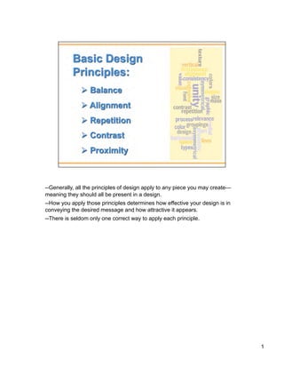
- 1. --Generally, all the principles of design apply to any piece you may create— meaning they should all be present in a design. --How you apply those principles determines how effective your design is in conveying the desired message and how attractive it appears. --There is seldom only one correct way to apply each principle. 1
- 2. ANALOGY: Try walking a long distance with a 2 pound bag of rocks in one hand and a 10 pound bag of marbles in the other. After awhile you'll be wanting to shift your load around, putting a few marbles in the rock bag to balance your load, make it easier to walk. This is how balance works in design. Balance in general is seen as equal visual weight. Visual balance comes from arranging elements on the page so no one section is heavier than the other. Or, a designer may intentionally throw elements out of balance to create tension or a certain mood. Symmetrical Balance a central axis dividing the composition in the middle, horizontally or vertically, with the same design on both sides, what we would think of as a mirror reflection. --Symmetrical balance is easiest to see in perfectly centered compositions or those with mirror images. In a design with only two elements they would be almost identical or have nearly the same visual mass. If one element was replaced by a smaller one, it could throw the page out of symmetry. To reclaim perfect symmetrical balance you might need to add or subtract or rearrange the elements so that they evenly divide the page such as a centered alignment or one that divides the page in even segments (halves, quarters). --When a design can be centered or evenly divided both vertically and horizontally it has the most complete symmetry possible. Symmetrical balance generally lends itself to more formal, orderly layouts. They often convey a sense of tranquility or familiarity or elegance or serious contemplation. Asymmetrical design typically off-center or created with an odd or mismatched number of disparate elements. However, you can still have an interesting design without perfect symmetry. --With asymmetrical balance you are evenly distributing the elements within the format which may mean balancing a large photo with several small graphics. Or, you can create tension by intentionally avoiding balance. --Uneven elements present us with more possibilities for arranging the page and creating interesting designs than perfectly symmetrical objects. Asymmetrical layouts are generally more dynamic and by intentionally ignoring balance the designer can create tension, express movement, or convey a mood (anger, excitement, joy, amusement) Radial Balance Parts of design are arranged so that they are balanced across the width and length of the page unless intentionally aiming for lack of balance. --On square and rectangular pages we generally place elements in orderly rows and columns. With radial designs the elements radiate from or swirl around in a circular or spiral path. 2
- 3. ANALOGY: Can you imagine how difficult it would be to find your car in a crowded parking lot if everyone ignored the parking lot stripes and parked in every which direction and angle? Imagine trying to get out of there! Alignment brings order to chaos, in a parking lot and on a piece of paper. How you align type and graphics on a page and in relation to each other can make your layout easier or more difficult to read, foster familiarity, or bring excitement to a stale design. Alignment is the placement of text and graphics so they line up on the page. It's one of the principles of design that help us create attractive, readable pages. Use alignment to: --create order --organize page elements --group items --create visual connections Good alignment is invisible. Most readers won't consciously notice that everything is lined up neatly but they will feel it when things are out of alignment. Lack of alignment creates a sloppy, unorganized look. Mixing too many alignments can have a similar effect. However, it's also OK to break alignment when it serves a specific purpose such as to intentionally create tension or draw attention to a specific element on the page. horizontal alignment In horizontal alignment left and right margins are exactly or visually equal. Horizontal alignment can be across the page or within columns. It doesn't necessarily mean center alignment. A block of flush left/ragged-right text can be aligned horizontally. Even though individual lines of text are not perfectly aligned on each side, careful attention to the amount of rag (white space at the end of the line) can result in a visually balanced amount of margin on each side of the block of text. vertical alignment In vertical alignment the top and bottom margins are exactly or visually equal. Vertical alignment can be the full page or within portions of the page. edge alignment Edge alignment lines up text or objects along top, bottom, left, or right edges. center alignment Center alignment may be horiztonally or vertically aligned, or both. visual or optical alignment Visual or optical alignment fixes some of the problems that can occur with other types of alignment due to the varying shapes of letters and graphics. In visual alignment the objects may not be precisely aligned but to the eye they appear lined up. 3
- 4. ANALOGY: What if Stop signs came in pink squares, yellow circles, or green triangles, depending on the changing whims of a town and a few of its residents? Imagine the ensuing traffic jams and accidents. Repeating design elements and consistent use of type and graphics styles within a document shows a reader where to go and helps them navigate your designs and layouts safely. Readers gain comfort from having certain elements repeat themselves at consistent intervals or in the same position. It is much easier to flip to the desired page of a magazine if the reader knows that the page number will be in the same location on every page. Specific columns or special sections of a newspaper are more readily recognized, even when they change location, if they look the same from issue to issue. Here are a few examples of how to use repetition: Use the same font for all your headlines. Use the same graphic rule at the top of all pages in a multi-page document. Put repeating elements (like page #s) in the same location on each page of a multi-page document. Consistency & Unity A grid, used consistently on all pages of a multi-page document, makes it easier for the designer to provide the consistent look that readers often expect. A carefully conceived grid system also allows the designer to introduce variations without forsaking readability or consistency. It also speeds layout because it takes the guesswork and "look back to see what we did before" out of where to place elements from one page to the next. 4
- 5. ANALOGY: On the basketball court, one pro team looks much like another. But send a few of those players for a stroll down most any major city street and something becomes apparent — those players are much taller than your average guy on the street. That's contrast. In design, big and small elements, black and white text, squares and circles, can all create contrast in design. Contrast occurs when two elements are different. The greater the difference the greater the contrast. The key to working with contrast is to make sure the differences are obvious. Contrast adds interest to the page and provides a means of emphasizing what is important or directing the reader's eye. On a page without contrast, the reader doesn't know where to look first or what is important. Contrast makes a page more interesting so the reader is more apt to pay attention to what is on the page. Contrast aids in readability by making headlines and subheadings stand out. Contrast shows what is important by making smaller or lighter elements recede on the page to allow other elements to take center stage. size Big and small elements of the same type, such as big and small images and big and small type are the most obvious uses of size to create contrast. Contrasting white space or the physical size of the piece with another element of the design is another method. value The relative lightness or darkness of two elements to each other can create a contrast in value. Whether with shades of gray or tints and shades of a single color, the further apart the values the greater the contrast. color Use harmonizing, prmary/complementary/secondary, and opposite colors to create contrast. Be careful with the value of the colors as well. For example, harmonizing colors (adjacent to each other on the color wheel) can appear washed out if there is not enough difference in the values of each color. type Type contrast can utilize size, value, and color to create contrasting typographic treatments. Add bold or italics to create contrast. Mix large type with small type. Combine serif with sans serif type to create type contrast. Set portions of text in contrasting colors or varying values. Changes in type alignment create contrast as does type spacing such as extreme kerning for headlines. 5
- 6. ANALOGY: Observe a group of people in a room. You can often learn a lot about who is listening intently to another person, which are strangers, or who is ignoring who by how close together they sit or stand. In design, proximity or closeness creates a bond between people and between elements on a page. How close together or far apart elements are placed suggests a relationship (or lack of) between otherwise disparate parts. Unity is also achieved by using a third element to connect distant parts. PROXIMITY Proximity in design simply means that objects near each other are seen as a unit. When elements that are related to each other are placed close together, they become one visual unit, reducing clutter and giving a clear structure. Organizing information into appropriate groups is one of the quickest and easiest ways to improve your designs. Often when people are getting started with design, there is a temptation to throw everything on the page and fill up every square centimeter of space with type and images. However, it makes information difficult to digest and really doesn’t look good. Using the principle of proximity, you’ll find as you group those items that have something in common, and separate those items that don’t, a clear visual hierarchy stands out on the page. Theory of Gestalt The Gestalt approach emphasizes that we perceive objects as well-organized patterns rather than separate component parts. According to this approach, when we open our eyes we do not see fractional particles in disorder. Instead, we notice larger areas with defined shapes and patterns. The "whole" that we see is something that is more structured and cohesive than a group of separate particles. proximity - how elements tend to be grouped together depending on their closeness. similarity - how items that are similar in some way tend to be grouped together. closure - how items are grouped together if they tend to complete a pattern. simplicity - how items are organized into figures according to symmetry, regularity, smoothness. White Space White space is any color. White space isn't white, literally, unless your paper is white. If the paper is yellow, the white space is yellow. White space is simply empty space - that area devoid of text and graphics. ANALOGY: Did you ever participate in that crazy college pasttime of VW Beetle stuffing? Were you ever the guy on the bottom struggling for a breath of fresh air or the last one in trying to find a place to stick your left elbow so the door will close? It wasn't comfortable, was it? Imagine trying to drive the car under those conditions. Designs that try to cram too much text and graphics onto the page are uncomfortable and may be impossible to read. White space gives your design breathing room. 6