

Recomendados
Más contenido relacionado
La actualidad más candente
La actualidad más candente (20)
Similar a Metro design language
Similar a Metro design language (20)
Último
Último (20)
Metro design language
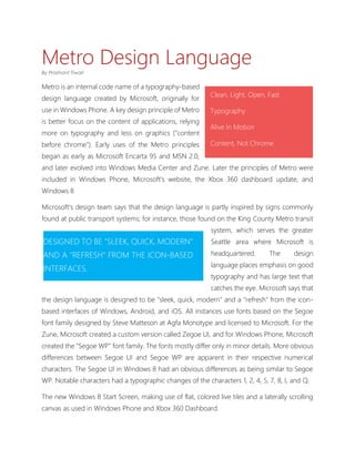
- 1. Metro Design Language By Prashant Tiwari Metro is an internal code name of a typography-based Clean, Light, Open, Fast design language created by Microsoft, originally for use in Windows Phone. A key design principle of Metro Typography is better focus on the content of applications, relying Alive In Motion more on typography and less on graphics ("content before chrome"). Early uses of the Metro principles Content, Not Chrome began as early as Microsoft Encarta 95 and MSN 2.0, and later evolved into Windows Media Center and Zune. Later the principles of Metro were included in Windows Phone, Microsoft's website, the Xbox 360 dashboard update, and Windows 8 Microsoft's design team says that the design language is partly inspired by signs commonly found at public transport systems; for instance, those found on the King County Metro transit system, which serves the greater DESIGNED TO BE "SLEEK, QUICK, MODERN" Seattle area where Microsoft is AND A "REFRESH" FROM THE ICON-BASED headquartered. The design language places emphasis on good INTERFACES. typography and has large text that catches the eye. Microsoft says that the design language is designed to be "sleek, quick, modern" and a "refresh" from the icon- based interfaces of Windows, Android, and iOS. All instances use fonts based on the Segoe font family designed by Steve Matteson at Agfa Monotype and licensed to Microsoft. For the Zune, Microsoft created a custom version called Zegoe UI, and for Windows Phone, Microsoft created the "Segoe WP" font family. The fonts mostly differ only in minor details. More obvious differences between Segoe UI and Segoe WP are apparent in their respective numerical characters. The Segoe UI in Windows 8 had an obvious differences as being similar to Segoe WP. Notable characters had a typographic changes of the characters 1, 2, 4, 5, 7, 8, I, and Q. The new Windows 8 Start Screen, making use of flat, colored live tiles and a laterally scrolling canvas as used in Windows Phone and Xbox 360 Dashboard.
- 2. F IGURE 1: W INDOWS 8 S TART S CREEN The design language was designed specifically to consolidate groups of common tasks to speed up usage. This is accomplished by excluding superfluous graphics and instead relying on the actual content to also function as the main UI. The resulting interfaces favor larger hubs over smaller buttons and often feature laterally scrolling canvases. Page titles are usually large and consequently also take advantage of lateral scrolling. Animation plays a large part, with transitions, and user interactions such as presses or swipes recommended to always be acknowledged by some form of natural animation or motion. This is intended to give the user the impression that the UI is "alive" and responsive, with "an added sense of depth. “ Internally, Microsoft has compiled a list of principles as core to the design language. Close to the official launch date of Windows 8 (October 26, 2012), more developers and Microsoft partners started working on creating new Metro applications, and many websites with resources related to this topic have been created, as well as the Microsoft's UX guidelines for Windows Store Apps. Early response to Metro was F IGURE 2: W INDOWS P HONE 8 S TART S CREEN generally positive. In a review of the Zune HD, Engadget said, "Microsoft continues its push towards big, big typography here, providing a sophisticated, neatly designed layout that's almost as functional
- 3. as it is attractive." CNET complimented the design language, saying, "It’s a bit more daring and informal than the tight, sterile icon grids and Rolodex menus of the iPhone and iPod Touch." The Industrial Designers Society of America (IDEA) awarded Windows Phone, which uses the UI, the "People's Choice Design" gold award as well as the "Best in Show" award. Isabel Ancona, the User Experience Consultant at IDEA, explained why Windows Phone won this award and explains the user experience of Metro: While the Metro-style interface introduced in Windows 8 was designed to be user-friendly on tablets, it is less accommodating for THE INNOVATION HERE IS THE FLUIDITY OF a desktop, and less customizable EXPERIENCE AND FOCUS ON THE DATA, than its predecessors. Users have WITHOUT USING TRADITIONAL USER particularly disapproved of the removal of the Windows Start menu INTERFACE CONVENTIONS OF WINDOWS that users are acclimated to as it has AND FRAMES. DATA BECOMES THE VISUAL been featured in all versions of ELEMENTS AND CONTROLS. SIMPLE Windows since Windows 95. In GESTURES AND TRANSITIONS GUIDE THE previous versions of Windows, the USER DEEPER INTO CONTENT. A TRULY Start menu provided a more ELEGANT AND UNIQUE EXPERIENCE. convenient way for novice and experienced users alike to launch programs and applications. Some reviews argue that Microsoft's decision to ditch Aero is the result of a conscious effort to reduce usage of system GPU resources and to prolong battery life, in order to target tablet market rather than its traditional desktop user base. In addition to removing the Start Menu, Windows 8 takes a more modal approach with its use of full-screen apps that steer away from reliance on the icon-based desktop interface. In doing so; however, Microsoft has shifted its focus away from multitasking and business productivity.