2. Among the brand identities featured in this issue Once that was approval was granted, the company the wordmark, and no circles. Yet other pages
are Primerica, Cable & Wireless Communications, unveiled its new brand mark: the wordmark feature the wordmark and part of the circles used
Yellow Pages (Canada), Everything Everywhere, surrounded by a swirl of multi-coloured circles. as a graphic element. Finally, some pages have
CNO Inc., Australia Unlimited, Hong Kong, no brand identity marks at all and their sites listed
and Astral. There are a couple of interesting points in all this. by country are still branded as Fortis.
First, the deliberate step the company took in
Update Sometimes, after a brand identity is unveiling its new name and brand identity. It’s not One gets the distinct impression they do not know
featured in this newsletter, more information clear exactly what was gained by unveiling part what to do with their new brand identity.
becomes available. Either the rationale for the of the new brand identity, but not the full mark.
rebranding is explained further or more aspects of Why not just state what the new name will be and ageas.com
the branding are revealed. This is usually not leave the launch of the whole brand identity until
remarked upon, since it is usually not remarkable. later? Or, on the other hand, show the full mark
Ageas, however, is an interesting exception. right from the start?
The last issue featured the new name and brand The other puzzling aspect is that they actually use
identity for Fortis, a European casualty of the both the wordmark on its own, and the wordmark
financial sector meltdown. The issue showed the surrounded by the circles. One gets the sense
wordmark that was unveiled with the announce- they don’t really know what to do. Click through
ment that the company would change its name to their web site. You will find some pages with the
Ageas, pending shareholder approval in April. wordmark inside the circles. Other pages have
NEW IDENTITY ALERT An occasional survey of new corporate brand identities PAGE 2
June 2010 compiled from on-line news sources by Method Branding. methodbranding.com
3. Pre vious Br AND iDeNtit y
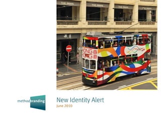
A u s T R A L I A On May 14, the Australian Trade Comment When Toronto unveiled its Unlimited pineapples in Toronto. The Australia Unlimited
Minister, Simon Crean, unveiled the country’s brand five years ago (see New Identity Alert, July mark does not have much to commend (though it
new brand, Australia Unlimited. The objective of 2005), it was roundly criticized as vacuous, and is better than Toronto’s). Those are apparently
the new brand, the minister stated, was to sell poorly executed. So now Australia has produced its boomerangs, though they look more like brackets,
Australia to the world as a great place do business, own spin at being unlimited. Have they fared which speak to containment, not to Unlimited.
not just as a holiday destination. The press release better? On the whole, no. One understands that the And then, what exactly does the white line through
announcing the new brand stated that as part of kangaroo brand was a tourism-focused brand the right bracket signify? Branding is about differ-
the branding process, eight concepts were tested in which did little to help trade, or economic develop- entiating yourself. Australia Unlimited fails because
14 countries (including Australia), with about 1,000 ment for Australia. But this new brand identity it does not create a unique brand; and worse, by
interviews in each country. won’t help much either. The problems begin with being so ordinary, it demonstrates the limits of
the basic idea of unlimited, which of course, is silly. this brand.
Nothing is without limits. Imagine building a ski
resort in Australia. This is as realistic as growing brandaustralia.gov.au
NEW IDENTITY ALERT An occasional survey of new corporate brand identities PAGE 3
June 2010 compiled from on-line news sources by Method Branding. methodbranding.com
4. Pre vious Br AND iDeNtit y
H o N g Ko N g A revitalized city brand – “a Comment This is unfortunate. Not so much Even after nine years, the original brand identity
refreshed dragon icon” – was launched by Hong because it is that terrible (it isn’t), but because it appeared fresh and relevant, at least from this
Kong at the end of March. The new brand identity is is an evolution of one of the best place brand side of the world. If there was a need to tinker, they
said to represent five core values “that Hong Kong identities. It is, also, an evolution that is inferior to should have worked with the other elements
people cherish and aspire to: Free, Enterprising, the original. The dragon, a wonderful metaphor around the dragon and logotype, upgrading how
Excellence, Innovative and Quality Living.” The for that city, has been dramatically reduced in it is presented without touching the dragon
original dragon brand identity was first launched favour of ribbons. The ribbons would have been and logotype.
in May 2001. In addition to a new Brand Hong Kong fine as supporting graphic elements, but don’t tell
web site, another site, facesofhongkong.com, as compelling a story as the dragon does. brandhk.gov.hk
has also been launched which invites the global facesofhongkong.com
audience to visit and learn about local people and The previous brand identity was applied in a
listen to their stories. It also encourages Hong Kong similar fashion, with ribbons of colour as support-
residents to post their own photographs. ing graphic elements, and was vibrant and lively.
NEW IDENTITY ALERT An occasional survey of new corporate brand identities PAGE 4
June 2010 compiled from on-line news sources by Method Branding. methodbranding.com
5. Pre vious Br AND iDeNtit y
C A B L E & W I R E L E ss Co M M u N I C AT I o N s Comment This is perplexing. Billed as a either. On the other hand, the most fascinating part
The end of March saw the launch of the new brand “demerger” the company essentially retains its of the new brand identity is the various icons and
identity for part of the troubled Cable & Wireless, old name (technically, it was previously Cable drawings on the web site. Looking like a Spirograph
which has split into two (the other part is Cable & & Wireless International), and describes its new gone crazy, they are nonetheless quite inventive
Wireless Worldwide, the fibre network and large symbol as “an evolution of the iconic Cable and arresting. From drawings of a hand, landscape,
telecom systems supplier). Cable & Wireless & Wireless ‘blue globe’ logo, which has been in flower and profiles, to phone icons, these graphics
Communications is a full-service telecommunica- existence as the Group identity since 1986.” Both are quite unique and add a dimension to the web
tions business, operating in the Caribbean, companies are still Cable & Wireless (the other site not found elsewhere.
Panama, Macau, Monaco and islands in the Indian opting for a Crate and Barrel look-alike wordmark).
Ocean, South Atlantic and the English Channel. The new symbol for this half of Cable & Wireless is cwc.com
The company is based in London. also not quite ground-breaking, bearing a resem- cw.com
blance to the Barclaycard symbol. The typographic
style selected for the logotype does not work
NEW IDENTITY ALERT An occasional survey of new corporate brand identities PAGE 5
June 2010 compiled from on-line news sources by Method Branding. methodbranding.com
6. Pre vious Br AND iDeNtit y
P R I M E R I C A More fallout from the financial to gain financial independence.” Primerica sells an upscale brand. It is firmly rooted as a “meat
services meltdown of two years ago has resulted in term life insurance, annuities, mutual funds and and potatoes” brand identity, serving middle
Citigroup disposing of its insurance subsidiary, other financial products, and also claim they insure income customers. This is further reinforced by
Primerica, to a private equity company this past more than 4.3 million lives. the company’s web site, which features straightfor-
April. As a result, Primerica recently launched its ward, simple images and a simple design with
new brand identity. Headquartered in Duluth, Comment Strong, simple and red, white and blue. large, clean type. This is a company that knows
Georgia, the company claims it is the largest What else could be expected for this insurance who it is, even if one of its executives got a bit over
independent financial services marketing company company? The tight interlocking rings are hardly enthusiastic at the brand launch.
in North America, with approximately 100,000 original (quick, how many other brands use this
licensed sales representatives. Primerica identifies device, not including the Olympics and Audi?), primerica.com
its primary market as “middle income families by but are still apropos in this context. With the rings’
helping them make informed financial decisions black outline and the straightforward black logo-
and providing them with the strategies and means type, the brand identity does not pretend to being
NEW IDENTITY ALERT An occasional survey of new corporate brand identities PAGE 6
June 2010 compiled from on-line news sources by Method Branding. methodbranding.com
7. Pre vious Br AND iDeNtit y
C N o F I N A N C I A L g R o u P At their annual Comment For a financial services holding company, Still, it is not clear why they could not have simply
meeting in May, shareholders approved changing the new brand identity is more appropriate than rebranded, remaining as Conseco. What is not
the name of the company from Conseco, Inc. to the previous “stairway to heaven” symbol. It known is whether prior to being renamed, the
CNO Financial Group, Inc. A holding company, it certainly is not as retail-focused as the marks for company was referred to as Conseco or as CNO,
operates mainly through three insurance subsidiar- their operating subsidiaries. The new symbol, while their New York Stock Exchange ticker symbol. One
ies: Bankers Life and Casualty Company, Colonial more “holding-company-like” is also both some- can only assume that outside of a small group of
Penn Life Insurance Company and Washington what ordinary and a bit silly. Did they really have to institutional investors, most of their stakeholders
National Insurance Company. Based in Carmel, place the letter O inside a lowercase N inside the referred to them as Conseco.
Indiana, CNO describes itself as serving “working letter C? The overall effect is a symbol with ele-
American families and seniors by helping them ments that are not quite balanced, with the outside cnoinc.com
protect against financial adversity and provide for blue strokes (the letter C) appearing thinner than
a more secure retirement.” the inside areas.
NEW IDENTITY ALERT An occasional survey of new corporate brand identities PAGE 7
June 2010 compiled from on-line news sources by Method Branding. methodbranding.com
8. Pre vious Br AND iDeNtit y
Co R E Lo g I C Previously the information solu- Comment The press release credits Dutch artist being dynamic and is more inline with supporting
tions group of The First American Corporation, this M.C. Escher for inspiration for the new symbol, the name. The company’s web site and collateral
company began trading at the beginning of the and says it communicates the brand promise of material, with a series of angular shapes emulating
month as CoreLogic. The company describes itself “Dynamic Insights.” Well at least they didn’t refer to the symbol, is well done. This just demonstrates,
as “a leading provider of consumer, financial and thinking outside of the box. But this is a well as opposed to the CNO symbol on the previous
property information, analytics and services to designed brand identity and an improvement over page, that it is possible to have a well designed
business and government…and is a recognized the previous one. The symbol may really not symbol based on the letter C.
leading provider of mortgage and automotive credit communicate dynamic insights, and it may not be
reporting, property tax, valuation, flood determina- the most original concept, but it does work well corelogic.com
tion, and geospatial analytics and services.” Based with the name. It does communicate logic, and the
in Santa Ana, California, CoreLogic says it has over grey triangles and red diamond shape all sharing
10,000 employees globally with revenues of $2.0 the same point at the centre certainly also commu-
billion in 2009. nicates core. Even the logotype has less to do with
NEW IDENTITY ALERT An occasional survey of new corporate brand identities PAGE 8
June 2010 compiled from on-line news sources by Method Branding. methodbranding.com
9. Pre vious Br AND iDeNtit y
s A P I E N s This provider of insurance software Comment This is a good example of forgettable companies would present itself in a more sophisti-
solutions launched its new brand identity last design. While certainly better that the previous cated and creative manner. This either did not occur
month. This follows the recent acquisition of mark, it is not very good. What exactly is that to them, or if it did, they failed miserably.
another insurance software developer. Sapiens swoosh on the letter A? What is it trying to commu-
describes itself as “a leading global provider of nicate? It is also poorly done, beginning by overlap- sapiens.com
business solutions for the insurance industry, ping the letter S and ending just past the right
helping modernize business processes and en- diagonal stroke of the letter A. In the final analysis,
abling insurance organizations to adapt quickly to all it communicates is simply a bad cliché, just like
change.” Based in Rehovot, Israel (which is located the chess set photographs used on their web site.
just south of Tel Aviv) and with offices in North One would have thought that a company creating
Carolina, England and Japan, Sapiens serves its sophisticated software for large, global insurance
customers in North America, Europe, the Middle
East and Asia.
NEW IDENTITY ALERT An occasional survey of new corporate brand identities PAGE 9
June 2010 compiled from on-line news sources by Method Branding. methodbranding.com
10. Pre vious Br AND iDeNtit y
Co L L I E R s I N T E R N AT I o N A L This global Comment This brand evolution follows on the positive step. (A square would have been more
real estate company unveiled its refreshed brand heels of the new brand identity launched by a interesting, but then the mark would be encroach-
identity this past April. Colliers International number of high profile break-away Collier offices ing into American Express’ look.) If anything can
describes itself as the third largest commercial real (see Cassidy Turley, New Identity Alert, March be criticized about this evolution, it is the shape.
estate firm and as “a global affiliation of indepen- 2010). This is a well done evolution of their previ- One wonders what other options they explored and
dently owned commercial real estate firms.” ous brand identity mark. Even without the gradient, could have settled on. Certainly there are other
Based in Seattle, Colliers claims it has 12,700 the blue area is lighter, and a bit more energetic. possibilities that would not have given the new
employees in 294 offices in 61 countries, and that The ratio of blue to the yellow/blue/red stripes is mark the look of a label. The double-edged sword
it manages 1.1 billion square feet, with revenues of now more dynamic and the rectangle’s round of rounded corners.
$1.6 billion. It is a subsidiary of FirstService Corpo- corners give the mark some humanity. This more
ration, whose FirstService Real Estate Advisors approachable look is principally communicated by colliers.com
(FirstService REA) was brought under the Colliers the upper and lowercase Colliers. The overall shape
umbrella earlier this year. is not as tall as the previous mark, which is also a
NEW IDENTITY ALERT An occasional survey of new corporate brand identities PAGE 10
June 2010 compiled from on-line news sources by Method Branding. methodbranding.com
11. Pre vious Br AND iDeNtit y
Y E L Lo W PAg E s Canada’s Yellow Pages Group Comment Not surprisingly, part of the impetus for symbol (even the hand’s grey is not a flat colour),
launched its new brand identity this past March. the new brand identity was to remove the reference why resort to drawing the hand in a manner used
Since publishing its first directory in 1908, the to a printed directory in the symbol. Increasingly, when coarse black and white printing was the
company has become “Canada’s leading local directory searches are conducted online and on standard used for creating graphics? Also puzzling
commercial search provider and largest directory mobile devices. The “phone book” (and telephone is the large yellow area over part of the symbol and
publisher.” They publish Bell Canada’s and Telus’ booths) are increasingly anachronistic, soon to be logotype on the corporate web site. This is sloppy
directories, as well as a number of other telephone relics of the past. The new brand identity is gener- and does not add anything to the brand identity.
directories across Canada, and a number of online ally well done, with a contemporary feel. The
directories which they claim attract over 7 million symbol’s button look has a friendly, approachable ypg.com
unique visitors per month. Based in Montreal, the feel. It’s good that they resisted keeping the yellowpages.ca
company has 2,300 employees in Canada and 350 rectangle as the holding shape. One wonders,
in the United States. though, why the hand has the break to delineate
the middle finger? Given the complexity in the
NEW IDENTITY ALERT An occasional survey of new corporate brand identities PAGE 11
June 2010 compiled from on-line news sources by Method Branding. methodbranding.com
12. Br AND iDeNtities of the joiNt veNt ure PArtNers
E v E R Y T H I N g E v E R Y W H E R E The name and customer base of 30 million people, and over nothing to do with operations and everything to do
brand identity for British joint venture wireless 16,500 employees. with retail marketing. But yet, a good tag line or
company, formed by Orange and T-Mobile, was slogan is not a brand name. What has been created
unveiled mid-May. Everything Everywhere is the Comment With these two huge European telecom- is not a brand identity, just a slogan. It will be
moniker for this joint venture by French and German munications companies combining their wireless interesting to see just how these two rivals play
telecommunications companies. The press release services in Great Britain, one wonders if this is just together, and what they will concoct for the British
states the company will maintain both the Orange the “first act,” with more to come. At a quick market. For their sake, hopefully, it will be better
and T-Mobile brands, “with each brand having its glance, it doesn’t seem to make sense to merge that this effort.
own (over 700) shops, marketing campaigns, operations, but leave the market-facing brands
propositions and service centres. However, behind intact. One can’t help but wonder if in a year or so, orange.com
the scenes, the two brands will be run by one the company will announce that one or both of the t-mobile.co.uk
company, with one team and one vision…” The existing brands will be replaced (with something
company will start operations on July 1, with a new?). They also chose a new name that has
NEW IDENTITY ALERT An occasional survey of new corporate brand identities PAGE 12
June 2010 compiled from on-line news sources by Method Branding. methodbranding.com
13. Pre vious Br AND iDeNtit y
HAROLD FONDS
GREENBERG HAROLD
FUND GREENBERG
A s T R A L This Canadian media company Comment The company wanted something less the end, they have a symbol that is fractured,
launched its new brand identity late last month. corporate, that conveyed “knowledge, passion and somewhat hard to read and does not bring clarity to
Astral describes itself as Canada’s “largest broad- imagination” as well as “human warmth and their message…something a broadcaster would
caster of English- and French-language pay and emotion, within a defined and responsive structure think to be of at least some importance.
specialty television services…largest radio broad- that is grounded and resilient.” These are lofty and,
caster… and) one of Canada’s most dynamic and yes, reasonable objectives. These are also objec- astral.com
innovative outdoor advertising companies.” They tives that have not been met. The idea is there, the
also claim to operate more than 100 web sites. execution is nowhere to be found. One has to only
Based in Montreal, Astral has over 2,800 employ- consider the MSN butterfly as a symbol (also made
ees across Canada. up of several colours) that would convey what
Astral wanted. They obviously could not copy MSN,
but there are so many possibilities that would have
been superior to the letter A symbol they have. In
NEW IDENTITY ALERT An occasional survey of new corporate brand identities PAGE 13
June 2010 compiled from on-line news sources by Method Branding. methodbranding.com
14. Pre vious Br AND iDeNtit y
W I Po On April 26, the 40th anniversary of the Comment It is hard to believe that the previous intellectual activity in the industrial, scientific,
entry into force of the WIPO Convention and the brand identity was created only 40 years ago. literary or artistic fields.
10th anniversary of World Intellectual Property Day, The new brand identity is easily a huge improve-
this international organization unveiled its new ment and is also very good on its own merits. WIPO falls short, however, in the implementation
brand identity. Based in Geneva, Switzerland, the Based on the WIPO headquarters building, the of its new brand identity. The web site, for example,
World Intellectual Property Organization (WIPO) symbol is described as representing the 7 elements is a crowded mess with the symbol unnecessarily
is a specialized agency of the United Nations which of intellectual property (articulated in the WIPO jammed into the narrow white band on top of the
was founded in 1967. It describes itself as “dedi- convention): artistic performances and broadcasts; site. It is a pity that this elegant and sophisticated
cated to developing a balanced and accessible inventions in all fields of human endeavor; scien- symbol should be applied so shoddily. One would
international intellectual property (IP) system, tific discoveries; industrial designs; trademarks expect much more from an organization that should
which rewards creativity, stimulates innovation and and commercial names; protection against unfair be much more sensitive to design and
contributes to economic development while safe- competition, and all other rights resulting from “artistic” aesthetics.
guarding the public interest.”
wipo.int
NEW IDENTITY ALERT An occasional survey of new corporate brand identities PAGE 14
June 2010 compiled from on-line news sources by Method Branding. methodbranding.com