SlideShare una empresa de Scribd logo
1 de 34
Task One Critiques

                                                     Ranking: 1
                                              Username: Amos Van Alen
                                                Team: The Lost Girls
                                                    Item: Vase(s)


Photo One: A Calm in the Madness
Concept: Finding a sense of calm and normalcy despite what's around you.
Photo Two: Playing Hide n' Seek
Concept: You can try all you want. Sometimes your attempts to hide yourself or something about yourself just don't work.
Photo Three: Pouring out all your love....
Photo Four: ...only to find it wasn't worth much.
Concept: Quite self-explanatory. Many people give themselves away, only to regret it later.
Photo Five: Make it what you want.
Concept: Life isn't always what you want... but that doesn't mean you can't change it.


Head Judge Critique:

-Kris Ramos, tinaateurface: 2
          You and team Mooncat are pretty much running head to head in this competition for me. While I had trouble deciding on
which one of you to rank first for this task, I ended up ranking you lower because of some obvious technical faults with your photos.
Despite those faults though, you brought some amazing photos to the table this task and I was VERY impressed. You gave us a
variety of photos that all looked pretty professional. As with team Mooncat’s photo’s, I could see some of yours in a professional
photography or even a modeling magazine.
          The first photo was probably my least favorite one as I didn’t really understand your concept or how the vase fit in. I also
didn’t like how the vase wasn’t very prominent and was even covered up by your watermark. The globe seemed more like your object
of focus. Additionally, the model looks a tad bored looking through the book and although her legs are reaching towards a great
modeling pose, they’re just not committed enough. Pointed toes always look more graceful and model like, and they also tighten up
your calves which make your legs look amazing.
          Your second photo was very interesting and I actually like it a lot. There isn’t much to say other than, I wish the model’s
face was more visible. It’s easy enough to tear out some of the grass to thin it out a bit and create a clearer photo. Your concept is
also a bit of a stretch and I don’t really understand why the model is holding a vase to her head. There’s no doubt that it looks cool,
but this photo doesn’t really fit the task.
          I really like how your third and fourth photos are related and in the future I’d like to see sets of photos that aren’t so scattered
with numerous concepts. I’d like to see a set of photos all devoted to one concept, just taken at different angles, lighting, etc.
Technically speaking, the fourth photo far exceeds the third. The third photo is awkwardly cropped at the legs and the top of the jar.
Additionally, the angle makes the model’s legs look especially short and chunky. However, I love the flow of hearts and the model
looks both adorable and gorgeous. While the arm holding up the vase is a bit stiff and looks a tad awkward, the model’s smile is very
beautiful and genuine. You’re so close to having a perfect photo, you just need to work on some of the small details that detract.
Your forth photo is a great example of this, as it’s almost completely perfect. The model looks amazing; she’s got the sad expression
down and her right arm and hand look quite graceful. The only downfalls are that her left arm and hand do look awkward and a tad
out of place. I think if she were to have more of a grip on the vase, it would look more like that arm and hand had a purpose to be
there. Additionally, the bottom of the dress is pulled too high up which creates an allusion that the model is larger than she is. It
would be simple enough to pull the dress down and there you have it, picture perfect.
          I am absolutely and completely in love with the concept of your last photo. Pure brilliance and it looks like you took a lot of
time in preparing the rose (as well as the model’s own skin) for the photograph. I’m always impressed by effort and in all of your
photos your team went the full mile or ten. The expression on the model’s face is perfect for the photo, I only with that her hand had
been in a position that didn’t make her look so bored. This photo also has the most problems photography wise, as it seems as if every
single object or limb is cropped poorly. Just remember to capture the entire image, without cropping it off in weird areas.
          Technically, you guys have some work to do, but you have amazing ideas and the dedication. I could easily see you two
coming out on top if you continue to put this much effort and thought into your concepts and develop your technical skills.

Photography Critiques:

-Sandy, Tragidy: 1
Likes:
I loved the colors and concept in all your photos.
Photo 1. Angle
Photo 2. Nice "POP" of color
Photo 3. Very cute
Photo 4. Nice, tight frame
Photo 5. Nice background
Dislikes/Tips:
Photo 1. "Busy" photo (not a strong focal point), incorporate more of object
Photo 2. Shoot it in a different angle so that the trees aren't in the photo?
Photo 3. Either make it a tighter frame or include her feet
Photo 4. None
Photo 5. Tighter frame, show more of vase?

-Daniel, Pheregames: Unavailable for this week.

-Kaitlyn, Tyrian Purplexx: 1
I adored the conceptualization of the vase in each of these pictures. While the vase wasn’t necessarily the focal point, it added
to the composition of the photo. The first photo almost looks like a face full of flowers with the strings and random objects slicing the
frame vertically. It’s a stunning, whimsical set captured in really nice lighting. The second photo was my least favorite of the bunch
simply because the model was a little too far back in frame that the vase was almost lost. The final three photos are excellent examples
of following the rule of three, maximizing a color palate, and manipulating light to your advantage.
         This team consistently steals my heart.

Summary-
Excellent: Lighting, Color, and Thematic Expression
Needs Work: Spacial Composition (Placing model and object in frame)

-Nick Sullivan, rpgcubed: 3
       Unavailable for this week.

-Demi, DemiTHEchipmunk: Unavailable for this week.

Modeling Critiques:

-Cassandra, Anriazna: 1
           Overall I felt that this team did a very lovely job. In their first image the model’s pose was very nice and you could still see
emotion in her face despite not being able to see too much of it. I’m sure it’s just me but I was rather disappointed that while the image
is meant to be weird it took a while for me to understand that it was weird. Maybe it’s just because the colors were all so neutral (aside
from the globe) but I don’t honestly know. What I love so much about their second picture is just how much like an animal the model
looks in it. The color of her skin looks just like the grass she’s crouched in and with the natural colors of the flowers in her vase she is
really able to blend in. It’s hard for me to see the emotion in her face with all the shadowing but I can still feel a sense of her being a
predator despite this. This image is just so unearthly and I find that really awesome. This team’s third image is absolutely adorable and
the pose of the model and her expression just screams ‘grab me and cuddle me until I pop.’ Everything about her really fits with the
caption and you can honestly see her “pouring out her love.” The way that this team used little cut up hearts to demonstrate it being
poured out was very clever as well and I was impressed with this. I do wish however that we got to see the image from further back so
we could see the model’s feet or at least her right foot. We were so close to a full body shot but just missed it.
           This team’s fourth image is excellent and I love how it flows from the last image. You can see the distraught in the model’s
eyes and the tear smudges they did with the makeup really helps to enlarge the feel of the image. I also found it to be very clever how
the team kept the colorful hearts in the vase and had ‘dead’ hearts outside of the vase (although one white heart did escape). The way
that they are scattered around the model and how they fall onto her defeated hand really help to express the feel of the image. I love
her posing as well as the staging which also looks defeated with all the cracks in the ground. My one problem with this image though
is I feel like the model is holding back some emotion. It does look like she’s sad, yes, but it seems like she could look even more
sorrowful in her eyes. The team’s final image is absolutely adorable. The model’s pose is great and goes wonderfully with the theme
of their picture. From the mood of the model I can feel a sense of mere amusement from finding something simple to do to make a
rose “pretty” and she really makes it seem like she’s a child with a paintbrush (the wardrobe also enhances this illusion). I love how
they placed paint on the model to make her have more of that child-like appearance and I also noticed that there is a heart on the other
side of the vase which I find really helps to tie this image in with all the others. I do however feel like we should either be able to see
the full body of the model or have her legs be non-visible.
           What I really loved about this team was how they used their task’s item to their arsenal. They were given an empty item to
represent so they represented it by filling it with something and using that something to demonstrate the picture. Not only did this
satisfy their requirement it also helped make the picture revolve around that one item so that it fit into the image and made it flow
instead of just being an object in it. Overall this team is doing a fantastic job. The model is great at expressing emotion into her images
regardless of being able to see her eyes which are the main way of delivering emotion. She is also wonderful at posing and the team
does a great job with wardrobe as well as staging. I would say for them to just keep finding ways to make themselves better and to
keep wowing us. As I said earlier I’m positive the model can give off more emotion and captivate us more so just keep working at
that. Make sure that every image is as perfect as it can be. Another point for them to work on is cropping; this doesn’t really have to
do with the modeling part but I just wanted to point it out. In both this round and the preliminary I felt like some of the images should
have been cropped differently.

-River, Osahar: Unavailable for this week.

-Shawn Keeney, Opaque Transparency: 1
          The Lost Girls - Once again, my favorite team. I think this team did a really good job of taking good pictures that didn't tell
one full story. I think that the first picture is good, but the vase could have been a bigger part of it; the model definitely portrays being
calm well, however. The second photo I like, but it looks a little like the vase is sticking out of her head, so that might be watched in
the future. I like the connection between the third and fourth pictures and the story they tell together, and the model's face shows those
emotions nicely (maybe just a bit more angst in the fourth picture, however). The fifth picture is my favorite; just like Alice painting
the roses red. Great, great job.

-Momo, -Ninja Cat Momo-: 1
Pros!
+ The expression of your 'queen' looking down at the camera is marvelous in the first picture. Sh e looks so haughty it's amazing.
Royalty doesn't begin to explain it.
+ Her eyes in the fourth picture really sucked me in, even if I wasn't a fan of it, they're what make me say that I really can't not like it.
Cons ):
= I'm going to say first off what brought this to the worst for me; overuse of photoshop and, when not photoshopped, too much
blurring. Blurry pictures may be appropriate sometimes; the only OK use of blurring here would be your fourth picture because her
eyes are bright and focused, but even then they're way too blurry. I always feel that when someone adds too many effects/blurs, they
are trying to hide mistakes in photos. You should be confident in what you turn in and use minimal, tasteful photoshopping.
= The photos are very warm; that is, there's a LOT of yellow.
= I can't tell the personality of your queen. In the first picture, she's obviously "I'm holier than thou", but in the second she looks shy,
like a real bird. And in the last ones, I don't get queen at all. Consistency without repetition is key.
= Her eyes are gorgeous; please don't cover them up with hair! It might be 'stylish' but a LOT of the human expressions are found in
the eyes and they are essential for silent photos to 'speak' to the viewer.

-Jordan-Elizabeth, KRYST4L M3TH: Unavailable for this week.
Ranking: 2
                                               Username: Roseanne
                                                 Team: Mooncat
                                       Item: Cane(s)


Concept (as written by contestants):
          Many of us, as we grow older, start to lose sight of what it was like to be a kid. Being carefree, happy, untroubled; that kind
of thing just doesn't come easily when you have all the worries and responsibilities of an adult. We become blind to the things we once
knew how to do, like imagine and trust and believe in ourselves. When we're little, it's easy to dream big, to say we're going to be
President when we grow up, or an astronaut, or a rockstar. But realistically, hardly anybody ever gets there. People get comfortable in
their spot in life that's fallen so short of their unattainable rockstar fantasies, simultaneously resentful of the dreams that never came
true and fearful that their remaining dreams might still be aiming too high or their position might be easily tumbled. People find
themselves stuck in a day-to-day grind just to get along and before they know it they've been working at Target for 20 years when they
were only going to do it for a year or two to save up for school; they hate where they are, but they're too scared to leave because
they're used to the status quo. The responsibility is their crutch to avoid getting out and DOING something; it's the reason they never
did get back to school or started a band, they had to pay off the car, then repair the car, then there was a medical bill, then a baby, blah
blah blah. So when people get jaded and resentful of the world, it's an expression of crushed childhood dreams and the hesitation to
dare to dream again and to dare to try again. Once in a while, we've got to get out and do something CRAZY, let go of our fear and
apathy and be daring!

Head Judge Critique:

-Kris Ramos, tinaateurface: 1
          Your team really blew me away this week. The second I opened your first photo, my jaw dropped and I was squealing to my
boyfriend in excitement. “Look, oh my goddddd, my contestants are amaaazzzinnng!!!” I pretty much yelled at him. Before I even
begin to analyze your photos I want to congratulate you on turning in professional quality photos. My biggest problem with the
photos we’ve received so far is that they generally look amateur. This isn’t necessarily a problem since I understand that most of the
contestants are just starting out, but it’s really relieving when a team turns in quality photos. Honestly, I could see these in some sort
of photography magazine—they’re that good.
          I’m in love with your concept, especially since when I think of a cane, the difference between adulthood and childhood
comes to mind. I love that your background (the playground) matches your theme and your clothing and props are simple, but match
and complement your theme completely. In general, the modeling is stellar and really helps create the mood you’re going for.
          The first photo is practically perfect in both composition and modeling. I love how the model is gripping the chain and the
cane; it’s intense but manages to look beautiful rather than awkward. My only problem with your photo is that the photo is pixilated
in areas outlining the model, specifically the patch on the model’s right (our left). Other than that, spot on, gorgeous photograph. I
am very very impressed.
          The second photo is also quite amazing and happens to be my favorite by far. It’s amazingly crisp, and the framing of the
photograph is great, so props to your photographer. The model’s body language is also phenomenal. Also, this photo is a perfect
example of using photoshop to enhance and not detract from the picture. I’d like all contestants to look at this photo to see what good
photoshopping looks like. Some may think it’s a little intense, and I may agree in other circumstances, but here it perfectly matches
the mood you’re going for.
           Although I do like the variety in the third and fourth photos, the overexposure detracts from the overall impact of the photo. I
hate to say it, but I have trouble getting past glaring white light in photos, it’s simply that distracting. Try to watch for the sun and its
impact on the camera when you’re taking your photos. Just shooting from a different angle would probably solve this problem. As
for the model, she does an amazing job of using her body to convey emotion and manages to keep the cane as the focal point in both
photos. Also, major props for managing to look natural and graceful sitting down.
           The last photo, although cool looking, is where I have the most problems, the biggest being that the cane is barely in the
photo. I literally had to search for it, and when the point of the whole task is to portray your item, this is a bit of an issue. It’s also a
bit of an awkward angle since we can see up the model’s nose. Additionally, the photoshopping of the photo makes the model appear
a little too gray and washed out. However, the clouds do look awesome.
           Unfortunately, it did seem like your item was the blindfold rather than the cane, mostly due to the last photo. Next time, just
make sure that the subject of the task is always visible. Other than that, my only suggestions are to watch for sun exposure and your
angles. These are terrific photos and if you continue on this path the other contestants will have to try their very hardest to match you.

Photography Critiques:

-Sandy, Tragidy: 5
Likes:
Photo 1. Colors
Photo 2. Nice angle, colors
Photo 3. Tight frame, color
Photo 4. nice lighting
Photo 5. background
Dislikes/Tips:
Photo 1. Not a strong center of interest(slightly "busy")
Photo 2. Tighter frame
Photo 3. Strong light coming from top center
Photo 4. Strong light in top left, tighter frame
Photo 5. Where is the cane?

-Daniel, Pheregames: Unavailable for this week.

-Kaitlyn, Tyrian Purplexx: 2
         I might have ranked Mooncat first were it not for the last picture. While it is in and of itself one of my favorite pictures of the
batch this week, the concept was lost when only the teeniest tiniest bit of the cane was in the picture. Conceptually this photo set is
one of the strongest: it tells a story not only using the model but using color and movement as well. As the pictures progress from 1 to
5 the frame opens up with less and less cluttering it. That’s a powerful visual statement.

Summary-
Excellent: Lighting, Spatial Composition (expressing claustrophobia/freedom using the setting), Color
Needs Work: Attention to detail (did you see that the cane was barely in frame?)

-Nick Sullivan, rpgcubed: 1
       Unavailable for this week.

-Demi, DemiTHEchipmunk: Unavailable for this week.

Modeling Critiques:

-Cassandra, Anriazna: 2
           This team did a very lovely job all-around. Their first image was posed nicely and despite her right arm and left hand
appearing obscure it really went along with the mood of the picture. I also felt that the model did a great job at expressing emotion in
her face despite us not being able to see her eyes which is very impressive. In their second image I really love how the placement of
her left hand and her mouth help to express the model’s struggle to find her way around. I do feel that her right arm is awkwardly
placed however. Their third image is alright but I feel like there is something wrong with it however I can’t honestly seem to place
what it is that I don’t like about it. I really like this team’s fourth picture; the model’s posing is very good and the expression on the
model’s face is just perfect and helps to tell a story. My one issue is that I don’t like how her gown folds in this image and it makes it
look awkwardly bulging causing it to make it hard to tell in which direction the model’s legs are.
          Out of the set I feel like this team’s fifth image was the best they submitted. The theme of this picture is a perfect ending to
the story that was told by the other’s and her pose is great. The expression that the model has is also very nice and helps to make her
look fascinated by the cloth that had blinded her floating away. The one issue that I have with this image however is that the cane is
practically not included and you might not notice it if you weren’t looking for it. As the cane was left abandoned on the floor it made
it seem more like the item the team was doing a composite of was the blindfold. Overall this team did a wonderful job with expressing
emotion and posing. I would like to see them ensuring that there are no flaws with any of their poses in the future and also to make
sure they follow the theme in every image. Later in the competition having even one image that does not go with the round’s
requirements could be very costly.

-River, Osahar: Unavailable for this week

-Shawn Keeney, Opaque Transparency: 3
         It sounds like they really put a lot of time into their concept, which shows me they really care about this competition. I like
the idea of someone losing their way in life and how the cane kind of ties in to getting around. However, I think that the first and
second photos look a little too similar, so I would just like to tell them to make sure each frame adds something different to the story.
Also, the cane is hardly visible in the last shot, so they need to make sure that whatever is supposed to be a main part of the picture is
clearly visible and being put to use. They are turning in consistently good pictures and I still think they're front runners.

-Momo, -Ninja Cat Momo-: 2
Pros!
+ The reds stand out very well in the pictures.
+ The peeking over the shoulder in the fourth picture is simply gorgeous, absolutely stunning. It's so sultry! Her red lips look amazing.
+ The last picture, though photoshopped, has a believable unearthly glow (if that makes sense).
+ The posing in the first picture is very strong. You can see her muscles as she grips the chain, and you get a wonderful silhouette of
her outstretched arm (very flattering--especially with sleeveless things. This prevents the dreaded bunching near the armpit. Kudos to
you!!) and the outline of her dress is also wonderful, straight, and very prominent.
+ The angle in the second picture is cool, she looks very regal-- above you, even though she has her arm stretched out, and seems to be
groping around, she looks like something out of a fairytale.
Cons ):
= In picture 2, there are too many primary colors contrasting. Yellow and red isn't the best of combinations, and the greenish-blue
really sets it off.
= In the third picture, we get the around-the-armpit-bunching that I said you avoided in the first picture. Be wary of all things
strapless/thin-strapped, you get very unflattering silhouettes around your armpits if you don't pose correctly.
= In the last picture, you wouldn't even know the cane was there unless you were looking for it.

-Jordan-Elizabeth, KRYST4L M3TH: Unavailable for this week

                                                        Ranking: 3
                                                 Username: melissyRAWR
                                                      Team: Sissy Q
                                                  Item: Picture Frame(s)
Concept (as written by contestants): Our items were pictures frames. Our concept was being trapped inside of a picture
frame. Jessie learns that there is life outside of her picture frame, and slowly goes insane when she finds she cannot escape.
Head Judge Critique:

-Kris Ramos, tinaateurface: 5
          In my opinion, your team came up with the most interesting concept out of all the teams. All of your photos depict a single
concept and the progression of the model going insane is well done and obvious. Unfortunately, it was a little too obvious in some
photos. Since this is a modeling contest, it is important for your model to look attractive. Your particular model is actually quite
pretty, yet in some of your photos she really doesn’t look it. This was most evident in the last photo. I understand that she’s supposed
to look like she’s going insane, but this doesn’t necessarily mean that she needs to look, well to be frank, ugly. Let me reiterate, it’s
not your model, I don’t think anyone would look attractive making that face.
          Your first photo is probably your best photo. I love how she really looks like she’s an image in a picture frame it reminds me
of the moving pictures in Harry Potter. It’s also the best photography. Most of your other photos are cropped strangely and the
lighting is too harsh.
          You’ve got concepts and creativity down, now you just need to work on your execution. Watch your cropping and angles.

Photography Critiques:

-Sandy, Tragidy: 7
Likes:
Photo 1. concept
Photo 2. Lighting, concept
Photo 3. Lighting
Photo 4. Concept
Photo 5. Emotional appeal
Dislikes/Tips:
Photo 1. Slightly tighter frame, lighting
Photo 2. Slightly tighter frame
Photo 3. Tighter frame
Photo 4. Lighting
Photo 5. Harsh lighting, combination of Photo 3 & 4 (brainstorming?)

-Daniel, Pheregames: Unavailable for this week

-Kaitlyn, Tyrian Purplexx: 3
          I was really impressed with this teams concept and execution in all five of the photos except for the third one. It lacks the
effect of the other four because you can see the white cardboard frame around the photo frame, since the room the team was shooting
in the background. That’s a very unfortunately technical error, but the lighting in this photo also fails to live up to the exceptionally
intense lighting of the other four photos. This photo really killed the effect for me, since it removed the illusion of a frame within a
frame.

Summary
Excellent: Lighting (creating an intense mood with harsh orange light from the flash), Conceptualization (excellent use of your
object), Spacial composition (model in center frame, framed within a picture frame).
Needs Work: Attention to Detail/Professionalism, Focus (some of your pictures could use a little bit less fuzziness)

-Nick Sullivan, rpgcubed: 2
       Unavailable for this week.

-Demi, DemiTHEchipmunk: Unavailable for this week.

Modeling Critiques:

-Cassandra, Anriazna: 8
          This team I found didn’t really give too much to judge as far as posing goes as most of the images are solely head-shots with
minor bust-shots but they did alright regardless of that. Their first image is very interesting and the model did a nice job at portraying
shock and curiosity. Their second image is also good however I do not feel like the model’s pose it appropriate for the expression on
her face. Her face still says “I wonder what’s out here” but her pose says “I want to grab that.” I feel that instead she should either
have laid her arms to make it look like she’s trying to pull herself out of the picture or just reach out, still shocked that there is
something on the other side. This team’s third image I felt was the best out of their set and with just how huge the model’s head looks
it makes the image all that more adorable almost like she’s a caricature popping out of a frame. The expression is great and the posing
is very nicely done. I do have a problem with this picture however and that is the cropping. Because we can see that the model is either
behind or inside of a white box and that there is a world on the other side of the box it takes away from the impression that she is a
picture on the wall and kills the spirit of the story that these images are trying to convey. This team’s fourth image is very cute as well
and she honestly does look like she’s snapped and just wants to tear her way out of the image. I do have an issue with her left hand
however as her fingers appear obscurely placed.
          I don’t really care much for this team’s final image. I feel like because it’s the same pose as their second image it is more of a
repeat than anything else. The model’s expression is still alright but she is lacking the amount of emotion she had in the other images.
The model all-around is very good at expressing emotion and is great at using that to her arsenal so keep it up. I do feel like they need
to work a bit harder on posing better as well as portraying a theme better. While I do feel like they did a good job at working with
what they were assigned I’m afraid I would have failed to understand what it was they were going for if they didn’t have captions.
Good work however and keep on practicing with those poses.

-River, Osahar: Unavailable for this week

-Shawn Keeney, Opaque Transparency: 2
          I love the concept and I think they found a way to portray it well. I don't really have too many comments, but I would just
like to see a little more variety in facial expressions because I've seen this wide-eyed look in a lot of the pictures they given us. Also, I
appreciate that the model was really going for it in portraying going insane, but I think it could be pulled back just a bit because we
still want the face to be attractive. Overall, one of my favorites this week.
-Momo, -Ninja Cat Momo-: 6
Pros!
+ I really enjoyed the concept for this picture and feel it was executed decently.
+ The expressions are amazing here. This model has such a wonderful range! In picture one, she's obviously very curious about the
picture frame, as if she had stumbled across it. In the second picture she looks almost scared as she realizes she can, gasp! get out of it!
The third picture feels hesitant but excited. The fourth and fifth actually made me laugh--in a good way. She looks so frustrated, so
insane! Which I feel was the point.
+ The picture frame is (obviously) very prominent in each picture.
Cons ):
= The coloring is very harsh in all the photos which is what knocked me down for this. There are a lot of warm colors-- reds, purples,
pinks, yellows. I feel this would have benefited from a simple cool filter in GIMP or more blues and greens in the picture in general.
= In the third picture, there is a bit of wall showing... was this an accident? If so, why was it not cropped? I feel it takes away from the
fantasy of the photo..
= In the third picture, her head looks really, really big due to the top being cut off.

-Jordan-Elizabeth, KRYST4L M3TH: Unavailable for this week


                                                     Ranking: 4
                                           Username: Sparkly Tiara of Death
                                                Team: Team Jefferson
                                                      Item: Rope

                                                    Concept, as written by
                                                    contestants:

                                                    My entries are based on the areas of
                                                    life young girls are bound to, such
                                                    as the bindings of beauty, peer
                                                    pressure, and media displays of
                                                    feminism. Makeup being the first
                                                    variation in the theme, the second
                                                    being social issues with friends and
                                                    schoolmates, and the third based on
                                                    how the media depicts femininity.

                                                    Who says Pokemon cards aren't
                                                    cool?
Skinny b***h.


Head Judge Critique:

-Kris Ramos, tinaateurface: 4
          First off, I have to mention that I am disappointed that you turned your photos in late, even if it was only a couple of hours.
Ten days is plenty of time to take photos and turn them in. Although generally you would automatically get ranked last, I ultimately
decided to let each judge decide for themselves how your tardiness would affect their individual rankings. Luckily for you, it didn’t
seem to hurt you to harshly this week. However, rest assured that if you are late again I’m sure the judges will rank you quite low, or
you will automatically be ranked last.
          I’m sure this is no surprise to you, as the last two photos were last resort, but your first three photos stand out quite a bit
against them. I absolutely love your first photo, it’s expressive, it’s beautiful, and other than the distracting background, the
photography is pretty good. The single tear adds a beautiful touch and the model embodied the mood perfectly.
          Your second photo is also pretty good although the photography is much worse than the first one. I wish you hadn’t cropped
out half of her body and the hand in the upper left hand corner shouldn’t be there. You could’ve simply taped the signs to the door. It
also would have been cooler if there had been more signs with social expectations written on them. Although the modeling is
expressive in this photo, it looks a bit cliché and sloppy. Maybe it’s just the weird cropping and photography that takes away from the
photo.
          I like the idea of the third photo quite a bit; the model tied down by social expectations represented by the magazines about
her. Very nice idea and execution. However, the photography could obviously improve as pretty much all of her limbs are cropped at
some point. The model’s body language is alright as she sort’ve looks like she’s struggling against the chains of society, but I’m not
sure how her facial expression matches the concept.
          I’m not going to say much on the last too, since they were sent as a last resort and I’m sure why you understand they’re not
the best of photos. The fourth photo doesn’t really make any sense, and the last photo...well the model’s head is cut off.
My only other concern is that you used a scarf instead of a rope. I know that I told team Mooncat that it was okay if they
used a walking stick instead of a cane and that the item didn’t matter too much as long as it complemented your concept, but rope is
such an easy item to obtain. Please try to stick as close to the task as possible.
         Your team has a lot of potential. I really like your concepts, your model is absolutely gorgeous, and the photography isn’t
too bad. Your model needs to work on posing and expressing model while your photographer needs to watch their cropping.


Photography Critiques:

-Sandy, Tragidy: 3
Likes:
Photo 1. Lighting, concept
Photo 2. Nice concept
Photo 3. Concept, lighting
Photo 4. Concept
Photo 5. Concept/message, lighting
Dislikes/Tips:
Photo 1. Background
Photo 2. Lighting, tighter frame
Photo 3. Slightly tighter frame?
Photo 4. Lighting doesn’t quite work, busy background
Photo 5. Crop top a bit?

-Daniel, Pheregames: Unavailable for this week

-Kaitlyn, Tyrian Purplexx: 8
          Normally I would have ranked a team last for being late, but given the circumstances of the bottom two, I’ll make an
exception this time. Hopefully this team doesn’t make a habit of it.
While I wish the prop had been actual rope instead of a scarf, I can appreciate the attention to detail used in the tying of and posing of
the model as well as the incorporation of other aspects of the photo. This team really knew how to manipulate props, particularly
paper, to get a point across.
First of all, your final photo says Outtake and appears to be the same photo as the third photo, which I didn’t particularly like…but
fortunately they’re both excellent photos. The sense of discomfort conveyed by the posing of the model and even by cutting off the
model’s head in the final photo all fit with your theme. Also your choice of color was excellent: Mostly black on white. Very stark and
very intense, which went well with your peer-pressure theme.
I couldn’t really decide if I like the over-exposure of the Pokemon card picture or not, but it did have me really interested. It didn’t
really work (since it messed up the sharpness of the picture), yet somehow it brought an artistic element to everything. Interesting
idea, keep it up.

Summary-
Excellent: Lighting, Color Contrast, Prop Usage
Needs works: Being on Time, making conscious decisions

-Nick Sullivan, rpgcubed: 5
       Unavailable for this week.

-Demi, DemiTHEchipmunk:


Modeling Critiques:

-Cassandra, Anriazna: 4
         This team did a fairly decent job. I must admit that in their application and their preliminary entries I was not all too
impressed with them but they really shinned this round. Out of all the images that they submitted their first one I felt was the best. The
model’s face honestly shows agony even without the aid of the perfectly positioned tear drop which helps to show the theme of the
image. They also did a fairly good job at the makeup chain that they placed on her face helping to show what they were going for. The
model’s pose is also very nice in this image and also helps to add to the agony. I do feel however that the model should have been
holding some kind of makeup tool to help to communicate that beauty is what is binding her as it feels like it’s missing just that extra
kick that would provide. Completely unrelated to the modeling part I do have to say that whatever it is that is that bright white color
on the top middle-left is fairly distracting as it looks like the bottom of a thought bubble in a comic book. In their second image I
really love how the model’s upper body is positioned but from under her bust down it just seems awkward for some reason. I do love
how she is gripping her hair to express more of the emotion that she’s conveying with getting beaten down from all the peer pressure.
It does bug me however that we see a hand in the top left and really distracts from the appearance that those are “shout outs” instead of
just pieces of paper cut out and held against a door.
          In their third picture I felt like once again the model did a great job with posing as well as conveying emotion but compared
to her other pictures the emotion seems to have dropped a few notches. The staging is great and continues to go along with the theme
of being bound by what society says you should do. I would have liked to have seen the image zoomed out a bit more though so we
could see her entire hand and perhaps a bit more of her legs as they really seem to be cut a bit too short. That also would show off
more of the magazines to help enhance what the purpose of this picture is. This team’s fourth image is also a fairly good one but the
emotion just falters severely in this image. Another note about her posing is her right arm I feel should have been angled differently to
not make her upper arm so awkward. This team’s final picture is fairly decent and even though you cannot see her eyes the image is
cropped just right on her head and you can still feel a sense of the emotion from earlier peeking through. While I do like the model’s
pose I feel as though the image would have been better if we couldn’t see her right arm as it does look awkwardly positioned and it
also would have been nice to have the image cropped differently so that her left shoe was not cut short. This was a great image
however and I feel really captivates the struggle against the feminism demands.
          I really loved how well the model conveyed emotion in this round. Originally my main problem with her modeling was that I
just didn’t feel anything from her but she has definitely changed my mind now. She did an excellent job at expressing this round and I
would love to see more of that in their future entries. The model’s posing is also very great. This team does need to work on ensuring
that there is emotion in every single image they submit as well as trying to perfect all the poses. What did bug me about this team was
their choice to use a scarf instead of a rope. While I can understand that rope may have been unavailable with them wrapping a scarf
around the model’s neck in the first picture it just didn’t communicate bonding and just made it seem like the scarf was how she
wanted to dress instead of binding her. I do appreciate the effort though to try to follow the theme as much as they were able to instead
of just ignoring it altogether. With this team’s tardiness it did effect their scoring in my eyes but as they were only a few hours late
instead of a day late I don’t feel it should have hurt them too bad. However they will need to make sure that they are on time from now
on, especially in the later rounds.

-River, Osahar: Unavailable for this week

-Shawn Keeney, Opaque Transparency: 9
         I'm really not a fan of lateness. They had ten days to work on this, and they turn it in a few hours after the deadline. To me
that shows a little bit of last minute work, just trying to scrounge something up to submit. What's more, the pictures weren't even
amazing so that I might be able to give them the benefit of the doubt. However, they were not the worst pictures, and I did like what
they turned in previously. The fourth and fifth pictures are totally out of place however, and I wouldn't know that they had anything to
do with rope. The first picture is kind of cool, the way that the makeup looks rope-like, and I see real emotion in the model's face, plus
she kept her hands elegant. The second picture I think could have been better if she looked less sad and more frazzled or stressed, and
she could have been being pulled by the signs instead of having them just floating there. The third picture is a little out of place too.
She's not looking at or interacting with the magazines at all, so they seem like they don't have anything to do with the shot, plus she
hid her neck. Not the best work I've seen, but I think they deserve to stay.

-Momo, -Ninja Cat Momo-: 3
Pros!
+The makeup and posing and everything in the first photo really wowed me. A scarf was a really good concept for a replacement for a
rope... though I feel an actual rope should have been used, this is a good replacement and worthy in my mind because what is a scarf,
other than a comfy rope? And also the 'rope' of society is a great metaphorical one to back you up. The lighting is wonderful in the
first one as well. She seems almost to be looking to the heavens, ready to gasp... her arms are protecting her but still weak-looking,
showing her 'weak' resistance!
+ I love the hands in her hair for the second photo. A universal sign of frustration can be pulling at your hair-- and the messed up hair
shows she's been at it. Her body looks weak, held up by the arms.
+ I am not a fan of cut off body parts, but in the last photo, you have done one of the rare cases where it is acceptable-- right above the
bridge of the nose. Any lower looks awkward, and any higher, why aren't you just including the whole face? You get her wonderful
jawline here with the shadows, and almost a feeling of anonymity-- this girl could be anyone, even you-- is what I get from it.
Cons ):
= The Pokemon thing seemed kind of...random. Also, it seems to be the only one with a heavy filter on it. Why? I understand that
Pokemon might be looked down upon in society, but compared to the others, it's a little weak. Also, her left (our right) arm is very
warped from the pose; the elbow is completely shadowed.
= I feel like the expression in the third photo is a little.. meh. She looks confused, and from what I get from the others, it's more of a
battle against the ropes of society rather than the confusion of 'why am I roped?' Also, due to the black dress, her whole torso and her
hips are combined in one giant black blob.
= However, in the last picture, I wish her foot had been completely in frame and her right (back) arm hadn't disappeared behind her
body.

-Jordan-Elizabeth, KRYST4L M3TH: Unavailable for this week


                                                      Ranking: 5
                                               Username: Varlet Tanoran
                                                   Team: Deadly Duet
                                                  Item: Alarm clock(s)
Concept, as written by contestants: "What on                                                                                    earth is
this thing for?!" was the concept for our five pictures. We wanted to use the alarm clocks in ways that are not what they are normally
used for. What happens when you use one incorrectly? It A) won't work (Picture 1, 2, 3, and 4). Or B) You will hurt yourself (Picture
5).

Photo 1
Can I unplug it?
Photo 2
Can I hit it?
Photo 3
Can I shoot it?
Photo 4
Is it a foot warmer?
Photo 5
I think I'm doing this wrong...


Head Judge Critique:

-Kris Ramos, tinaateurface: 7
          My biggest problem with your photos is that they don’t really look like something you’d see in a professional photography
or modeling magazine. They aren’t horrible photos, they just look like they’re taken for recreational fun rather than for artistic value.
Additionally, I don’t really understand your concept at all. It’s confusing, messy, and could be used for pretty much any item. I was
looking for a more specific and deeper understanding of your item.
          All of your photos are too closely cropped in to really be good samples o photography, although, I am impressed that your
cropping isn’t actually bad especially considering how zoomed in you are. Your model has one of the most interesting and captivating
looks, yet I don’t think she’s using that to her potential here. She’s expressive, yet it’s too comical to be real. Her modeling simply
looks like acting.
          Compared to your other photos, there isn’t much going on in your first photo. In fact, it’s just a girl with an alarm clock. I
have no idea what I’m supposed to be getting out of it. Your second photo is definitely more interesting, but without the caption I
would have no idea what is going on. Your photos need to be able to stand on their own.
          Your third photo is my favorite. The model has a very beautiful natural smile. However, yet again, I don’t understand what
it means. Why would an alarm clock be a foot warmer? It just seems like you took a bunch of pictures with an alarm clock and then
put whatever captions to them that you could.
          The fourth has poor lighting, which isn’t exactly surprising since you are inside. I have yet to see some nice natural lighting
(not overexposed) from you guys, so lighting is definitely something you need to work on. However, the photography and photo itself
in this photo is the most interesting of the bunch.
          Your only photo that approaches having a deep conceptual meaning is your last photo. I like how the cord is wrapped around
you. I don’t think this was intentional on your part, but the idea that I get out of this is that you are being tied down by time and
scheduling. Conceptually, this was my favorite photo, however, the model’s eyes are partially closed and the angle isn’t very
flattering.

Photography Critiques:

-Sandy, Tragidy: 2
Likes:
Photo 1. Nice lighting
Photo 2. Lighting and angle
Photo 3. Nice use of object
Photo 4. Lighting, nice background
Photo 5. Nice use of object, interesting angle
Dislikes/Tips:
Photo 1. Bit too busy of a background, not a strong focal point
Photo 2. Use of object (a bit more brainstorming?)
Photo 3. Not fond of lighting, and slight busy background
Photo 4. Crop out chair?
Photo 5. Maybe show more of the clocks themselves?

-Daniel, Pheregames: Unavailable for this week

-Kaitlyn, Tyrian Purplexx: 4
          Unfortunately I must give this critique first: Whenever I look at the photos for this team I do not see the photo first. Not the
model, or the composition of the photo; I always see the watermark first. Would there be a way to make the watermark smaller or
more transparent? For me it takes over and diminishes the photos.
          Okay, with that out of the way I was quite impressed! Frankly, I was expecting your traditional double-bell alarm clock to
feature in all of the photos, but this team did a great job with thinking outside the box. Good work. Also you continue to place your
subject as well as shoot and pleasing and interesting angles. For example: your third and Fifth photos. The alarm clock in the third
photo is clearly recognizable, but the eye is drawn to the model as well. In the fifth photo, the off kilter angle definitely gives the
impression that she’s not doing something right.
I believe this team could really rocket to the top by taking into better account their lighting and color palate. Unnatural patterns rarely
photograph well as a background because they are distracting, especially in the second photo where the model is wearing an intense
pattern. Try to make blank backdrops for you photos, such as the wooden headboard in your first picture or the green wall in the third
rather than the patterned blue and brown blanket in the photos.
          I believe your use of flash is washing out your model. Try using natural light or outside light in some of your photos rather
than relying on the camera flash, as it can create intense (and sometimes unwanted) shadows and glare as well as bleach out color.

Summary-
Excellent: Conceptualization, Creative thinking (Cell phone alarm! Love it!), Angle and Focus
Needs Work: Lighting (particularly use of flash), Color, Watermark (Please I know its important)

-Nick Sullivan, rpgcubed: 9
       Unavailable for this week.

-Demi, DemiTHEchipmunk: Unavailable for this week

Modeling Critiques:

-Cassandra, Anriazna: 3
         While I must admit that I much rather preferred their last submissions over this weeks entries this team is still one of the
better ones and I liked what they did. I did like the pose that the model had in their first image but I feel like the way the pillow
encased her arm made her arm look rather small but it still didn’t detract too much from the image. The model’s expression was cute
but I would have liked to see a bit more attitude in her face to help her look more ‘smug’ about her unplugging the clock. The model’s
posing in the second image was also well done but I felt like the gun should have been moved a bit further to her left so that we could
see more of her right forearm. I did not feel like the model did a very good job at expressing emotion in this image and it honestly
looked like she was trying not to laugh. Perhaps it would have been better if she appeared cynical or crazy as if she’s about to give the
clock a beating of a lifetime? The emotion just didn’t really come through.
         Their third image was also not one of their best. The model’s arms are hung too awkwardly over the bed and she does not
appear to be aiming at the clock which is what the caption expresses she is doing. It also appears as if she is looking more at the
camera then the clock which also plays into her not appearing as though the clock is what she is aiming for. I do like the staging of this
picture however; the Mexican blanket in the back, the lion blanket and the tipped over root beer bottle gives the image a tavern-like
appearance which helps play in nicely with “can I shoot it?” Their fourth image was decent in comparison to the others. The pose is
good and the model is expressing a decent amount of emotion although I would have liked to see just a touch more. My one issue with
this picture is that I feel the photo should have been taken a little higher up or a bit more to the right so we could see more of her body
so that it’s more obvious that the feet belong to her. This team’s fifth image was cute and I loved the concept that they portrayed. I do
feel that the image should have been cropped differently however as it seems like the model’s lower body is unnecessary to the shot. I
was also disappointed that the old-fashioned alarm clock used in images three and four wasn’t in this image as it seems more like
“revenge of the clocks” then “clocks attack” but I won’t hold that against the image. I did not feel like the model had enough emotion
in this picture however, she just doesn’t seem too put-out that the clocks have defeated her.
          What I really liked about this team was how they really incorporated the use of a clock by telling a story on how to defeat one
and what will happen if you’re too abusive to a clock. What I also really appreciated was how they didn’t just use one clock to make it
not so boring. This team did a fantastic job at incorporating the item in a way that was interesting and didn’t feel like they were bound
by what they had to work with. This team I feel did a very lovely job with posing as well as with portraying the theme. I would like to
see them work more on expressing more emotion in their images so that they are more believable. They also need to make sure that
the model’s posing it top-notch for every image they submit as when we come closer to the final rounds one small error could mean
disaster.

-River, Osahar: Unavailable for this week

-Shawn Keeney, Opaque Transparency: 8
         All I can say is WHAT HAPPENED?! I have to say, I did like their idea, but they did not execute it properly at all. In not one
of the photos did the model look confused or baffled by the clock, as one might be if they didn't know what it was. However, it's
killing me because the individual photos aren't horrible, but in no way do they create any kind of concept when looked at together. The
only thing I have to say is that in some of the pictures the model's neck is hidden (1, 3, and 4), but they've got to be able to turn it what
is asked of them.

-Momo, -Ninja Cat Momo-: 5
Pros!
+ In the second picture, the posing is very strong. Direct eye-contact with the camera is wonderful, it really brings the intimidation
factor up. Nothing shows us that you are a fighting girl more than eye contact!
+ The focus in the third picture is brilliant! I love how the alarm clock, though a prominent part of the picture, is blurred to focus on
the model instead.
Cons ):
= In the first three photos, the model's expression is exactly the same. Variety is the spice of life!
= The last expression is just.... strange. She looks like she's attempting to be seductive but failing.
= In the second picture, she looks like an amputee due to sitting on the lower half of her legs.
= In the third picture, the model seems to be looking at something other than the clock?
= Blurred pictures are never good, as are dark pictures. Remember to have enough lighting, even if it is nighttime, be wary of flashes
and use a tripod or some other thing to keep your photos steady.

-Jordan-Elizabeth, KRYST4L M3TH: Unavailable for this week
Ranking: 6
   Username: cjaoov
Team: Tegan and Sierra
    Item: Pillow(s)
Concept (as written by contestants): The days we took these photos were following incredibly tense and difficult days in my
relationship with my boyfriend. This series of photos was an attempt to depict the loneliness I felt during the fight and the relief I felt
when the conflict was resolved. In the beginning of the fighting, I felt completely alone and abandoned, but as we worked through the
issues we were dealing with, I began to feel more hope that things would become normal and happy again. It took some time and
space for us to work it out, but after a few very lonely days, things seemed ok again. The overwhelming feelings of loneliness
followed by overwhelming feelings of love were the driving force in creating these photos.

Head Judge Critique:

-Kris Ramos, tinaateurface: 9
          To be honest, I was a little surprised at how high some of the judges ranked you this round. I do like how you took the task
personally and connected it to your own life, but the photographs themselves aren’t very professional looking or high quality. So, just
to reiterate, I do like your concept and the flow of how the story unfolds, but the photos themselves do not express it very well.
          The first three photos kind of look like they were taken by an over-eager parent on a family camping trip. In the first photo,
the model just looks bored, rather than hurt or dejected. I don’t get why she’s just sitting in the van with a pillow in her lap. Nothing
about the photo says, “I feel awful and lonely.” The second and third photos are both blurry and in poor lighting. Again, the model
looks bored out of her mind in photo two, and her smile in photo three looks quite forced. I really don’t get what these photos are
trying to tell us. How does the trampoline help emulate what you’re trying to portray here?
          The fourth and fifth photos, fortunately, are better. I actually kind of like them although, because she’s looking upside-down
at an awkward angle, the model looks slightly demonic in the forth. The shadow-play is also distracting and the cropping makes her
hand look overly large and disconnected. The leaves and pillow are placed nicely, though, and frame the photo nicely. I just feel that
you could have done something more with this photo. The fifth photo is cute, although one could argue that it’s simply a girl throwing
a pillow in the air. The shadow on the model’s face is also annoying and the cropping of her legs is awkward. For this photo I would
have liked to seen a close up shot, maybe bust up, of the models face, arms, and the pillow in the air. Against the blue sky, this would
have made a pretty striking photo.
          Although you’re currently at the bottom of the pack for me, I think you do have the potential to get a lot better if you take
these critiques to heart and work hard on them to improve your skills. The photographer should watch for cropping, lighting
(particularly with harsh light and shadow play), and angles. The model needs to work on looking natural and expressive on camera.

-Sandy, Tragidy: 4
Likes:
Photo 1. Lighting (softens the mood for me.
Photo 2. Use of object more than previous.
Photo 3. Lighting is alright
Photo 4. Nice lighting and resourcefulness
Photo 5. Best lighting of this set, and nice background
Dislikes/Tips:
Photo 1. Should have used a tighter frame and have pillow more incorporated.
Photo 2. Tighter frame.
Photo 3. Sharper (focus)
Photo 4.I would crop out the top a bit.
Photo 5. Not fond of shadow on model's face.

-Daniel, Pheregames: Unavailable for this week

-Kaitlyn, Tyrian Purplexx: 5
         I did not especially like the conceptualization of their item, since it didn’t really seem to match with what was written about
the photoset, but I can’t say this is a bad batch of photos. Conversely I can’t say its an excellent batch of photos either. The first thing I
thought when I saw these photos was “senior portrait” and that doesn’t mean they’re bad! But it does mean they are a little on the safe
side. This team is really going to need to break out of the box in terms of their art or they’re going to get left behind teams who take
more risks.
         On a more positive note, the last three photos use a very very pleasing palette. Earth tones are always an excellent choice and
the blue sky in the final photo is just that much more beautiful because of the earthy/neutral palate. Also the photos are
compositionally pleasing with the object and model framed nicely.
         The lighting of the first photo and focus of the second photo are a bit off, but not so much that they destroy the photo.

Summary-
Excellent: Color usage, use of Rule of threes
Needs Work: Focus, Lighting (in some cases), Thinking outside the box, working with a theme

-Nick Sullivan, rpgcubed: 8
       Unavailable for this week.

-Demi, DemiTHEchipmunk: Unavailable for this week

Modeling Critiques:

-Cassandra, Anriazna: 5
           The pose in their first image is decent although I wish that the door to the van was open more so that we could see her full
right arm. Unfortunately I can’t feel much emotion in her face as she appears to be zoning out more than thinking about her sorrows. I
found that their second image appears to be a tad blurry and that makes it hard to really focus on the picture. Her posing is once again
decent but I feel like the image should have included the bottom of her legs as it was so close to capturing her entire body and just fell
short. Once again I also can’t see emotion in the model’s face which is a disappointment. Another flaw with this image I found is that
you can see her panties peeping out of her pants which is rather unflattering and distracting from the image. Their third image is
definitely better than the first two in my opinion and the model did a good job at posing in this one although I would have liked to see
her with better posture. She is also finally expressing emotion that we can see which does help. I do feel that the image should have
been taken differently, showing more of her body that got cut off and less of the unnecessary behind-the-trampoline scene. I do feel
that in this image the pillow isn’t very noticeable however as it’s brown and seems to blend in but that’s just my thoughts on it.
           Their fourth image is the best of the lot both posing-wise and for emotion. The model looks amazingly beautiful in this
picture and you can really see contentment in her face. I do wish however that you couldn’t see that tag for the pillow/pillowcase.
Their fifth image is also one of their better ones and also helps to express emotion nicely. The way she has her mouth open and the
fact that she is tossing the pillow in the air helps to show off complete happiness and the freedom from depression pulling the story of
this set to a close. Once again I do wish that this picture showed the rest of her body as with all the free space above the pillow we
could have afforded to have the camera tilted a bit further down. I also feel as though this picture would be able to show more emotion
if the model had spread her legs a bit more to show more freedom and joy. Another flaw I found is how dark her shadow across her
face is; I understand that it has nothing to do with modeling but I do wish that was made lighter. I do love how the model posed her
upper body however and I am impressed with how their final three images turned out compared to the preliminary entries. Overall this
team still needs to work on more posing techniques as well as expressing enough emotion in every one of their images. Good work on
following the theme of this weeks competition but make sure you kick it up a notch for the next few rounds.

-River, Osahar: Unavailable for this week

-Shawn Keeney, Opaque Transparency: 4
          I like that she connected things going on in her life to this challenge because it makes it seem a little more real. I think that
the third photo is a little too smiley and if it were go anywhere it should go last because as it stands the story goes from lonely to
pondering to happy to a little less happy to ecstatic. I think that in the first picture the model's face could have had a little more life and
emotion to match her hunched over body. Also, the second photo could have been made a bit more innocent by maybe hugging the
pillow a little more. Otherwise, great job.


-Momo, -Ninja Cat Momo-: 4
Pros!
+ The lighting in the last two pictures is lovely. The sunlight helps bring out the happiness brought by the pillow, and the light on the
model's face in the fourth picture is just so interesting.
+ The expressions really tell a tale. It starts out a bit wistful, sad, but then gradually reaches a point of happiness and finally elation.
You can really believe she's happy in the last two. Her smile is wonderful!
+ The pillow is prominent in 3/5 of the pictures. Once again, the last two pictures are the best in my opinion. The pillow is a clear part
of the picture and the model is interacting appropriately with it.
+ The posing in the second picture. The pillow seems to be comforting her; she's hugging it like a child would hug a stuffed animal.
This shows me a sincerity which is hard to find in modeling. It's touching.
+ The posing in the last picture really brings out a happiness and comfortable feeling. Exposing everything by the joyous gesture of
throwing your hands into the air really shows how comfortable you are with 'exposing your belly', a place which we normally cover
when we aren't comfortable. The nice thing is that this fits with the theme, too. At the beginning, she is more reserved in her body
language, covering her stomach and kind of huddled together, protecting her self. You can see how she changes from reserved to
blatantly happy.
Cons ):
= The facial expressions in the first two are rather blank. I only get a wisp of wistful, not much else. I don't see sadness, or comfort,
more of a glazed-over look while looking off camera.
= In the third picture, her hands are cut out of the frame, as well as her legs, causing a stretched-out effect. Cutting out parts of limbs is
never a good idea. In the fourth picture, her hands just kind of 'appear' out of nowhere.
= I'm not a huge fan of the tree directly behind the model in the second picture. It takes the focus away from her with all the
branches-- the negative space in the picture is too great, and all the focus is cluttered around her. I feel you would have been able to
focus easier on her if it was in a different part of the frame.
= In pictures one and three, the pillow isn't too prominent. I wouldn't have known it was really to be there if I didn't know the theme
was to revolve around the pillow.

-Jordan-Elizabeth, KRYST4L M3TH: Unavailable for this week


                                                          Ranking: 7
                                                     Username: beagleteer
                                                          Team: 1867
                                                      Item: Caution Tape
Captions, in order from left to right:

                                                                      Photo 1
                                                                      An 1867 twist on Alice in Wonderland.
                                                                      Photo 2
                                                                      Caution: you might learn something.
                                                                      Photo 3
                                                                      It's a dangerous world out there.
                                                                      Photo 4
                                                                      "And it rips my life away, but it's a great escape"
                                                                      Photo 5
                                                                      The following girl contains nudity, sexuality, coarse language,
                                                                      violence and mature themes. Viewer discretion is advised.


                                                         Head Judge Critique:

                                                         -Kris Ramos, tinaateurface: 3
                                                                    While your photos didn’t shock me into pleasure like the top two teams
                                                            did, I did genuinely like a couple of your photos and I feel like you have
                                                            improved greatly from your application photos. That being said, your photos
                                                            were very much a hit or miss for me this week.
                                                                    In my opinion, your first and third did not look like they belonged in
                                                            this competition. They were too dark and the fact that they were taken of the
                                                            model’s back confused me. Additionally, the concepts going with these two
                                                            photos were kind of a stretch. They weren’t very memorable and I feel that
that shows in the lack of effort or quality in these two specific photos.
           That being said, I really loved the concepts of your other three photos. They were all adequate uses for caution tape and the
photos themselves were interesting to look at. Your caption on the second photo is a perfect example of a caption that really goes with
the photo and helps me understand it, but still caters to the idea that a photo should stand alone without the caption. Maybe I’m biased
as an avid reader, but I found the concept for this photo funny and really compelling. The photography is much better than your
previous photos, although I don’t understand your background at all. Random fire hydrant? I think you can do better than that to
create a good setting. However, the model’s face here is great and matches the mood of the photo perfectly. Since the beginning, the
model has shown that she’s very good at being expressive.
           I like that you went out of the norm and sent in a black and white photo, although I do not suggest that contestants try to do
this all the time. Sending in black and white photos should only be done when it enhances the mood, and I think that here is a perfect
example where black and white fits. The model’s body positioning is kind of awkward, but her facial expression and arms are so
graceful and so beautiful that I can’t help but stare. Not to mention they caption the mood of the photo perfectly. The only negatives
are that the lighting is a bit harsh and some areas of the photo are too bright, while others are too dark.
          Your last photo is by far my favorite and unlike last time, being my favorite photo of the bunch actually holds merit. The
idea of this photo is wonderful and I love how you managed to cover up the model’s body so that she looks bare but not naked. This
is a good example of when minimal clothing is acceptable and necessary; just don’t take this to mean that stripping for every photo is
a good idea. I also like how vivid and contrasting the colors are in this photo. That, along with the model’s expression and hand
gesture, screams caution to me. I just wish that your camera was better quality and that the photographer had focused on the model’s
face better. It’s a bit blurry or pixilated (I can’t really tell which) and takes away from the model’s wonderfully intense expression.
However, I love the use of negative space in this photo. Again, this is a perfect example of where negative space works with the
photograph rather than against it. The more I look at this photo the more agitated I get, because it has the potential to be AMAZING,
but the poor photo quality detracts. Still, the more I analyze, the more I get excited at its symbolism.
          I’m just a little confused as to why there are some great shots and some pretty, to be a little brutally honest here, awful ones.
I think it’s obvious that you have a lot of talent and potential to be great, but it doesn’t seem like you’re playing it up all the time. If
you push and put a lot of effort in, I think you have a shot at doing really well in this contest. I’d just like to see you guys improve as
you have been.

Photography Critiques:

-Sandy, Tragidy: 6
Likes:
Photo 1. Lighting (eerie mood), Subtle “POP” of color
Photo 2. Lighting, use of object
Photo 3. Lighting on model is nice
Photo 4. Lighting, use of object
Photo 5. Concept, lighting
Dislikes/Tips:
Photo 1. None
Photo 2. Tighter frame
Photo 3. Tighter frame, lighten the background a bit?
Photo 4. Tighter frame?
Photo 5. Tighter frame

-Daniel, Pheregames: Unavailable for this week

-Kaitlyn, Tyrian Purplexx: 6
         This team, like the last, sort of became victims of not being bad but not being as good as everyone else. Really work to beat
the other teams next week guys! I wish this team had stuck to one conceptualization of their item, as it seemed they were going for a
censorship-type deal (The book, the girl) or a BEWARE-type deal (Alice, and the bike shot), yet none of the photos coherently
blended into one another. Not necessarily a bad thing, but perhaps in the future pick five unique themes or one theme for all five
photos? Just a personal preference, it didn’t affect my ranking of this team.
         What did effect it was a distracting misuse of lighting in photos one, three, and four. They are all too dark, and the concept
was lost. I had to squint to find the model in the first photo, and squint again to find the caution tape in the third and fourth. Again
beware of the flash in your camera: in the third photo it washes out the model’s jacket and glares on the model’s hair and the fence,
dimming the appearance of the caution tape. Also the flash glared of the reflector on the bike.
         The second photo’s color palette is slightly off kilter, but that may be because of the evening-lighting on the model’s
awesome-crazy hair. The hydrant and red pole also clutter the frame. Its hard to see the stack of books next to the model because the
eye gets too busy.

Summary-
Excellent: Play with color, presentation of item
Needs Work: Spatial relations with Model and setting, Lighting (too dark, too much flash), Attention to Color

-Nick Sullivan, rpgcubed: 4
       Unavailable for this week.

-Demi, DemiTHEchipmunk: Unavailable for this week

Modeling Critiques:
-Cassandra, Anriazna: 9
          While I can see that this team has improved from the last round their images still leave something to be desired. Their first
and third images did not have too much to judge modeling-wise as not much of the model was visible and while this can be okay in
some circumstances the images left me bored. The second image did not look very much like the model was trying to pose but you
could see some emotion trying to come off of her face but it did seem to be cut short. I would have liked to see a bit more emotion to
help convey a story to the audience. Out of the set I feel like their fourth images was the best one they submitted. The pose was good
but once again there didn’t seem to be enough emotion. I feel like this scene is meant to express anguish but it doesn’t seem to have
enough. Their fifth picture was also better than the first three I found and the pose that the model had did go alright with the theme.
This is also the picture where the model expressed the most emotion and I would like to see more of this implemented in their future
work.
          As far as this team following the theme I feel as though they did a fair job on it however their second and third images made
the caution tape seem awkward in the image and didn’t make sense. I do appreciate that they did implement it in every picture they
turned in however. This team needs to work on ensuring that there is emotion and a purpose in every image that they submit. The
model also should work more on posing in ways that are interesting to the audience. Right now I can tell that the model is capable of
expressing emotion and I would like to see more of that. They are a very interesting team and it would be nice to see what they can do
if they push themselves harder.

-River, Osahar: Unavailable for this week

-Shawn Keeney, Opaque Transparency: 10
         I started off really liking this team, but I've grown less confident in them with each set of photos. This set is definitely my
least favorite. When I think of a concept, I would assume the pictures would tell a story or at least go together in some way. All five
pictures were completely disjointed and had nothing to do with each other, and their discriptions really didn't help much either. As far
as modeling, she didn't really do that great either. In the first and third pictures she looks just kind of like a blob in the middle of the
frame. In the second picture her expression reads a little like she's questioning what she's reading instead of shocked at the interesting
things she's learning from it. In the fourth picture she has absolutely no neck and looks a little like she's passed out drunk than
experiencing great escape. Finally, the fifth picture is the most interesting, but it looks like a bad mug shot; she could have had a little
more attitude to back up all the things in the caption, because she just looks like she got arrested for running drunk around town
wearing nothing but caution tape. Also, I'm a little annoyed that they keep telling us that none of their photos have been edited; I don't
know if that's supposed to be impressive or what, but I'm not a fan of brown-nosers.

-Momo, -Ninja Cat Momo-: 7
Pros!
+ In the second picture, she looks so thoughtful! Focused on the book, which is very nice. Often you see models gazing blankly into
the distance or such. It's nice to see them focused on something in the picture.
+ The fourth picture makes wonderful use of natural lighting (which really makes me happy! Flash is not your friend!) and her pose is
great. You can really tell she's struggling in her sleep, she's very obviously unrested. The covers are tossed and you can tell she's been
rolling around, and you can really relate, too.
+/= The last picture I'm not really sure what to make of. I can't quite tell whether I like it or not. Her facial expression is odd, as if
she's about to cry, but her body language is stiff, her shoulders thrown back, defiant.
Cons ):
= There's nothing for me to judge in the first picture. It's very dark and I can barely see the model.
= In the second picture, her hair is whipping in front of her face, thus creating an uncomfortable look on her face and muddying her
features.
= Once again, in the third picture, there's nothing for me to judge as a modeling judge. I feel the photo is too dark and I can't tell what
is going on at all.
= The fourth picture is too dark for my tastes as well. I can barely make out what's going on.

-Jordan-Elizabeth, KRYST4L M3TH: Unavailable for this week
Ranking: 8
Username: Alanna Tarantella
 Team: Uh Oh Spaghetti-Os
      Item: Hammer
Concept (as written by contestants): Our concept centered around the idea of "getting hammered" as it refers to getting
drunk. As both my photographer and I are in college, we see this sort of scene play out rather often and sometimes it ends a lot happier
or a lot worse. We picked a sad portrayal of this particular story mostly because it makes more of an impact since many women
become the victim of similar situations every year. What started as a sort of silly pun (since our object was a hammer and it's a very
obvious play on words XD ) ended up being a lot more serious for both of us. We also chose a sort of movie-type theme as well since
the situation is so common as well as scarily familiar to many college students.

Head Judge Critique:

-Kris Ramos, tinaateurface: 8
          Your concept was probably the only one that I understood but just didn’t like. It was clear what you were going for and it is
a clever play on words, but, honestly, it was just kind of weird. I do, however, love the movie film strip idea so major props for that.
          While your first photo is quite beautiful of the model, it also really doesn’t go with the sequence at all. First off, you can
                                                               barely see the hammer in it at all and second, it simply looks like a girl
                                                               holding a hammer. If the drink is there too, you can’t see it at all. It just
                                                               doesn’t make any sense.
                                                                  The second photo is definitely your best in terms of concept and
                                                               modeling. The model is expressive and looks exactly like how I would
                                                               imagine a drunken party girl would look. The item is also clear and it’s
                                                               obvious what the photo means. Additionally, while the angle is weird, it
                                                               actually works for this photo as it is slightly disorienting.
                                                                            I like how the effect of the third photo emulates how
                                                                      disorienting being drunk can be. However, the item isn’t apparent
                                                                      in the photo at all and the model’s arm looks a bit awkward. While
                                                                      not awful, it’s not exactly wonderful photography. The sephia tone
                                                                      does work though.
                                                                            The fourth photo is by far my least favorite. The random
                                                                      persons arm is creepy and awkward and maybe it’s supposed to
                                                                      signify the other people around the drunk girl, but here it just looks
                                                                      scary. The model’s face should be in focus, not the creepy hand.
                                                                      Your model is gorgeous; please use it to your advantage.
                                                                               I think the last photo would be close to wonderful if the
                                                                      lighting wasn’t awful. It’s way overexposed and the model’s
                                                                      features are undefined. It’s also not a very flattering angle as the
                                                                      model looks like she has a bit of a double chin. The cropping is also
                                                                      discerning and makes it look like the model’s face never ends.
                                                                            I think that both the photographer and the model have a lot to
                                                                      work on, but you both show potential. The model is good at being
                                                                      expressive, but it’s almost a little too comical. It’s hard to tell how
                                                                      well the model moves her body as there haven’t been many full
                                                                      body shots. The photographer needs to zoom out a lot and focus on
creating a good photograph, not necessarily just a snapshot of a pretty girl living her life. They also need to watch their angles,
lighting, and cropping.

Photography Critiques:

-Sandy, Tragidy: 9
Likes:
Photo 1. Cleverness(use of hammer)
Photo 2. Use of hammer
Photo 3. Concept, better lighting
Photo 4. Intriguing
Photo 5. Concept, loved the way the model’s hair looks
Dislikes/Tips:
Photo 1. Lighting, busy background
Photo 2. Crop- lot of negative space
Photo 3. Her hand’s not really there left, so the object looks randomly placed there
Photo 4. Blurry, lighting, slightly busy background
Photo 5. Unflattering angle
-Daniel, Pheregames: Unavailable for this week

-Kaitlyn, Tyrian Purplexx: 9
         Earned some more points from me for trying to really conceptualize their item. The “Hammered” idea was very interesting
and very poignant, but wasn’t executed very well. I would have liked to see a prolonged exposure to create a motion blur rather than
the strange effects that were used, and would have loved some more play with lighting.

-Nick Sullivan, rpgcubed: 6
       Unavailable for this week.

-Demi, DemiTHEchipmunk: Unavailable for this week

Modeling Critiques:

-Cassandra, Anriazna: 6
          This team did do a better job than they did last week but they still do have a way to go before they are able to keep up with
the competition. I was pleased however that this week we got more than just headshots. Their first image is cute in a sense but that’s
really as far as it goes for me. I can hardly see emotion in the model’s eyes and from what I can see I can’t tell what it is. What also
bugged me about this image is how hard it is to place that there is a hammer in the picture; the hammer was this team’s item to work
with and the picture was meant to at least have a hammer as something easy to see and you wouldn’t know it was there unless you
were looking for it. Their second image is alright and once again the model is doing a good job at looking cute. The wardrobe however
is awkward in this image and really makes her body look distorted. The model also has her left arm twisted weird which makes her
hand appear to be disjointed. This picture honestly does seem more like the model is just taking a fun at-a-party picture instead of
actually posing and it really seems more like the team was goofing off than trying to come up with an entry. Their third image I felt
was the best as far as expressing emotion and fitting with the theme they were portraying. The one issue I have with it is that you can’t
really tell that it’s a hammer in the picture because of the lighting.
          In their fourth picture it took me a very long time to figure out what the purpose of the hand on the hammer was; perhaps the
pill should have been a different color as that particular shade of red just seems to blend into the picture and it’s hard to place. I don’t
sense a lot of emotion from the model in this image as well as she just seems to be looking off watching one of her friends while
pretending to be happy despite her honestly being bored. The final picture they submitted is alright but the model doesn’t honestly
look ‘hammered.’ Perhaps the picture could be improved by showing a bit more then just her head and having the model extend her
head backwards a bit to avoid the wrinkles that come from looking down too much. She also did not express enough emotion in this
image and once again simply looks bored. I know from their application that the model does know how to pose and does know how to
express emotion and I would like to see this. They haven’t been quite up to snuff and I know that she can do it if she is pushed to do
her best. I appreciated their creativity with the task that was assigned but they didn’t quite display the concept they were going for in
the best manner.

-River, Osahar: Unavailable for this week

-Shawn Keeney, Opaque Transparency: 7
          I think the idea is interesting but it might not have been the best way to conceptualize an actual hammer. In the first picture I
almost didn't even see the hammer, and I was actually looking for it; it just really doesn't serve any purpose in the shot. The next three
pictures don't make a lot of sense either because I'm more focused on the fact that there's a hammer in the pitcher than the fact that this
girl is getting into a sticky situation. The fifth picture doesn't really give the hammer any purpose either, and the model's face is
completely dead, void of any emotion or life. This team is regressing hardcore for me, but I can't get their earlier pictures out of my
head because I really liked them.

-Momo, -Ninja Cat Momo-: 8
Pros!
+ The first picture is clever, I see that hammer behind her back!
+ I really like the angle in the second picture. She looks like she's really having a fun time and it's a good use of the concept 'getting
hammered'. The hammer is very prominent in the picture and you get the point across.
Cons ):
= Despite being clever, I feel the hammer is too hidden in the first picture. I'd like it a tad bit more obvious, perhaps if you focused on
the mirror rather than the girl it would get across better.
= Photoshop/Picnik, despite their awesome-ness, generally aren't your friends if you overuse filters.
= The makeup is very heavy and unflattering.
= In the third picture, the pose isn't very flattering. You can't see any part of her neck, she looks very scrunched together, the striped
shirt makes her look shapeless, and her hair is all in front of her shoulders thus looking very unnatural.
= The hammer isn't very prominent in the third picture due to being too blurred.
= The last picture is a very unflattering pose as well. You see her neck but there's no shape to it; the camera cuts off part of it and thus
makes her look very...blob-like. From the last round of photos I know she has a wonderful jawline. Show it off!

-Jordan-Elizabeth, KRYST4L M3TH: Unavailable for this week


                                                          Ranking: 9
                                                     Username: nimbuscat
                                                     Team: TIMANJONI
                                                       Item: Penny(ies)


                                               Concept, as written by
                                               contestants:

                                               The concept is what is luck? Luck is a
                                               concept in and amongst itself, but what is
                                               it, really? Does it exist, or is it something
we must believe in when we're in difficult times and need something extra? Pennies have represented luck for a long time...but do they
work for everyone? Do they work at all?


                                                             Head Judge Critique:

-Kris Ramos, tinaateurface: 6
          Your photos were neither at the top of the pack or at the bottom this week. The weird thing is that you had one of the best
backgrounds and locations to work with, yet you didn’t use it to its full potential at all. I think this mainly falls on the photographer
who needs to learn how to work with vertical lines, but the model could have also done more to make the photos more interesting.
          You had a great concept; honestly, it was one of my favorites and I really loved the fountain as your location and maybe
that’s why these photos are so disappointing to me. It would have been so amazing if you got your model in a long flowing dress and
had her rising out of the water sprinkling pennies. There are so many things you could have done to create an absolutely stunning
photograph, yet all you did is stand or sit around the fountain with a single penny.
          As a photographer, you need to watch for lines in the photograph. Crooked lines can really put off a photo, which is evident
in this set. Straightening out your horizons automatically makes photos look more professional. Additionally, you should try different
angles such as above and below to make the fountain look more expansive and prominent.
          The model looks pretty bored in every single one of your photos except for the last. The model needs to work on not just
being there as a subject in a photo, but as a median for the mood, tone, and concept. She needs to incorporate herself into the
photograph better.
          She does, however, have ridiculously beautiful body language in the last photo. Her hand placement is perfect and she has
such graceful arms. Apparently I have a thing for graceful arms and hands, so kudos to you.
          Your concept is right on, but you need to push the envelope and go out of your comfort zone. Go a little crazy, let loose and
do something to make your photos really pop. We want to be amazed and shocked by your photos.

Photography Critiques:

-Sandy, Tragidy: 8
Likes:
Photo 1. Lighting, colors
Photo 2. Lighting
Photo 3. Lighting, concept
Photo 4. lighting
Photo 5. Lighting, strongest center of interest
Dislikes/Tips:
Photo 1. Lighting on penny, use of object, tighter frame?
Photo 2. Tighter frame
Photo 3. Slightly tighter frame
Photo 4. Faster shutter speed?, busy background, brainstorm a bit more?
Photo 5. Use of object

-Daniel, Pheregames: Unavailable for this week

-Kaitlyn, Tyrian Purplexx: 7
         Super kudos for a great, unique theme. Unfortunately, the super unique theme wasn’t able to shine because of a rather drab
setting. While the fountain itself wasn’t uninteresting, you didn’t utlize the entirety of it, but instead chose to shoot from just one
corner of the fountain. In a competition as tough as this one, you’ve really got to pull in interest.
The reason this team is ranked so low is basically because I forgot about them. There wasn’t anything particularly good or bad about
them they were just…there. That’s the best critique I can give this team. Use what you’re given! From what I’ve seen you live in an
amazingly beautiful area of the world. Lets see you step up that setting and take more risks with your shots.

Summary
Excellent- Lighting, Thematic Interpretation
Needs Work- Thinking outside the box (shoot wise), Taking Risks, Focus

-Nick Sullivan, rpgcubed: 7


-Demi, DemiTHEchipmunk: Unavailable for this week

Modeling Critiques:

-Cassandra, Anriazna: 10


-River, Osahar: Unavailable for this week

-Shawn Keeney, Opaque Transparency: 6
           I like their concept, but the photos didn't really portray it in the best way. There should have been more progression, because
I think there could have been more backgrounds other than the fountain. How could anyone expect luck to come their way by just
dropping the penny in and waiting there for a briefcase full of money or their one true love to just fall out of the sky? The first photo
could have shown her picking up the penny from the ground, because I think it's too easy to just kind of sit there and look at the
penny. The second photo is nice, but I would have liked to see her face look more like she was making a wish instead of just dropping
the penny in. Third photo I don't like because I think back-of-the-head shots are an easy way out. Fourth photo kind of confused me
because, but then I got it; again, she could have looked a little more wishful when dropping the penny in. I like photo five too, because
I think it really sums up the whole idea. The expression reads nicely as "Why isn't it working?" I see progression, and that deserves
another chance.

-Momo, -Ninja Cat Momo-: 9
Pros!
+ Pennies are very small and thus very hard to focus on. Photos three and five were excellent ways to focus on it.
+ In photo three, I love how the penny is (one of) the only things in the pool. You can really focus on it, and you can tell the model is
focused on it, too.
+ In photo five, the penny looks like a precious object. You can tell the model is contemplating it very seriously, but she has a hint of a
smile which shows the light side of it. The pose is wonderful, as if it is sacred; and the lighting is superb, not too harsh and not too
shadowy.
Cons ):
= In photo one, the penny is completely washed out. Her knee is in and odd position, higher than the other one, causing her to appear
crouched.
= In photo two, you can't really see the penny. Her outstretched pose would have made a much nicer silhouette if she had worn tighter
garments. The coat and very loose shirt create a weird outline for her.
= In the third picture, I feel if you had removed the leaves in the fountain it would have been perfect.
= In the fourth picture, I don't see a penny at all?

-Jordan-Elizabeth, KRYST4L M3TH: Unavailable for this week
Ranking: 10
                                    Username: Dread Pirate Sam
                                     Team: The Cougar's Beret
                                          Item: Feather(s)


Captions, in order from left to right:

Photo 1
"The Feathered Queen"

Photo 2
"Through the murk..."

Photo 3
"Dreams of Flight"
Task One Critique
Task One Critique
Task One Critique

Más contenido relacionado

Destacado

Calendar (Season 1 New)
Calendar (Season 1 New)Calendar (Season 1 New)
Calendar (Season 1 New)quailbites
 
Task 5 Critiques
Task 5 CritiquesTask 5 Critiques
Task 5 Critiquesquailbites
 
Task 6 Critiques
Task 6 CritiquesTask 6 Critiques
Task 6 Critiquesquailbites
 
Rest of season 1 calendar
Rest of season 1 calendarRest of season 1 calendar
Rest of season 1 calendarquailbites
 
Task 2 Critiques
Task 2 CritiquesTask 2 Critiques
Task 2 Critiquesquailbites
 
Task 4 Critiques
Task 4 CritiquesTask 4 Critiques
Task 4 Critiquesquailbites
 

Destacado (7)

Final Task
Final TaskFinal Task
Final Task
 
Calendar (Season 1 New)
Calendar (Season 1 New)Calendar (Season 1 New)
Calendar (Season 1 New)
 
Task 5 Critiques
Task 5 CritiquesTask 5 Critiques
Task 5 Critiques
 
Task 6 Critiques
Task 6 CritiquesTask 6 Critiques
Task 6 Critiques
 
Rest of season 1 calendar
Rest of season 1 calendarRest of season 1 calendar
Rest of season 1 calendar
 
Task 2 Critiques
Task 2 CritiquesTask 2 Critiques
Task 2 Critiques
 
Task 4 Critiques
Task 4 CritiquesTask 4 Critiques
Task 4 Critiques
 

Similar a Task One Critique

Task 3 Critiques
Task 3 CritiquesTask 3 Critiques
Task 3 Critiquesquailbites
 
PP: Preliminary Critiques
PP: Preliminary CritiquesPP: Preliminary Critiques
PP: Preliminary Critiquesquailbites
 
On going evaluations
On going evaluationsOn going evaluations
On going evaluationsrachel1305
 
Experiments evidence template
Experiments evidence templateExperiments evidence template
Experiments evidence templateshaniajane
 
Competitive photography principles
Competitive photography principlesCompetitive photography principles
Competitive photography principlesDave Shafer
 
On going evaluations
On going evaluationsOn going evaluations
On going evaluationsshaniajane
 
Photographer 2 out of 6 annie
Photographer 2 out of 6   anniePhotographer 2 out of 6   annie
Photographer 2 out of 6 anniewolllfie
 
Portrait task 4 final images review work sheet (1)
Portrait task 4 final images review work sheet (1)Portrait task 4 final images review work sheet (1)
Portrait task 4 final images review work sheet (1)HaiiEmmaa
 
Researched photographers 3
Researched photographers 3Researched photographers 3
Researched photographers 3Kate-Anna Smith
 
Photography exam research
Photography exam researchPhotography exam research
Photography exam researchkadeejahsexam
 
Portrait analysis
Portrait analysisPortrait analysis
Portrait analysiszowiley
 
Researched photographers 5
Researched photographers 5Researched photographers 5
Researched photographers 5Kate-Anna Smith
 
Experiments evidence template
Experiments evidence templateExperiments evidence template
Experiments evidence templateHenry123456789
 
Researched photographers natalia pereira
Researched photographers   natalia pereiraResearched photographers   natalia pereira
Researched photographers natalia pereiraKate-Anna Smith
 
Updated Development pro forma
Updated Development pro formaUpdated Development pro forma
Updated Development pro formaNicole Tunningley
 
Digital work development pro forma
Digital work development pro formaDigital work development pro forma
Digital work development pro formaNicole Tunningley
 

Similar a Task One Critique (20)

Task 3 Critiques
Task 3 CritiquesTask 3 Critiques
Task 3 Critiques
 
PP: Preliminary Critiques
PP: Preliminary CritiquesPP: Preliminary Critiques
PP: Preliminary Critiques
 
On going evaluations
On going evaluationsOn going evaluations
On going evaluations
 
Experiments evidence template
Experiments evidence templateExperiments evidence template
Experiments evidence template
 
Competitive photography principles
Competitive photography principlesCompetitive photography principles
Competitive photography principles
 
Task 2
Task 2Task 2
Task 2
 
On going evaluations
On going evaluationsOn going evaluations
On going evaluations
 
Photographer 2 out of 6 annie
Photographer 2 out of 6   anniePhotographer 2 out of 6   annie
Photographer 2 out of 6 annie
 
Portrait task 4 final images review work sheet (1)
Portrait task 4 final images review work sheet (1)Portrait task 4 final images review work sheet (1)
Portrait task 4 final images review work sheet (1)
 
Researched photographers 3
Researched photographers 3Researched photographers 3
Researched photographers 3
 
Photography exam research
Photography exam researchPhotography exam research
Photography exam research
 
Evaluation (2)
Evaluation (2)Evaluation (2)
Evaluation (2)
 
Portrait analysis
Portrait analysisPortrait analysis
Portrait analysis
 
Researched photographers 5
Researched photographers 5Researched photographers 5
Researched photographers 5
 
Experiments evidence template
Experiments evidence templateExperiments evidence template
Experiments evidence template
 
Researched photographers natalia pereira
Researched photographers   natalia pereiraResearched photographers   natalia pereira
Researched photographers natalia pereira
 
Updated Development pro forma
Updated Development pro formaUpdated Development pro forma
Updated Development pro forma
 
Task 6 evaluation
Task 6  evaluationTask 6  evaluation
Task 6 evaluation
 
Digital work development pro forma
Digital work development pro formaDigital work development pro forma
Digital work development pro forma
 
Development pro forma
Development pro formaDevelopment pro forma
Development pro forma
 

Task One Critique

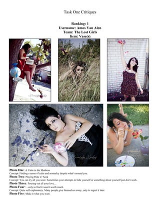
  • 1. Task One Critiques Ranking: 1 Username: Amos Van Alen Team: The Lost Girls Item: Vase(s) Photo One: A Calm in the Madness Concept: Finding a sense of calm and normalcy despite what's around you. Photo Two: Playing Hide n' Seek Concept: You can try all you want. Sometimes your attempts to hide yourself or something about yourself just don't work. Photo Three: Pouring out all your love.... Photo Four: ...only to find it wasn't worth much. Concept: Quite self-explanatory. Many people give themselves away, only to regret it later. Photo Five: Make it what you want.
  • 2. Concept: Life isn't always what you want... but that doesn't mean you can't change it. Head Judge Critique: -Kris Ramos, tinaateurface: 2 You and team Mooncat are pretty much running head to head in this competition for me. While I had trouble deciding on which one of you to rank first for this task, I ended up ranking you lower because of some obvious technical faults with your photos. Despite those faults though, you brought some amazing photos to the table this task and I was VERY impressed. You gave us a variety of photos that all looked pretty professional. As with team Mooncat’s photo’s, I could see some of yours in a professional photography or even a modeling magazine. The first photo was probably my least favorite one as I didn’t really understand your concept or how the vase fit in. I also didn’t like how the vase wasn’t very prominent and was even covered up by your watermark. The globe seemed more like your object of focus. Additionally, the model looks a tad bored looking through the book and although her legs are reaching towards a great modeling pose, they’re just not committed enough. Pointed toes always look more graceful and model like, and they also tighten up your calves which make your legs look amazing. Your second photo was very interesting and I actually like it a lot. There isn’t much to say other than, I wish the model’s face was more visible. It’s easy enough to tear out some of the grass to thin it out a bit and create a clearer photo. Your concept is also a bit of a stretch and I don’t really understand why the model is holding a vase to her head. There’s no doubt that it looks cool, but this photo doesn’t really fit the task. I really like how your third and fourth photos are related and in the future I’d like to see sets of photos that aren’t so scattered with numerous concepts. I’d like to see a set of photos all devoted to one concept, just taken at different angles, lighting, etc. Technically speaking, the fourth photo far exceeds the third. The third photo is awkwardly cropped at the legs and the top of the jar. Additionally, the angle makes the model’s legs look especially short and chunky. However, I love the flow of hearts and the model looks both adorable and gorgeous. While the arm holding up the vase is a bit stiff and looks a tad awkward, the model’s smile is very beautiful and genuine. You’re so close to having a perfect photo, you just need to work on some of the small details that detract. Your forth photo is a great example of this, as it’s almost completely perfect. The model looks amazing; she’s got the sad expression down and her right arm and hand look quite graceful. The only downfalls are that her left arm and hand do look awkward and a tad out of place. I think if she were to have more of a grip on the vase, it would look more like that arm and hand had a purpose to be there. Additionally, the bottom of the dress is pulled too high up which creates an allusion that the model is larger than she is. It would be simple enough to pull the dress down and there you have it, picture perfect. I am absolutely and completely in love with the concept of your last photo. Pure brilliance and it looks like you took a lot of time in preparing the rose (as well as the model’s own skin) for the photograph. I’m always impressed by effort and in all of your photos your team went the full mile or ten. The expression on the model’s face is perfect for the photo, I only with that her hand had been in a position that didn’t make her look so bored. This photo also has the most problems photography wise, as it seems as if every single object or limb is cropped poorly. Just remember to capture the entire image, without cropping it off in weird areas. Technically, you guys have some work to do, but you have amazing ideas and the dedication. I could easily see you two coming out on top if you continue to put this much effort and thought into your concepts and develop your technical skills. Photography Critiques: -Sandy, Tragidy: 1 Likes: I loved the colors and concept in all your photos. Photo 1. Angle Photo 2. Nice "POP" of color Photo 3. Very cute Photo 4. Nice, tight frame Photo 5. Nice background Dislikes/Tips: Photo 1. "Busy" photo (not a strong focal point), incorporate more of object Photo 2. Shoot it in a different angle so that the trees aren't in the photo? Photo 3. Either make it a tighter frame or include her feet Photo 4. None Photo 5. Tighter frame, show more of vase? -Daniel, Pheregames: Unavailable for this week. -Kaitlyn, Tyrian Purplexx: 1
  • 3. I adored the conceptualization of the vase in each of these pictures. While the vase wasn’t necessarily the focal point, it added to the composition of the photo. The first photo almost looks like a face full of flowers with the strings and random objects slicing the frame vertically. It’s a stunning, whimsical set captured in really nice lighting. The second photo was my least favorite of the bunch simply because the model was a little too far back in frame that the vase was almost lost. The final three photos are excellent examples of following the rule of three, maximizing a color palate, and manipulating light to your advantage. This team consistently steals my heart. Summary- Excellent: Lighting, Color, and Thematic Expression Needs Work: Spacial Composition (Placing model and object in frame) -Nick Sullivan, rpgcubed: 3 Unavailable for this week. -Demi, DemiTHEchipmunk: Unavailable for this week. Modeling Critiques: -Cassandra, Anriazna: 1 Overall I felt that this team did a very lovely job. In their first image the model’s pose was very nice and you could still see emotion in her face despite not being able to see too much of it. I’m sure it’s just me but I was rather disappointed that while the image is meant to be weird it took a while for me to understand that it was weird. Maybe it’s just because the colors were all so neutral (aside from the globe) but I don’t honestly know. What I love so much about their second picture is just how much like an animal the model looks in it. The color of her skin looks just like the grass she’s crouched in and with the natural colors of the flowers in her vase she is really able to blend in. It’s hard for me to see the emotion in her face with all the shadowing but I can still feel a sense of her being a predator despite this. This image is just so unearthly and I find that really awesome. This team’s third image is absolutely adorable and the pose of the model and her expression just screams ‘grab me and cuddle me until I pop.’ Everything about her really fits with the caption and you can honestly see her “pouring out her love.” The way that this team used little cut up hearts to demonstrate it being poured out was very clever as well and I was impressed with this. I do wish however that we got to see the image from further back so we could see the model’s feet or at least her right foot. We were so close to a full body shot but just missed it. This team’s fourth image is excellent and I love how it flows from the last image. You can see the distraught in the model’s eyes and the tear smudges they did with the makeup really helps to enlarge the feel of the image. I also found it to be very clever how the team kept the colorful hearts in the vase and had ‘dead’ hearts outside of the vase (although one white heart did escape). The way that they are scattered around the model and how they fall onto her defeated hand really help to express the feel of the image. I love her posing as well as the staging which also looks defeated with all the cracks in the ground. My one problem with this image though is I feel like the model is holding back some emotion. It does look like she’s sad, yes, but it seems like she could look even more sorrowful in her eyes. The team’s final image is absolutely adorable. The model’s pose is great and goes wonderfully with the theme of their picture. From the mood of the model I can feel a sense of mere amusement from finding something simple to do to make a rose “pretty” and she really makes it seem like she’s a child with a paintbrush (the wardrobe also enhances this illusion). I love how they placed paint on the model to make her have more of that child-like appearance and I also noticed that there is a heart on the other side of the vase which I find really helps to tie this image in with all the others. I do however feel like we should either be able to see the full body of the model or have her legs be non-visible. What I really loved about this team was how they used their task’s item to their arsenal. They were given an empty item to represent so they represented it by filling it with something and using that something to demonstrate the picture. Not only did this satisfy their requirement it also helped make the picture revolve around that one item so that it fit into the image and made it flow instead of just being an object in it. Overall this team is doing a fantastic job. The model is great at expressing emotion into her images regardless of being able to see her eyes which are the main way of delivering emotion. She is also wonderful at posing and the team does a great job with wardrobe as well as staging. I would say for them to just keep finding ways to make themselves better and to keep wowing us. As I said earlier I’m positive the model can give off more emotion and captivate us more so just keep working at that. Make sure that every image is as perfect as it can be. Another point for them to work on is cropping; this doesn’t really have to do with the modeling part but I just wanted to point it out. In both this round and the preliminary I felt like some of the images should have been cropped differently. -River, Osahar: Unavailable for this week. -Shawn Keeney, Opaque Transparency: 1 The Lost Girls - Once again, my favorite team. I think this team did a really good job of taking good pictures that didn't tell one full story. I think that the first picture is good, but the vase could have been a bigger part of it; the model definitely portrays being calm well, however. The second photo I like, but it looks a little like the vase is sticking out of her head, so that might be watched in
  • 4. the future. I like the connection between the third and fourth pictures and the story they tell together, and the model's face shows those emotions nicely (maybe just a bit more angst in the fourth picture, however). The fifth picture is my favorite; just like Alice painting the roses red. Great, great job. -Momo, -Ninja Cat Momo-: 1 Pros! + The expression of your 'queen' looking down at the camera is marvelous in the first picture. Sh e looks so haughty it's amazing. Royalty doesn't begin to explain it. + Her eyes in the fourth picture really sucked me in, even if I wasn't a fan of it, they're what make me say that I really can't not like it. Cons ): = I'm going to say first off what brought this to the worst for me; overuse of photoshop and, when not photoshopped, too much blurring. Blurry pictures may be appropriate sometimes; the only OK use of blurring here would be your fourth picture because her eyes are bright and focused, but even then they're way too blurry. I always feel that when someone adds too many effects/blurs, they are trying to hide mistakes in photos. You should be confident in what you turn in and use minimal, tasteful photoshopping. = The photos are very warm; that is, there's a LOT of yellow. = I can't tell the personality of your queen. In the first picture, she's obviously "I'm holier than thou", but in the second she looks shy, like a real bird. And in the last ones, I don't get queen at all. Consistency without repetition is key. = Her eyes are gorgeous; please don't cover them up with hair! It might be 'stylish' but a LOT of the human expressions are found in the eyes and they are essential for silent photos to 'speak' to the viewer. -Jordan-Elizabeth, KRYST4L M3TH: Unavailable for this week.
  • 5. Ranking: 2 Username: Roseanne Team: Mooncat Item: Cane(s) Concept (as written by contestants): Many of us, as we grow older, start to lose sight of what it was like to be a kid. Being carefree, happy, untroubled; that kind of thing just doesn't come easily when you have all the worries and responsibilities of an adult. We become blind to the things we once knew how to do, like imagine and trust and believe in ourselves. When we're little, it's easy to dream big, to say we're going to be President when we grow up, or an astronaut, or a rockstar. But realistically, hardly anybody ever gets there. People get comfortable in their spot in life that's fallen so short of their unattainable rockstar fantasies, simultaneously resentful of the dreams that never came true and fearful that their remaining dreams might still be aiming too high or their position might be easily tumbled. People find themselves stuck in a day-to-day grind just to get along and before they know it they've been working at Target for 20 years when they were only going to do it for a year or two to save up for school; they hate where they are, but they're too scared to leave because they're used to the status quo. The responsibility is their crutch to avoid getting out and DOING something; it's the reason they never did get back to school or started a band, they had to pay off the car, then repair the car, then there was a medical bill, then a baby, blah blah blah. So when people get jaded and resentful of the world, it's an expression of crushed childhood dreams and the hesitation to dare to dream again and to dare to try again. Once in a while, we've got to get out and do something CRAZY, let go of our fear and apathy and be daring! Head Judge Critique: -Kris Ramos, tinaateurface: 1 Your team really blew me away this week. The second I opened your first photo, my jaw dropped and I was squealing to my boyfriend in excitement. “Look, oh my goddddd, my contestants are amaaazzzinnng!!!” I pretty much yelled at him. Before I even begin to analyze your photos I want to congratulate you on turning in professional quality photos. My biggest problem with the photos we’ve received so far is that they generally look amateur. This isn’t necessarily a problem since I understand that most of the contestants are just starting out, but it’s really relieving when a team turns in quality photos. Honestly, I could see these in some sort of photography magazine—they’re that good. I’m in love with your concept, especially since when I think of a cane, the difference between adulthood and childhood comes to mind. I love that your background (the playground) matches your theme and your clothing and props are simple, but match and complement your theme completely. In general, the modeling is stellar and really helps create the mood you’re going for. The first photo is practically perfect in both composition and modeling. I love how the model is gripping the chain and the cane; it’s intense but manages to look beautiful rather than awkward. My only problem with your photo is that the photo is pixilated in areas outlining the model, specifically the patch on the model’s right (our left). Other than that, spot on, gorgeous photograph. I am very very impressed. The second photo is also quite amazing and happens to be my favorite by far. It’s amazingly crisp, and the framing of the photograph is great, so props to your photographer. The model’s body language is also phenomenal. Also, this photo is a perfect
  • 6. example of using photoshop to enhance and not detract from the picture. I’d like all contestants to look at this photo to see what good photoshopping looks like. Some may think it’s a little intense, and I may agree in other circumstances, but here it perfectly matches the mood you’re going for. Although I do like the variety in the third and fourth photos, the overexposure detracts from the overall impact of the photo. I hate to say it, but I have trouble getting past glaring white light in photos, it’s simply that distracting. Try to watch for the sun and its impact on the camera when you’re taking your photos. Just shooting from a different angle would probably solve this problem. As for the model, she does an amazing job of using her body to convey emotion and manages to keep the cane as the focal point in both photos. Also, major props for managing to look natural and graceful sitting down. The last photo, although cool looking, is where I have the most problems, the biggest being that the cane is barely in the photo. I literally had to search for it, and when the point of the whole task is to portray your item, this is a bit of an issue. It’s also a bit of an awkward angle since we can see up the model’s nose. Additionally, the photoshopping of the photo makes the model appear a little too gray and washed out. However, the clouds do look awesome. Unfortunately, it did seem like your item was the blindfold rather than the cane, mostly due to the last photo. Next time, just make sure that the subject of the task is always visible. Other than that, my only suggestions are to watch for sun exposure and your angles. These are terrific photos and if you continue on this path the other contestants will have to try their very hardest to match you. Photography Critiques: -Sandy, Tragidy: 5 Likes: Photo 1. Colors Photo 2. Nice angle, colors Photo 3. Tight frame, color Photo 4. nice lighting Photo 5. background Dislikes/Tips: Photo 1. Not a strong center of interest(slightly "busy") Photo 2. Tighter frame Photo 3. Strong light coming from top center Photo 4. Strong light in top left, tighter frame Photo 5. Where is the cane? -Daniel, Pheregames: Unavailable for this week. -Kaitlyn, Tyrian Purplexx: 2 I might have ranked Mooncat first were it not for the last picture. While it is in and of itself one of my favorite pictures of the batch this week, the concept was lost when only the teeniest tiniest bit of the cane was in the picture. Conceptually this photo set is one of the strongest: it tells a story not only using the model but using color and movement as well. As the pictures progress from 1 to 5 the frame opens up with less and less cluttering it. That’s a powerful visual statement. Summary- Excellent: Lighting, Spatial Composition (expressing claustrophobia/freedom using the setting), Color Needs Work: Attention to detail (did you see that the cane was barely in frame?) -Nick Sullivan, rpgcubed: 1 Unavailable for this week. -Demi, DemiTHEchipmunk: Unavailable for this week. Modeling Critiques: -Cassandra, Anriazna: 2 This team did a very lovely job all-around. Their first image was posed nicely and despite her right arm and left hand appearing obscure it really went along with the mood of the picture. I also felt that the model did a great job at expressing emotion in her face despite us not being able to see her eyes which is very impressive. In their second image I really love how the placement of her left hand and her mouth help to express the model’s struggle to find her way around. I do feel that her right arm is awkwardly placed however. Their third image is alright but I feel like there is something wrong with it however I can’t honestly seem to place what it is that I don’t like about it. I really like this team’s fourth picture; the model’s posing is very good and the expression on the
  • 7. model’s face is just perfect and helps to tell a story. My one issue is that I don’t like how her gown folds in this image and it makes it look awkwardly bulging causing it to make it hard to tell in which direction the model’s legs are. Out of the set I feel like this team’s fifth image was the best they submitted. The theme of this picture is a perfect ending to the story that was told by the other’s and her pose is great. The expression that the model has is also very nice and helps to make her look fascinated by the cloth that had blinded her floating away. The one issue that I have with this image however is that the cane is practically not included and you might not notice it if you weren’t looking for it. As the cane was left abandoned on the floor it made it seem more like the item the team was doing a composite of was the blindfold. Overall this team did a wonderful job with expressing emotion and posing. I would like to see them ensuring that there are no flaws with any of their poses in the future and also to make sure they follow the theme in every image. Later in the competition having even one image that does not go with the round’s requirements could be very costly. -River, Osahar: Unavailable for this week -Shawn Keeney, Opaque Transparency: 3 It sounds like they really put a lot of time into their concept, which shows me they really care about this competition. I like the idea of someone losing their way in life and how the cane kind of ties in to getting around. However, I think that the first and second photos look a little too similar, so I would just like to tell them to make sure each frame adds something different to the story. Also, the cane is hardly visible in the last shot, so they need to make sure that whatever is supposed to be a main part of the picture is clearly visible and being put to use. They are turning in consistently good pictures and I still think they're front runners. -Momo, -Ninja Cat Momo-: 2 Pros! + The reds stand out very well in the pictures. + The peeking over the shoulder in the fourth picture is simply gorgeous, absolutely stunning. It's so sultry! Her red lips look amazing. + The last picture, though photoshopped, has a believable unearthly glow (if that makes sense). + The posing in the first picture is very strong. You can see her muscles as she grips the chain, and you get a wonderful silhouette of her outstretched arm (very flattering--especially with sleeveless things. This prevents the dreaded bunching near the armpit. Kudos to you!!) and the outline of her dress is also wonderful, straight, and very prominent. + The angle in the second picture is cool, she looks very regal-- above you, even though she has her arm stretched out, and seems to be groping around, she looks like something out of a fairytale. Cons ): = In picture 2, there are too many primary colors contrasting. Yellow and red isn't the best of combinations, and the greenish-blue really sets it off. = In the third picture, we get the around-the-armpit-bunching that I said you avoided in the first picture. Be wary of all things strapless/thin-strapped, you get very unflattering silhouettes around your armpits if you don't pose correctly. = In the last picture, you wouldn't even know the cane was there unless you were looking for it. -Jordan-Elizabeth, KRYST4L M3TH: Unavailable for this week Ranking: 3 Username: melissyRAWR Team: Sissy Q Item: Picture Frame(s)
  • 8. Concept (as written by contestants): Our items were pictures frames. Our concept was being trapped inside of a picture frame. Jessie learns that there is life outside of her picture frame, and slowly goes insane when she finds she cannot escape. Head Judge Critique: -Kris Ramos, tinaateurface: 5 In my opinion, your team came up with the most interesting concept out of all the teams. All of your photos depict a single concept and the progression of the model going insane is well done and obvious. Unfortunately, it was a little too obvious in some photos. Since this is a modeling contest, it is important for your model to look attractive. Your particular model is actually quite pretty, yet in some of your photos she really doesn’t look it. This was most evident in the last photo. I understand that she’s supposed to look like she’s going insane, but this doesn’t necessarily mean that she needs to look, well to be frank, ugly. Let me reiterate, it’s not your model, I don’t think anyone would look attractive making that face. Your first photo is probably your best photo. I love how she really looks like she’s an image in a picture frame it reminds me of the moving pictures in Harry Potter. It’s also the best photography. Most of your other photos are cropped strangely and the lighting is too harsh. You’ve got concepts and creativity down, now you just need to work on your execution. Watch your cropping and angles. Photography Critiques: -Sandy, Tragidy: 7 Likes: Photo 1. concept Photo 2. Lighting, concept Photo 3. Lighting
  • 9. Photo 4. Concept Photo 5. Emotional appeal Dislikes/Tips: Photo 1. Slightly tighter frame, lighting Photo 2. Slightly tighter frame Photo 3. Tighter frame Photo 4. Lighting Photo 5. Harsh lighting, combination of Photo 3 & 4 (brainstorming?) -Daniel, Pheregames: Unavailable for this week -Kaitlyn, Tyrian Purplexx: 3 I was really impressed with this teams concept and execution in all five of the photos except for the third one. It lacks the effect of the other four because you can see the white cardboard frame around the photo frame, since the room the team was shooting in the background. That’s a very unfortunately technical error, but the lighting in this photo also fails to live up to the exceptionally intense lighting of the other four photos. This photo really killed the effect for me, since it removed the illusion of a frame within a frame. Summary Excellent: Lighting (creating an intense mood with harsh orange light from the flash), Conceptualization (excellent use of your object), Spacial composition (model in center frame, framed within a picture frame). Needs Work: Attention to Detail/Professionalism, Focus (some of your pictures could use a little bit less fuzziness) -Nick Sullivan, rpgcubed: 2 Unavailable for this week. -Demi, DemiTHEchipmunk: Unavailable for this week. Modeling Critiques: -Cassandra, Anriazna: 8 This team I found didn’t really give too much to judge as far as posing goes as most of the images are solely head-shots with minor bust-shots but they did alright regardless of that. Their first image is very interesting and the model did a nice job at portraying shock and curiosity. Their second image is also good however I do not feel like the model’s pose it appropriate for the expression on her face. Her face still says “I wonder what’s out here” but her pose says “I want to grab that.” I feel that instead she should either have laid her arms to make it look like she’s trying to pull herself out of the picture or just reach out, still shocked that there is something on the other side. This team’s third image I felt was the best out of their set and with just how huge the model’s head looks it makes the image all that more adorable almost like she’s a caricature popping out of a frame. The expression is great and the posing is very nicely done. I do have a problem with this picture however and that is the cropping. Because we can see that the model is either behind or inside of a white box and that there is a world on the other side of the box it takes away from the impression that she is a picture on the wall and kills the spirit of the story that these images are trying to convey. This team’s fourth image is very cute as well and she honestly does look like she’s snapped and just wants to tear her way out of the image. I do have an issue with her left hand however as her fingers appear obscurely placed. I don’t really care much for this team’s final image. I feel like because it’s the same pose as their second image it is more of a repeat than anything else. The model’s expression is still alright but she is lacking the amount of emotion she had in the other images. The model all-around is very good at expressing emotion and is great at using that to her arsenal so keep it up. I do feel like they need to work a bit harder on posing better as well as portraying a theme better. While I do feel like they did a good job at working with what they were assigned I’m afraid I would have failed to understand what it was they were going for if they didn’t have captions. Good work however and keep on practicing with those poses. -River, Osahar: Unavailable for this week -Shawn Keeney, Opaque Transparency: 2 I love the concept and I think they found a way to portray it well. I don't really have too many comments, but I would just like to see a little more variety in facial expressions because I've seen this wide-eyed look in a lot of the pictures they given us. Also, I appreciate that the model was really going for it in portraying going insane, but I think it could be pulled back just a bit because we still want the face to be attractive. Overall, one of my favorites this week.
  • 10. -Momo, -Ninja Cat Momo-: 6 Pros! + I really enjoyed the concept for this picture and feel it was executed decently. + The expressions are amazing here. This model has such a wonderful range! In picture one, she's obviously very curious about the picture frame, as if she had stumbled across it. In the second picture she looks almost scared as she realizes she can, gasp! get out of it! The third picture feels hesitant but excited. The fourth and fifth actually made me laugh--in a good way. She looks so frustrated, so insane! Which I feel was the point. + The picture frame is (obviously) very prominent in each picture. Cons ): = The coloring is very harsh in all the photos which is what knocked me down for this. There are a lot of warm colors-- reds, purples, pinks, yellows. I feel this would have benefited from a simple cool filter in GIMP or more blues and greens in the picture in general. = In the third picture, there is a bit of wall showing... was this an accident? If so, why was it not cropped? I feel it takes away from the fantasy of the photo.. = In the third picture, her head looks really, really big due to the top being cut off. -Jordan-Elizabeth, KRYST4L M3TH: Unavailable for this week Ranking: 4 Username: Sparkly Tiara of Death Team: Team Jefferson Item: Rope Concept, as written by contestants: My entries are based on the areas of life young girls are bound to, such as the bindings of beauty, peer pressure, and media displays of feminism. Makeup being the first variation in the theme, the second being social issues with friends and schoolmates, and the third based on how the media depicts femininity. Who says Pokemon cards aren't cool?
  • 11. Skinny b***h. Head Judge Critique: -Kris Ramos, tinaateurface: 4 First off, I have to mention that I am disappointed that you turned your photos in late, even if it was only a couple of hours. Ten days is plenty of time to take photos and turn them in. Although generally you would automatically get ranked last, I ultimately decided to let each judge decide for themselves how your tardiness would affect their individual rankings. Luckily for you, it didn’t seem to hurt you to harshly this week. However, rest assured that if you are late again I’m sure the judges will rank you quite low, or you will automatically be ranked last. I’m sure this is no surprise to you, as the last two photos were last resort, but your first three photos stand out quite a bit against them. I absolutely love your first photo, it’s expressive, it’s beautiful, and other than the distracting background, the photography is pretty good. The single tear adds a beautiful touch and the model embodied the mood perfectly. Your second photo is also pretty good although the photography is much worse than the first one. I wish you hadn’t cropped out half of her body and the hand in the upper left hand corner shouldn’t be there. You could’ve simply taped the signs to the door. It also would have been cooler if there had been more signs with social expectations written on them. Although the modeling is expressive in this photo, it looks a bit cliché and sloppy. Maybe it’s just the weird cropping and photography that takes away from the photo. I like the idea of the third photo quite a bit; the model tied down by social expectations represented by the magazines about her. Very nice idea and execution. However, the photography could obviously improve as pretty much all of her limbs are cropped at some point. The model’s body language is alright as she sort’ve looks like she’s struggling against the chains of society, but I’m not sure how her facial expression matches the concept. I’m not going to say much on the last too, since they were sent as a last resort and I’m sure why you understand they’re not the best of photos. The fourth photo doesn’t really make any sense, and the last photo...well the model’s head is cut off.
  • 12. My only other concern is that you used a scarf instead of a rope. I know that I told team Mooncat that it was okay if they used a walking stick instead of a cane and that the item didn’t matter too much as long as it complemented your concept, but rope is such an easy item to obtain. Please try to stick as close to the task as possible. Your team has a lot of potential. I really like your concepts, your model is absolutely gorgeous, and the photography isn’t too bad. Your model needs to work on posing and expressing model while your photographer needs to watch their cropping. Photography Critiques: -Sandy, Tragidy: 3 Likes: Photo 1. Lighting, concept Photo 2. Nice concept Photo 3. Concept, lighting Photo 4. Concept Photo 5. Concept/message, lighting Dislikes/Tips: Photo 1. Background Photo 2. Lighting, tighter frame Photo 3. Slightly tighter frame? Photo 4. Lighting doesn’t quite work, busy background Photo 5. Crop top a bit? -Daniel, Pheregames: Unavailable for this week -Kaitlyn, Tyrian Purplexx: 8 Normally I would have ranked a team last for being late, but given the circumstances of the bottom two, I’ll make an exception this time. Hopefully this team doesn’t make a habit of it. While I wish the prop had been actual rope instead of a scarf, I can appreciate the attention to detail used in the tying of and posing of the model as well as the incorporation of other aspects of the photo. This team really knew how to manipulate props, particularly paper, to get a point across. First of all, your final photo says Outtake and appears to be the same photo as the third photo, which I didn’t particularly like…but fortunately they’re both excellent photos. The sense of discomfort conveyed by the posing of the model and even by cutting off the model’s head in the final photo all fit with your theme. Also your choice of color was excellent: Mostly black on white. Very stark and very intense, which went well with your peer-pressure theme. I couldn’t really decide if I like the over-exposure of the Pokemon card picture or not, but it did have me really interested. It didn’t really work (since it messed up the sharpness of the picture), yet somehow it brought an artistic element to everything. Interesting idea, keep it up. Summary- Excellent: Lighting, Color Contrast, Prop Usage Needs works: Being on Time, making conscious decisions -Nick Sullivan, rpgcubed: 5 Unavailable for this week. -Demi, DemiTHEchipmunk: Modeling Critiques: -Cassandra, Anriazna: 4 This team did a fairly decent job. I must admit that in their application and their preliminary entries I was not all too impressed with them but they really shinned this round. Out of all the images that they submitted their first one I felt was the best. The model’s face honestly shows agony even without the aid of the perfectly positioned tear drop which helps to show the theme of the image. They also did a fairly good job at the makeup chain that they placed on her face helping to show what they were going for. The model’s pose is also very nice in this image and also helps to add to the agony. I do feel however that the model should have been holding some kind of makeup tool to help to communicate that beauty is what is binding her as it feels like it’s missing just that extra
  • 13. kick that would provide. Completely unrelated to the modeling part I do have to say that whatever it is that is that bright white color on the top middle-left is fairly distracting as it looks like the bottom of a thought bubble in a comic book. In their second image I really love how the model’s upper body is positioned but from under her bust down it just seems awkward for some reason. I do love how she is gripping her hair to express more of the emotion that she’s conveying with getting beaten down from all the peer pressure. It does bug me however that we see a hand in the top left and really distracts from the appearance that those are “shout outs” instead of just pieces of paper cut out and held against a door. In their third picture I felt like once again the model did a great job with posing as well as conveying emotion but compared to her other pictures the emotion seems to have dropped a few notches. The staging is great and continues to go along with the theme of being bound by what society says you should do. I would have liked to have seen the image zoomed out a bit more though so we could see her entire hand and perhaps a bit more of her legs as they really seem to be cut a bit too short. That also would show off more of the magazines to help enhance what the purpose of this picture is. This team’s fourth image is also a fairly good one but the emotion just falters severely in this image. Another note about her posing is her right arm I feel should have been angled differently to not make her upper arm so awkward. This team’s final picture is fairly decent and even though you cannot see her eyes the image is cropped just right on her head and you can still feel a sense of the emotion from earlier peeking through. While I do like the model’s pose I feel as though the image would have been better if we couldn’t see her right arm as it does look awkwardly positioned and it also would have been nice to have the image cropped differently so that her left shoe was not cut short. This was a great image however and I feel really captivates the struggle against the feminism demands. I really loved how well the model conveyed emotion in this round. Originally my main problem with her modeling was that I just didn’t feel anything from her but she has definitely changed my mind now. She did an excellent job at expressing this round and I would love to see more of that in their future entries. The model’s posing is also very great. This team does need to work on ensuring that there is emotion in every single image they submit as well as trying to perfect all the poses. What did bug me about this team was their choice to use a scarf instead of a rope. While I can understand that rope may have been unavailable with them wrapping a scarf around the model’s neck in the first picture it just didn’t communicate bonding and just made it seem like the scarf was how she wanted to dress instead of binding her. I do appreciate the effort though to try to follow the theme as much as they were able to instead of just ignoring it altogether. With this team’s tardiness it did effect their scoring in my eyes but as they were only a few hours late instead of a day late I don’t feel it should have hurt them too bad. However they will need to make sure that they are on time from now on, especially in the later rounds. -River, Osahar: Unavailable for this week -Shawn Keeney, Opaque Transparency: 9 I'm really not a fan of lateness. They had ten days to work on this, and they turn it in a few hours after the deadline. To me that shows a little bit of last minute work, just trying to scrounge something up to submit. What's more, the pictures weren't even amazing so that I might be able to give them the benefit of the doubt. However, they were not the worst pictures, and I did like what they turned in previously. The fourth and fifth pictures are totally out of place however, and I wouldn't know that they had anything to do with rope. The first picture is kind of cool, the way that the makeup looks rope-like, and I see real emotion in the model's face, plus she kept her hands elegant. The second picture I think could have been better if she looked less sad and more frazzled or stressed, and she could have been being pulled by the signs instead of having them just floating there. The third picture is a little out of place too. She's not looking at or interacting with the magazines at all, so they seem like they don't have anything to do with the shot, plus she hid her neck. Not the best work I've seen, but I think they deserve to stay. -Momo, -Ninja Cat Momo-: 3 Pros! +The makeup and posing and everything in the first photo really wowed me. A scarf was a really good concept for a replacement for a rope... though I feel an actual rope should have been used, this is a good replacement and worthy in my mind because what is a scarf, other than a comfy rope? And also the 'rope' of society is a great metaphorical one to back you up. The lighting is wonderful in the first one as well. She seems almost to be looking to the heavens, ready to gasp... her arms are protecting her but still weak-looking, showing her 'weak' resistance! + I love the hands in her hair for the second photo. A universal sign of frustration can be pulling at your hair-- and the messed up hair shows she's been at it. Her body looks weak, held up by the arms. + I am not a fan of cut off body parts, but in the last photo, you have done one of the rare cases where it is acceptable-- right above the bridge of the nose. Any lower looks awkward, and any higher, why aren't you just including the whole face? You get her wonderful jawline here with the shadows, and almost a feeling of anonymity-- this girl could be anyone, even you-- is what I get from it. Cons ): = The Pokemon thing seemed kind of...random. Also, it seems to be the only one with a heavy filter on it. Why? I understand that Pokemon might be looked down upon in society, but compared to the others, it's a little weak. Also, her left (our right) arm is very warped from the pose; the elbow is completely shadowed. = I feel like the expression in the third photo is a little.. meh. She looks confused, and from what I get from the others, it's more of a battle against the ropes of society rather than the confusion of 'why am I roped?' Also, due to the black dress, her whole torso and her hips are combined in one giant black blob.
  • 14. = However, in the last picture, I wish her foot had been completely in frame and her right (back) arm hadn't disappeared behind her body. -Jordan-Elizabeth, KRYST4L M3TH: Unavailable for this week Ranking: 5 Username: Varlet Tanoran Team: Deadly Duet Item: Alarm clock(s)
  • 15. Concept, as written by contestants: "What on earth is this thing for?!" was the concept for our five pictures. We wanted to use the alarm clocks in ways that are not what they are normally used for. What happens when you use one incorrectly? It A) won't work (Picture 1, 2, 3, and 4). Or B) You will hurt yourself (Picture 5). Photo 1 Can I unplug it? Photo 2 Can I hit it? Photo 3 Can I shoot it? Photo 4 Is it a foot warmer? Photo 5 I think I'm doing this wrong... Head Judge Critique: -Kris Ramos, tinaateurface: 7 My biggest problem with your photos is that they don’t really look like something you’d see in a professional photography or modeling magazine. They aren’t horrible photos, they just look like they’re taken for recreational fun rather than for artistic value. Additionally, I don’t really understand your concept at all. It’s confusing, messy, and could be used for pretty much any item. I was looking for a more specific and deeper understanding of your item. All of your photos are too closely cropped in to really be good samples o photography, although, I am impressed that your cropping isn’t actually bad especially considering how zoomed in you are. Your model has one of the most interesting and captivating looks, yet I don’t think she’s using that to her potential here. She’s expressive, yet it’s too comical to be real. Her modeling simply looks like acting. Compared to your other photos, there isn’t much going on in your first photo. In fact, it’s just a girl with an alarm clock. I have no idea what I’m supposed to be getting out of it. Your second photo is definitely more interesting, but without the caption I would have no idea what is going on. Your photos need to be able to stand on their own. Your third photo is my favorite. The model has a very beautiful natural smile. However, yet again, I don’t understand what it means. Why would an alarm clock be a foot warmer? It just seems like you took a bunch of pictures with an alarm clock and then put whatever captions to them that you could. The fourth has poor lighting, which isn’t exactly surprising since you are inside. I have yet to see some nice natural lighting (not overexposed) from you guys, so lighting is definitely something you need to work on. However, the photography and photo itself in this photo is the most interesting of the bunch. Your only photo that approaches having a deep conceptual meaning is your last photo. I like how the cord is wrapped around you. I don’t think this was intentional on your part, but the idea that I get out of this is that you are being tied down by time and
  • 16. scheduling. Conceptually, this was my favorite photo, however, the model’s eyes are partially closed and the angle isn’t very flattering. Photography Critiques: -Sandy, Tragidy: 2 Likes: Photo 1. Nice lighting Photo 2. Lighting and angle Photo 3. Nice use of object Photo 4. Lighting, nice background Photo 5. Nice use of object, interesting angle Dislikes/Tips: Photo 1. Bit too busy of a background, not a strong focal point Photo 2. Use of object (a bit more brainstorming?) Photo 3. Not fond of lighting, and slight busy background Photo 4. Crop out chair? Photo 5. Maybe show more of the clocks themselves? -Daniel, Pheregames: Unavailable for this week -Kaitlyn, Tyrian Purplexx: 4 Unfortunately I must give this critique first: Whenever I look at the photos for this team I do not see the photo first. Not the model, or the composition of the photo; I always see the watermark first. Would there be a way to make the watermark smaller or more transparent? For me it takes over and diminishes the photos. Okay, with that out of the way I was quite impressed! Frankly, I was expecting your traditional double-bell alarm clock to feature in all of the photos, but this team did a great job with thinking outside the box. Good work. Also you continue to place your subject as well as shoot and pleasing and interesting angles. For example: your third and Fifth photos. The alarm clock in the third photo is clearly recognizable, but the eye is drawn to the model as well. In the fifth photo, the off kilter angle definitely gives the impression that she’s not doing something right. I believe this team could really rocket to the top by taking into better account their lighting and color palate. Unnatural patterns rarely photograph well as a background because they are distracting, especially in the second photo where the model is wearing an intense pattern. Try to make blank backdrops for you photos, such as the wooden headboard in your first picture or the green wall in the third rather than the patterned blue and brown blanket in the photos. I believe your use of flash is washing out your model. Try using natural light or outside light in some of your photos rather than relying on the camera flash, as it can create intense (and sometimes unwanted) shadows and glare as well as bleach out color. Summary- Excellent: Conceptualization, Creative thinking (Cell phone alarm! Love it!), Angle and Focus Needs Work: Lighting (particularly use of flash), Color, Watermark (Please I know its important) -Nick Sullivan, rpgcubed: 9 Unavailable for this week. -Demi, DemiTHEchipmunk: Unavailable for this week Modeling Critiques: -Cassandra, Anriazna: 3 While I must admit that I much rather preferred their last submissions over this weeks entries this team is still one of the better ones and I liked what they did. I did like the pose that the model had in their first image but I feel like the way the pillow encased her arm made her arm look rather small but it still didn’t detract too much from the image. The model’s expression was cute but I would have liked to see a bit more attitude in her face to help her look more ‘smug’ about her unplugging the clock. The model’s posing in the second image was also well done but I felt like the gun should have been moved a bit further to her left so that we could see more of her right forearm. I did not feel like the model did a very good job at expressing emotion in this image and it honestly looked like she was trying not to laugh. Perhaps it would have been better if she appeared cynical or crazy as if she’s about to give the clock a beating of a lifetime? The emotion just didn’t really come through. Their third image was also not one of their best. The model’s arms are hung too awkwardly over the bed and she does not appear to be aiming at the clock which is what the caption expresses she is doing. It also appears as if she is looking more at the
  • 17. camera then the clock which also plays into her not appearing as though the clock is what she is aiming for. I do like the staging of this picture however; the Mexican blanket in the back, the lion blanket and the tipped over root beer bottle gives the image a tavern-like appearance which helps play in nicely with “can I shoot it?” Their fourth image was decent in comparison to the others. The pose is good and the model is expressing a decent amount of emotion although I would have liked to see just a touch more. My one issue with this picture is that I feel the photo should have been taken a little higher up or a bit more to the right so we could see more of her body so that it’s more obvious that the feet belong to her. This team’s fifth image was cute and I loved the concept that they portrayed. I do feel that the image should have been cropped differently however as it seems like the model’s lower body is unnecessary to the shot. I was also disappointed that the old-fashioned alarm clock used in images three and four wasn’t in this image as it seems more like “revenge of the clocks” then “clocks attack” but I won’t hold that against the image. I did not feel like the model had enough emotion in this picture however, she just doesn’t seem too put-out that the clocks have defeated her. What I really liked about this team was how they really incorporated the use of a clock by telling a story on how to defeat one and what will happen if you’re too abusive to a clock. What I also really appreciated was how they didn’t just use one clock to make it not so boring. This team did a fantastic job at incorporating the item in a way that was interesting and didn’t feel like they were bound by what they had to work with. This team I feel did a very lovely job with posing as well as with portraying the theme. I would like to see them work more on expressing more emotion in their images so that they are more believable. They also need to make sure that the model’s posing it top-notch for every image they submit as when we come closer to the final rounds one small error could mean disaster. -River, Osahar: Unavailable for this week -Shawn Keeney, Opaque Transparency: 8 All I can say is WHAT HAPPENED?! I have to say, I did like their idea, but they did not execute it properly at all. In not one of the photos did the model look confused or baffled by the clock, as one might be if they didn't know what it was. However, it's killing me because the individual photos aren't horrible, but in no way do they create any kind of concept when looked at together. The only thing I have to say is that in some of the pictures the model's neck is hidden (1, 3, and 4), but they've got to be able to turn it what is asked of them. -Momo, -Ninja Cat Momo-: 5 Pros! + In the second picture, the posing is very strong. Direct eye-contact with the camera is wonderful, it really brings the intimidation factor up. Nothing shows us that you are a fighting girl more than eye contact! + The focus in the third picture is brilliant! I love how the alarm clock, though a prominent part of the picture, is blurred to focus on the model instead. Cons ): = In the first three photos, the model's expression is exactly the same. Variety is the spice of life! = The last expression is just.... strange. She looks like she's attempting to be seductive but failing. = In the second picture, she looks like an amputee due to sitting on the lower half of her legs. = In the third picture, the model seems to be looking at something other than the clock? = Blurred pictures are never good, as are dark pictures. Remember to have enough lighting, even if it is nighttime, be wary of flashes and use a tripod or some other thing to keep your photos steady. -Jordan-Elizabeth, KRYST4L M3TH: Unavailable for this week
  • 18. Ranking: 6 Username: cjaoov Team: Tegan and Sierra Item: Pillow(s)
  • 19. Concept (as written by contestants): The days we took these photos were following incredibly tense and difficult days in my relationship with my boyfriend. This series of photos was an attempt to depict the loneliness I felt during the fight and the relief I felt when the conflict was resolved. In the beginning of the fighting, I felt completely alone and abandoned, but as we worked through the issues we were dealing with, I began to feel more hope that things would become normal and happy again. It took some time and space for us to work it out, but after a few very lonely days, things seemed ok again. The overwhelming feelings of loneliness followed by overwhelming feelings of love were the driving force in creating these photos. Head Judge Critique: -Kris Ramos, tinaateurface: 9 To be honest, I was a little surprised at how high some of the judges ranked you this round. I do like how you took the task personally and connected it to your own life, but the photographs themselves aren’t very professional looking or high quality. So, just to reiterate, I do like your concept and the flow of how the story unfolds, but the photos themselves do not express it very well. The first three photos kind of look like they were taken by an over-eager parent on a family camping trip. In the first photo, the model just looks bored, rather than hurt or dejected. I don’t get why she’s just sitting in the van with a pillow in her lap. Nothing about the photo says, “I feel awful and lonely.” The second and third photos are both blurry and in poor lighting. Again, the model looks bored out of her mind in photo two, and her smile in photo three looks quite forced. I really don’t get what these photos are trying to tell us. How does the trampoline help emulate what you’re trying to portray here? The fourth and fifth photos, fortunately, are better. I actually kind of like them although, because she’s looking upside-down at an awkward angle, the model looks slightly demonic in the forth. The shadow-play is also distracting and the cropping makes her hand look overly large and disconnected. The leaves and pillow are placed nicely, though, and frame the photo nicely. I just feel that you could have done something more with this photo. The fifth photo is cute, although one could argue that it’s simply a girl throwing a pillow in the air. The shadow on the model’s face is also annoying and the cropping of her legs is awkward. For this photo I would have liked to seen a close up shot, maybe bust up, of the models face, arms, and the pillow in the air. Against the blue sky, this would have made a pretty striking photo. Although you’re currently at the bottom of the pack for me, I think you do have the potential to get a lot better if you take these critiques to heart and work hard on them to improve your skills. The photographer should watch for cropping, lighting (particularly with harsh light and shadow play), and angles. The model needs to work on looking natural and expressive on camera. -Sandy, Tragidy: 4 Likes: Photo 1. Lighting (softens the mood for me. Photo 2. Use of object more than previous. Photo 3. Lighting is alright Photo 4. Nice lighting and resourcefulness Photo 5. Best lighting of this set, and nice background Dislikes/Tips: Photo 1. Should have used a tighter frame and have pillow more incorporated. Photo 2. Tighter frame. Photo 3. Sharper (focus) Photo 4.I would crop out the top a bit. Photo 5. Not fond of shadow on model's face. -Daniel, Pheregames: Unavailable for this week -Kaitlyn, Tyrian Purplexx: 5 I did not especially like the conceptualization of their item, since it didn’t really seem to match with what was written about the photoset, but I can’t say this is a bad batch of photos. Conversely I can’t say its an excellent batch of photos either. The first thing I thought when I saw these photos was “senior portrait” and that doesn’t mean they’re bad! But it does mean they are a little on the safe side. This team is really going to need to break out of the box in terms of their art or they’re going to get left behind teams who take more risks. On a more positive note, the last three photos use a very very pleasing palette. Earth tones are always an excellent choice and the blue sky in the final photo is just that much more beautiful because of the earthy/neutral palate. Also the photos are compositionally pleasing with the object and model framed nicely. The lighting of the first photo and focus of the second photo are a bit off, but not so much that they destroy the photo. Summary-
  • 20. Excellent: Color usage, use of Rule of threes Needs Work: Focus, Lighting (in some cases), Thinking outside the box, working with a theme -Nick Sullivan, rpgcubed: 8 Unavailable for this week. -Demi, DemiTHEchipmunk: Unavailable for this week Modeling Critiques: -Cassandra, Anriazna: 5 The pose in their first image is decent although I wish that the door to the van was open more so that we could see her full right arm. Unfortunately I can’t feel much emotion in her face as she appears to be zoning out more than thinking about her sorrows. I found that their second image appears to be a tad blurry and that makes it hard to really focus on the picture. Her posing is once again decent but I feel like the image should have included the bottom of her legs as it was so close to capturing her entire body and just fell short. Once again I also can’t see emotion in the model’s face which is a disappointment. Another flaw with this image I found is that you can see her panties peeping out of her pants which is rather unflattering and distracting from the image. Their third image is definitely better than the first two in my opinion and the model did a good job at posing in this one although I would have liked to see her with better posture. She is also finally expressing emotion that we can see which does help. I do feel that the image should have been taken differently, showing more of her body that got cut off and less of the unnecessary behind-the-trampoline scene. I do feel that in this image the pillow isn’t very noticeable however as it’s brown and seems to blend in but that’s just my thoughts on it. Their fourth image is the best of the lot both posing-wise and for emotion. The model looks amazingly beautiful in this picture and you can really see contentment in her face. I do wish however that you couldn’t see that tag for the pillow/pillowcase. Their fifth image is also one of their better ones and also helps to express emotion nicely. The way she has her mouth open and the fact that she is tossing the pillow in the air helps to show off complete happiness and the freedom from depression pulling the story of this set to a close. Once again I do wish that this picture showed the rest of her body as with all the free space above the pillow we could have afforded to have the camera tilted a bit further down. I also feel as though this picture would be able to show more emotion if the model had spread her legs a bit more to show more freedom and joy. Another flaw I found is how dark her shadow across her face is; I understand that it has nothing to do with modeling but I do wish that was made lighter. I do love how the model posed her upper body however and I am impressed with how their final three images turned out compared to the preliminary entries. Overall this team still needs to work on more posing techniques as well as expressing enough emotion in every one of their images. Good work on following the theme of this weeks competition but make sure you kick it up a notch for the next few rounds. -River, Osahar: Unavailable for this week -Shawn Keeney, Opaque Transparency: 4 I like that she connected things going on in her life to this challenge because it makes it seem a little more real. I think that the third photo is a little too smiley and if it were go anywhere it should go last because as it stands the story goes from lonely to pondering to happy to a little less happy to ecstatic. I think that in the first picture the model's face could have had a little more life and emotion to match her hunched over body. Also, the second photo could have been made a bit more innocent by maybe hugging the pillow a little more. Otherwise, great job. -Momo, -Ninja Cat Momo-: 4 Pros! + The lighting in the last two pictures is lovely. The sunlight helps bring out the happiness brought by the pillow, and the light on the model's face in the fourth picture is just so interesting. + The expressions really tell a tale. It starts out a bit wistful, sad, but then gradually reaches a point of happiness and finally elation. You can really believe she's happy in the last two. Her smile is wonderful! + The pillow is prominent in 3/5 of the pictures. Once again, the last two pictures are the best in my opinion. The pillow is a clear part of the picture and the model is interacting appropriately with it. + The posing in the second picture. The pillow seems to be comforting her; she's hugging it like a child would hug a stuffed animal. This shows me a sincerity which is hard to find in modeling. It's touching. + The posing in the last picture really brings out a happiness and comfortable feeling. Exposing everything by the joyous gesture of throwing your hands into the air really shows how comfortable you are with 'exposing your belly', a place which we normally cover when we aren't comfortable. The nice thing is that this fits with the theme, too. At the beginning, she is more reserved in her body language, covering her stomach and kind of huddled together, protecting her self. You can see how she changes from reserved to blatantly happy. Cons ):
  • 21. = The facial expressions in the first two are rather blank. I only get a wisp of wistful, not much else. I don't see sadness, or comfort, more of a glazed-over look while looking off camera. = In the third picture, her hands are cut out of the frame, as well as her legs, causing a stretched-out effect. Cutting out parts of limbs is never a good idea. In the fourth picture, her hands just kind of 'appear' out of nowhere. = I'm not a huge fan of the tree directly behind the model in the second picture. It takes the focus away from her with all the branches-- the negative space in the picture is too great, and all the focus is cluttered around her. I feel you would have been able to focus easier on her if it was in a different part of the frame. = In pictures one and three, the pillow isn't too prominent. I wouldn't have known it was really to be there if I didn't know the theme was to revolve around the pillow. -Jordan-Elizabeth, KRYST4L M3TH: Unavailable for this week Ranking: 7 Username: beagleteer Team: 1867 Item: Caution Tape
  • 22. Captions, in order from left to right: Photo 1 An 1867 twist on Alice in Wonderland. Photo 2 Caution: you might learn something. Photo 3 It's a dangerous world out there. Photo 4 "And it rips my life away, but it's a great escape" Photo 5 The following girl contains nudity, sexuality, coarse language, violence and mature themes. Viewer discretion is advised. Head Judge Critique: -Kris Ramos, tinaateurface: 3 While your photos didn’t shock me into pleasure like the top two teams did, I did genuinely like a couple of your photos and I feel like you have improved greatly from your application photos. That being said, your photos were very much a hit or miss for me this week. In my opinion, your first and third did not look like they belonged in this competition. They were too dark and the fact that they were taken of the model’s back confused me. Additionally, the concepts going with these two photos were kind of a stretch. They weren’t very memorable and I feel that that shows in the lack of effort or quality in these two specific photos. That being said, I really loved the concepts of your other three photos. They were all adequate uses for caution tape and the photos themselves were interesting to look at. Your caption on the second photo is a perfect example of a caption that really goes with the photo and helps me understand it, but still caters to the idea that a photo should stand alone without the caption. Maybe I’m biased as an avid reader, but I found the concept for this photo funny and really compelling. The photography is much better than your previous photos, although I don’t understand your background at all. Random fire hydrant? I think you can do better than that to create a good setting. However, the model’s face here is great and matches the mood of the photo perfectly. Since the beginning, the model has shown that she’s very good at being expressive. I like that you went out of the norm and sent in a black and white photo, although I do not suggest that contestants try to do this all the time. Sending in black and white photos should only be done when it enhances the mood, and I think that here is a perfect example where black and white fits. The model’s body positioning is kind of awkward, but her facial expression and arms are so
  • 23. graceful and so beautiful that I can’t help but stare. Not to mention they caption the mood of the photo perfectly. The only negatives are that the lighting is a bit harsh and some areas of the photo are too bright, while others are too dark. Your last photo is by far my favorite and unlike last time, being my favorite photo of the bunch actually holds merit. The idea of this photo is wonderful and I love how you managed to cover up the model’s body so that she looks bare but not naked. This is a good example of when minimal clothing is acceptable and necessary; just don’t take this to mean that stripping for every photo is a good idea. I also like how vivid and contrasting the colors are in this photo. That, along with the model’s expression and hand gesture, screams caution to me. I just wish that your camera was better quality and that the photographer had focused on the model’s face better. It’s a bit blurry or pixilated (I can’t really tell which) and takes away from the model’s wonderfully intense expression. However, I love the use of negative space in this photo. Again, this is a perfect example of where negative space works with the photograph rather than against it. The more I look at this photo the more agitated I get, because it has the potential to be AMAZING, but the poor photo quality detracts. Still, the more I analyze, the more I get excited at its symbolism. I’m just a little confused as to why there are some great shots and some pretty, to be a little brutally honest here, awful ones. I think it’s obvious that you have a lot of talent and potential to be great, but it doesn’t seem like you’re playing it up all the time. If you push and put a lot of effort in, I think you have a shot at doing really well in this contest. I’d just like to see you guys improve as you have been. Photography Critiques: -Sandy, Tragidy: 6 Likes: Photo 1. Lighting (eerie mood), Subtle “POP” of color Photo 2. Lighting, use of object Photo 3. Lighting on model is nice Photo 4. Lighting, use of object Photo 5. Concept, lighting Dislikes/Tips: Photo 1. None Photo 2. Tighter frame Photo 3. Tighter frame, lighten the background a bit? Photo 4. Tighter frame? Photo 5. Tighter frame -Daniel, Pheregames: Unavailable for this week -Kaitlyn, Tyrian Purplexx: 6 This team, like the last, sort of became victims of not being bad but not being as good as everyone else. Really work to beat the other teams next week guys! I wish this team had stuck to one conceptualization of their item, as it seemed they were going for a censorship-type deal (The book, the girl) or a BEWARE-type deal (Alice, and the bike shot), yet none of the photos coherently blended into one another. Not necessarily a bad thing, but perhaps in the future pick five unique themes or one theme for all five photos? Just a personal preference, it didn’t affect my ranking of this team. What did effect it was a distracting misuse of lighting in photos one, three, and four. They are all too dark, and the concept was lost. I had to squint to find the model in the first photo, and squint again to find the caution tape in the third and fourth. Again beware of the flash in your camera: in the third photo it washes out the model’s jacket and glares on the model’s hair and the fence, dimming the appearance of the caution tape. Also the flash glared of the reflector on the bike. The second photo’s color palette is slightly off kilter, but that may be because of the evening-lighting on the model’s awesome-crazy hair. The hydrant and red pole also clutter the frame. Its hard to see the stack of books next to the model because the eye gets too busy. Summary- Excellent: Play with color, presentation of item Needs Work: Spatial relations with Model and setting, Lighting (too dark, too much flash), Attention to Color -Nick Sullivan, rpgcubed: 4 Unavailable for this week. -Demi, DemiTHEchipmunk: Unavailable for this week Modeling Critiques:
  • 24. -Cassandra, Anriazna: 9 While I can see that this team has improved from the last round their images still leave something to be desired. Their first and third images did not have too much to judge modeling-wise as not much of the model was visible and while this can be okay in some circumstances the images left me bored. The second image did not look very much like the model was trying to pose but you could see some emotion trying to come off of her face but it did seem to be cut short. I would have liked to see a bit more emotion to help convey a story to the audience. Out of the set I feel like their fourth images was the best one they submitted. The pose was good but once again there didn’t seem to be enough emotion. I feel like this scene is meant to express anguish but it doesn’t seem to have enough. Their fifth picture was also better than the first three I found and the pose that the model had did go alright with the theme. This is also the picture where the model expressed the most emotion and I would like to see more of this implemented in their future work. As far as this team following the theme I feel as though they did a fair job on it however their second and third images made the caution tape seem awkward in the image and didn’t make sense. I do appreciate that they did implement it in every picture they turned in however. This team needs to work on ensuring that there is emotion and a purpose in every image that they submit. The model also should work more on posing in ways that are interesting to the audience. Right now I can tell that the model is capable of expressing emotion and I would like to see more of that. They are a very interesting team and it would be nice to see what they can do if they push themselves harder. -River, Osahar: Unavailable for this week -Shawn Keeney, Opaque Transparency: 10 I started off really liking this team, but I've grown less confident in them with each set of photos. This set is definitely my least favorite. When I think of a concept, I would assume the pictures would tell a story or at least go together in some way. All five pictures were completely disjointed and had nothing to do with each other, and their discriptions really didn't help much either. As far as modeling, she didn't really do that great either. In the first and third pictures she looks just kind of like a blob in the middle of the frame. In the second picture her expression reads a little like she's questioning what she's reading instead of shocked at the interesting things she's learning from it. In the fourth picture she has absolutely no neck and looks a little like she's passed out drunk than experiencing great escape. Finally, the fifth picture is the most interesting, but it looks like a bad mug shot; she could have had a little more attitude to back up all the things in the caption, because she just looks like she got arrested for running drunk around town wearing nothing but caution tape. Also, I'm a little annoyed that they keep telling us that none of their photos have been edited; I don't know if that's supposed to be impressive or what, but I'm not a fan of brown-nosers. -Momo, -Ninja Cat Momo-: 7 Pros! + In the second picture, she looks so thoughtful! Focused on the book, which is very nice. Often you see models gazing blankly into the distance or such. It's nice to see them focused on something in the picture. + The fourth picture makes wonderful use of natural lighting (which really makes me happy! Flash is not your friend!) and her pose is great. You can really tell she's struggling in her sleep, she's very obviously unrested. The covers are tossed and you can tell she's been rolling around, and you can really relate, too. +/= The last picture I'm not really sure what to make of. I can't quite tell whether I like it or not. Her facial expression is odd, as if she's about to cry, but her body language is stiff, her shoulders thrown back, defiant. Cons ): = There's nothing for me to judge in the first picture. It's very dark and I can barely see the model. = In the second picture, her hair is whipping in front of her face, thus creating an uncomfortable look on her face and muddying her features. = Once again, in the third picture, there's nothing for me to judge as a modeling judge. I feel the photo is too dark and I can't tell what is going on at all. = The fourth picture is too dark for my tastes as well. I can barely make out what's going on. -Jordan-Elizabeth, KRYST4L M3TH: Unavailable for this week
  • 25. Ranking: 8 Username: Alanna Tarantella Team: Uh Oh Spaghetti-Os Item: Hammer
  • 26. Concept (as written by contestants): Our concept centered around the idea of "getting hammered" as it refers to getting drunk. As both my photographer and I are in college, we see this sort of scene play out rather often and sometimes it ends a lot happier or a lot worse. We picked a sad portrayal of this particular story mostly because it makes more of an impact since many women become the victim of similar situations every year. What started as a sort of silly pun (since our object was a hammer and it's a very obvious play on words XD ) ended up being a lot more serious for both of us. We also chose a sort of movie-type theme as well since the situation is so common as well as scarily familiar to many college students. Head Judge Critique: -Kris Ramos, tinaateurface: 8 Your concept was probably the only one that I understood but just didn’t like. It was clear what you were going for and it is a clever play on words, but, honestly, it was just kind of weird. I do, however, love the movie film strip idea so major props for that. While your first photo is quite beautiful of the model, it also really doesn’t go with the sequence at all. First off, you can barely see the hammer in it at all and second, it simply looks like a girl holding a hammer. If the drink is there too, you can’t see it at all. It just doesn’t make any sense. The second photo is definitely your best in terms of concept and modeling. The model is expressive and looks exactly like how I would imagine a drunken party girl would look. The item is also clear and it’s obvious what the photo means. Additionally, while the angle is weird, it actually works for this photo as it is slightly disorienting. I like how the effect of the third photo emulates how disorienting being drunk can be. However, the item isn’t apparent in the photo at all and the model’s arm looks a bit awkward. While not awful, it’s not exactly wonderful photography. The sephia tone does work though. The fourth photo is by far my least favorite. The random persons arm is creepy and awkward and maybe it’s supposed to signify the other people around the drunk girl, but here it just looks scary. The model’s face should be in focus, not the creepy hand. Your model is gorgeous; please use it to your advantage. I think the last photo would be close to wonderful if the lighting wasn’t awful. It’s way overexposed and the model’s features are undefined. It’s also not a very flattering angle as the model looks like she has a bit of a double chin. The cropping is also discerning and makes it look like the model’s face never ends. I think that both the photographer and the model have a lot to work on, but you both show potential. The model is good at being expressive, but it’s almost a little too comical. It’s hard to tell how well the model moves her body as there haven’t been many full body shots. The photographer needs to zoom out a lot and focus on creating a good photograph, not necessarily just a snapshot of a pretty girl living her life. They also need to watch their angles, lighting, and cropping. Photography Critiques: -Sandy, Tragidy: 9 Likes: Photo 1. Cleverness(use of hammer) Photo 2. Use of hammer Photo 3. Concept, better lighting Photo 4. Intriguing Photo 5. Concept, loved the way the model’s hair looks Dislikes/Tips: Photo 1. Lighting, busy background Photo 2. Crop- lot of negative space Photo 3. Her hand’s not really there left, so the object looks randomly placed there Photo 4. Blurry, lighting, slightly busy background Photo 5. Unflattering angle
  • 27. -Daniel, Pheregames: Unavailable for this week -Kaitlyn, Tyrian Purplexx: 9 Earned some more points from me for trying to really conceptualize their item. The “Hammered” idea was very interesting and very poignant, but wasn’t executed very well. I would have liked to see a prolonged exposure to create a motion blur rather than the strange effects that were used, and would have loved some more play with lighting. -Nick Sullivan, rpgcubed: 6 Unavailable for this week. -Demi, DemiTHEchipmunk: Unavailable for this week Modeling Critiques: -Cassandra, Anriazna: 6 This team did do a better job than they did last week but they still do have a way to go before they are able to keep up with the competition. I was pleased however that this week we got more than just headshots. Their first image is cute in a sense but that’s really as far as it goes for me. I can hardly see emotion in the model’s eyes and from what I can see I can’t tell what it is. What also bugged me about this image is how hard it is to place that there is a hammer in the picture; the hammer was this team’s item to work with and the picture was meant to at least have a hammer as something easy to see and you wouldn’t know it was there unless you were looking for it. Their second image is alright and once again the model is doing a good job at looking cute. The wardrobe however is awkward in this image and really makes her body look distorted. The model also has her left arm twisted weird which makes her hand appear to be disjointed. This picture honestly does seem more like the model is just taking a fun at-a-party picture instead of actually posing and it really seems more like the team was goofing off than trying to come up with an entry. Their third image I felt was the best as far as expressing emotion and fitting with the theme they were portraying. The one issue I have with it is that you can’t really tell that it’s a hammer in the picture because of the lighting. In their fourth picture it took me a very long time to figure out what the purpose of the hand on the hammer was; perhaps the pill should have been a different color as that particular shade of red just seems to blend into the picture and it’s hard to place. I don’t sense a lot of emotion from the model in this image as well as she just seems to be looking off watching one of her friends while pretending to be happy despite her honestly being bored. The final picture they submitted is alright but the model doesn’t honestly look ‘hammered.’ Perhaps the picture could be improved by showing a bit more then just her head and having the model extend her head backwards a bit to avoid the wrinkles that come from looking down too much. She also did not express enough emotion in this image and once again simply looks bored. I know from their application that the model does know how to pose and does know how to express emotion and I would like to see this. They haven’t been quite up to snuff and I know that she can do it if she is pushed to do her best. I appreciated their creativity with the task that was assigned but they didn’t quite display the concept they were going for in the best manner. -River, Osahar: Unavailable for this week -Shawn Keeney, Opaque Transparency: 7 I think the idea is interesting but it might not have been the best way to conceptualize an actual hammer. In the first picture I almost didn't even see the hammer, and I was actually looking for it; it just really doesn't serve any purpose in the shot. The next three pictures don't make a lot of sense either because I'm more focused on the fact that there's a hammer in the pitcher than the fact that this girl is getting into a sticky situation. The fifth picture doesn't really give the hammer any purpose either, and the model's face is completely dead, void of any emotion or life. This team is regressing hardcore for me, but I can't get their earlier pictures out of my head because I really liked them. -Momo, -Ninja Cat Momo-: 8 Pros! + The first picture is clever, I see that hammer behind her back! + I really like the angle in the second picture. She looks like she's really having a fun time and it's a good use of the concept 'getting hammered'. The hammer is very prominent in the picture and you get the point across. Cons ): = Despite being clever, I feel the hammer is too hidden in the first picture. I'd like it a tad bit more obvious, perhaps if you focused on the mirror rather than the girl it would get across better. = Photoshop/Picnik, despite their awesome-ness, generally aren't your friends if you overuse filters. = The makeup is very heavy and unflattering.
  • 28. = In the third picture, the pose isn't very flattering. You can't see any part of her neck, she looks very scrunched together, the striped shirt makes her look shapeless, and her hair is all in front of her shoulders thus looking very unnatural. = The hammer isn't very prominent in the third picture due to being too blurred. = The last picture is a very unflattering pose as well. You see her neck but there's no shape to it; the camera cuts off part of it and thus makes her look very...blob-like. From the last round of photos I know she has a wonderful jawline. Show it off! -Jordan-Elizabeth, KRYST4L M3TH: Unavailable for this week Ranking: 9 Username: nimbuscat Team: TIMANJONI Item: Penny(ies) Concept, as written by contestants: The concept is what is luck? Luck is a concept in and amongst itself, but what is it, really? Does it exist, or is it something
  • 29. we must believe in when we're in difficult times and need something extra? Pennies have represented luck for a long time...but do they work for everyone? Do they work at all? Head Judge Critique: -Kris Ramos, tinaateurface: 6 Your photos were neither at the top of the pack or at the bottom this week. The weird thing is that you had one of the best backgrounds and locations to work with, yet you didn’t use it to its full potential at all. I think this mainly falls on the photographer who needs to learn how to work with vertical lines, but the model could have also done more to make the photos more interesting. You had a great concept; honestly, it was one of my favorites and I really loved the fountain as your location and maybe that’s why these photos are so disappointing to me. It would have been so amazing if you got your model in a long flowing dress and had her rising out of the water sprinkling pennies. There are so many things you could have done to create an absolutely stunning photograph, yet all you did is stand or sit around the fountain with a single penny. As a photographer, you need to watch for lines in the photograph. Crooked lines can really put off a photo, which is evident in this set. Straightening out your horizons automatically makes photos look more professional. Additionally, you should try different angles such as above and below to make the fountain look more expansive and prominent. The model looks pretty bored in every single one of your photos except for the last. The model needs to work on not just being there as a subject in a photo, but as a median for the mood, tone, and concept. She needs to incorporate herself into the photograph better. She does, however, have ridiculously beautiful body language in the last photo. Her hand placement is perfect and she has such graceful arms. Apparently I have a thing for graceful arms and hands, so kudos to you. Your concept is right on, but you need to push the envelope and go out of your comfort zone. Go a little crazy, let loose and do something to make your photos really pop. We want to be amazed and shocked by your photos. Photography Critiques: -Sandy, Tragidy: 8 Likes: Photo 1. Lighting, colors Photo 2. Lighting Photo 3. Lighting, concept Photo 4. lighting Photo 5. Lighting, strongest center of interest Dislikes/Tips: Photo 1. Lighting on penny, use of object, tighter frame? Photo 2. Tighter frame Photo 3. Slightly tighter frame Photo 4. Faster shutter speed?, busy background, brainstorm a bit more?
  • 30. Photo 5. Use of object -Daniel, Pheregames: Unavailable for this week -Kaitlyn, Tyrian Purplexx: 7 Super kudos for a great, unique theme. Unfortunately, the super unique theme wasn’t able to shine because of a rather drab setting. While the fountain itself wasn’t uninteresting, you didn’t utlize the entirety of it, but instead chose to shoot from just one corner of the fountain. In a competition as tough as this one, you’ve really got to pull in interest. The reason this team is ranked so low is basically because I forgot about them. There wasn’t anything particularly good or bad about them they were just…there. That’s the best critique I can give this team. Use what you’re given! From what I’ve seen you live in an amazingly beautiful area of the world. Lets see you step up that setting and take more risks with your shots. Summary Excellent- Lighting, Thematic Interpretation Needs Work- Thinking outside the box (shoot wise), Taking Risks, Focus -Nick Sullivan, rpgcubed: 7 -Demi, DemiTHEchipmunk: Unavailable for this week Modeling Critiques: -Cassandra, Anriazna: 10 -River, Osahar: Unavailable for this week -Shawn Keeney, Opaque Transparency: 6 I like their concept, but the photos didn't really portray it in the best way. There should have been more progression, because I think there could have been more backgrounds other than the fountain. How could anyone expect luck to come their way by just dropping the penny in and waiting there for a briefcase full of money or their one true love to just fall out of the sky? The first photo could have shown her picking up the penny from the ground, because I think it's too easy to just kind of sit there and look at the penny. The second photo is nice, but I would have liked to see her face look more like she was making a wish instead of just dropping the penny in. Third photo I don't like because I think back-of-the-head shots are an easy way out. Fourth photo kind of confused me because, but then I got it; again, she could have looked a little more wishful when dropping the penny in. I like photo five too, because I think it really sums up the whole idea. The expression reads nicely as "Why isn't it working?" I see progression, and that deserves another chance. -Momo, -Ninja Cat Momo-: 9 Pros! + Pennies are very small and thus very hard to focus on. Photos three and five were excellent ways to focus on it. + In photo three, I love how the penny is (one of) the only things in the pool. You can really focus on it, and you can tell the model is focused on it, too. + In photo five, the penny looks like a precious object. You can tell the model is contemplating it very seriously, but she has a hint of a smile which shows the light side of it. The pose is wonderful, as if it is sacred; and the lighting is superb, not too harsh and not too shadowy. Cons ): = In photo one, the penny is completely washed out. Her knee is in and odd position, higher than the other one, causing her to appear crouched. = In photo two, you can't really see the penny. Her outstretched pose would have made a much nicer silhouette if she had worn tighter garments. The coat and very loose shirt create a weird outline for her. = In the third picture, I feel if you had removed the leaves in the fountain it would have been perfect. = In the fourth picture, I don't see a penny at all? -Jordan-Elizabeth, KRYST4L M3TH: Unavailable for this week
  • 31. Ranking: 10 Username: Dread Pirate Sam Team: The Cougar's Beret Item: Feather(s) Captions, in order from left to right: Photo 1 "The Feathered Queen" Photo 2 "Through the murk..." Photo 3 "Dreams of Flight"