Artistic Alternative Pop Star Digipak
•Descargar como DOCX, PDF•
0 recomendaciones•1,189 vistas

The document provides an in-depth analysis of the digipaks for two albums: Florence and the Machine and Rihanna. For Florence's album, the summary notes that the digipak utilizes a vintage, artistic theme throughout with neutral colors and makeup that draws attention to her unusual appearance. Rihanna's album cover stands out for its unusual black and white design that emphasizes her image over brightness and focuses on her hair and rebellious persona through smoking images. The photoshoot depicts her in gritty urban settings to look candid and connect with fans beyond a typical pop image.

Recomendados
Más contenido relacionado
La actualidad más candente
La actualidad más candente (19)
Similar a Artistic Alternative Pop Star Digipak
Similar a Artistic Alternative Pop Star Digipak (20)
Más de Kerry Costello
Más de Kerry Costello (20)
Artistic Alternative Pop Star Digipak
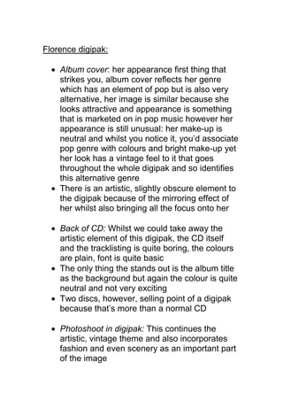
- 1. Florence digipak: Album cover: her appearance first thing that strikes you, album cover reflects her genre which has an element of pop but is also very alternative, her image is similar because she looks attractive and appearance is something that is marketed on in pop music however her appearance is still unusual: her make-up is neutral and whilst you notice it, you’d associate pop genre with colours and bright make-up yet her look has a vintage feel to it that goes throughout the whole digipak and so identifies this alternative genre There is an artistic, slightly obscure element to the digipak because of the mirroring effect of her whilst also bringing all the focus onto her Back of CD: Whilst we could take away the artistic element of this digipak, the CD itself and the tracklisting is quite boring, the colours are plain, font is quite basic The only thing the stands out is the album title as the background but again the colour is quite neutral and not very exciting Two discs, however, selling point of a digipak because that’s more than a normal CD Photoshoot in digipak: This continues the artistic, vintage theme and also incorporates fashion and even scenery as an important part of the image
- 2. Lighting and colour is key in the images; manipulated to emphasize her appearance, e.g she is in the middle of the window, then the shadows are used to give an edgy vibe which again makes it look quite alternative Her clothes, whilst they are glamorous and vintage which shows that fashion is a big factor in her image, they are quite neutral colours again and the whole use of neutral colours helps draw attention to her hair because you don’t notice what she’s wearing as such, the first thing you are drawn to is her hair The colour of her hair is really striking and is the most if not only source of colour in the photo and links the whole photoshoot together, shows her hair is her most distinct part of her look and makes her recognizable Other: Something that I found interesting was the lyrics handwritten on the photos because it gives it a personal feel, as if she’s personally written about her feelings as if it was a diary, and it is something that we would think about using for our artist This photo here also provides a personal feel because it feels like it’s been taken spontaneously, out of her private life Overall, I like the artistic yet glamorous vibe that is constructed through the mise-en-scene of the digipak, so the lighting and her image, and is something that we would consider using for our digipak
- 3. Rihannadigipak: Album cover: Firstly, the album cover is in black and white, as it most of the album, which is not typical of the pop genre because it’s usually about colour and brightness so the fact that it’s black and white emphasizes the focus on her. The only colour on the album cover is on the spine, and it’s her name, to again highlight her as commodity. The typography in general is quite basic, small and plain font, so that people are drawn to her face and it’s clear that she’s the main focus. Smoking: rebellious, could show that this album is more dark and less pop What is also not as pop as other digipaks is that her make-up is quite minimal, not very bright, yet her hair takes up most of the album cover so again that continues this theme that hair in particular influences the image, maybe more so than make-up in this instance Back of CD: Has no tracklisting, the tracklisting is inside the digipak which is something innovative for all digipaks and could be something that we’d consider for our digipak Again the main focus is on her, she is in the middle of the photo and takes up all of it even though it is flipped upside down Unlike the album cover, it isn’t a close-up and instead focuses on her fashion which is quite an unusual combination but continues this theme that image is very important
- 4. Again, she is smoking here which makes her look rebellious and careless Photoshoot: On the inside of the digipak, there is where we finally see some colour but the background is quite dull so not just that Rihanna is the main focus but her top half Again fashion, in this case jewelry, is the main factor of her image which is something we’ll definetly consider for our digipak What we liked about the whole photoshoot is that it doesn’t look like a photoshoot, it looks like it has been taken in a city that isn’t that glamourous, because of the graffiti and dirty surroundings but gives it an edgy feel. Pop is genuinely seen to be quite glamourous yet her digipak is constructed to look gritty and more associated with non famous people than it would be a pop star. We really liked this because it gives a more realistic portrayal of her that could help to connect more with her fans All of the photos are made to look as if they’ve been taken for a newspaper article, with the exception of the photos where she gives eye contact, it’s as if she isn’t aware that they’re being taken, which gives a candid feel. The photos on the staircase in particular look spontenous, the background isn’t particularly, the setting looks quite gritty, just like a normal flat
- 5. Her poses demand a lot of attention and are controversial alone because they are quite sexual This could reflect her image in the media – she is the subject of a lot of controversial attention in the media and so Rihanna could be playing on this and reflecting her rebellious attitude towards it She constructs a party girl, rebellious image throughout the digpak with the photos of her posing with alcohol and cigarettes, which is something that is more rock than conventional pop music Throughout the digipak, her clothes are minimal which enhances her attractiveness again, which could appeal to a male audience where is a female pop star would genuinely expected to be targeting young girls The whole digipak in general doesn’t seem genre specific Tracklisting: the thing I liked most about the digipak was how the tracklisting was constructed. It’s presented as a newspaper article, with links the whole digipak together, and also continues with obvious influence of media in the digipak. Each song title has a different font, which we found really intersesting and unique, and is something that we would consider for our digipak