
Recomendados
Más contenido relacionado
La actualidad más candente
La actualidad más candente (16)
Destacado
Destacado (19)
Similar a Music Magazine Evaluation
Similar a Music Magazine Evaluation (20)
Último
Último (20)
Music Magazine Evaluation
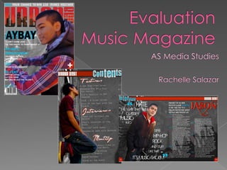
- 1. EvaluationMusic Magazine AS Media Studies Rachelle Salazar
- 2. 1. In what ways does your media product use, develop or challenge forms and conventions of real media products?
- 3. Front Cover In the magazine that I have created, I have incorporated the main generic conventions such as barcode, cover lines, price, date of issue, masthead and including the main image. I subscribed to these conventions by making the main image dominate the masthead as most of the magazines has the same idea of covering the masthead to look more professional. I made sure that the left third is displayed clearly so that the masthead is recognisable for the buyers. I also placed the barcode on the bottom left corner so it’s easy to see. The date of issue and the price is also shown above the barcode so the reader would not get stress of finding it. I distributed the cover lines around the cover, and also placing the main cover on the side to make it look more like a magazine. And I made sure that the font size of the main cover is bigger that the rest of the cover lines to make it standout on the page. I feel that my magazine is conventional as it uses similar colours like red and purple to follow the house style of the magazine - just like the VIBE magazine for example.
- 5. Double Page Spread For the Double Page Spread, I made sure that it’s sophisticated in terms of typography, layout and design. I did this because I want the readers to catch their attention on the page. The left side of the magazine contains the main image with quote and the right side contains the article. Again, the name of the masthead is placed on the top page to let the reader know what Magazine it is. Just like Vibe magazines, they add the masthead in every pages of their magazine.
- 6. I also challenged these conventions for my front cover, as the model is not providing any eye contact to the readers. I did this in all the images that I added to follow the house style of the magazine. I pretended that the models are well-known already so that there is no need for eye contact as the readers will easily recognise the model. Also, I made sure that the typography is consistent throughout my magazine. As you can see from the bottom, the title of the page looks a little symmetrical as they both have different sizes and the same colour. Also, the red and black box is the same just so it separates on the page. I am mostly influenced by Billboard magazine by the way that they edited their images such as having a black and white background. See: Jay Z (black and white) I incorporated this idea of photo shoot on my own magazine as the image of Jay Z’s background shows the buildings and lights. I did this during the photo shoot because it interests the reader more to buy it. I believe that if the magazine looks “tacky”, the readers will not be attracted to buy it.
- 7. 2. How does your media product represent particular social groups?
- 8. The social group for my magazine represents a particular social group which are known as Hip-Hop/R&B which they represents males to be a machismo type. My magazine represents this social group for those who are interested in celebrity gossips, Hip Hop/R&B music, and also for those who are interested in Hip Hop fashion. My magazine represents a stereotypical way as most R&B/Hip Hop magazine mostly illustrates Black or Asian people as rebels and “giddy” by the way they wear their clothes, movement and even accent. I feel that my magazine is bias as it dominates women because my magazine is all about men and no evidence about women of any kind. See my blog to know more about Hip Hop. The kind of race that they have has a negative representation as the models attitude appears to be looking away off the camera as if they don’t care less. This is effective as it easily links to the type of genre that I am aiming to do. I believe that my music magazine contains a realistic portrait of this type of social group which would help to attract the readers to buy this magazine. Another magazine that portrays this type of social group is The Source magazine.
- 9. 3. What kind of media institution might distribute your media product and why?
- 10. These are some institution that I believe that my magazine would sell best on: Hip Hop Village (mass market) Bauer Media Hip Hop village is a well known music organisation who are dedicated to promoting Hip Hop artists. This mass market is able to distribute my magazine because it involves young adults informing them about the Hip Hop culture. And this is what I am aiming at doing. Bauer Media is the largest publisher in Europe publishing a wide range of different magazines such as Empire, Trout, Grazia, Q magazine, etc. This company also owns TV channels such as 4Music therefore; It would be a great opportunity to promote this magazine thru television.
- 11. 4. Who would be the audience for your media product?
- 12. The target audience for my product is at the average age of around 16-25 males and females who are interested in Hip Hop/R&B music or even Hip Hop/R&B artists. This would make the readers engage on the magazine as they can relate with them straightforwardly. I took a questionnaire to a group of people who listens to R&B/Hip Hop music. The questionnaire is shown at my blog. This helps me on what kind of features I can add on my magazine. Other types of magazine that my particular audience could be interested at are: Vibe, The Source, Rap Up etc. These magazines appeals to me because they are a good influence on my work. These magazines has helped me a lot on doing my cover lines and article on what kind of topics they talk about in their magazine. Such as talking about what they have been up to, about their music, gossips, etc.
- 13. 5. How did you attract/address your audience?
- 14. The readers are attracted by the magazine’s appearance itself. The model stands out the most on the page because the background image is black and white so the readers will focus more on the model rather than the background. The next thing would be the masthead because the red also stands out on the cover. Also, I feel that the design of the masthead hints to the genre of the magazine – urban and beat links to Hip Hop. I chose the colour red because it stands out the most. The red colour links to Hip Hop as this type of social group mostly likes to show off about who they are, what they are wearing, the way they speak, etc.
- 15. The use of pug on the top line article grabs the reader’s attention because of the word ‘WIN’. This would then tempt then to join the competition. The use of imperative (‘your chance to win’) to form a relationship between the reader. I also used some language techniques such as superlatives (‘calling all the best rappers ...’) so the readers would actually believe that they are the best rappers in the U.K. I added rhetorical question (‘too hot to be gangsta?’) to make the reader think about the answer. This would allure them to read the article about TJAY. The use of anaphoric repetition (‘got the ...’) to emphasise that this artist has really got it. These cover lines attracts the reader to buy this magazine and read the article which also they could also be attracted by the joining the competition too.
- 16. 6.What have you learnt about technologies from the process of constructing the product?
- 17. In making this project, I have learnt to use many software programs. I have used all these programs before which is very easy to manipulate around as I already know the features. However, I am new at using Photoshop so this is a huge improvement for my editing skills.
- 19. I believe that it takes a lot of effort to create a magazine as it takes a lot of thought and planning into how to produce a magazine. I’ve also learnt that the photographs have to be perfect to make the magazine look appealing for the target audience. Throughout my whole project, I’ve learnt that I have to always keep in mind who my target audience is and what they look for in a Hip Hop magazine.
- 20. 7.Looking back to your preliminary task, what do you feel that you have learnt in the progression from it to the full product?
- 21. In the progression of my work from creating my school magazine to creating the main task, I can see a huge difference on my work as I believe that my editing skills have improved dramatically - From using Microsoft Word to Photoshop Element. In my opinion, the biggest changes here is the masthead as my latest one looks more defined than the old one. My latest magazine looks more professional than the old one in terms of layout, image effect and texts. I have learnt more about the magazine industry and the ways that they implement and present their magazines. I have also improved my knowledge about the forms and conventions of a magazine and what a Hip Hop magazine is looking for.
- 22. How successful do you feel your end product is in fulfilling the task? How well does it fit in the brief?
- 23. I fee that my main task of making a music magazine has become successful in many ways. My editing skills has improved a lot. I’ve also improved my photography skills and my knowledge about the magazine industry has developed enormously. In the beginning, I had difficulties on creating a magazine cover because I did not know what a typical magazine is looking for. I this case, the research and planning has helped me a lot to design my final product. If I had another chance to improve my magazine, I would probably change a little thing – the main cover line on the front cover. I don’t like the text as it looks too simple and rather big. If I can only reduce it down a little and probably change the colour, then I am satisfied with my work. I really enjoyed doing this coursework because I have learnt a lot of new things such as using a new software e.g. using Photoshop Element. My designs has developed in great deal as I feel that the best one that I have done in this coursework would be the masthead. I really like this design because its very simple yet sophisticated in many ways, and I feel that it stands out the most in my magazine.