
Recomendados
Más contenido relacionado
La actualidad más candente
La actualidad más candente (20)
Destacado
Destacado (19)
Similar a Media 7
Similar a Media 7 (20)
Más de rebecca-paterson
Más de rebecca-paterson (20)
Último
Último (20)
Media 7
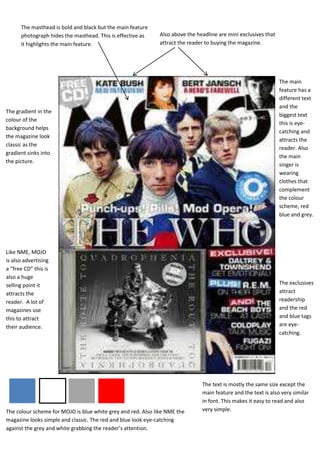
- 1. The masthead is bold and black but the main feature photograph hides the masthead. This is effective as Also above the headline are mini exclusives that it highlights the main feature. attract the reader to buying the magazine. The main feature has a different text and the The gradient in the biggest text colour of the this is eye- background helps catching and the magazine look attracts the classic as the reader. Also gradient sinks into the main the picture. singer is wearing clothes that complement the colour scheme, red blue and grey. Like NME, MOJO is also advertising a “free CD” this is also a huge selling point it The exclusives attracts the attract reader. A lot of readership magazines use and the red this to attract and blue tags their audience. are eye- catching. The text is mostly the same size except the main feature and the text is also very similar in font. This makes it easy to read and also The colour scheme for MOJO is blue white grey and red. Also like NME the very simple. magazine looks simple and classic. The red and blue look eye-catching against the grey and white grabbing the reader’s attention.