1. Analysing images
At the beginning of
this academic year,
we start our AS
course, however,
before we carried
on through the
course, we needed
to know the ground
basis of studying
Media. In the
second week of
media, we learnt
about how to
analyse images in
greater depth. We
learnt about the
mise-en-scene.
Mise-en-scene is a
French terminology
for ‘putting on
stage’. This term
refers to
everything that is
in the scene. We
also learnt about
two useful words,
Denotation and
connotation.
Denotation refers
to the literal
meaning of a word
or image- what the
audience can
visually see.
Connotation refers
to the association
that are connected
to a certain word-
what the denotation
represents.
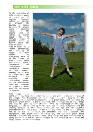
This image is a
point of view, long shot which indicates the girl is the main focus of
the image. The denotation of this image is a girl jumping in the
foreground, in a natural environment, in a green area, with the blue sky
and dark green trees in the background. The connotations of this image
are that the girl is very cheerful. This is referenced by the body
language, as she is jumping in the air. Her costume, dungarees and the
primary colours in this image symbolize her age and her youthful
characteristics. The clouds in the blue sky links to the girls costume
and so we can relate with the character and the situation. The
background, the green grass, the blue sky and the dark green trees
reflect a natural and tranquil mood. This image has been manipulated by
being edited with natural photo filters as the effect of this makes the
photo bolder and more valuable.
2. Adobe Photoshop basics
Colour filtering
This tool can be useful for my magazine as I will have a set colour
scheme, therefore, I can use colour filtering so my scheme colour
and main photo correspond with each other. This tool makes the
image much more interesting to the viewer and attracts a wider
audience.
The aim of this lesson was to become familiar
with the basic tools in Photoshop. In this
lesson we focused on colour filtering. As you
can see from these two images, colour
filtering adds a colour base to the image. I
experimented with this tool in Adobe
Photoshop. I took a sample photo of students
outside St Marylebone School. I did this on
Photoshop by duplicating the photo, in case I
made an error and I needed a back up. I
created a new layer, where I used different colour paint tool, which I
selected from the colour palette. I decided to do a rainbow effect so I
used the colours: red, blue, green, purple and yellow. At this point,
the paint tool covered the original photo, therefore, to blend the
colour with the image, I went on the layer toolbox on the right hand
side, and I changed the blending mode to soft light. This meant that
when we colour it in using the paint tool, the image is still visible
through the colours.
3. Adobe Photoshop basics
Editing and enhancing
Our focus on this lesson was editing and
enhancing an image on Adobe Photoshop,
specifically concentrating on the cloning and
eraser tool. I used this sample image of a
close up of a woman’s face. As you may be able
to see, her features are rough and unedited.
The aim of this experiment was to remove her
blemishes and soothe her face. Firstly, open
this image on Photoshop and I duplicated this
layer, in case I made any errors whilst
editing. I zoomed into her face and I selected
the spot healing tool and placed the tool over
her blemishes and spots. Her blemishes and
spots are replaced with the surrounded
background which blends the skin together.
Then, I selected filter on the top tool bar and selected gausaim blur. I
had to be careful using this tool, as I didn’t want to blur the image
too much, otherwise I wouldn’t be able to see her features. Therefore, I
adjusted the settings and used blur 1.0. The gausaim blur blend the
image to smoothen the face. The next step was to erase the eyes, lips,
nose ring and earring from
the new layer, so that it
appears much sharper. This
makes the image more
realistic and
professional. This was the
basic layer completed. I
decided to change the
colour of her eyes and
hair. A similar technique
is used to change the
colour of her eyes, like
we used the colour
filtering effect. A
created a new layer and I
selected the brush tool. I
chose the colour which I
wanted to use and I had to
adjust the brush to the
size of her pupil. Once I
selected the colour and
size, I clicked the brush
over her eyes. However,
this tends to cover her
eyelashes so I erased the
brush so I was able to see
her eyelashes. I changed the blending mode to soft light and I adjusted
the opacity to make the eyes look realistic and transparent. In order to
change her hair colour I create an adjustment layer and selected on
hue/saturation layer. I grouped this layer with the previous layers and
selected the tick box which read colourize. I adjusted the hue and
saturation bar to get the right colour.
4. Fonts and their usages
Sans serif is a typeface that does not have the small features
A
called ‘serifs’ at the end of strokes. An example is this font
called Gill Sans Mt. A sans serif font is suitable for writing
essays and annotations. Sans serif fonts are good for bold
headings and master-heads. This typeface can be light or
heavy, depending on the emphasis of the text.
A
A serif font is a type of font with short, light lines or curves called
serifs projecting from the top or bottom of a main stroke of a letter.
Serif typefaces are used for body text because it is more legible than
sans-serif fonts. Serif fonts give a professional finish to a magazine.
An example of a serif font is this current font, called Cambria.
Script typefaces are based upon the varied and often fluid stroke
A
created by handwriting. This font is called Monotype Corsiva which is
an example of a script typeface. Script typefaces add elegance to the
product, for example, script fonts are often used to create a sense of
luxury on product packaging. However, they are unclear when the font
size is small. Therefore, script typefaces are appropriate for short and
big phrases or words.
Grunge font refers to eroded font. For example,
A
Hurry Up is a grunge font as this typeface is
neither serif nor a sans serif font. Users use a
grunge font to advertise a particular subject.
Grunge fonts can also be used depending on the
theme and content of the magazine, for example, a
grunge typeface would work well with a music
magazine.
5. Comparing school magazines
In this lesson we were asked to compare two
school magazines. I chose these two magazines
because both magazines contrast each other which
makes it an interesting analysis. This magazine
is has a formal layout which addresses that the
school is posh and well established. The mood
translated in this shot is tranquil and soothing.
The image used on the front cover of this
magazine is a point of view long camera shot. A
point of view shot shows a view from the
subjects’ perspective, therefore we can seduce
that the subject are the parent or guardian of
the pupils at this school. The colours used in
this shot relate to the colours of the school
logo which creates an impact as the page design
complements one another. This image has been
edited, and the brightness has been adjusted so
the logo and the master-head stand out from the
page. The effect of this is that users are
attracted to the magazine. All the text has been
aligned to the centre, so as the eyes flows the ‘C’ or ‘S’ shape on the page,
the eyes are naturally drawn to the name and logo of the school, which is their
first impression. The text ‘royal’ is bigger in size than the rest of the text,
this is significant as ‘royal’ relates to the royal family, who are posh. The
colours blue and red symbolise wealth, and these colours have been tinted in
the image. The font used is Serif which communicates that this magazine is
formal and intellectual. However, my magazine will be informal as the target
audience is different. The majority of students will choose a magazine which is
vibrant and informal which will grab their attention.
The second magazine I chose, contrasted the first
one I selected. This magazine is informal and
therefore attracts youths. The shot used to
capture this frame is a low angle close up camera
shot. A low angle shot is a camera angle that
looks up at a subject or an object. This can be
used to create an impression of higher status and
authority. Specifically in this shot, we can
suggest that students want their voices to be
heard. Therefore, this shot attracts the users
because being students; we are portrayed as
dominant and intimidating. The importance of
using a sepia effect on the image suggests a
flashback or past memory which is being reflected
on. The sepia tone creates a warm, antique
feeling which will attracts users because sepia
or black and white images call a larger voice
than colour images. In addition, the white
master-head is bold and stands out. The kickers
in this magazine are aimed at different
audiences. For example, the kicker ‘got the holy
spirit’ will aim at religious people, however, the title is unusual, therefore
this addresses to a wider audience. On the other hand, the kicker, ‘music
review’, will attract musicians and those who are interested din the music
industry. The date line is written on the top right hand corner as this is the
standard formatting in most magazines. The reason for this is that the eyes
start from the right hand corner and flows down in a ‘C’ shape and stop in the
bottom right hand corner. Therefore, the date is crucial as the users will want
the latest issue. The overall design and layout of this front cover is flowing
and appeals to a greater audience.
6. Photo-shoot
In this lesson, I
took multiple photos
for my school
magazine front
cover. My original
idea was to have a
shot of four
students jumping in
the air with their
GCSE results.
However, I realised
that if my school
magazine will be
portrait, this frame
shot would not work.
So instead I decided
to stick with two
students in my shot.
As you can see in my
first shootout, the
frame is not
interesting and it
does not attract to
a wide audience.
Furthermore, if I
was to place that
image in a magazine,
I would not be able
to add an attractive
layout as the focus
is in the middle of
the shot. Therefore
I considered a shot
which would appeal and of which the focus
point is right aligned. I decided to have two
students jumping in the, one with a book and
the other with her results. Is image is more
effective as I have chosen a better scenery.
This shot is a high angle long shot. The
denotations of this image are two students
jumping in the air with books and results on
the road, near a park and school. The
connotation of this if you study hard then
good results are waiting. Also, the book
symbolises that you need access to different
resources to help you gain more knowledge. I
felt that this task was rather successful,
however, there were some aspects which I
intend to change in the future. Next time, I
would consider the costume, for example if the
girls wore uniform or smart clothing, the
connotation would be spread stronger and the image would be bolder.
However, I like the scenery as the background is walking into the
distance.
7. October 2010
Welcome to my
Sweet Sixteen
Make your stand
Are you tired
of always listening
to teacher babble?
Well now is your
chance to seek
sweet revenge
One step higher
After passing through
the summer exams,
are you struggling to cope
with a-level life?
Want your voice to be heard?
MOCK UP
8. School magazine mock up
DATE LINE
MASTERHEAD
KICKER
EXPLANTORY
TEXT
KICKER
EXPLANTORY
TEXT
LEFT THIRD ALIGNED MAIN COVER LINE
When I create my magazine cover, I will use one font only but I will use different sizes and formats
with the font to keep the audience engaged. The master-head will be bold and will be size 41. I do not
want it to be really big otherwise it will cover the main picture. However, I need to ensure that the
master-head sticks out so the users know what magazine they are purchasing. The date-line will be in
the top right hand side, when I did my research most magazine use the standard format, therefore, if I
use it, it will make my work look professional. I will have two kickers. ‘Make your stand’ will be size
16. ‘Your’ is bold and underlined because it addresses and engages the audience. Therefore, this will
attract them to read my magazine. Underneath the kicker I have written an explanatory text. I have
briefly summarized what the article will be about. I have used a rhetorical question to grab the
attention of the user so they purchase this magazine. This will be size 11. My second kicker is ‘one
step higher’. I have used an unusual kicker to attract my target audience. I have underlined ‘one’
because I want to reassure students not to stress. The size of this kicker will be size 20 and the
explanatory text will be size 11. Again, I have used a rhetorical question to address students. I have
used a logical question which applies to all students, regardless of age, religion or sex. My main
cover line will be size 20 because it needs to stand out. I have highlighted ‘your’ to communicate to
students so I can make the text believable. The main picture, in the background, will be black and
white. However, the main focus is on the two students in the foreground. Therefore, I will make them
stand out by having colour on the focus point. I have chosen Lucida Console as my main font because it
is an interesting typeface which not many people would use, therefore this will make my magazine
unique. I have used code of convention such as the left alignment and the classical ‘C’ shape eye flow
technique. This will make my magazine successful and appealing to my target audience.
9. Photoshop
Before I began to edit my photograph
on Photoshop, I duplicated the layer,
so I had a back-up in case I made any
errors. By having a back-up, this
saves me time from redoing all the
edits on the photo, therefore, this
saves time and work. I saved my work
regularly, to avoid having to waste
time on lost work. I changed the page
orientation to A4, as this will be
the size of my magazine, as it is
easy to carry around and the size
will be suitable
for the users. I
started editing
my duplicate
layer by using
the brush tool. This tool is used to paint on the photo
which has been selected, on the chosen layer. This tool can
be used to fill in a layer with a colour chosen from the
palette or it can be used to paint brush strokes with
different colours which have to
select individually from the
paint palette. I used the paint
palette to select what I colour I
wanted to use, I clicked on set
foreground colour and I selected
white. I then had to choose to select
which type of paint brush I wanted to
use- each brush had a different
technique. As I wanted a normal brush,
I chose to use the blending brush. And
I changed the settings so I had a big
brush so the strokes were big as this
was a quick method. I decided to use
this tool instead of the
paint bucket because I
was able to control where
the white paint went on
the image. Therefore, I
had control over the image. This tool is effective
because there are different dynamics which can be
applied and for different purposes, therefore it is
convenient for everyone, and it can be used for any
purpose. In the bottom right hand corner, there is
a box where you can edit the layers. I selected on
the layer which I was currently using and I changed
the blending modes to see a preview of how my photo
would look like with those
effects. I decided to use
saturation. This turned my
image from colour to black and
white. However, I changed the
opacity so that the photo wasn’t
fully black and white, as I
wanted a hint of colour to attract my target audience. I
used the eraser tool to erase the two girls jumping in the
foreground. I chose to do this effect because it would bring
more focus to the foreground which will appeal to the
audience and it will bring emphasis to my magazine.
10. Photoshop
This tool is appropriate because it erases the areas which are unwanted on the
selected layer. This tool is significant and I used it because I could change
the size of the eraser and I could select different dynamics. For this
particular image, I used the blending eraser because I wanted the colour to
blend into the background rather than using the block eraser which will mark a
line around the areas I have erased. Therefore, this tool creates an impact on
my production, because it makes my magazine
cover look more professional and appealing for
my target audience. I have finished editing my
background image, so the next stage was to add
the text for my magazine. The text indicates
and represents the genre and content of the
magazine. These are illustrated by the code of
conventions, such as the master head, kickers
and explanatory text. The add text to my front
cover of my magazine, I used the horizontal
type tool. I created a new layer, as if I wanted to move the text around, I
wouldn’t move the previous layer as well. I clicked on where I wanted the text
to be positioned and I started to type my master head- the name of my magazine.
I highlighted the text so I could change the formatting of the text. This
toolbar includes all the font facilities I need. This is useful as I will
remember to check all these settings before I carry on creating my magazine
front cover. I changed the font to Lucida Console as shown in my mock up which
I created to plan my magazine. I changed the font size and I made the typeface
bold so it was bolder. This made it easier to read and understand. I used the
eyedropper tool to select the shade of pink I wanted. This tool is significant
as it allows the user to select a particular colour which exists on the image
chosen. I used this tool by highlighting the text and using the eyedropper tool
to find the colour I wanted from my background layer. I selected the shade of
pink I wanted from the pink folder shown in the girls’ hand. I decided to use
this tool because I wanted the colours to match; therefore the master head
colour complements the pink folder.
11. First draft
This is the first
draft of my school
magazine. I created
my magazine with
referral to my mock
up plan. I got
feedback from my
peers to see what I
could improve to make
my school magazine
more appealing and
professional. I
received both
positive and negative
criticism. The
feedback I received
from my test buddy
was significant as it
helped me make my
magazine more
efficient. And it
also helped me
acknowledge was my
target audience are
attracted by, so I
can appeal to my
target audience.
Improvements:
1. Avoid the text covering the focal point in the background.
2. Add hint of colour to trees to make the photograph realistic
3. Make kicker size bigger than explanatory text
4. Make the text clearer and more visible
5. Limit the colour usage
Positives:
1. The focal point of the image is appealing
2. There is good eye flow
3. Greyscale effect is interesting and attracts a wide audience
4. Photograph relates to master-head, which reflects genre
12. Final magazine front cover
I have abided by the code of convention in comparison to my first
draft. I have undertaken the criticism given by my test buddy and I
have changed my magazine according to what my target audience may
prefer. My texts are aligned on the left margin and I have followed the
eye flow ‘C’ shape to make it easier for users to follow. I have
limited the colours to pink and yellow. I have also added a date and
issue number to make my magazine front cover look more professional. I
rearranged the text so the text did not cover the image, I also changed
the size of the textboxes, to make it appropriate for a school
magazine.
13. Additional photo-shoot for TOC
Agency name: Sweet Sixteen
Shoot Date: 11/10/10
Model Shot Macro/ Background Positioning Details of
type/angle Flash and on TOC editing
/ distance Lighting
Hattie Low angle, Outdoors, The location will Table of content I will add an
Upton- long shot therefore be outside of the feature article effect to the
Dance, there will school gates, for ‘one step photograph by
Debbie be natural which will read higher’ as a- changing the
Onyemelukw lighting. ‘St Marylebone levels is an blending mode.
e, Tibyaan However, if School’ on the important and
Nassir, outdoors is front of the rapid step from
Penny not possible school building. lower school,
Nakan, or if the A group of therefore
Jessica weather is students will be students meet
Murphy bad, I will socialising. No new people and
do my photo- essential props socialising is a
shoot inside are needed; skill which has
school at however, the to be improved
the costume must be in order to
reception appropriate and learn for coming
area. I will relevant for years and stages
then use school life. in life.
flash to add Therefore, this
to give the photo-shoot is
same effect. relevant for
this article
which will be
position in the
left column.
Hattie Median, over I will not The location will Table of content Photograph will
Upton- the shoulder be using be inside of feature article be faded using
Dance, shot artificial school, in the about ‘one step Gaussian blur,
Tibyaan lighting for corridors where higher’ which is and I will use
Nassir this there are tables an article which the erase tool
photograph. and lockers. This gives advice for to add focal
Lighting sets a school students who effect on the
will come atmosphere. Two have started a- student
from the students will be levels. Position studying. Add a
window, sat at a table article on left calm mood to the
natural studying. Props column. photograph using
sunlight. If will include colour effect.
flash is water bottle,
necessary, books, paper,
ensure glasses and
camera is at stationery.
least 1.5 Camera shot will
metres away be taken from
from shot, shoulder of one
to avoid of the students.
over There will be no
exposure eye contact with
the camera, to
make the shot
seem realistic.
14. Additional photo-shoot for TOC
Agency name: Sweet Sixteen
Shoot Date: 11/10/10
Model Shot Macro/ Background Positioning Details of
type/angle Flash and on TOC editing
/ distance Lighting
Tibyaan High angle, Indoors, The location will Table of content I will add
Nassir, long shot flash will be indoors. feature article colour effect to
Debbie be Students will for ‘make your this Photoshop
Onyemelukw necessary, stand in a circle stand’. to enhance the
e, Penny however I and they will be Positioned on image.
Nakan will need to holding hands and left column.
ensure stretching their
camera is at hand in the
least 1.5 circle. The
metres away background will
from shot, be simple. A high
to avoid angle shot will
over be taken so the
exposure floor will only
by visible. No
props are needed
Tibyaan Point of Indoors Location will be Table of Enhance the
Nassir view, long therefore, I in the school content, image image so
shot will need atmosphere, in positioned on attention is
flash, the building. the right drawn on the
however I Preferably alignment of the vibrant colour.
need to leaning against a page. Adjust
ensure the right painted brightness and
camera is wall with shadows.
1.5 metres furniture if
away from possible. Student
the shot to will stand with a
prevent over smile and holding
exposure her thumbs up.
Possible props
could included
glasses if
possible
otherwise not
essential.
Hattie High angle Indoors, in In a classroom, Photo elated to Edited in
Upton- shot a classroom with desks, article ‘make Photoshop,
Dance with natural chairs, your stand’. specific editing
sunlight whiteboard etc, Positioned on not specified
coming from student mimicking the left column, yet.
the windows teachers. Student with photo in to
will be teaching the right.
and sitting at
desk. Props
include glasses
and smart
clothing.