1. 1. In what ways does your media product use, develop or
challenge forms and conventions of real media products?
(i.e. of music magazines)
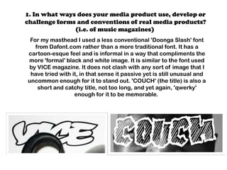
For my masthead I used a less conventional 'Doonga Slash' font
from Dafont.com rather than a more traditional font. It has a
cartoon-esque feel and is informal in a way that compliments the
more 'formal' black and white image. It is similar to the font used
by VICE magazine. It does not clash with any sort of image that I
have tried with it, in that sense it passive yet is still unusual and
uncommon enough for it to stand out. 'COUCH' (the title) is also a
short and catchy title, not too long, and yet again, 'qwerky'
enough for it to be memorable.
2. LAYOUT
The layout and style I have portrayed within COUCH magazine is one that is
very simplistic, monotone, and constant through out all the different pages
and spreads. The black and white, well-constructed theme is something I
have retained, along with text. The Doonga Slash font which features on the
cover's masthead is also prominent in pages such as the table of
contents, where it is used for numbering, and smaller titles. On my double
paged spread, the same font is also used for page numbers and the articles
title, this, in terms of lay out gives it a unified theme. Although some of the
content and style within my magazine is not particularly conventional
(using non traditional images and fonts etc) the idea of a constant style
and lay out is something which still remains, and is also used in many other
professional media texts.
In terms of imagery, the non-conformative style of the photos I have used
reinforce a certain degree of interest into my magazine, rather than a
standard white backdrop and mid-shot of a model I opted for a almost
sinister, extreme close-up for my front cover, converted it into black and
white, and then hid the identity of my 'artist' to also add interest. This sort
of style in turn reflects the genre of music I wished to feature in my
magazine, that of course being a contemporary style of hip-hop.
3. In terms of conformity, the cover image is similar to several issues of Port
and Esquire magazine in terms of the close up and high detail shot used,
which is then wrapped up in the oddness of magazines such as
BITCHSLAP and VICE. This is also consistent in my table of contents
photo, and the main image on the double paged spread, both are high
quality, both are slightly bizarre yet very attractive and interesting to my
ideal reader. In terms of reader profile, I think this sort of style and imagery
worked well, my intended readers would be a young audience running up
to a more middle aged audience, so obviously the images would have to be
interesting enough to match the slightly more literate and 'out there'
articles.
4. DESIGN & FONT
As far as Font goes, I wanted that to be consistent, much as it was with the
main font used for the title, this has happened, I have also used Cooper Black
for smaller subheadings and to break up pieces or highlight questions in the
article, on the cover, it is used for smaller information, and as a runner on
pages like the table of contents.
By keeping this consistent, but also keeping it slightly less formal, it makes
the magazine seem a lot more well constructed like many magazines I
have analyzed do, yet also appeals to the audience I have designated for
reasons stated above. The contrast of less formal and less conventional
fonts and text with the actual content being well written is an oddly
complimenting feature I always aimed to achieve with COUCH magazine.
5. How my artist represents my chosen genre: My artist's profile is designed to be
aged between mid 30's to early 40's. In the mise-en-scene, both his attire and
his body language is very relaxed much like my desired reader base and the
overall lay out of COUCH magazine. Yet on the double paged spread, his
identity if concealed by a mask, much like how it is hidden on the cover by the
masthead. This is an usual feature for an usual sub-sect of the hip-hop genre
(one I chose my magazine to focus on) and the mask not only reinforces this.
The idea for the 'mask' or 'hidden identity' stemmed from rapper of a similar
age and style MF DOOM who I have featured heavily in both my image
construction and style building through out the development process, as a
rapper he does not tend to burden himself with heavily or obvious branded
clothing for advertisement purposes on any sort of images he is
on, particularly for interviews etc, so this is something I have considered and
thus acted upon.
I left this out as it is much more of a mainstream hip hop tact to use and my
magazine is certainly swayed more towards a non-commercial and 'select'
type of media text. This well spoken and interesting character helps extend to
an impressionable yet well educated younger audience, and of course an older
audience which would probably have been exposed to his music previously, as
they may be of a similar age.