Typographic Research - Teacher's Assistant In Class Presentation
•
1 recomendación•454 vistas


Recomendados
Más contenido relacionado
La actualidad más candente
Destacado
Más de Ross Papa
Typographic Research - Teacher's Assistant In Class Presentation
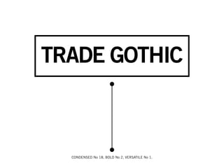
- 1. TRADE GOTHIC CONDENSED No 18, BOLD No 2, VERSATILE No 1.
- 2. TRADE GOTHIC HISTORY Trade Gothic was designed by Jackson Burke between 1949-1963. Trade Gothic doesn’t really have an exciting backstory or incredible design uses. What it does give is a very legible san serif (partly due to it’s large counters*). You can findTrade Gothic commonly in bookcover designs, magazines, and newspapers. *
- 3. { I associate with it most, not just for its loveliness, but for how honest it is. Trade Gothic JASON SANTA MARIA is sturdy and simple with little flourish or fuss. http://jasonsantamaria.com/articles/if-you-were-a-typeface/ It’s dependable, industrious, plays well with other typefaces, and can often be the anchor for structure to be spun from in a design.
- 4. “ Typography must often draw attention to itself before it will be read. YET in order to be read, it must relinquish the “ attention drawn. Words of wisdom from Bringhurst’s Elements of Typographic Style.
- 5. “The Hidden Cost of War” // http://www.good.is/?p=12104 Notice how Trade Gothic remains very sturdy and constant but the way it’s used compels the audience forward through the message.
- 6. Here, Trade Gothic Condensed is used. When using Condensed in titling, you can get away with using the standard kerning (space between characters) but when using Condensed in type blocks, give more space between characters to avoid it looking like a big black box on your screen.
- 7. 1451 Mittelschrift / 1451 Engschrift / FF
- 8. HISTORY DIN 1451 (aka DIN-Mittelschrift), the first version of this typeface. In 1936, DIN was chosen to be used as the standard for architectural uses, engineering purposes, traffic, administrative and business purposes. This typeface was design to be clean and very legible, which is why DIN is used many contemporary german road signage. It is fairly industrial and be percieved as severe at times, but there is enough playful moments within the typeface so that it can be used in uses outside of “industrial”
- 16. Bodoni abcdefghijop 123 AQ abcdefghijop
- 17. Giambattista Bodoni engraver, type designer, typographer, printer, publisher. “Bodoni achieved an unprecedented level of technical re nement, allowing him to faithfully reproduce letterforms with very thin "hairlines", standing in sharp contrast to the thicker lines constituting the main stems of the characters. He became known for his designs of pseudoclassical typefaces.... His printing re ected an aesthetic of plain, unadorned style, combined with purity of materials.” - http://en.wikipedia.org/wiki/Giambattista_Bodoni
- 18. Small Aperature Ball Terminals High Contrast Exaggerated Modulation Hairline Serifs Historically: Romantic (18th & 19th centuries) Typographically: Didone Classi cation; “slab-like serifs without brackets, vertical orientation of weight axes, strong contrast between thick and thin lines, and an unornamented”