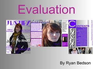
2. This is the cover of my music magazine and as you can see it is very conventional as it follows the basic layout such as, big bond title at the top of the page. Image in the middle dominating the page. A splash going through the main image relating to the main story. Also side stories and pugs to show everything else that is in the magazine.
3. My contents page is also conventional as I have followed the basic structure of a contents page. Contents at the top of the page. Stories and page numbers in the main body of the page. Images relating to stories that are inside the story with page numbers on.
4. My double page spread is also conventional as I have used the whole image as the background. The reason why I have done this is because it attracts the reader to the page because the image really stands out. The font that I have used is a range of colours, this is to look more eye catching. I have not used a lot of text because I don’t want the reader to be reading for ages I wanted the image to tell most of the story.
5.
6.
7.
8.
9.
10.
11. Preliminary cover and contents This is my preliminary task and as you can see it is not the best magazine cover and content. My cover is not that good because the background looks really dull as it is just one colour there is not much information on there. Also the pug is not good because I have used red on there and it doesn’t fit in with any of the other colours because I have decided to use the colours of the Biddulph high school badge. My contents page is not very good because I have used different text than on the front cover. Another bad point is that there is not enough pages because a music magazine is well more than 15 pages. Also the background is one bold colour and it looks dull.
12. Magazine first draft These are my first drafts of my music magazine this includes my front cover, contents page and my double page spread. This is not as good as my final draft as I have used one colour as the background which is not as eye catching. Also there is not much information and over all it just looks boring. The only difference between by contents page is that I have changed one of the images to a picture of Jasmine to link it to the front cover and have put some information down the side because it looks plain. I have changes my double page spread a lot because ity is not eye catching and authentic. Also I have changes the image because it is the same one as my front cover and also a double page spread looks more professional if the image is the whole background so that is what I have done.
13. Final product These are my final products as you can see the differences to the front cover is I have made the background fade into two colours this is to make it look more eye catching and have also added more text to give the reader a better understanding to see what is inside. The only differences to my contents page is I have changed the bottom image to Jasmine to like to the main story and I have also added a bit more information down the side to make sure that the page is filled. My double page spread is really different as I have changed everything about