SlideShare una empresa de Scribd logo
1 de 5
(Ultima Font) I have chosen this font as a possible
 (Home & Hearth Font) I have chosen this                                  font for my cover lines because it is very clear,
  font because it is simple so easy to read                              simple and easy to read. Also similar to passions
  but at the same time it is bold so stands                             sans font the letters are very curved which makes
              out on the page.                                            them seem very feminine which is appropriate
                                                                           since my magazine is aimed towards a female
                                                                                             audience.


                                                     Potential
   (Passion Sans Font) I have chosen this font       Cover Line                 (Chinacat Font) This font would be
  because it is simple and easy to read. It also
incorporates a lot of curves which are associated      Fonts                  appropriate for my magazine because
                                                                              it is both simple and easy to read. It is
femininity and my magazine is aimed towards a
                                                                              also quite bold so would stand out on
                 female audience.
                                                                                    the page without looking too
                                                                                             dramatic.


(Lovely Eunike Hans Font) This font is not only
 curved it also looks very relaxed and almost as
    if it is hand written. I think this would be                   (Dock 51) This is my most dramatic possible cover line
  appropriate to use in my magazine because I                     font. I have chosen this font because it is bold so stands
  want teenagers to feel they can easily pick up                    out but also because it is very modern because of the
 my magazine . They should enjoy reading the                       way the letters have been cut into sections. I think this
 magazine therefore I don’t want it to look too                      would be appropriate for my magazine because my
   formal. That way they can relate to it more.                      magazine is about pop music which is very modern
 Also although the font is simple it is still bold                   genre of music. I also think that because this font is
     so would be appropriate for a cover line                        very unique it will catch readers eyes making them
           because it would stand out well.                                   more inclined to read the article.
Body text
                                                           (Century Gothic) I have
                                                        chosen this as a potential font             (urban jungle) I have chosen this font because
   (marcelle) This font is a potential mast head          again because the style is               it looks slightly like an explosion has just taken
 font. I have chosen it because it is very curved        basic so easy to read. I have             place because of the way parts of the letters are
      again like others so has connotations of            also chosen it because the                    missing. which is appropriate since my
    femininity. I also chose it because it is very       letters are very rounded so                magazine is about pop which as a single word
bold and modern. Although it comes across as                will appeal to a female                  can be associated with an explosion. Also the
  being very feminine it does has an edge to it                    audience.                         fact it looks like an explosion has taken place
because of the way the M is slightly rubbed out                                                    could also represent the fact the information in
  . This would be appropriate for my magazine                                                         the magazine has just exploded so is all new
   because unlike many pop magazines on the
 market at the moment I plan for my magazine             Potential                                 gossip and information. I have also chosen this
                                                                                                   font because it is very unique so is eye catching
to be aimed at a slightly older audience of 16-19
                                                        Mast Head &
                                                                                                      and it is also very bold which makes it stand
   year olds so I don’t want my font to look too                                                                            out.
                  girly and childish.
                                                                                                                    Body text
                                                         Body Text                                           (corbel) I have picked this font

                                                           Fonts                                             out because it isn’t too bold so
                                                                                                             could work well on a page that
                                                                                                             is suppose to be mainly images
                                                                                                               because it wouldn’t distract
                                                                                                                        from them.


                                                                                                             Masthead
    (birth of a hero) This font is very modern but
   simplistic at the same time . It includes a lot of
rounded shapes which I think makes it appropriate
 for my music magazine because to me they could                  Body text
  represent vinyl's or Cds which we associate a lot                                                               (forte) This font is both
                                                            (Arial rounded MT bold) I have
     with music. I also think this font would be                                                                rounded and curved so has
                                                         chosen this font because it is a basic
appropriate because it is easy to read so people will                                                         connotations of femininity. It
                                                          font so doesn’t take much effort to
 look at my magazine and instantly know what it’s                                                            is also bold and easy to read so
                                                          read. Also it is a recognized font so
                        about.                                                                                 will attract a lot of attention
                                                          has a professional finish which will
                                                                                                              because people will be able to
                                                        overall make my magazine look more
                                                                                                              read it without any problems
                                                           professional. It is also bold so will
                                                                                                                and spot it out of a crowd.
                                                         stand out easily on a page with a lot
                                                                        of images.
These are examples of the types of
images that will feature in my magazine.
  They will all be high quality images
 taken in a studio or in a particular set
  or location. There may also be a few
      taken from live concerts and
              performances.
Colour Schemes – all of my
   potential colour schemes incorporate
     colours such as pink and white to
represent the innocent fun associated with
     pop music and the femininity of my
magazine. I have incorporated the colour
  black into some of the colour schemes
  because this is a more mature colour so
could help show that my magazine is for a
 slightly older audience interested in pop
                    music.

Más contenido relacionado

Destacado (14)

Folha de Abrantes n.º 1
Folha de Abrantes n.º 1Folha de Abrantes n.º 1
Folha de Abrantes n.º 1
 
Ubuntu tsahim test pagmaa
Ubuntu tsahim test pagmaaUbuntu tsahim test pagmaa
Ubuntu tsahim test pagmaa
 
Teaching parents how to use puzzle temp
Teaching parents how to use  puzzle tempTeaching parents how to use  puzzle temp
Teaching parents how to use puzzle temp
 
Animales
AnimalesAnimales
Animales
 
April fool
April foolApril fool
April fool
 
Grammar book 2
Grammar book 2Grammar book 2
Grammar book 2
 
7 สามัญ อังกฤษ
7 สามัญ อังกฤษ7 สามัญ อังกฤษ
7 สามัญ อังกฤษ
 
IES Turgalium. Actividad 3.
IES Turgalium. Actividad 3. IES Turgalium. Actividad 3.
IES Turgalium. Actividad 3.
 
зөвлөмж.2
зөвлөмж.2зөвлөмж.2
зөвлөмж.2
 
презентациялысенкоо
презентациялысенкоопрезентациялысенкоо
презентациялысенкоо
 
Introduce al software
Introduce al softwareIntroduce al software
Introduce al software
 
Feature Extraction for Universal Hypothesis Testing via Rank-Constrained Opti...
Feature Extraction for Universal Hypothesis Testing via Rank-Constrained Opti...Feature Extraction for Universal Hypothesis Testing via Rank-Constrained Opti...
Feature Extraction for Universal Hypothesis Testing via Rank-Constrained Opti...
 
Petare peatón
Petare peatónPetare peatón
Petare peatón
 
Réflexions
RéflexionsRéflexions
Réflexions
 

Último

Architecting Cloud Native Applications
Architecting Cloud Native ApplicationsArchitecting Cloud Native Applications
Architecting Cloud Native Applications
WSO2
 

Último (20)

Apidays New York 2024 - The Good, the Bad and the Governed by David O'Neill, ...
Apidays New York 2024 - The Good, the Bad and the Governed by David O'Neill, ...Apidays New York 2024 - The Good, the Bad and the Governed by David O'Neill, ...
Apidays New York 2024 - The Good, the Bad and the Governed by David O'Neill, ...
 
Axa Assurance Maroc - Insurer Innovation Award 2024
Axa Assurance Maroc - Insurer Innovation Award 2024Axa Assurance Maroc - Insurer Innovation Award 2024
Axa Assurance Maroc - Insurer Innovation Award 2024
 
Exploring the Future Potential of AI-Enabled Smartphone Processors
Exploring the Future Potential of AI-Enabled Smartphone ProcessorsExploring the Future Potential of AI-Enabled Smartphone Processors
Exploring the Future Potential of AI-Enabled Smartphone Processors
 
MS Copilot expands with MS Graph connectors
MS Copilot expands with MS Graph connectorsMS Copilot expands with MS Graph connectors
MS Copilot expands with MS Graph connectors
 
Polkadot JAM Slides - Token2049 - By Dr. Gavin Wood
Polkadot JAM Slides - Token2049 - By Dr. Gavin WoodPolkadot JAM Slides - Token2049 - By Dr. Gavin Wood
Polkadot JAM Slides - Token2049 - By Dr. Gavin Wood
 
Real Time Object Detection Using Open CV
Real Time Object Detection Using Open CVReal Time Object Detection Using Open CV
Real Time Object Detection Using Open CV
 
Boost Fertility New Invention Ups Success Rates.pdf
Boost Fertility New Invention Ups Success Rates.pdfBoost Fertility New Invention Ups Success Rates.pdf
Boost Fertility New Invention Ups Success Rates.pdf
 
TrustArc Webinar - Stay Ahead of US State Data Privacy Law Developments
TrustArc Webinar - Stay Ahead of US State Data Privacy Law DevelopmentsTrustArc Webinar - Stay Ahead of US State Data Privacy Law Developments
TrustArc Webinar - Stay Ahead of US State Data Privacy Law Developments
 
Apidays New York 2024 - The value of a flexible API Management solution for O...
Apidays New York 2024 - The value of a flexible API Management solution for O...Apidays New York 2024 - The value of a flexible API Management solution for O...
Apidays New York 2024 - The value of a flexible API Management solution for O...
 
Strategize a Smooth Tenant-to-tenant Migration and Copilot Takeoff
Strategize a Smooth Tenant-to-tenant Migration and Copilot TakeoffStrategize a Smooth Tenant-to-tenant Migration and Copilot Takeoff
Strategize a Smooth Tenant-to-tenant Migration and Copilot Takeoff
 
Apidays Singapore 2024 - Building Digital Trust in a Digital Economy by Veron...
Apidays Singapore 2024 - Building Digital Trust in a Digital Economy by Veron...Apidays Singapore 2024 - Building Digital Trust in a Digital Economy by Veron...
Apidays Singapore 2024 - Building Digital Trust in a Digital Economy by Veron...
 
Architecting Cloud Native Applications
Architecting Cloud Native ApplicationsArchitecting Cloud Native Applications
Architecting Cloud Native Applications
 
Mastering MySQL Database Architecture: Deep Dive into MySQL Shell and MySQL R...
Mastering MySQL Database Architecture: Deep Dive into MySQL Shell and MySQL R...Mastering MySQL Database Architecture: Deep Dive into MySQL Shell and MySQL R...
Mastering MySQL Database Architecture: Deep Dive into MySQL Shell and MySQL R...
 
DBX First Quarter 2024 Investor Presentation
DBX First Quarter 2024 Investor PresentationDBX First Quarter 2024 Investor Presentation
DBX First Quarter 2024 Investor Presentation
 
EMPOWERMENT TECHNOLOGY GRADE 11 QUARTER 2 REVIEWER
EMPOWERMENT TECHNOLOGY GRADE 11 QUARTER 2 REVIEWEREMPOWERMENT TECHNOLOGY GRADE 11 QUARTER 2 REVIEWER
EMPOWERMENT TECHNOLOGY GRADE 11 QUARTER 2 REVIEWER
 
AWS Community Day CPH - Three problems of Terraform
AWS Community Day CPH - Three problems of TerraformAWS Community Day CPH - Three problems of Terraform
AWS Community Day CPH - Three problems of Terraform
 
Apidays New York 2024 - Scaling API-first by Ian Reasor and Radu Cotescu, Adobe
Apidays New York 2024 - Scaling API-first by Ian Reasor and Radu Cotescu, AdobeApidays New York 2024 - Scaling API-first by Ian Reasor and Radu Cotescu, Adobe
Apidays New York 2024 - Scaling API-first by Ian Reasor and Radu Cotescu, Adobe
 
Powerful Google developer tools for immediate impact! (2023-24 C)
Powerful Google developer tools for immediate impact! (2023-24 C)Powerful Google developer tools for immediate impact! (2023-24 C)
Powerful Google developer tools for immediate impact! (2023-24 C)
 
A Year of the Servo Reboot: Where Are We Now?
A Year of the Servo Reboot: Where Are We Now?A Year of the Servo Reboot: Where Are We Now?
A Year of the Servo Reboot: Where Are We Now?
 
Apidays Singapore 2024 - Modernizing Securities Finance by Madhu Subbu
Apidays Singapore 2024 - Modernizing Securities Finance by Madhu SubbuApidays Singapore 2024 - Modernizing Securities Finance by Madhu Subbu
Apidays Singapore 2024 - Modernizing Securities Finance by Madhu Subbu
 

Media design

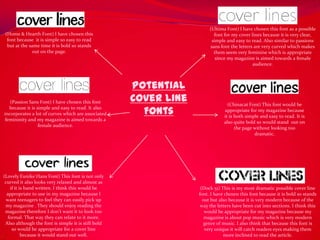
  • 1. (Ultima Font) I have chosen this font as a possible (Home & Hearth Font) I have chosen this font for my cover lines because it is very clear, font because it is simple so easy to read simple and easy to read. Also similar to passions but at the same time it is bold so stands sans font the letters are very curved which makes out on the page. them seem very feminine which is appropriate since my magazine is aimed towards a female audience. Potential (Passion Sans Font) I have chosen this font Cover Line (Chinacat Font) This font would be because it is simple and easy to read. It also incorporates a lot of curves which are associated Fonts appropriate for my magazine because it is both simple and easy to read. It is femininity and my magazine is aimed towards a also quite bold so would stand out on female audience. the page without looking too dramatic. (Lovely Eunike Hans Font) This font is not only curved it also looks very relaxed and almost as if it is hand written. I think this would be (Dock 51) This is my most dramatic possible cover line appropriate to use in my magazine because I font. I have chosen this font because it is bold so stands want teenagers to feel they can easily pick up out but also because it is very modern because of the my magazine . They should enjoy reading the way the letters have been cut into sections. I think this magazine therefore I don’t want it to look too would be appropriate for my magazine because my formal. That way they can relate to it more. magazine is about pop music which is very modern Also although the font is simple it is still bold genre of music. I also think that because this font is so would be appropriate for a cover line very unique it will catch readers eyes making them because it would stand out well. more inclined to read the article.
  • 2. Body text (Century Gothic) I have chosen this as a potential font (urban jungle) I have chosen this font because (marcelle) This font is a potential mast head again because the style is it looks slightly like an explosion has just taken font. I have chosen it because it is very curved basic so easy to read. I have place because of the way parts of the letters are again like others so has connotations of also chosen it because the missing. which is appropriate since my femininity. I also chose it because it is very letters are very rounded so magazine is about pop which as a single word bold and modern. Although it comes across as will appeal to a female can be associated with an explosion. Also the being very feminine it does has an edge to it audience. fact it looks like an explosion has taken place because of the way the M is slightly rubbed out could also represent the fact the information in . This would be appropriate for my magazine the magazine has just exploded so is all new because unlike many pop magazines on the market at the moment I plan for my magazine Potential gossip and information. I have also chosen this font because it is very unique so is eye catching to be aimed at a slightly older audience of 16-19 Mast Head & and it is also very bold which makes it stand year olds so I don’t want my font to look too out. girly and childish. Body text Body Text (corbel) I have picked this font Fonts out because it isn’t too bold so could work well on a page that is suppose to be mainly images because it wouldn’t distract from them. Masthead (birth of a hero) This font is very modern but simplistic at the same time . It includes a lot of rounded shapes which I think makes it appropriate for my music magazine because to me they could Body text represent vinyl's or Cds which we associate a lot (forte) This font is both (Arial rounded MT bold) I have with music. I also think this font would be rounded and curved so has chosen this font because it is a basic appropriate because it is easy to read so people will connotations of femininity. It font so doesn’t take much effort to look at my magazine and instantly know what it’s is also bold and easy to read so read. Also it is a recognized font so about. will attract a lot of attention has a professional finish which will because people will be able to overall make my magazine look more read it without any problems professional. It is also bold so will and spot it out of a crowd. stand out easily on a page with a lot of images.
  • 3. These are examples of the types of images that will feature in my magazine. They will all be high quality images taken in a studio or in a particular set or location. There may also be a few taken from live concerts and performances.
  • 4.
  • 5. Colour Schemes – all of my potential colour schemes incorporate colours such as pink and white to represent the innocent fun associated with pop music and the femininity of my magazine. I have incorporated the colour black into some of the colour schemes because this is a more mature colour so could help show that my magazine is for a slightly older audience interested in pop music.