
Recommended
More Related Content
What's hot
What's hot (18)
Similar to Media mag for classical
Similar to Media mag for classical (20)
More from shahana18
More from shahana18 (18)
Media mag for classical
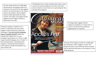
- 1. The Masthead’s font is white and bold, which makes it stand out from the colourful background. The font of the title is written similarly to musical notes, thus representing the vibe and style of the magazine. The layout of this magazine consists of a middle aged lady composing in what it suggests a concert. The background colours consist off brown white and peach, they are bland and mild colours as the audience is in the middle age group. The main image consists of a middle aged lady wearing an evening gown whilst she is composing. The portrait of this lady suggests that she is a prominent figure in the classical world, so the audience may be targeted towards middle aged people who enjoy concerts. This image is very elegant and this suggests that this magazine intends to represented in this style. The feature headline is “Apollo’s Fire” is written in a bold white font colour which suggests a vibe of excitement as above the anchorage is “THE USA’S HOTTEST BAROQUE BAND IS HEADING OUR WAY” which may indicates that “Apollo’s Fire” is a very prestigious classical group act. There is a slight usage of youthful language such as “hottest” in bold red capital letters, indicating that the magazine is attempting trying to appeal to other audiences and give the publication as a more modern vibe. This plug/ header suggests that this magazine is prestigious, as it states that it is news for the classical music profession, suggesting that it is important