
Recomendados
Más contenido relacionado
La actualidad más candente
La actualidad más candente (20)
Destacado
Destacado (16)
Similar a Double Page Spread
Similar a Double Page Spread (20)
Último
Último (20)
Double Page Spread
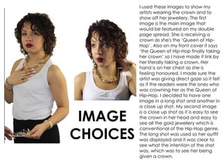
- 1. I used these images to show my artists wearing the crown and to show off her jewellery. The first image is the main image that would be featured on my double page spread. She is receiving a crown as she's the ‘Queen of Hip- Hop’. Also on my front cover it says ‘the Queen of Hip-Hop finally taking her crown’ so I have made it link by her literally taking a crown. Her hand is on her chest as she is feeling honoured. I made sure the artist was giving direct gaze so it felt as if the readers were the ones who was crowning her as the Queen of Hip-Hop. I decided to have one image in a long shot and another in a close up shot. My second image is a close up shot as it is easy to see the crown in her head and easy to see all the gold jewellery which is conventional of the Hip-Hop genre. The long shot was used so her outfit was displayed and it was clear to see what the intention of the shot was, which was to see her being given a crown. IMAGE CHOICES
- 2. All throughout my magazine construction, I have kept the colour the same. On my double page spread I made sure ‘Anita Diaz’ was in the same colour I used on my front cover and contents page. It makes the name of the artist stand out on the page and shows who the article is about. I made sure it was big and bold as I wanted my double page spread to have a bold feel to it. On all the titles that I have used, I have stuck with the same effects to make them look bigger and attract attention of the readers. The font that I have used in my double page spread is ‘LA Headlights BTN’, I have used this font throughout my magazine and it makes the writing stand out and it is clear to read. Gold is used on the questions being asked from the interviewer so that it’s easy for readers to see which responses are the artists and which are the interviewer. The gold fits in with my colour scheme of gold and burgundy and makes the page not seem so plain. COLOUR AND FONT CHOICE
- 3. I had some difficulties lassoing out these images. I originally wanted to have three images on my double page spread but I have resorted to two images as it couldn’t all fit. All these images were considered for my double page spread but the final two I chose looked better. Those 6 images I had cut out and attempted to put them on my page but they all looked wrong. As some of those images I took had a grey background, it was a struggle for me to change it from grey to white as certain areas picked up the exposure more than others.
- 4. These are the stages that I have taken to produce my double page spread. I started off by putting the name of the artist on the page first so that I could work around it. As it was the biggest text on the page it had to be the first step so I could know how small to make the images and other fonts. I then added my first image so that I knew where to place the text. I added a description of the artist to introduce the readers to Anita Diaz. I then added my final image so that I could establish a layout for my double page spread. Where the images are placed, it was easier for me to know where to place the text. I then added all the text on the page and it was able to be read easily as the layout was clear. I added a pull quote of the artist and put it above the artists head so It would be obvious to readers that it’s from the artist. DIFFERENT STAGES OF PRODUCTION